


Seleccione este tipo de licencia cuando esté desarrollando una aplicación app para iOS, Android o Windows Phone, y vaya a incrustar el archivo en el código de su aplicación móvil. va a incrustar el archivo fuente en el código de su aplicación móvil.
Glory
por TypeSETit
Estilos individuales desde $9.99 USD
Familia completa de 13 fuentes: $99.99 USD
Glory Fuente La familia era
diseñada por
Rob Leuschke y
publicado por
TypeSETit. Glory contiene
1
estilos y opciones de paquetes familiares.
Más información sobre esta familia
- Aa Glifos
-
¡Mejor PrecioPaquetes de familia
- Estilos individuales
- Especificaciones técnicas
- Licencias
-
Glory Thin
-
Glory Thin Italic
-
Glory Light
-
Glory Light Italic
-
Glory
-
Glory Italic
-
Glory Medium
-
Glory Medium Italic
-
Glory Bold
-
Glory Bold Italic
-
Glory Heavy
-
Glory Heavy Italic
Por Estilo:
$7.69 USD
Paquete de 13 estilos:
$99.99 USD
Glory Thin
2 fuentes-
-
Por Estilo:
$12.49 USD
Paquete de 2 estilos:
$24.99 USD
Glory
2 fuentes-
-
Por Estilo:
$12.49 USD
Paquete de 2 estilos:
$24.99 USD
Glory Medium
2 fuentes-
-
Por Estilo:
$12.49 USD
Paquete de 2 estilos:
$24.99 USD
Glory Light
2 fuentes-
-
Por Estilo:
$12.49 USD
Paquete de 2 estilos:
$24.99 USD
Glory Heavy
2 fuentes-
-
Por Estilo:
$12.49 USD
Paquete de 2 estilos:
$24.99 USD
Glory Bold
2 fuentes-
-
Por Estilo:
$12.49 USD
Paquete de 2 estilos:
$24.99 USD
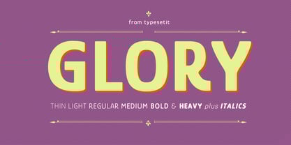
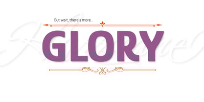
Sobre la familia Glory Fuente
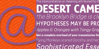
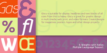
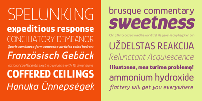
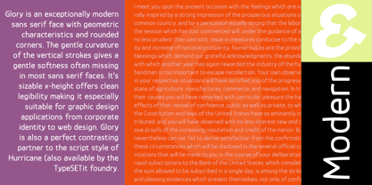
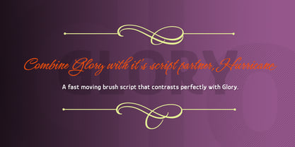
Glory is a modern sans serif font. The rounded corners of the family’s characters give it a soft, contemporary feel. While the characters are slightly condensed, this semi mono-weight sans features some forms with subtly curved vertical strokes. Glory was created with graphic design in mind. Create logos, headlines and body text with the six weights that are available. Combine Glory with other script styles to give your work warmth and contrast.
For a truly professional look, team up Glory with its script companion, Hurricane.
Diseñadores: Rob Leuschke
Editorial: TypeSETit
Fundición: TypeSETit
Propietario del diseño: TypeSETit
MyFonts debut: Apr 30, 2016
Glory
Acerca de TypeSETit
“I think it’s important as an artist to challenge myself and work outside of what’s comfortable,” TypeSETit’s founder, Robert Leuschke, said in his Creative Characters interview. Based just outside of St. Louis in the heart of the United States, Rob began his career working alongside some of the best lettering artists in the industry at Hallmark Cards. “I began working in the Lettering Department in July of 1983, and that’s when I really began to learn how to do lettering,” he says. “Working at Hallmark Cards was like going to graduate school and getting paid for it. It was fantastic.” He began working as a freelance graphic designer in the late 1980’s and realized that he could increase the production of his work by creating customized fonts of his hand lettering. He has created fonts ever since. After designing a few fonts for larger foundries like ITC and Bitstream, he began offering his designs on MyFonts in the summer of 2004. Since then, he’s seen great success with typefaces such as Corinthia, an elegant script that was featured on our Top Ten Fonts of 2008 list, and Style Script which was one of our Most Popular Fonts of 2013. Where does Rob draw inspiration for his noteworthy designs? “I try to look for things that are not what I would typically do,” he says, “then give them my own adaptation. If something catches my eye, I make a note or take a picture with my cellphone. That’s how I came up with Arizonia. I saw some lettering painted on a truck and took a photo.” “Sign painters have such a gift for beautiful letterforms. As for other designs, since I am proficient at much but master at nothing, I tend to combine styles. Take for example, Lovers Quarrel or Passions Conflict. They both have a calligraphic feel, but I intentionally broke rules and added swashes and swirls, especially with the uppercase forms and then gave them a more contemporary script look.” Prior to 2004, embellished forms were a rarity in the font world. “I think my introduction of more hand lettered looking fonts inspired other artists to think outside of traditional typeface design. For example, I was one of the first designers to offer words and phrases in glyphs with my Holiday Font. I only recently discovered that a term for that is ‘word art.’ I’d like to think that I have been a trend-setter in that respect.”
Seguir leyendo
Leer menos
- Al seleccionar una opción, se actualiza toda la página.