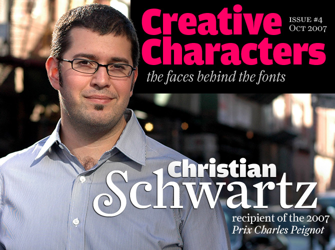
photo of Christian Schwartz by Christine Tran
When we asked you, our readers, to tell us whom you would like us to interview for Creative Characters, one name that kept coming up was Christian Schwartz’s. Although he’s not even 30, Christian Schwartz is among the most prolific type designers in the USA, having published fonts with about half a dozen foundries. He has also created successful corporate type systems, such as the superfamily made for the German railways, for which he and Erik Spiekerman received the Federal German Design Prize 2007. And that’s not his only award this year...
Christian, you’ve just received the Prix Charles Peignot of the worldwide typographers’ association, ATypI. Congratulations! What did you think when they gave you the news?
I was out getting a cup of coffee when [president] Jean-François Porchez called to deliver the news. He left a very funny, very cryptic message on my voicemail, instructing me to call back “immédiatement”. Since he had never called me before, wouldn’t say what he was calling about in his message, and it had been 4 or 5 years since the last Prix, I had some suspicion that this was what he wanted to talk to me about, but it was still a shock when he actually said that I was going to receive the prize. Although I have some really great collaborators, they’re all far away, so I spend almost all of my time working in my little office at home, by myself, which makes my job seem very anonymous. It’s a real honor to be recognized by my colleagues.
Apart from these special occasions, what is it that gives you most satisfaction in your work?
I have a lot of interest in following the news – local, national, international – all of it, and by extension I love reading newspapers and magazines. Books, too, but my first love is newspapers. Being able to contribute to the experience of reading publications is what I enjoy most about my work as a type designer.
It seems your relationship with typography began at a very early age – at three or four years old. How did that happen?
My father is an animator. He works with computers now, but when I was really young he still did everything by hand, including setting type with dry-transfer lettering for the occasional map or title. When he was done with these sheets, he would let me have the leftovers, for labeling my drawings.
You were fourteen when your first typeface, Flywheel, was published at a professional foundry. Was that a major event in your young life? Were you surprised?
I was very surprised. I felt a bit like I was getting away with something – I was accepted by the first foundry I submitted anything to! The difficult thing was following it up. Real curves turned out not to be as easy to draw as rounded rectangles.
Pennsylvania
While studying graphic design in Pittsburgh, Christian Schwartz got intrigued by the industrial look of the lettering on Pennsylvania license plates. When he took up the design of a monospaced typeface (“it was the late 90s and that’s what was cool”), the number plates became his inspiration. He expanded the alphabet into a complete text and display family, using the unorthodox serifs of the source to even out the texture of the monospaced lowercase. As Schwartz himself has remarked, Keystone State by Anuthin Wongsunkakon is based on the same original, but “leaves more of the quirks intact”.
How did you learn how to draw type, and how to use the software?
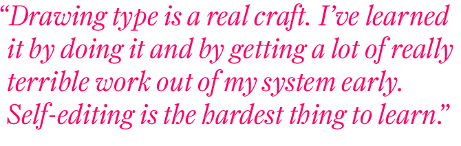
The software is fairly easy to learn, although I still get confused at times in FontLab Studio. I learned some good habits at Font Bureau, and have slowly developed a production process that works for me. Drawing type, however, is a real craft. I’ve learned it by doing it a whole lot, and getting a lot of really terrible work out of my system early. Self-editing is the hardest thing to learn.
The most important thing I did to help my development as a type designer was probably to look at a whole lot of existing typefaces, to analyze what really made them work (or not) – everything from Franklin Gothic to ITC Charter. Tobias Frere-Jones encouraged me to do this when I was an intern at Font Bureau during the summer of 1996, working under his direction. He taught me the essentials of drawing type – the rest has just been practice. David Berlow taught me about spacing during that same summer.
At what point in life did you decide to fully concentrate on type design?
I have tried to move away from type design a couple of times, but I keep getting pulled back in. When I graduated from Carnegie Mellon, I had every intention of using my graphic design degree for doing actual graphic design, but instead I ended up as an in-house type designer at MetaDesign in Berlin (starting an ongoing working relationship with Erik Spiekermann), then spending about 2 years working at Font Bureau before I moved to New York with dreams of becoming a magazine art director. It took me about 3 weeks of freelancing at Roger Black’s studio to realize that I just wasn’t cut out for magazine design. Roger had apparently anticipated this but had patiently waited while I figured it out for myself. He immediately had a lot of lettering and type design projects for me, and I haven’t looked back since.
Los Feliz
Los Feliz is a district in Los Angeles that is full of amazing homemade signs. One such sign, for a company called Los Feliz Auto Parts & Service, was photographed by Schwartz’s friend Matt Tragesser. Tragesser thought the hand-painted letters would make a good typeface, and sent the pictures to Christian. “I [had] spent 10 years trying to learn the ‘right’ way to draw type,” wrote Schwartz. “When Matt showed me the Los Feliz sign, I realized it was an excellent time to take everything I’ve learned and turn it inside out to ask myself: ‘If I didn’t know what I was doing, what would I do?,’ and to forgo tradition in favor of expressiveness.” Tragesser’s research to locate the sign painter resulted in a dead end, but months after Emigre released Los Feliz, Los Angeles magazine found him – a local craftsman named Cosmo Avila.
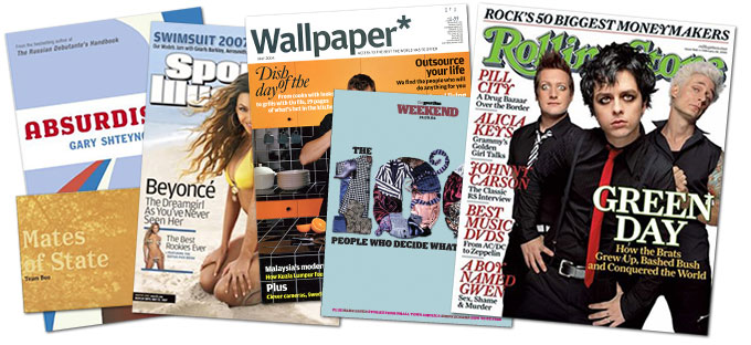
Samples of how Schartz’s fonts have been used in various publications
You’ve become Erik Spiekermann’s right hand for most of his type design projects, and the two of you have created some impressive work together. Who does what?
Erik Spiekermann has plenty of good ideas for typefaces, but has little to no interest in sitting down at a computer to draw the thousands of characters it takes to build a usable family. He’s far too busy, and probably too impatient. In any case, I think he got the “boring” part of type design out of his system back in the ’70s, when character sets were smaller but everything had to be done by hand.
When Erik and I work together, I take his big-picture ideas and translate them into typefaces. We also discuss details the whole way through – does the i need a serif? Is the M too wide? He’s fond of saying that I always do what he asks, and then I do what I think is right. I’ve learned a lot from him about how to figure out what kind of family a corporate client needs. I also learned a bit about how to speak their language. It’s nearly impossible to use aesthetics to sell a new typeface to people who are not very savvy about type. It’s far more digestible when it’s wrapped in a compelling story, and Erik is an excellent storyteller.
You’ve also continued to work for Roger Black, whose main speciality it is to do high-end magazine redesigns. What’s your working relationship like?
Roger is much less interested in the micro level than Erik is. What I really enjoy about working with Roger is that he often describes what he wants in non-typgraphic terms. When we were working on the first round of sketches for the Houston Chronicle, he didn’t say, “there’s too much bracketing on the serifs.” Instead, he told me, “You need to do something about those ridiculous bellbottoms!”
Amplitude
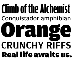
Amplitude is an unusual sans-serif that makes for very different effects in text and display sizes. Schwartz took a functional device – the inktrap – and made it into an aesthetic feature. There’s a precedent: Matthew Carter’s Bell Centennial, probably the best known typeface with exaggerated inktraps. Originally designed for telephone directories, its was made to be used at very small sizes on absorbent paper. Deep inktraps were carved out to avoid the prevent ink from closing up sharp corners. As a student, Schwartz liked making “improper” use of Bell Centennial as a display face because its inktraps just looked cool. A few years later he made Amplitude do the same. When used in text sizes, it looks breezy and bright; used large, its deep cuts make for a striking image.
You’re not yet thirty; so you belong to the first generation of designers to whom personal computers have always been around. Do you still think it is important to be able to draw by hand – or to know how the old technologies worked?
I did some letterpress work in college, and did a bit of old-fashioned paste-up work, with a waxer, blue pencil, and a light table at my job in high school, so I have some vague familiarity with the old technologies. I don’t really think it’s necessary to do beautiful drawings by hand to be a good type designer. I think my own sketches are incredibly ugly, but they help me to quickly develop ideas, which is the important thing. The only potential issue I see with working 100% on the computer is that even the earliest proofs are seductively clean and crisp, so you have to be very careful to keep your critical eye sharp and not decide prematurely that the work is finished.
You’ve designed an incredible array of typefaces in an amazing range of styles, many of which are historically inspired. Is there a historical period of style that you prefer?
I’m not necessarily focused on one particular period. I think I’m more of an omnivore: I like to skip around and see what I can learn from various ways of putting type together – Granjon’s italics are absolutely incredible, beautiful, and inspiring, but I don’t think I could say I like them more than 19th century British Egyptians, or mid-20th century Swiss sans serifs.
When you do a revival or reinterpretation – how much of your own heart and soul can you put into a typeface?
If expressing my innermost heart and soul through my work was my number one priority, I would probably go back to painting, or become a writer. The way I see it, my job is to make tools for other people, not to indulge myself through drawing wacky letters. I’m not saying that personal expression is a bad starting point for a typeface, just that it’s not a way I feel comfortable working. I don’t think I have interesting enough ideas for “blue sky” projects. I have to have a problem to solve, even for non-commissioned work. Amplitude attempts to adapt the engineering needed to make tiny type readable into a stylistic trait. Farnham updates Johann Fleischman’s fantastic transitional faces to fit contemporary magazines.
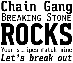
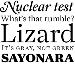
Fritz
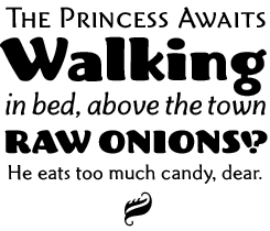
Fritz is based on various pieces of handlettering done in the early 20th century by Oswald Cooper, a commercial artist and type designer best known for the popular display face Cooper Black. With Fritz, Christian Schwartz tried to “get into Oz Cooper’s head,” using the ideas underlying the lettering to draw a soft and flexible font for text and display. Being pretty self-critical, Schwartz later noted: “In retrospect, I wish I made the italic more cursive and didn’t follow the rules of the text weights so closely when drawing the Robusto.” As it is, Fritz works beautifully regardless; and its idiosyncracies give it a lot of pizazz.
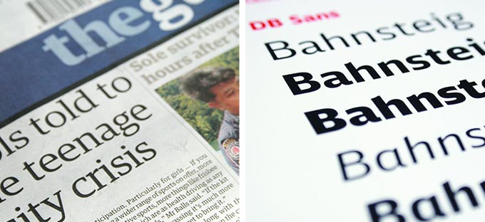
Two of Christian's custom type projects that have recently won general acclaim: the Guardian family designed with Paul Barnes, and the type system for the Deutsche Bahn (German Railways) designed with Erik Spiekermann. (We'd love to sell them, but DB and the Guardian paid handsomely for exclusive use.)
One of our readers, a budding typophile called Reed Reibstein, contributed the following questions: How do you manage to come up with innovative ideas for each project? Could you mention any designers and books that have inspired you through the years?
It depends on the project, really. I often have a very pragmatic problem to solve, which makes it pretty easy to know where to begin. For example, Houston came from a specific project brief from Roger Black – how to interpret the model of Monotype’s Italian Old Style for use as a news text face, specifically at 9pt on the Houston Chronicle’s presses.
I used to always carry a sketchbook, which I would gradually fill up with sketches of letters that I liked, but I’ve been doing that less and less these days. I’ve realized that I’m more interested in working initially from ideas and problems than from the formal side of things, unless I’m doing a historical revival.
My secret to coming up with good ideas is that I work with amazing collaborators. Sometimes these collborators are type designers, like Paul Barnes, Kris Sowersby and Tal Leming. Sometimes these are clients: David Curcurito at Esquire; Mark Porter at The Guardian; Roger Black, on a number of projects. Erik Spiekermann manages to be both a co-designer and a client all at once. I have a much easier time designing a typeface once I can imagine how it will exist on the page. Paul Barnes and I spent several fruitless weeks coming up with sketches for the Guardian until we stopped thinking so hard about how we wanted it to look, and started to focus on what it needed to do – Mark Porter’s assertion that the pages would be “modern and austere” got us out of focusing on endless variations of serif shapes and ball terminals, and gave us something to work towards.
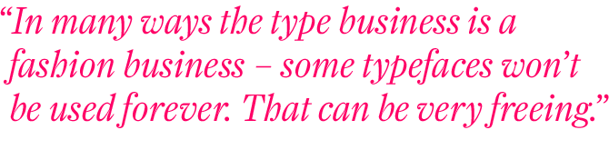
When I was first getting serious about type design, many years ago, I was lucky enough to have the opportunity to work as an intern with Tobias Frere-Jones, who was still at Font Bureau at that point. He instilled a love for type history and an appreciation for type specimen books. However, while I love type history, I try to keep an eye on what’s going on right now, not just in graphic design but also in fashion, music, television – serious culture and pop culture, all at once – so I buy more magazines than I care to admit. In many ways the type business is a fashion business – some typefaces are intrinsically attached to the time and place in which they were created, and so they won’t be used forever. That can be very freeing.
What is it that makes a young type designer tick?
I have a really great little stovetop espresso maker. That is more or less what keeps me going.
Thank you for the insight, Christian. We hope to see more work from you in the future!
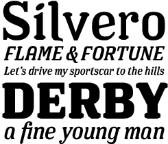
Farnham
Johann Fleischman was a virtuoso German punchcutter who worked for the Enschedé foundry in 18th-century Holland. Like his contemporaries Baskerville and Fournier, Fleischman took advantage of better tools and harder steel to achieve a remarkable crispness and “sparkle” on the page. His typefaces were largely forgotten as tastes changed, but the interest in Fleischman’s work was renewed in the 1990s as several digital revivals were made.
With Farnham, Christian Schwartz did not opt for a pure and faithful revival, but used the source material as a starting point for a very contemporary text face. Leaving out features he found distracting or exaggerated, he achieved a beautifully usable text font full of character.

Who would you interview?
Creative Characters is the new MyFonts newsletter dedicated to people behind the fonts. Each month, we will be interviewing a notable personality from the type world. And we would like you, the reader, to have your say.
Which creative character would you interview if you had the chance? And what would you ask them? Let us know, and your choice may end up in a future edition of this newsletter! Just send an email with your ideas to [email protected].
If you’re curious to know which type designers we’ve already interviewed as part of past Creative Characters newsletters, have a look at the archive.
Credits
This month’s interview was conducted and edited by Jan Middendorp and designed by Nick Sherman.
Supporting fonts
The Creative Characters masthead is set in Amplitude and Farnham; the pull-quotes and large question mark are also set in Farnham; the small URL at the top is set in Unibody 8 Italic.
Unsubscribe info
This message was sent to:
[email].
If you no longer wish to receive this newsletter, you may change your subscription settings at: www.myfonts.com/MailingList
Comments?
We’d love to hear from you! Please send any questions or comments about this newsletter to [email protected]