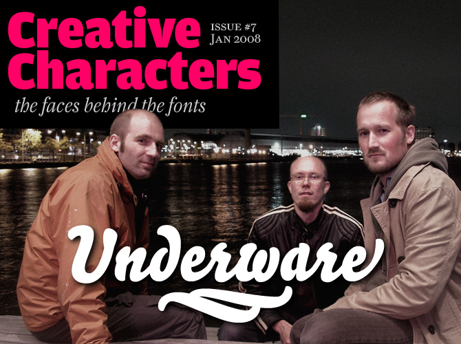
They began working together ten years ago when studying type design and typography in The Hague, the Netherlands. They gradually became the type world’s best loved design collective. They are Underware: Akiem Helmling (German, The Hague) and Sami Kortemäki (Finnish, Helsinki), Bas Jacobs (Dutch, living in Amsterdam). Besides making strikingly original typefaces, Underware publish books and magazines, give hilarious lectures and inspiring workshops, perform in art galleries, and are the founders of Typeradio, the world’s only traveling radio station dedicated to typography. Meet Underware, three guys who know how to have fun with type…
Underware is a studio whose members live and work in three cities in two different countries. How did you get together?
After combining forces on various projects while at the Royal Academy of Arts in Den Haag, it was a natural step to continue our cooperation after graduation. Some call us “a virtual studio” but that is not correct. We have one shared bank account and discuss all projects together. If the three of us worked at the same location it wouldn’t change a lot. But as we all prefer to live in the city which we inhabit, it just turned out be Amsterdam, Den Haag and Helsinki. Let’s say Underware is a multi-locale-studio.
Your typefaces claim to be “collective” designs instead of being credited to one individual designer. How does this work in practice? Do you really design type together?
For typefaces it’s not so common to have several people credited as designers. But our activities overlap so much that they are impossible to separate.
In practice, of course, a new typeface usually starts with one person. Others might take over after a while, might just criticize it, might bring up new ideas, might start making another weight or an italic, etc. The most important thing, however, is to define a typographic palette – define what a typeface should be able to do and what not. This is always discussed and specified together, and is way more important than “who is the one actually making it.”
How have you managed to stay together over the years?
That is an interesting question, because that is much harder and it takes more alertness than starting up a cooperation. While studying we didn’t only spend lots of time together on projects, but also in the pub and on the beach. Now, with our multiple locations, it can easily happen that we only discuss work and drift apart on a personal level. That”s why we get together a few weekends a year, where we do nothing but have a sauna.
The main thing is trust. If one of us does something stupid, we don’t lose faith. Next time it will be the other guys’ turn to make a foolish mistake. What keeps us working together is that we keep appreciating the differences. We still get surprised by the stuff on the other side of the wire, and we’re aware that none of us would be able to achieve on his own what we can do together.
Also, we give each other lots of freedom. If the weather’s good, Akiem goes riding the waves with his surf board, Sami goes training his six-pack with 18th-century cannon balls and Bas bikes around Amsterdam in search of a 5-kilo jar of Nutella. If it’s raining, we work out our brains. If one wants to sketch ideas for an all new typeface, he can do so, even when there’s other stuff on the desk. Instead of killing each other’s budding ideas, we let them grow freely. After some time we get together to decide which ideas are worth continuing.
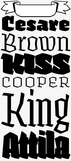
Bello
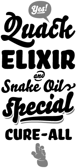
The members of Underware are experienced lettering artists; the paint brush is one of their favorite tools. Bello convincingly mimics the work of the sign writer. It adds character to menus, magazines and logos – and it would provide perfect signage in a beach bar.
Bello is big, beautiful and well-equipped. Its glamorous ligatures and swashes allow the user to give each word its individual layout. Besides the appealing flow of the Bello Script face, there’s the upright and sturdy Bello Small Caps. In Bello Pro, the OpenType version, the Small Caps are integrated, together with a set of striking word logotypes. When you opt for the separate logotype font, Bello Words, there's a companion font of drop shadows to play around with in different colors. Bello is the ultimate brush font toykit.
What would you say are the best and the most difficult aspects of publishing your own typefaces?
Best aspect? Defining our own challenges. Which, in fact, is also the most difficult aspect. Other challenges: to get your typeface known, and to set yourself a deadline. It is not easy to make your typeface stand out among those other 60,000 fonts. As for deadlines: we are very good at endlessly developing and improving our fonts, never considering them good enough, and before you know it, another year has gone by!
As you see, we don’t have a fool-proof production line for our retail fonts. We also don’t have a master plan about what our font library should look like in ten years. We follow our intuition and current motivation, and we cherish that freedom.
Example: for the typeface Auto we first made one italic style. But we felt that something was missing - that in fact it would be groovy to have a palette of three different italic styles to pair with a single roman. Then we saw that in practice the choice of italic also miraculously changes the feel of the roman! We would not be aware of these things if we didn’t take so much time developing the fonts.
For the first two Underware type families, Dolly and Sauna, you developed a unique and courageous sales system based on trust. A CD with the complete family was included with the specimen booklets, leaving it to the users to buy a license when they find themselves using the typeface. Did that work for you? Would it still work today?
The idea is to (try to) understand the position and the needs of the end users. If you want them to use your fonts, you must listen to their needs. Graphic designers often depend on their customer’s decisions; they may need to test-run a font to see if it actually works for their specific situation. It’s good if the type designer can give them the possibility to do just that. Therefore our publications come with the CD. The trust-each-other system is clearly described on the CD, and users seem to understand and appreciate this.
The current OpenType jungle actually shows that most people don’t know exactly what they’re buying. The only way to really test-drive a typeface is by installing it and using it. All other ways (like online test-drivers, etc) offer a preview, but will never be a satisfying substitute. Would you ever buy a new car straight from a catalogue or a car simulator?
Did the system work for us? People do license our fonts – first they buy a book, then they come back to purchase a license. So there are still honest people around. But it’s hard to measure how effective this system really is. And yes, we will do it again. Our next publication will also have a CD including the fonts for testing.
Auto 1, 2, & 3
With Auto, it’s the Italics that make the difference. Auto (the roman) is a friendly, open sans serif typeface with a humanist touch, not unlike Fedra Sans or Relato Sans. What makes Underware’s Auto unique is its range of three markedly different Italics, each with its own typographic flavor.
Auto 1 Italic is straightforward and restrained. It can accompany the roman in a serious book or an annual report. Auto 2 Italic has a more personal touch, a friendly flow. Also, it contrasts more strongly with the roman, and therefore is great for emphasis in dictionaries or listings. The Italic for Auto 3 is the most provocative of the lot, almost upright, with open counters and strategically placed serifs, loops and swashes.
The possibilities are endless. Choose an Auto for a specific occasion. Use three Autos within one corporate identity, so that different kinds of publications can be given their own flavor. Use the three Italics to for multi-lingual texts or to differentiate between speakers in a play... In short: use your imagination!
Bas ponders early sketches of what would eventually become Dolly.
Those early specimens, designed by Dutch designers Wout de Vringer (Dolly) and Piet Schreuders (Sauna) were beautifully produced. The Sauna specimen especially was quite spectacular. Titled Read Naked, it was printed on heat- and moisture-resistant material, and some texts were printed with special ink that only became visible at sauna temperatures. Early presentations of Sauna verged on performance art, involving lots of hot water and steam. Did you do it just to have fun, or was there some a conscious strategy behind it?
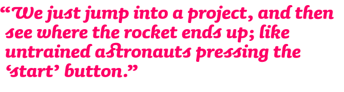
We can get very enthusiastic, sometimes overenthusiastic, and when this happens we tend to lose sight of the big picture. This prevents us from precisely planning what we are doing. We just jump into a project, and then see where the rocket ends up; like untrained astronauts pressing the “start” button. We like to think big, without knowing where that will take us.
At the moment we are working on a publication on “voluntary suffering.” Not sure where this will take us, but the subject is engrossing. Then the rest of the process of making this book just has to grow naturally.
A conscious strategy behind our publications? Here’s one of our goals: to give kudos to our mothers while they’re still alive. At least, for that reason we had three cover girls in the Is Not take-away #1 publication.
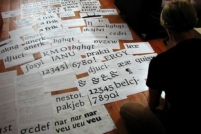
A question about type and technology. You are all very computer-savvy, you program websites and have designed fonts that play with the pixel grid. Yet you always emphasize the importance of sketching and drawing by hand. Would you say it’s crucial to start each project by turning your back to the computer screen?
More important than which direction to look, or which tools to use, is the processor: our brain. Sitting at a computer screen is not always the most inspirational environment, most ideas are born somewhere else. But yes, you are right. We find sketching by hand very liberating. It can be very rough, in the train on an old newspaper, or more accurate behind your desk in a sketchbook.
Mostly we do not scan the hand sketches in order to digitize them 1:1. They’re a tool that helps us define the basic form and concept much quicker than a computer. We sketch complete words, not just single letters – that makes it easier to see each letter in the right context. It immediately gives an idea of the spacing, rhythm and style. Relatively soon we start to enhance this sketch digitally. For a while the digital and analog sketches develop simultaneously. But then there is a period of around 2 years where a type family gets further designed and produced on the computer.
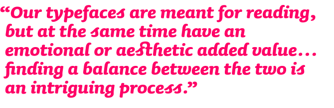
We find it easier to create a personal, evocative style when we sketch by hand. Probably none of our typefaces are “neutral,” all are expressive and peculiar. Our typefaces are meant for reading, but at the same time have an emotional or aesthetic added value. The last aspect is often over-exposed, while the first aspect, the user-friendliness, is much more important. Finding a balance between the two is an intriguing process.
Fakir
Fakir is a contemporary take on the blackletter genre – a streetwise gothic, so to speak. It examines the edgy structure of the textura alphabet, as it was written with broad-nibbed pens for centuries, but also looks at lettershapes used in graffiti pieces.
For decades, blackletter was abandoned – it was almost a taboo, with its confusing connotations of fascism, heavy metal rock, and beer. But the genre has seen a remarkable revival, and it’s cool again to use and wear it. Underware taps into that newly found popularity, hoping “to give our generation a blackletter from the here and now.” Fakir is not a revival, but “an all-new 21st-century blackletter uncorked in 2006, after 5 years of aging.”
The end result from one of Underware’s previous Typeworkshops
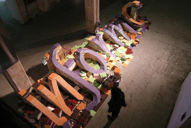
You’ve worked out a rather unique system of typography workshops and a website to support it. Could you tell us more about the kind of workshops you offer? Does working with students influence your own design practice?
If there’s a formula for our workshops, it would be something like: problem + group of people + type design knowledge + unconventional application = surprise = motivation = energy.
Most of our workshops take place in various academies, with a local organizer helping us to realize the event. The longest workshop so far ran for two weeks and the shortest for just a couple of hours, but 2–4 days is typical.
The end result can be anything. Although the 3D results are more immediately eye-catching than something very specifically 2D, the subject can be anything. We enjoy type, and if others enjoy type as well, we can have an entertaining and inspiring time together. It’s amazing to experience that what we find fascinating is also interesting to others. We influence and get influenced, and sometimes participants from different workshops even start to discuss with each other
There has always been something subversive about Underware – from your name and working structure to the individual typefaces. Lately, you’ve participated in the redesign of the Daimler identity, developing that luxury car company’s new logo. Did that feel like some kind of contradiction? A triumph? Entering a different world? Or just another job?
The design approach is very much the same for every project. Doesn’t matter if it’s a local underground record label called Sic-Rec, or a multi-national company like Daimler. You always try to find the best typographic solution. Of course, seeing your logo applied worldwide can cause a sense of triumph, but you also get that seeing somebody very proud and happy with the new logo for his record label (which is his life’s passion). You can’t compare the two. Probably the biggest triumph is to be asked (and appreciated) for your work by two very different parties.
Working on a custom type project is quite a different story from working on our own retail fonts. Corporate type should pay tribute to the client, not to us. It was very intriguing to see that such a high-class luxury brand could have potential to carry a “beyond style” logotype. Something very subversive could also have worked, and the brand would still be a luxury brand, because everybody already knows and values the brand.
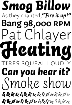
Sauna
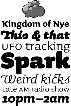
Like the Finnish invention it was named after, Sauna has a warm and comfortable feeling. It’s a type family that is hard to define. Its basic silhouette is rather square, but it is round and cozy in its details. It is an attractive headline face with an unmistakable character of its own, but it has been used successfully for long texts as well.
As with Dolly, the Regular and Bold weights are far apart, so that they provide strong contrasts within a piece of text. The Black weight is extreme in every sense, and is only recommended for sizes ranging from large to huge. Each weight of Sauna comes with two italics: the regular italic is formal and dependable, the swash italic is frivolous and cheerful. To top that off, Sauna offers three ligature fonts which the swash italics, make for really fancy headlines. (Don’t forget to check out the dingbats!)
When you’re not designing typefaces or logos, what other types of design work or art are you working on?
Unfortunately we are not biomedical scientists, but we love playing the piano, running an art gallery, pimping up wooden boats, riding bikes, developing our masculinity with girya kettlebells, playing kamikaze chess, watching clouds, running our own radio station, making the ultimate espresso, publishing type specimen books, playing panna with kids, jumping into a hole in the ice, serving green tea, cooking, culture and any kind of sub-culture.
What new type projects do you have in store? Is it more difficult now than it was, say, five years ago to come up with original ideas?
We have around eight font families under construction at the moment, and some publications. It hasn’t become more difficult to think of new ideas, it’s just that finishing a project isn’t our strongest point. We always try to be better than last time. And as long as there’s no deadline, a typeface is never good enough but can always be improved. Some fonts have been in progress for as long as five years now. Last weekend we sat down together again, and defined which fonts to finish first. “The next font we release will be a fully loaded script typeface, based on the Typeradio logotype”.
Then we jumped back into the sauna.
Thanks so much for the insight. And please... start working on that Typeradio font. We can’t wait to see it.
Dolly
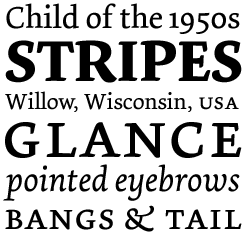
Dolly is a book typeface in the best Dutch tradition – made for optimum legibility, inconspicuous yet beautifully detailed, suited for conventional typography but also for elegant display work.
The Roman is a low-contrast text face that works well in both small and display sizes. The Italic is slightly lighter in color and provides subtle emphasis. Dolly Bold is nice and dark, which works perfectly when some extra attention is needed. Providing solutions to most problems encountered in book typography, the Dolly family is proof than small can be quite beautiful.

Who would you interview?
Creative Characters is the MyFonts newsletter dedicated to people behind the fonts. Each month, we will be interviewing a notable personality from the type world. And we would like you, the reader, to have your say.
Which creative character would you interview if you had the chance? And what would you ask them? Let us know, and your choice may end up in a future edition of this newsletter! Just send an email with your ideas to [email protected].
If you’re curious to know which type designers we’ve already interviewed as part of past Creative Characters newsletters, have a look at the archive.
Credits
This month’s interview was conducted and edited by Jan Middendorp and designed by Nick Sherman.
Supporting fonts
The Creative Characters masthead is set in Amplitude and Farnham; the intro image features Underware’s Bello; the pull-quotes are set in Sauna; the large question mark is set in Farnham, and the small URL at the top is set in Unibody 8.
Unsubscribe info
This message was sent to:
[email].
It is never our intention to send unwanted e-mail. If you no longer wish to receive this newsletter, you may change your subscription settings at: www.myfonts.com/MailingList
Comments?
We’d love to hear from you! Please send any questions or comments about this newsletter to [email protected]