
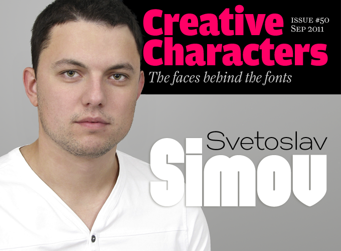
Based in Bulgaria, Svetoslav Simov — “Svet” to his friends — runs one of the most successful young microfoundries to have joined MyFonts in recent times. In less than three years, his Fontfabric collection has grown to almost thirty type families, many of which have become top sellers. His typefaces are in perfect tune with the current revival of 1970s geometric lettering and ornamentation, a style of graphic design which he loves and admires, while adding subtle new flavors to the repertoire of available fonts. Meet Svetoslav Simov, our man in Sofia.
Svetoslav, could you say something about graphic design and typography education in Bulgaria, and about your own background? Do you have a formal education in type design?
No, I have no formal typographic education. I started to lean toward type design while working as a graphic designer. Graphic design is a vast field, of course, and to do justice to its history in Bulgaria I need to go back in time a bit to explain it.
Bulgarian typography emerged, often out of artists’ ateliers, in the early 20th century as part of a culture that was on its way to becoming a genuine European gem, with some of the finest architects, artists, authors and intellectuals of the era. Over the subsequent decades, a general tendency in the country towards Western European influences meant that the new artists of typography (called “schrift” in Bulgarian, the German word), benefited from the best traditions of Austrian, German and French typographic achievements.
Good progress was being made until the communists took power. Many intellectuals were banished or killed in concentration camps. Art was co-opted to serve the party’s purposes. Fortunately, they still needed great schrift masters and artists, so the Bulgarian National Academy of Art, founded in 1896, remained one of the finest in Europe. The down side was an inevitable tinkering with styles and methods, since the artists had to fit the communist mold. On the other hand, the academic programs were heavily sponsored by the government, so we now have marvelous examples of typographic excellence from that period (1950-1989).
Regretfully, in the transition from communism to democracy the high level typographic education in art schools and the academy somehow dissipated. Due to the economic crisis it became hard to make a living as a teacher, and many of the best specialists had to seek other sources of income. So at present it is difficult to get a good education in typography in Bulgaria, although type design is taught in several art schools as well as in the National Academy of Art as part of several majors. But there is a great heritage to learn from, even if most of the inspiration comes from western and sometimes oriental examples of creative type and lettering.
All of your fonts, aside the painterly Pastel, are based on simple geometric forms — straight lines and circles. Why did you choose that approach?
The letterforms that I like and that inspire me most are those found in types like DIN, Futura and AvantGarde — typefaces with a strong foundation in geometry. Even back in high school, geometry and drawing were my most prominent skills. This later influenced my work as a typographer. Because I don’t sketch the font beforehand but work directly in the vector program, my method of developing fonts defines their geometric style. Almost every font and every single glyph begins with a basic shape — a straight line or a circle. I then gradually define its visual characteristics, and I end the whole thing with some fine tuning. The geometric approach is central to my work, but I do wish to broaden my spectrum of styles.
Many of your typefaces recall the geometric type and lettering of the 1960s and 1970s. Do you admire that period? Was that style particularly strong in Bulgaria?
Yes, I am definitely fond of the typography from that period. It has produced classic typefaces that are on display all around us. You can see them all the time, and that has an impact. I’m fascinated by the rather symbiotic combination of geometric and organic forms in some of those fonts. The wide array of experiments with the proportions of the glyphs’ stems is also inspiring. So I think work from that era has left a lasting trail in the evolution of type design, up to this day, and quite probably into the future.
In Bulgaria, variants of this kind of fonts are very well known, and are among designers’ favorites. Again, this was a strong period for typography in Bulgaria. It resonates from the ’60s right up to today.
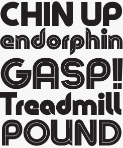
Code PRO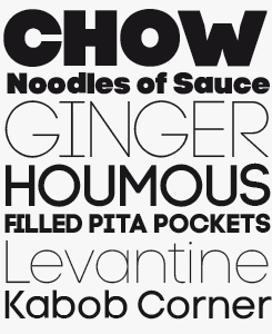
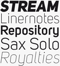
Code Pro is AvantGarde on performance- enhancing substances, with even the lighter weights having a muscular assertiveness thanks to the disciplined geometry of their glyphs. Available in four weights, both in all caps and in standard mixed case, Code Pro’s palpable popularity, both on MyFonts and on the Behance Network, has been fueled by free demo versions of the Regular and Light weights. Modernism has rarely felt so contemporary.
Gabriel Sans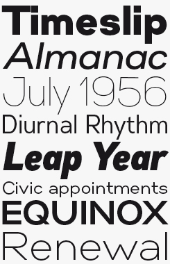
With 24 fonts distributed across two widths and six weights, plus corresponding italics, Gabriel Sans is Simov’s largest family to date. It draws its influences from a variety of early to mid-twentieth century sources, from Futura to Helvetica and Folio, with the added benefit of real italics (rather the mechanical obliques those fonts later acquired). The normal width of Gabriel Sans is relatively wide, which would make its ideal setting somewhere equally spacious. Film posters, book title pages, automobile adverts or architectural magazines would all allowGabriel Sans the room it likes to breathe. Use Gabriel Sans Condensed for the accompanying blocks of text.
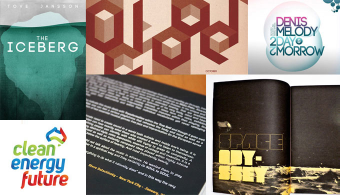
Clockwise, from top left: Code Pro on the cover of Snow, designed by Tobias Hall; Cubic used in the Hard to Read Calendar by Timi Everent; Code Pro on sleeve artwork; Prisma in magazine headlines; Uni Sans used to set text (from a CD digipak by Marco A. Fierro); Uni Sans in the Clean Energy Future logo (Australian Government).
Was there any specific work by another designer that was an eye-opener for you? Something that made you exclaim: “Yes! That’s how it works!”?
It’s true that I got a great deal of my understanding of the type designing process from observing good quality examples. But I can’t think of a specific piece that inspired that kind of “breakthrough” in my growth as a typographer. Having previously dealt with elementary shapes and forms as a designer helped me develop my consistency and a sense of form and basic composition — all essential if you want quality in a font.
Your collection of typefaces shows that the simple principles of geometric construction can result in a wide variety of forms. Please describe your thinking process when trying out new approaches. Do you always start with the same letters? Do you draw a grid first?
Ideas take shape based in part on some kind of inner concept, an urge to express a certain view, and in part are inspired by a mental library of visual concepts that, having been a designer for some years now, I’ve been gradually adding to and that is continually growing. Before I’ve sat down at the computer, I will have simply played with that mental library of impressions, ideas and motives in my mind. My favorite thing in the whole process of building a font is creating the style of the outline. The proficiency and experience I have acquired with the vector software is crucial: being able to handle the vectors and in just a short time quickly outline what’s in my head, I am able to set some variants of the font, and then pick up what’s best. It’s as if the vector editor becomes a continuation of my thoughts.
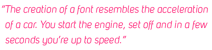
I imagine the creation of a font and its style to resemble the acceleration of a car. You start the engine, set off and in a few seconds you’re up to speed. After that the only thing you have to do is maintain the momentum.
It seldom happens that I do the whole thing in one go. I’ll often leave the style that I’ve worked on to mature for a while. Coming back to it allows me to have a clearer view of its flaws and ambiguities, and clarify the style. I can go through this several times. I don’t proceed with the whole set until I have refined the overall style and created a few main letters of the final variant — usually a, g, e and s. A grid helps me establish the ratios between stems, proportions and serifs.
Probably one of the trickiest aspects of type design is achieving consistency across all the letters of the alphabet. Do you have a system for this?
Before I started to engage in type design, I used to make sets of 200, 300 or even 1,000 icons in a specific style. I sometimes had to produce a set in a day or a limited number of budgeted hours. This experience taught me the discipline not to deviate from a given style, so that consistency throughout a font now comes naturally to me.
Solomon & Solomon Sans 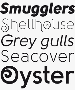
Successful ornamental sans serifs like Solomon are a difficult trick to turn — monolinear strokes don’t encourage particularly elaborate flourishes. But Solomon shows that swirls, loops and spirals need not be the sole preserve of digital calligraphers — a little twist on an otherwise sensible sans can be a very fine thing indeed. For those who’d like a more straightforward variety of Solomon’s shapes, there is now Solomon Sans — a well-equipped seven-weight family that offers multiple figure styles as well as Cyrillic and Greek.
Dovde
Thick-skinned Dovde is one of several fonts created by Simov that take the extremely chunky aesthetic popular in online forums and add a delicate aspect through small touches of fine detail. See also: Avatar, Prisma and Clou, among others, for more explorations around this theme.
Are there any specific letters or other signs that you think are particularly hard to design — or especially rewarding? Any specific letters you often use to give a font personality?
Of course, you have to dedicate more time and attention to some letters than others — the most expressive glyphs are the ones that give a font its personality. In my view the glyphs that have the strongest individuality and that often define a font are the lowercase a and g. The a, because it is a basic character, and so often repeated in a text. The g, because it has a form of its own, and is able to take two directions — either to be unique and special, or to resemble all the rest and be in a greater harmony with them. Another important feature that characterizes a font is the alphabet’s oval — b, c, d, e, o, a, g, and the corresponding capitals. In fact, this is one of the pivots of creating a face.
In some of your typefaces, such as Zag, there is a striking fusion between a clean modernity and swashy ornament. Other people have taken this trend of decorative letterforms much further — it’s becoming a real movement. Do you like that kind of work, do you find it inspirational?
I like flavoring my work, creating a symbiosis between sans serif and stylized ornaments — the Solomon type family is another example of this. Zag was one of my first successful projects on MyFonts, and I recall working on it with real pleasure. I designed Zag in collaboration with my then fiancée, now wife, Maria Simova. My part was to construct the sans serif in its pure line, and she took it from there to add the simple ornaments. My wife has a great, comprehensive experience with ornaments. She is able to create fine, graceful ornaments as well as beautiful, heavily decorated ones. When I feel that a font could go in such direction, I refer it to her. So, I cannot say that this stylistic approach is typical for me, but such work is definitely inspiring.
You seem to invest a lot of attention into making your font samples. Are they all your own work? Do you enjoy making them, and finding a style for them?
I think it’s very important to present fonts in a good sample setting. I like showing different ways of using a font to emphasize its strengths and distinguishing features. I enjoy taking the time to dive into graphic design, taking a break from pure type design thinking. It gives me fresh momentum, another creative outlet. People seem to be inspired by seeing a variety of attractive designs that show them how a font can a good basis for a design. While most of the samples were designed by me, sometimes I like to involve other designers and illustrators, which adds to the color and variety of the presentations. I’ve received some wonderful feedback from customers and users, so I think I’ve succeeded in capturing and teasing their imaginations.
Apart from MyFonts, you use the portfolio website Behance Network and you have your own website. Has online interaction with others — users or fellow designers — shown you new directions, or made you change your mind sometimes?
My products are made by designers for designers, and so I like to put them in the spotlight by featuring them in blogs and portfolio sites. It allows me to promote the font while getting some comments and critiques. To receive positive feedback is encouraging, of course, but there have been very few useful comments that could be taken as guidelines or suggestions, since the feedback is rather more general than particular. There are also some fellow designers whose work I know and respect and who have a good understanding of typography, to whom I go for advice or benchmarking. I really appreciate the feedback, as well as the interaction with clients and customers.
Uni Sans
Born into the DIN family tradition, Uni Sans is a clean-cut, precise, slightly condensed text face that will also make for crisp headlines and lean corporate identities for technology or communication companies — it will complement photography particularly well, given its understated character and clarity of form.
Zag
Zag, like Solomon (above), was produced in collaboration with Simov’s wife, then fiancée, Maria — whose flair for a fine yet restrained finishing touch is evident in both fonts. As with some of Simov’s other designs, Zag will bring a suggestion of times-past to contemporary text settings, in this case through those discreetly tasteful Art Deco-style drops. Use anywhere elegance and simplicity is in high demand.
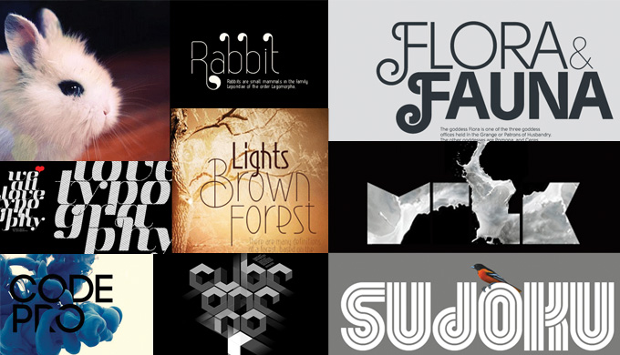
Simov’s vibrant font showings. Top row, left to right: Zag, Solomon. Middle: Aston, Reader, Prisma.
Bottom: Code Pro, Cubic, Sudoku.
There are a lot of international symposia and conferences where designers and type lovers get together. Are you attracted by this social aspect of typography? Have you traveled much since you began to become successful?
To be honest, I haven’t had an occasion to travel with that purpose since I became a little better known in typographic circles. But I am certainly attracted to the social aspect of the work and I enjoy a lively communication with other people in this field. I like the natural sharing of information, exchanging experience and ideas, you name it. Conferences don’t appeal to me so much, but I want to set up workshops here in Bulgaria on the subject of fonts and typography. I imagine expressing ideas and opinions, resolving problems with fellow designers, sharing impressions and putting together some teamwork as well. I am still rather young, but I hope to have an impact on the new generation of designers in Bulgaria, to build a foundation for greater typographic performance in the future. I think this might work.
Has your success on MyFonts surprised you? Has it allowed you to do things you did not even dream of before?
As a person who believes in God, I take the inspiration and the talent He has given me as the foundation of my success. I am grateful for my achievements, which give me the zeal to work even harder and make ever better fonts. At a certain point, I decided to focus 100% on type design, concentrating all my creativity on it, and I was fortunate to create some fonts that became bestsellers. Yet type design to me is much more like a hobby than a profession, in that it is something I immensely enjoy doing. It doesn’t feel like something that I am stuck with to make a living. I like things happening with ease. I enjoy playing with forms, styles, letters… To me every phase of the making is a treat, and I like to put 100% of my creative energy in to the process.
That’s the spirit! We are looking forward to whatever you will come up with next, and we hope your new Solomon Sans will be a great success!
Colo pro
Colo Pro will be a great tool for illustrators and editorial designers working with contemporary brands and fashion titles. Sold as either two separate fonts — an inline are well as a black version — or one affordable package, it comes supplied with full character sets as well as multiple language and territory support, including Greek and Cyrillic. Colo Pro is a professional’s tool while tapping into the indie design community.
MyFonts is on Twitter and Facebook!
Join the MyFonts community on Twitter and Facebook. Tips, news, interesting links, personal favorites and more from MyFonts’ staff.


Who would you interview?
Creative Characters is the MyFonts newsletter dedicated to people behind the fonts. Each month, we interview a notable personality from the type world. And we would like you, the reader, to have your say.
Which creative character would you interview if you had the chance? And what would you ask them? Let us know, and your choice may end up in a future edition of this newsletter! Just send an email with your ideas to [email protected].
In the past, we’ve interviewed the likes of Michael Doret, Laura Worthington, Jonathan Barnbrook, Rob Leuschke, David Berlow, Ronna Penner and Jos Buivenga. If you’re curious to know which other type designers we’ve already interviewed as part of past Creative Characters newsletters, have a look at the archive.
Colophon
This newsletter was edited by Jan Middendorp and designed using Nick Sherman’s original template, with specimens and type descriptions by Anthony Noel.
The Creative Characters nameplate is set in Amplitude and Farnham; the intro image features Dan Pro and Gabriel Sans; the pull-quote is set in Uni Sans; the Twitter picture is from LiebeTweet and the large question mark is in Farnham.
Comments?
We’d love to hear from you! Please send any questions or comments about this newsletter to [email protected]
Subscription info
Want to get future issues of Creative Characters sent to your inbox? Subscribe at www.myfonts.com/MailingList
Newsletter archives
Know someone who would be interested in this? Want to see past issues? All MyFonts newsletters (including this one) are available to view online here.