
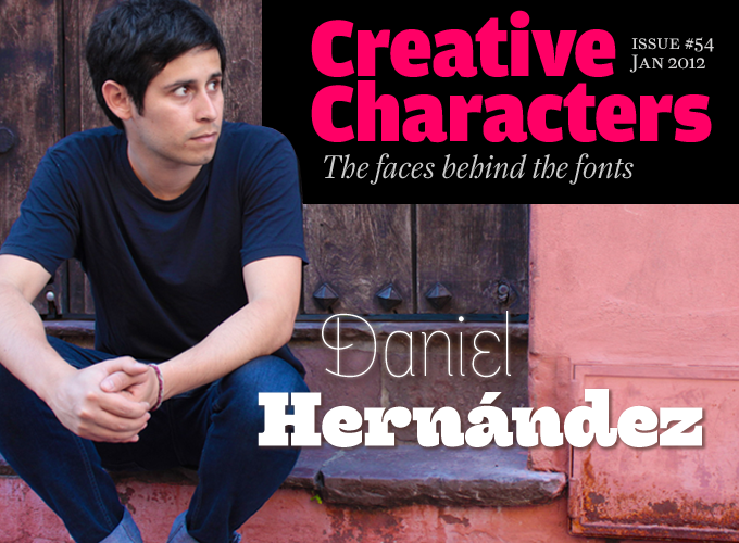
Photo by Paula Nazal
Last year Daniel Hernández left his native Chile for Buenos Aires, Argentina — arguably the typographic capital of South America — to become a full-time type designer. His dedication has paid off. In the brief period since his first typefaces appeared on MyFonts, he has become a regular on our bestseller lists. His typefaces are also quite special, with that mixture of novelty, fun and craftsmanship that we have come to know as, somehow, typically “latino”. Having published his first fonts with Sudtipos, he is now part of LatinoType, a successful new Chilean foundry with international ambitions.
Daniel, many type designers go through a period of doing a lot of graphic work — print and web design — before focusing on making letterforms. How has this been for you?
I became interested in type design at a rather early stage in my career. At university I was a type and typography fanatic; I began by drawing my first pixel alphabets in Photoshop in 2004, which I then imported into an old version of Fontographer — all very self-taught and amateurish.
After graduation I worked at a design agency for six months. I soon realized that this was not how I wanted to make a living. So I began looking for projects that would help me grow as a designer, and give me more freedom to dedicate time to my real passion — designing typefaces. It wasn’t an easy decision and it resulted in a difficult situation at first. Working independently you don’t have a secure payment each month, which can complicate things quite a bit.
So I became a freelancer, mostly on projects in the field of brand design and editorial design. More importantly, I started teaching typography and graphic design at several universities and academies in Chile. In 2010 I decided to start selling my fonts commercially, and so I contacted Alejandro Paul in Buenos Aires, with a couple of typefaces under my arm — Pincoya Black and Rita — hoping to distribute them through Sudtipos. Ale was very helpful; he has set a great example of how to run a typefoundry and how to do it in a professional way.
From that moment on, I’ve dedicated myself to type design full-time (and more). It’s been a crucial decision for me, because type design is something I am passionate about; and there is nothing more rewarding in life than doing what you love to do — your work.
You received your first prize in 2006, when you were still a student: an award from the Argentinian magazine tipoGráfica. The typeface was Stgotic, an amazing mixture of blackletter shapes and a low-resolution pixel structure. Did that font somehow sum up your influences as a student?
Stgotic has been a very important font for me and not only because it won me that tipoGráfica award. As one of my very earliest typefaces, it reflects my initiation into the type design profession. Experimenting with a modular font helped me enormously in understanding the structure of single characters and the inner system of a font.
Chile did not have much of a type design scene at the time — there were only about half a dozen people making fonts. Francisco Gálvez was one of the pioneers, alongside Rodrigo Ramirez. Miguel Hernández was also designing pixel fonts that were marketed by the now-extinct Atomic Media, and Luciano Vergara distributed through T26. These designers were my main examples at the time. Miguel Hernández (no relation) helped me a lot in developing my pixel fonts and in handling font design software. It’s a pretty crazy experience to see people who were your main influences transform into partners and friends.
You soon joined Miguel Hernández and Luciano Vergara, the co-founders of the Latinotype foundry. What was so attractive about creating your own foundry?
What led me to join Miguel and Luciano was primarily my wish to work independently on type design — to obtain more freedom to do what I wanted. Another important reason to set up Latinotype was to help professionalize type design as a discipline, firstly in Chile and secondly in all of Latin America. Our idea is to develop Latinotype into one of the principal channels distributing Latin American type to the world, which is why we are in search of new designers to join our core group. Right now all of us are from Chile, but in the coming months we will be incorporating typefaces by designers from Argentina, Mexico, Venezuela and Colombia.
Hernandez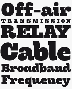
The second of Hernández’s typefaces to be released by Sudtipos, the chubby yet energetic and agile Hernandez is a heavy-weight slab serif with lots of variation built into its DNA. Details like tails, terminals and serifs can be interchanged using the Titling and Alternate Character functions in OpenType-capable software. Perfect for display settings in magazines, posters and animated titles or infographics. Check out the use of deliberately exaggerated inktraps as a stylistic device.
Sanchez
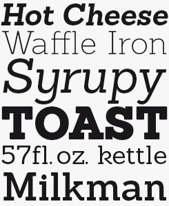
Showing how within one genre there can be a huge contrast in character, Sanchez is about as different from Hernandez (above) as it’s possible to be while still remaining a slab serif. Where Hernandez balloons and bulges in surprising places, Sanchez retains its sleek and efficient feel right into its heaviest weights. Its personal touches, subtly rounded corners and generous range of weights make it an adaptable display face that would fair pretty well in longer text settings as well. An efficient modern-day alternative to such ubiquitous slab serifs as Rockwell, Sanchez is a sporty and useful tool for editorial and advertising design. Try the regular and italic weights for free.
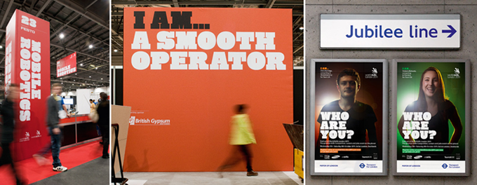
A customized version of the Rita font, Rita Especial, put to spectacular use: WorldSkills London 2011. Developed by HypeForType in collaboration with Sudtipos for London brand communications consultancy Purpose.
Latinotype’s slogan is gently provocative: “Latin type, in latino hands”. And in fact, there is a specific atmosphere to the typefaces you publish. How would you describe the “latino” style or approach?
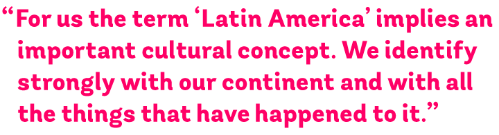
For us the term “Latin America” implies an important cultural concept. We identify strongly with our continent and with all the things that have happened to it. We Latin Americans have built our identity from the identities of others, of the countries that conquered our continent. These circumstances have resulted in a mix of cultures; they have formed us as a people, they inform and define our way of seeing and doing things.
The fact that Latin America does not have the same kind of typographic tradition that exists in Europe and the United States is important and relevant because it means we can try out new things without fear, without prejudices, without a past and with a lot of future. In actual fact with Latinotype we want to give ourselves the opportunity to experiment — in terms of formal choices, concepts and strategies — in ways that may not conform to the commonly accepted parameters and to some may seem strange or even dreadful.
We combine all of this, however, with the rigor that is a prerequisite for designing high-quality fonts and running a serious business while continually trying to professionalize the typographic discipline in our region.
While type design was a rare discipline in Latin America ten or fifteen years ago, the development in recent years has been phenomenal. What do you think were the main factors in bringing about this enormous surge in typographic creativity?
The earliest efforts in digital type design and production in Latin America date back to about 25 years ago, with the democratization of technology and the arrival of the first personal computers in this area. In theory, anyone who had access to a computer could now design a typeface. Those early years were strongly characterized by experimentation, rather than attention to typographic history; type design was the initiative of individual people, rather than educational institutions. Gradually the need arose to gather more academic knowledge about type design and typography and these disciplines began to be introduced in design and art schools.
Today, many people in Latin America are designing type professionally. I think this has happened mainly because new markets have become accessible to designers from this part of the world, that previously had only been discovered by a handful of people. I am sure there would be even more people working in this field today if designers were more generally aware of the economic opportunities.
The fact that there is a huge production of new typefaces in this region has been documented during the various editions of the Biennale of Latin Typography — Tipos Latinos, formerly “Letras Latinas”. Each edition showed around seventy designs at a high professional level, selected from a total of about 450 submissions.
Guadalupe
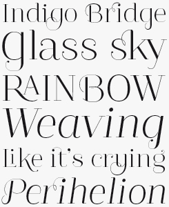
Guadalupe belongs to a growing category of richly featured and finely executed display typefaces that have their roots in the royal tradition of nineteenth-century Didones. It’s a genre the art directors of glossy magazines love, pressing all the right buttons to suggest affluence and privilege that these typefaces evoke. Guadalupe brings elegant ornamental ligatures, optional ball terminals (in the Gota variety) and lots of potential for intricate detailing. Guadalupe Essentials is a stripped-down version that would suit web usage.
Merced
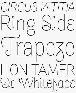
Merced is a slender sans serif titling face with a supple skeleton. While its regular capitals appear somewhat stiff and minimalist, these are delightfully contrasted by the looser feeling lowercase characters and the swashy alternates in both cases. Use Merced for call outs and advertising headlines that require a softer, lyrical touch.
You published your first commercial fonts with Sudtipos less than two years ago. You’ve had several hits since, both with them and with Latinotype. Has this success influenced the way you work?
Absolutely. It’s even influenced some of the decisions I have made about my personal life. I decided to stop giving classes and let go of my clients in order to relocate to Buenos Aires and isolate myself a little from everything, dedicating myself totally to type design. It has also changed the way in which I go about a new project, taking a more strategic perspective, trying to be more professional and serious while not losing sight of the fun.
Could you say something about this “strategic” aspect? What are the factors you take into account when deciding what kind of font to work on next?
I keep my eyes open all the time. I am always looking at type — on the street, on websites, in print; new fonts, old fonts. I’m a little obsessive in this respect. I really want to know what fonts people are using and how they are using them. I want to know what the trends are, what is successful and what isn’t. With these observations in mind, and adding some research into important visual references (usually Latin American graphic design) to the mix, I decide what to design next. I usually work on two projects at once, in order to be able to move away and look at it from a new perspective when I get back to it. That helps me a lot to keep things fresh. Yet I think my main “strategy” is to work on projects that are inspiring, fun and motivating.
To what extent do you, and the other members of Latinotype, derive inspiration from vernacular sources — such as signpainting, letterpress posters, and street art? Is Argentina different from Chile in this respect?
In Chile, one of the first projects in digital typography was TUP, which stands for Tipografía Urbana Popular, by the group tipografia.cl. The project aimed to record and interpret the alphabets used by various Chilean lettering artists and signpainters, to digitize them and convert them into digital fonts.
Another important project was the identity and signage system of the Transantiago public transportation system in Santiago, developed by Francisco Gálvez and Rodrigo Ramírez. The typeface family they designed as part of this project has certain characteristics that refer to the work of lettering artists in Chile.
What I want to show with these examples is that we undergo influences in all possible ways, from whatever we experience. We spend our lives looking at signs — on buses, at fairs, markets and corner stores. In Chile, we were born into an environment marked by the graphic design of the 1960s, 1970s and 1980s, by political posters, by the nueva canción chilena of Chilean singer-songwriters, by Mauricio Amster’s incredible work. These are all things we have grown up with and we have ingrained in our essence. It would be difficult to separate ourselves from that past.
Latin America has a very strong graphic heritage, and in one way or another the countries in this region are very alike. Of course, in some projects these influences are much more obvious than in others, but I believe that they are always present somehow, sometimes in a more literal sense, at other times in details or concepts.
Andes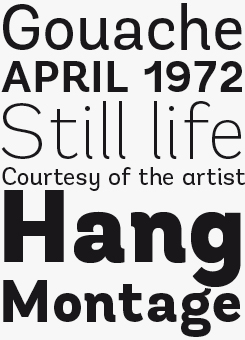
Hernández’s most recent release, Andes, is an expansion of Merced, adding seven more weights to the original’s ultra thin. The expansion makes Andes much more than a useful text companion to Merced, it is a substantial display and text face in its own right that will find a home in editorial design studios everywhere. We’re looking forward to seeing some complementary italics!
Pincoya Black Pro
Pincoya Black Pro has some of its roots in a classic design of the 1970s alternative scene in Chile: the logo of the political folk band Quilapayún by iconic Chilean designer Vicente Larrea. A playful and hard-hitting graphical instrument, Pincoya Black uses OpenType contextual alternates to insert its distinctive multiple underlines.
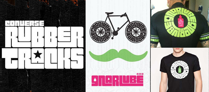
Pincoya Black used in sports-related branding and advertising: Converse (left) and Gnar Lube (center and right).
Many of your typefaces have certain characteristics that could be called “unorthodox” or “quirky” in their detailing and/or structure. Are those elements the result of conscious attempts on your part to be “different” or do they come naturally to you?
It is a mixture of both. On the one hand I try to give each font characteristics that make it unique and different from others. On the other hand you need to allow for a certain spontaneity when designing. It has to do with what I said before about being fearless and unprejudiced. To design with a degree of innocence and naivety, without carrying a heavy load of historical baggage in your backpack — not more than a basic book on type. This can result in something unusual yet useful, ugly yet nice, unruly but popular, or simply something different.
With typefaces like Sanchez and Andes, you seem to be moving towards larger, multi-purpose families. What is the next step: a huge superfamily of text fonts?
In the beginning I was attracted to the idea of designing fonts with a large number of characters, with many alternates and swashes, etc. However, I am rather inclined to design display typefaces. I like it a lot and it suits me. So I intend to continue in this vein for a while and perhaps in a few years, when I have more working experience, I will develop a text family.
As your typefaces become successful, you will gradually see more and more of your own fonts used by others. Has there been any use so far that you were particularly pleased by?
The process of designing and selling fonts is quite satisfying because the people who buy them appropriate the fonts and they somehow acquire a life of their own. It’s kind of weird to walk down a street and see how they used your font for some poster or publication. It is a priceless experience, even more so when the font is used well.
One of the jobs I liked a lot is the one made with Pincoya Black Pro for a brand of bicycle accessories called Gnar Lube. The designer managed to personalize the font in a unique way. Moreover, I saw my work being used on media I had never seen it on before: socks, cycling suits, sweatshirts, etc.
How has MyFonts contributed to fulfilling your dreams as a designer and a foundry?
It’s been just two years since I began selling my fonts, first through Sudtipos and from 2011 as a member of Latinotype. I must say MyFonts has played a crucial part in this process, because it has allowed us to position ourselves in this highly competitive market and reach an audience that would have been much more difficult to reach in any other way. I think this is an important point, because by these means our fonts can be viewed and purchased on a daily basis by an incredible number of designers. This has allowed us — thanks, also, to our great team and the fact that our typefaces have been well received — to market our fonts internationally and gain a wide popularity within less than a year.
…and this is only the beginning. Thanks for talking to us and good luck to you and your partners at Latinotype!
Monroe
Monroe is a thoroughly contemporary, lightweight slab serif, equally at home making a splash on the pages of websites as it is in printed publications like magazines, catalogues or the prospectuses of dynamic young enterprises. Its generous horizontal width makes it especially good for eye-catching headlines while — with a little OpenType magic — its flamboyant flourishes and swashes set it apart from its contemporaries in the modern slab genre.
Rita
Woodtype is not a lettering style known for its refinement, and Rita plays up its coarseness to dramatic and splendid effect. Each of its two versions, Bold and Fat, both contain extra ornaments and a selection of full words.
MyFonts is on Twitter and Facebook!
Join the MyFonts community on Twitter and Facebook. Tips, news, interesting links, personal favorites and more from MyFonts’ staff.


Who would you interview?
Creative Characters is the MyFonts newsletter dedicated to people behind the fonts. Each month, we interview a notable personality from the type world. And we would like you, the reader, to have your say.
Which creative character would you interview if you had the chance? And what would you ask them? Let us know, and your choice may end up in a future edition of this newsletter! Just send an email with your ideas to [email protected].
In the past, we’ve interviewed the likes of Michael Doret, Laura Worthington, Jonathan Barnbrook, Rob Leuschke, David Berlow, Ronna Penner and Jos Buivenga. If you’re curious to know which other type designers we’ve already interviewed as part of past Creative Characters newsletters, have a look at the archive.
Colophon
This newsletter was edited by Jan Middendorp and designed using Nick Sherman’s original template, with specimens and type descriptions by Anthony Noel.
The Creative Characters nameplate is set in Amplitude and Farnham; the intro image features Merced and Hernandez; the pull-quote is set in Andes Bold; and the large question mark is in Farnham.
Comments?
We’d love to hear from you! Please send any questions or comments about this newsletter to [email protected]
Subscription info
Want to get future issues of Creative Characters sent to your inbox? Subscribe at www.myfonts.com/MailingList
Newsletter archives
Know someone who would be interested in this? Want to see past issues? All MyFonts newsletters (including this one) are available to view online here.