
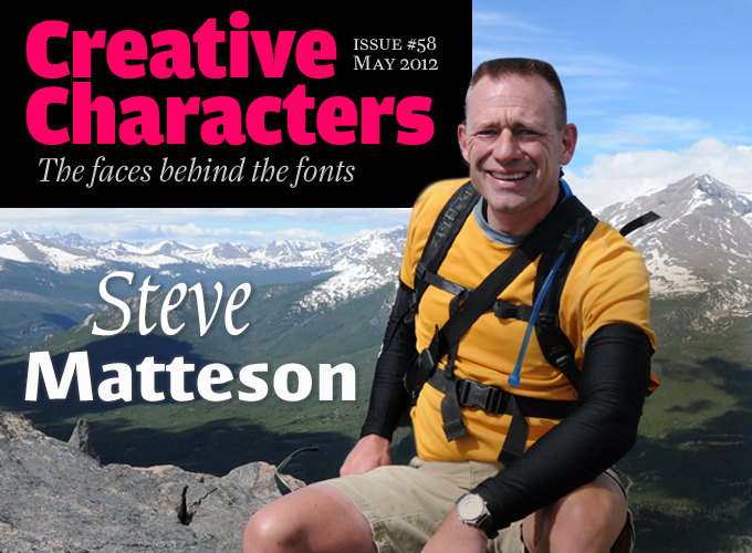
Is it an exaggeration to say that he’s one of the unsung heroes of digital type design? Whenever you read texts on a digital device, chances are you’re looking at a font he’s had a hand in, such as Microsoft’s versions of Arial, Times New Roman or Courier New. Having led the California office of Monotype Imaging in the 1990s, he became a founding partner of Ascender Corp in 2005 and, as their chief type designer, created a huge range of functional type families including the Droid fonts for Google. He rejoined Monotype when they acquired Ascender in late 2010 and recently published the wonderful Massif Pro typeface. While he excels in making useful digital type, he is by no means a pallid geek: he balances supple curves with steep slopes, and nodes with knots-per-hour. No ODS for Steve Matteson, our man at the top.
If you didn’t have to be at your computer this week, where would you be?
My first choice would probably be mountain-biking the trails near Fraser, Colorado, in the shadow of Byers Peak. A great Rocky Mountain experience.
You’re also an avid mountain-climber, aren’t you? Is your passion for the Great Outdoors a kind of compensation for the long hours at the computer screen — and has it always been like that?
Yeah — climbing, hiking, running, cycling, sailing and other things provide balance to what amounts to a very sedentary occupation. I get an acute sense of ODS (Outdoor Deficit Syndrome) while working or traveling for extended periods of time. In 1991 this got me in trouble at the (then very conservative) Monotype office in England. In an afternoon break I went outside to play volleyball with a couple of other Americans who’d been working night and day on the Windows core fonts project. In fairness, the office manager at the time simply wasn’t used to this sort of display, nor was he aware of the 14-hour work days we were doing. Software companies have really changed the way people work and unwind.
The outdoors also informs my design sensibility. I know people sometimes reference the bustling city with tall buildings and planned spaces as inspiration. For me it’s quite the opposite. I look at design as the removal of all this distraction, clutter and uniformity. Nature has its own balance and rhythm and harmony that speaks to me louder than constructed design.
You had your first professional experience in type design while still a student at the Rochester Institute of Technology’s School of Printing. Were you already convinced, back then, that fonts were your future?
“Typography” for sure — but not so much type “design”. I really wasn’t made aware of how type design was done aside from pen and ink, cutting rubylith and then some mysterious system that used a “puck” (Ikarus). Type design wasn’t an attraction because I didn’t have any hands-on experience apart from calligraphy. My resumé was turned down by both Hallmark and Compugraphic.
But it was the practice of typography — constant exposure to metal type — that drew me to letters. I found it to be a useful form of artistic expression but I wasn’t exactly sure how that was going to play out as a career. I learned about famous typographers like Freeman Craw and Bruce Rogers and Saul Bass and hoped I might end up working for someone like that.
Were you always fascinated by the technical aspects of typography?
Well, I was in school when the Macintosh was introduced; so I was mostly fascinated by the rapid change that technology was bringing. I feared that it would not be an advancement in the craft in the same way that so many good type designs suffered in the phototype era. So I think I was hoping to be part of making this new technology as good as the hot metal I enjoyed working with so much. I remember my typography professor giving me a beautiful poster of hot metal Times New Roman to use for reference when making low resolution bitmaps for Times. It was really hard to see how you could make something as beautiful as ink on paper with brick-sized pixels.
But with my first postgraduate job of hinting digital outlines I could see how refined the details of letterforms were and writing computer code to preserve that beauty was daunting, frustrating, rewarding and sometimes stupefying.
At the start of your career, what were your most significant professional experiences?
I suppose that would have to be seeing my technical handiwork shipping in the core fonts with Windows 3.1. It was hard to appreciate the scope of how many people would be interacting with those early system fonts. But even 20 years after that product shipped those fonts are still being worked on and many many people have contributed to their maintenance over the years.
From a design standpoint I think I appreciate more simple achievements like digitizing Goudy Ornate as a favor to Alexander Lawson (educator and author of Anatomy of a Typeface). I doubt anyone has made a dime from the typeface but it made one of my heroes very happy to be able to typeset a personal invitation on his computer using his typeface of choice. I think he must’ve been 80 years old at the time.
Another great memory is working with the printer Harold Berliner on a centenary keepsake for Monotype — a facsimile broadside of Bruce Rogers’s Oxford Lectern Bible. Working in his mountaintop home to design the piece and write the colophon was just fantastic.
Massif Pro
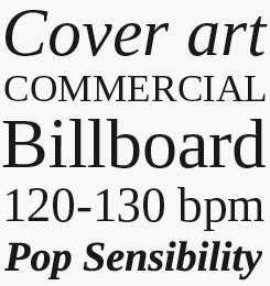
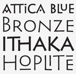
Massif Pro is probably Matteson’s most personal type family to date. He found his inspiration for this text face in the dramatic granite formations of North America’s Sierra Nevada Mountains. The typeface’s striking design echoes the faults and fissures that define a massif formation, resulting in a rich texture when used for body text, and revealing distinctive shapes and proportions at display sizes.
Bertham Pro
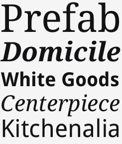
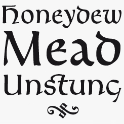
The Bertham Pro family is a revival of Frederic W. Goudy’s Bertham typeface. In digitzing Goudy’s single-weight classic, Matteson added bold, italic and open-face styles. Unmistakably American in appearance, Bertham Pro recalls the days of craftsmanship and hard manual work.
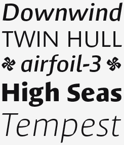
Endurance Pro
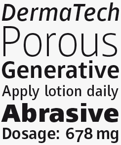
Endurance Pro was designed by Matteson as a more graceful, less industrial-looking sans serif. Named to reflect the typeface’s suitability for extreme conditions ranging from billboards to mobile phone screens, the typeface was designed with on-screen legibility as a key attribute, along with careful detailing for a polished appearance in larger sizes. Endurance is a highly professional font family with multiple figure styles for financial and scientific publications, and a broad language coverage including Greek and Cyrillic.
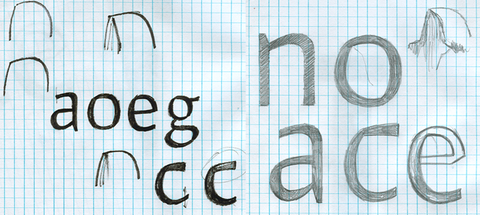
Sketches for Massif Pro, Matteson’s recent original typeface inspired by the Sierra Nevada mountains.
In the early 1990s, many budding type designers learned their craft creating loads of adventurous and cheeky typefaces that explored distortion, sampling, geometry, etc. You, on the other hand, were hired by Monotype a couple of years after graduation to produce very serious fonts for typographically demanding environments and high technical constraints. Did you ever have the feeling you missed something?
Well, I have certainly had my share of “cheeky work”. I rarely get a chance to do anything that’s not customer driven. I can say with a fair amount of certainty that I wouldn’t have designed Curlz or Kidprint had somebody not asked for them specifically.
But yes, I’ve had to focus on some very large, time-consuming projects that were serious and disciplined in nature. I like to say I’ll never get back the years I’ve spent drawing arrows and technical symbols for government contracts or database companies. I think that is why I’m having such a fun time researching Goudy’s life and work and reviving his typefaces in the process. It’s utterly self-indulgent and playful, and it fuels my inner historian.
I don’t think I missed anything with the experimental movements of the past 20 years. I work hard to make useful, hard-working typefaces and satisfy demanding customers. I’m happy to leave the experimentation to artists that are good at that.
As the head of Monotype’s California office in the 1990s, you produced so-called OEM fonts for use in specific hardware and software; you worked on some of the core fonts for Windows, such as Arial and Times New Roman. Obviously, these were faces that already existed as digital fonts. What did those jobs consist in — and what made them interesting?
I think the most difficult thing about working with the Windows fonts specifically was knowing that these digital versions were made inferior by forcing them onto metrics established by Apple and Adobe. Times New Roman and Arial were much better typefaces in their original form and distorting them was a disappointing necessity for cross-platform document sharing. But compromise of this type had been going on for years prior to my career. Sabon, for example, was designed to work on both Linotype and Monotype machines.
I think that mainly it’s a shame that during the first years of the digital boom, they didn’t choose typefaces designed specifically for the newer technologies. Lucida and Lucida Sans for instance, would have been far superior choices for digital documents than Helvetica and Times.
You designed an impressive series of original text typefaces as a Type Director at Ascender. When working within the Ascender team, how did you take decisions about what kind of retail font to make next? Is this a group process or are you largely autonomous in choosing a style, weight range, etc.?
At Ascender I was completely autonomous but with the caveat that I had to help make my seven other partners make a living. Forty weights of “an experimental sans” would not have been a popular diversion given that we were a new foundry with lots of commitments. The idea for any new design was to try to mix functional designs that solved problems of device legibility (Mayberry) or metric compatibility (Ascender Serif) with designs which both showed innovation and connection to our craft (Pescadero and Chicory).
There were very few times I can remember at Ascender when we weren’t working on something specifically for clients; as a consequence, I didn’t have a lot of time left for exploration.
While you’re a digital problem-solver by trade, you don’t shy away from the stonecarver’s hammer and chisel, or from having designs letterpress-printed. What can today’s digital typographer learn from those crafts?
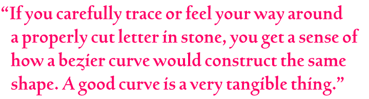
There are times I’d like to try that chisel out on my LCD monitor! It’s interesting to me that if you carefully trace or feel your way around a properly cut letter in stone you get a sense of how a Bézier curve would construct the same shape. A good curve is a very tangible thing. I think it’s fantastic that schools like Reading and KABK are using these old tools to teach digital typographers.
Hand setting type is so fundamental to designing type, but even more so in the practice of using type. The notion of space is physical — not just visual. It also helps one understand that the metal type form is a vehicle to transfer ink to a page and the result may or may not be an accurate reflection of the designer’s intent. The same thing happens when type is interpreted as pixels. There may be something lost in that translation. I think letterpress is an extremely valuable exercise in understanding this.
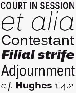
Mayberry Pro
Mayberry Pro is a slightly condensed humanist sans serif which allows for more legible text in narrow columns. Originally developed as part of a set of fonts designed for digital user interfaces, Mayberry’s open counters and upright stress help keep the design legible at low resolutions, making it an excellent choice for use in documents destined for on-screen reading or presentation. Much care has been given to design subtleties allowing the design to function well at large sizes too.
Droid Serif & Sans
The Droid family is a set of friendly typefaces optimized for display on screen. With its upright stress, open forms and neutral appearance it provides comfortable reading on mobile handsets in menus, in the web browser and other screen text.
Ascender Serif
Ascender Serif was designed to be metrically compatible with Times New Roman, making it extremely useful for developers needing width-compatible fonts to address document portability across various platforms. Ascender Serif offers refined on-screen readability characteristics and the pan-European WGL character set.
You’ve produced several fonts based on the work of Frederic Goudy, one of the great individualists of American type design. Have his views influenced you? Of the “old folks”, as Goudy himself put it, who else inspires you?
I really do admire Fred Goudy and his wife Bertha. People today tend not to realize the impact they had on bringing art back to commercial graphic design. People can debate all day the worthiness of Goudy typefaces — most of which have terrible digital interpretations — but they can’t deny his contributions to typography, type design, graphic education and scholarship.
Other influences have come from many different people, though. I think that is simply the nature of the business. Generally speaking, I resist the Swiss style, and gravitate to the organic. William A. Dwiggins, Oldřich Menhart and Eric Gill would all be at the top of my list.
How do you go about designing revivals? What kind of printed models do you use? Do you refer to original working drawings, when available?
Most of my revivals, particularly the Goudy typefaces, are completely self-indulgent explorations. They have been holiday and weekend projects to learn more about the Goudys through their actual work. They’re mostly digitizations direct from letterpress proofs but in the case of Bertham Pro italic there was no original to refer to. I drew quite a few of those letters by hand to get “into the spirit”.
I’ve worked on many Monotype revivals right from the working drawings (including Goudy Floriated Caps, Fairbank and Menhart). These drawings were truly wonderful things to experience because of the precision and artfulness of the draftsmen and women.
Of your original typefaces, which is the one that you think represents your personality and taste most strongly?
I typically design type as a tool with an end use or customer in mind. So I think Massif — which had no customer, end use, or specific purpose — must then be the most accurate expression of my own personality. I think I look for order and refinement to a degree but then prefer texture and strong personality over neutrality.
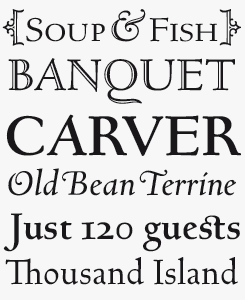
Friar Pro
Friar Pro is Matteson’s revival of Goudy’s Friar typeface. Goudy himself described his typeface as a “typographic solecism”, due to its combination of lowercase half-uncial forms from the 4th through 7th centuries, with uppercase square capitals from the 4th century. Friar will lend an authentic scribal appearance to any document requiring a scholastic or medieval air.
Chicory
Chicory is calligraphic typeface that oozes craftsmanship, elegance and style. It is a narrow chancery script — ideal for formal invitations, newsletter mastheads, menus and greeting cards.
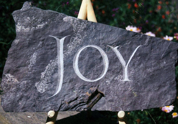
Letters cut in slate by Steve Matteson.
I can imagine the design process of the Droid families was a bit different from the usual, as these are fonts for print as well as on-screen reading, with an emphasis on the latter. Can you tell us something about it, and about the way they were tested?
All the typefaces for Google have been heavily tested on screen for clarity of form, the right proportion and spacing for UI and the right contrast for reading on screen. I spent time on site in Mountain View to see how the designs held up in mobile displays. I remember one day having FontLab opened up with a letter enlarged to my full computer screen and a UI designer walked in. He saw it and jokingly said, “We’ll almost never show fonts that big in Android”. But he understood that this type of magnification and attention to detail was critical to things looking good on a micro level.
You began working for high-profile clients very early in your career. Young type designers today find themselves in a much denser landscape: there are hundreds of designers, and new fonts coming out every day. What could be a good strategy for a budding designer to stand out from the crowd?
That’s a great question. The only answer I can speak of with any authority is hard work and patience. There are those who spend more time self-promoting than honing their skills. It is extremely competitive now but it just takes one very satisfied customer who can help promote your capabilities. If a customer says good things about you, it carries a lot more weight than you being the loudest voice in the chat room. Specialization is another way to make an impact — like a particular lettering style — but it can also pigeonhole someone into a narrower field of expertise.
Having rejoined Monotype with the Ascender team, what has become possible for you that perhaps wasn’t in the past eight years or so? What do you most want to achieve?
The biggest attraction was to work with a team of designers again. Collaboration and inspiration from others is very stimulating and engaging. My ambition is to bring the best historic book faces into a new era. Designs like Baskerville, Dante and Sabon rendered with the best screen technology will hopefully help make reading a congenial experience again.
That is a marvellous ambition indeed. Thanks for sharing your experiences and insights!
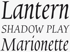
Pericles Pro
With an aesthetic that recalls inscribed, chiseled stone and an art deco playfulness, Pericles Pro is a great face for creating eye-catching typography on book covers, banners and greetings cards. A digital revival of Robert Foster’s ATF classic Pericles, the family is equipped with sophisticated OpenType programming, plenty of alternates and a fine set of ligatures to mix and match.
Louisville Script
A youthful, casual handwriting script font, Louisville Script is ideal for casual correspondence such as cards, scrapbooks, menus and flyers. Based on Matteson’s own handwriting and named after Louisville, Colorado.
MyFonts is on Twitter and Facebook!
Join the MyFonts community on Twitter and Facebook. Tips, news, interesting links, personal favorites and more from MyFonts’ staff.

Who would you interview?
Creative Characters is the MyFonts newsletter dedicated to people behind the fonts. Each month, we interview a notable personality from the type world. And we would like you, the reader, to have your say.
Which creative character would you interview if you had the chance? And what would you ask them? Let us know, and your choice may end up in a future edition of this newsletter! Just send an email with your ideas to [email protected].
In the past, we’ve interviewed the likes of Michael Doret, Laura Worthington, Jonathan Barnbrook, Rob Leuschke, David Berlow, Ronna Penner and Jos Buivenga. If you’re curious to know which other type designers we’ve already interviewed as part of past Creative Characters newsletters, have a look at the archive.
Colophon
This newsletter was edited by Jan Middendorp and designed using Nick Sherman’s original template, with specimens and type descriptions by Anthony Noel.
The Creative Characters nameplate is set in Amplitude and Farnham; the intro image features Chicory and Massif Pro; the pull-quote is set in Bertham Pro; and the large question mark is in Farnham.
Comments?
We’d love to hear from you! Please send any questions or comments about this newsletter to [email protected]
Subscription info
Want to get future issues of Creative Characters sent to your inbox? Subscribe at www.myfonts.com/MailingList
Newsletter archives
Know someone who would be interested in this? Want to see past issues? All MyFonts newsletters (including this one) are available to view online here.