
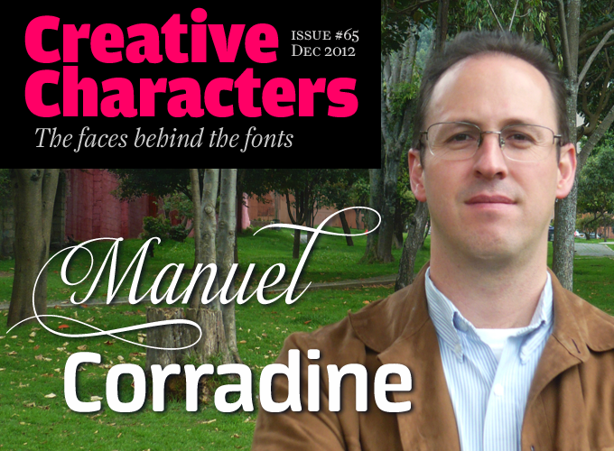
If MyFonts had a Continent of the Year, then in 2012 it would be South America. Never before did we have so many successful typefaces from the Latino typographic universe, whose development in the past ten years has been phenomenal. And so we make no apology for offering you the third interview in a row with a Latin American designer. This month’s interviewee is from Bogotá, Colombia; having joined MyFonts in 2007, his foundry has published a growing and diverse collection of fonts of increasing quality and ambition. His output ranges from quirky display and scribbling fonts to elaborate, polished scripts and, recently, neo-futurist sans-serifs. Meet Manuel Eduardo Corradine, falling in and out of love with fonts.
Manuel, you are working as a graphic designer, illustrator, type designer and calligrapher. Of these activities, is there one that you enjoy most, or that is closest to your heart?
My work as a graphic designer and entrepreneur has allowed me to explore all these aspects of our profession, and I love taking on new challenges. They force me to be very creative and to develop novel ideas — but I like doing that on my own terms. Type design turned out to be the field in which I was most able to do things according to my own taste, and without any pressure from anyone concerning the style I must aim for or the results I must obtain. This is related to my affinity for art and its freedom of expression; it also gives me a strong sense of independence.
Page layout, illustration or calligraphy work can also be very satisfying, but is almost invariably performed according to the criteria and standards set by the client, which makes this kind of activity less pleasant at times. Calligraphy is a skill that I regard very highly, and while I’m not exactly a virtuoso calligrapher, its principles have helped me develop many of my fonts. My calligraphic work is far from perfect, and so I compensate for that by tinkering with the result on the computer until I achieve the strokes and curves that I like.
Could you say something about your formal education?
I studied Graphic Design at the National University of Colombia for four years. Even though it’s fairly recent, new design technologies and the use of personal computers were only just beginning to penetrate the classrooms at the time. As a consequence, many of the skills we learned as part of the design curriculum were based on manual techniques, using tools such as brushes, pencils, Rapidographs, triangles, lightboxes, etc. I’m not saying we did not have access to digital design tools — I’d used computers for almost a decade, so I consider myself lucky to be part of a generation that served as a bridge between the analog and the digital era. I have had experiences in both of these design methods, unlike many young designers today who haven’t even touched a piece of paper to make a sketch before beginning their design work.
As a calligrapher you’re self-taught… how did you go about learning this craft?
Curiosity has always been an important motive for me, and so I enjoy learning new and different techniques — which does not necessarily imply that I get to totally master each technique. I started to dabble in calligraphy in my free time outside of college while working with my brother Santiago, who is also a graphic designer. We worked in his studio, making paper by hand and developing various products related to this material, using traditional techniques such as bookbinding, letterpress printing, marbling, intaglio, and sealing. We finally felt that calligraphy would be a necessary component of all these activities, so I decided to investigate and try out some strokes. The result was quite interesting so I kept practicing whenever I had the chance. The activities in our studio gradually focused on commercial activities such as designing invitations for weddings and other social events, so for over fifteen years I addressed envelopes for invitations working myself through long listings of people on a daily basis.
Could you say something about hand-lettering traditions in Colombia? Is vernacular, street-style lettering a source of inspiration to you, or to graphic designers in general?
Although vernacular art is very present in Colombian culture, it is not a very common reference for graphic designers. In villages and small towns across the country there are many artists working intuitively, whose job is to “decorate” the facades of shops and businesses with hand-made lettering. Only a couple of my type designs were inspired by these signs — I can only think of my Candelaria and Oferta typefaces — and the same goes for most of my Colombian colleagues.
Several of the earliest typefaces you published on MyFonts, over five years ago, were experimental or destructive. Did you subscribe to a kind of “grunge” or anarchist aesthetic at the time? Are there any typefaces you now wish you hadn’t published?
Actually, I don’t really identify with any of these destructive styles in particular, but I’m fascinated by their expressiveness. It’s a bit like the way many of us take pleasure in things that are aged and worn, that seem to have recorded the passage of time and the influence of climatic factors, such as the Pyramids and the Sphinx in Egypt, the Parthenon in Greece or even Stonehenge. But also I think designers should be able to design for all audiences; in this case there is an audience that appreciates these kinds of products.
As for the fonts I designed referring to rustic or degraded styles: just like the designs based on geometric grids, they represent phases in my career which I should not ignore, because each of them helped me to explore new concepts and learn about typography. I’m sure I do things better now than five years ago, but it has all been part of the experience. However, I look at these early low-quality fonts with different eyes now and I have even planned to update and correct some of the older typefaces that I think have potential to be improved and expanded.
Almibar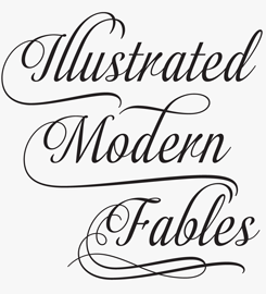
Released in mid-2012, Almibar is currently Corradine’s most successful script font (although that may change soon, with the spectacular Quarzo coming up). Almibar recalls the penmanship exercises of the 18th and 19th centuries. Its biggest asset is probably the huge collection of ornamented and swashed characters, both for the upper- and the lowercase alphabets.
Canciller
Inspired by classic italic handwriting, Canciller takes this calligraphic model into a more typographic direction. Working in collaboration with Sergio Ramírez, Corradine made a stylish type family that tones down the pronounced contrasts of the broad-nibbed pen and introduces softer curves and contemporary detailing to help legibility. Available in six weights, from light and delicate to black and powerful, Canciller is a versatile series that allows graphic designers to create a clear hierarchy and striking visual accents.
Miel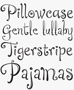
Personal lettering styles become fonts, and popular fonts set trends. And before you know it, there’s a whole subgenre. Released in late 2010, Miel is a personal variation on the whimsical hand-made lettering made into fonts by such artists as Laura Varsky from Argentina or PintassilgoPrints from Brazil. While by no means a copy of their fonts, Miel successfully emulates the energetic, deliberately childlike style that that fits so well with strong colors and a youthful, illustrative approach.

Sketches for Corradine’s latest script font, Quarzo.
What are the main things you learned about calligraphy and type design during half a decade of independent study and artistic development?
Calligraphy taught me how to handle contrast, from the subtlest to the most striking. But what I also appreciate in calligraphy is rhythm, pressure and, very importantly, the imperfections and accidents that create unexpected details in the letters. My experience with and interest in calligraphy has been very intense, and now I’m trying to do calligraphy without a pen, i.e. using pencils to draw strokes that mimic the contrasts and the pressure of writing with a pen. I have to figure out mentally what stroke thickness or contrast each segment of the letter is supposed to have, without needing the actual tool that creates the desired stroke.
In terms of typographic styles, I am constantly introducing new concepts and with every new typeface I take on new challenges. I am very interested in OpenType programming and I try to incorporate it, according to the requirements of each typeface, because the programming and features I implement are different for each font family.
Another aspect I have developed is the ornamentation of typefaces, often designing many variants of a single character, which gives users a larger set of graphic tools to develop their projects with, and to differentiate from the work made by others. I have developed complex systems of ornamentation that can include a single group of letters (like the upper case, lower case, ascenders and descenders, numbers, etc.) or involve the entire font or type family.
Could you describe the process of making a handwritten or calligraphic font? Do you just scan and trace your drawings, or is a lot of visual research and design done directly on the computer?
In the beginning I simply scanned my hand-drawn letters or “wrote” directly on a graphics tablet, but over the years I’ve developed several ways of making fonts, and my methods are continually changing. My latest handwriting fonts were meticulously redrawn and corrected on the computer to achieve greater consistency in the strokes without losing their manual character. At the moment I usually trace scanned drawings and correct the strokes node by node, to remedy any kind of error and make optical corrections.
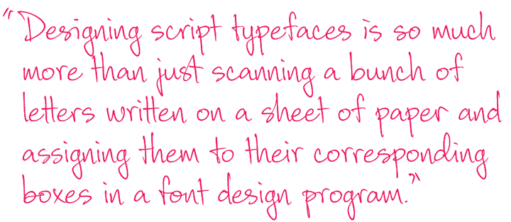
Designing script typefaces is much more than just scanning a bunch of letters written on a sheet of paper, and assigning them to their corresponding boxes in a font design program. My work is the result of an analysis of the role played by each letter within a line of text, and their interaction with the surrounding letters.
I’m very interested in the contextual behavior of glyphs and I use OpenType to program variants that make script letters look more spontaneous and realistic. My dream is to program script fonts so well that they are easily mistaken for hand-rendered lettering, and it is virtually impossible to find two identical letters on a page of text at first glance.
Corradine Handwriting
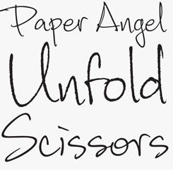
Corradine Handwriting is based on the designer’s own informal handwriting. When using the font in an application with full OpenType functionality, the automatic substitution of alternates and special ligatures lends an authentic sense of improvisation to the text. It’ll be difficult to find two identical letters in the same text.
Legendaria
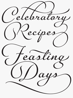
Legendaria is the kind of elegant connected script you’ll find on luxury food packaging or invitation cards. With over 1300 ornamented characters, it is very versatile and sophisticated. Most lower case letters have at least 15 different options. For OpenType users, Legendaria OT is the best choice. Others may choose some of the varieties that come in separate fonts. For artistically minded users, the complementary Legendaria ornamental family offers a wide range of possibilities.
What is better, or more pleasant: working by hand or working with the computer? Are there any tasks that would be impossible without the computer?
Drawing by hand is a very pleasant exercise, but unfortunately my strokes are not always perfect and the computer allows me to polish what I have made by hand and reach a level of detail and accuracy that my hand can’t achieve. I would say my hand generates the idea and the computer makes it presentable.
I learned to use a personal computer from a young age and I consider myself a very skilled user, so I enjoy designing in front of a screen. In type design there are many digital processes that it would be a waste of time trying to carry out without the help of a computer, such as spacing and kerning.
Recent fonts like Tecna and Neuron have a somewhat futuristic feel, and their names also evoke a kind of high-tech world. Are you fascinated with technology or science fiction?
There are many things in life that I’m fascinated by, and technology is one of them. In the same way I sometimes like things that are rough and unkempt, I can also be attracted by simplicity and cleanness — which is the case with some of my latest designs. Moreover, these typefaces have been designed in collaboration with Sergio Ramírez, who has a preference for clear and rational letterforms.
Of the many fonts in the Corradine type library, representing a wide range of styles, do you have any personal favorites?
While developing all this work over the years, I have often been quite pleased with my typefaces just after I finished them; yet as time goes by, my perception of them changes and in most cases my initial delight is followed by a phase of falling out of love. And so right now there aren’t so many typefaces that I’m still totally happy with and that I really cherish. It is the case, for instance, for Mussica, Legendaria and Bucanera, which were drawn in diverse styles but which show similarities in terms of proportion and ornamentation. They are fonts that are outside of the conventional, and propose new forms of ornamentation through extensions of their strokes and terminals into elegant swashes and spirals.
On the other hand there is a series of handwriting fonts that I’ve been developing over the years based on the handwriting styles of my family. For instance, there are fonts based on the writing of my father and mother, Alberto and Helga, who are architects and to whom I owe much of my appreciation for art and design.
You have been very productive so far — it seems you worked without interruption for years! If you could take a break, taking several months off from designing retail fonts, what would you most like to do?
Of course this is purely hypothetical, as I don’t think I’ll move away from type design; but if push came to shove, I’ve always enjoyed various kinds of manual activities a lot, so I could devote myself to a wide array of activities, like building toys for children, or making wooden furniture, designing puzzles or even designing computer games.
Neuron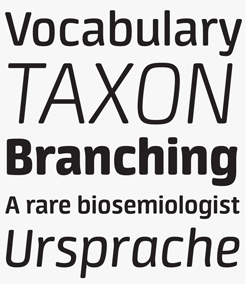
Neuron is a fresh variation on the popular squarish sans. It has quite a few special qualities that distinguish it from the competition: subtly rounded stroke endings, generous spacing and a rather tall x-height combine to create an effect of friendliness as well as great readability. The family comes in eight weights plus italics; the ExtraBold, Black and Heavy weights make for powerful, compact headlines.
Mussica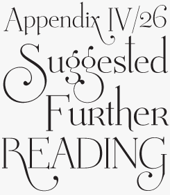
Mussica has many of the characteristics of a Didone — vertical stress, thin hairlines, simple lines for serifs — while the ball terminals suggest a transitional, 18th-century heritage. But it’s more eclectic than that. Mussica has the whimsicality and unpredictability typical of today’s “why not?” attitude in type design.There’s an uppercase “R” in the middle of the lowercase set, and a wild set of swashes. The capitals dangle way below the baseline. In spite of all these the font manages to maintain its dignity. Check out the Antiqued variety.
Various lettering works for clients by Manuel Corradine.
Your country has a problematic and rather violent recent history. Do you think that has influenced your generation’s education and development as designers? Have things changed much during the past ten years or so?
I’m not a person who likes to talk a lot about these issues but I think that it is something that no Colombian can ignore. Let me say this: it is true that my country has suffered a very nasty, decades-long internal conflict, but I think that the worst is now over and we live in a country that is much safer than it was ten years ago. Sure, some of the problems of drug trafficking persist as they do elsewhere in the world but they are not as overwhelming as they used to be.
Even during the most difficult years, most Colombians, including designers and all other professionals, have tried to stay out of these issues, carrying on our lives full of optimism and giving our best efforts to maintain a worthy and steady way of life, trying to contribute to the development of our society.
In our practice as professional designers, it is likely that the national conflict has influenced our way of seeing things but by and large I think this influence has made us more positive and critical. Perhaps one might think that the conflict would have a negative effect on us, a bit like being a doctor in a battlefield, but it doesn’t somehow. We are surrounded by wonderful, valuable things such as our traditional cultures, our country’s biological and climatic diversity and splendid landscapes; this is really what influences us most and makes us feel proud to live in this beautiful country.
Corradine Fonts is among the most successful young microfoundries on MyFonts. How has the collaboration with MyFonts helped you in your career as a type designer? What do you like most about MyFonts, and what could we improve?
MyFonts has, of course, been an excellent platform for my typefaces from the moment I entered the font market. Having started out on my own, I now work with two assistants to develop my work. MyFonts has many advantages that help font designers with no huge resources to get access to this market — without, for example, having to become an expert in marketing or hire services for it. It provides me with great tools to promote my fonts and improve my position on the market.
Something that I think could be improved on MyFonts is that there are many fonts that do not have sufficient quality for commercial use, or are overpriced; this includes some of my own fonts from the early years. Perhaps MyFonts could suggest changes in the pricing of fonts or install a filter on a certain kind of fonts. I imagine fonts could be classified into high, medium and low quality, so that the most demanding users could choose to access premium fonts only, or when you buy a font in a lower quality range, you’d be made fully aware of that. But I realize that this can be quite a subjective assessment, so I’m not so sure if it is at all possible to curate the collection in such a way…
The good news is that we are now working with a permanent Type Review Board, and these suggestions will certainly be added to our agenda!
Finally, what do you think and hope the immediate future has in store for you and your work?
My interest in lettering and typography is not something new, so I guess I will continue to explore any avenue that allows me to master my discipline with greater professionalism. Things do not come to you as gifts from heaven but must be worked for with passion and dedication. In the next few years I intend to return to some of my earlier typefaces in order to correct, improve or expand them. I also have tons of sketches and ideas I want to develop into new typefaces. My biggest challenge is to develop text typefaces and superfamilies whose complexity requires more dedication, effort and above all experience.
Thanks, Manuel, for your thoughtful comments. We’re looking forward to ever more ambitious font families.
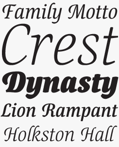
Tecna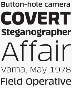
Designed in collaboration with Sergio Ramírez, Tecna is a modern sans typeface with straight strokes and rounded angles and curved thinnings at the endings that give this clean square sans a fresh, unusual touch. Its wide proportions give big impact to the texts. It has a tall x-height that enhances its legibility in smaller sizes.
Quarzo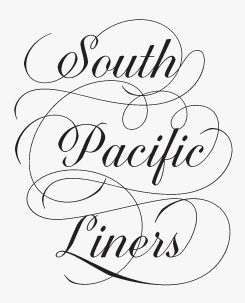
Quarzo, Corradine’s latest, is another project undertaken with Sergio Ramírez. A connected script font based on writing with the flexible nib, Quarzo comes with a wealth of swashed letters — mostly capitals — plus a stunning collection of flourishes which connect seamlessly to beginning and ending letters. They can be selected using the glyph palette in your layout program. The lettershapes are basically those of roundhand calligraphy, but some strokes have a subtle angularity that lend the typeface a modern touch. Angles along with inktraps give the font a better performance when printing. Stroke angles and spacing are very consistent, so lines set in Quarzo have a dignified, even rhythm. The icing on the cake: a set of independent flourishes to be placed around the words.
MyFonts is on Twitter and Facebook!
Join the MyFonts community on Twitter and Facebook. Tips, news, interesting links, personal favorites and more from MyFonts’ staff.

Who would you interview?
Creative Characters is the MyFonts newsletter dedicated to people behind the fonts. Each month, we interview a notable personality from the type world. And we would like you, the reader, to have your say.
Which creative character would you interview if you had the chance? And what would you ask them? Let us know, and your choice may end up in a future edition of this newsletter! Just send an email with your ideas to [email protected].
In the past, we’ve interviewed the likes of Gerard Unger, Emily Conners, Jonathan Barnbrook, Nick Cooke, Chank Diesel, PintassilgoPrints and Jos Buivenga. If you’re curious to know which other type designers we’ve already interviewed as part of past Creative Characters newsletters, have a look at the archive.
Colophon
This newsletter was edited by Jan Middendorp and designed using Nick Sherman’s original template, with specimens by Anthony Noel.
The Creative Characters nameplate is set in Amplitude and Farnham; the intro image features Almibar and Neuron; the pull-quote is set in Corradine Handwriting; and the large question mark is in Farnham.
Comments?
We’d love to hear from you! Please send any questions or comments about this newsletter to [email protected]
Subscription info
Want to get future issues of Creative Characters sent to your inbox? Subscribe at www.myfonts.com/MailingList
Newsletter archives
Know someone who would be interested in this? Want to see past issues? All MyFonts newsletters (including this one) are available to view online here.