
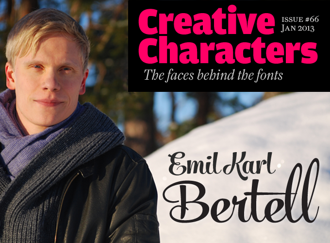
Photo by Minea Paavola
This month’s interviewee was an international free-font hero while still in his teens, before attending design college, dropping out, and becoming a well-known graphic designer and illustrator. Having made stunning illustrations and typographic posters for clients in the cultural and editorial sectors, he eventually specialized in energetic script and display fonts. His foundry Fenotype has been at MyFonts for a mere three years, but it feels as if it’s been longer. His fonts were featured in our Fonts-of-the-Year lists of 2011 and 2012, making him the most successful type designer from the Nordic countries currently on MyFonts. Meet Emil Bertell, our man in Turku, Finland.
Emil, in previous newsletters we wrote that you lived in Helsinki — but that’s not quite correct, it’s Turku now, isn’t it? What is it like in the middle of winter — depressing, or cozy? Do you wish you were somewhere else, or is it a great time to work hard?
Turku, where we moved from Helsinki in late 2011, is the oldest city in Finland and the country’s original capital. I love Helsinki but Turku is also a great town. Helsinki winters are crazy. It’s either too cold, too warm or too much snow. It’s always too windy, so the rain is usually horizontal. Turku can also be quite chilly: the morning we took the portrait shown above, it was -25° Celsius (-14° F). But we’ve had quite a nice winter so far this year. I’ve had to learn to dress properly again for winter because I play outside with my 18-month-old daughter almost every day.
My most productive season used to be autumn. This may have something to do with the clients’ rhythm, because usually all projects had to be finished before Christmas. Now I seem to be constantly productive throughout the year.
Your bio states that you started studying graphic design in 2004 and that many of your fonts date back from the three years or so before that. What’s the story? Did you decide to turn your hobby into a profession?
I had an obsession for visual culture right from the beginning. I started in a kids’ art school before I could read, and did an art-oriented high school, specializing in multimedia. When I had to do my military service, as every male Finn must, I managed to get a job at the army newspaper. So instead of playing soldiers in the woods I worked in an office spending my days mostly playing with the cool wax-printer they had. I also designed fonts in my spare time.
I published my first font files (I don’t know if they can actually be called fonts) as a 16-year-old. I was seventeen the first time I was featured in a book on type: Freefonts! Designer Fonts Online. At the time, the idea that they actually wanted to publish my stuff was truly overwhelming. Those early free fonts were later featured in a couple of Japanese font magazines and in several other books. I had learned about computers and graphic design during my multimedia classes, and consumed every magazine and book about visual culture that I could get my hands on. But I had no education in type design whatsoever — just some elementary calligraphy classes. Which didn’t stop me from setting up my first website, 2TheLeft, with my brother Erik, to release our freeware fonts.
In those days I sometimes made a font in a day — some of them were only named by the date they were designed. We released dozens of those fonts as freeware during 2000–2002. I can't even remember how some of my fonts look, yet I still get occasional licensing inquiries for them. At some point it occurred to me that I could actually make some money with fonts. In 2002 I started offering commercial fonts through my own humble website Fenotype.com. Those fonts had the basic punctuation marks and numbers which were lacking from many of my freeware fonts.
This was all before you enrolled in University.
Yes. I was twenty when I had finally gotten through the Finnish school system and out of the army, and was free to do whatever I wanted. I applied to the UIAH University of Art & Design in Helsinki (now called Aalto University) and began my graphic design studies there in 2004. I studied typography and type design with great interest but I was also interested in many other areas. As a result I did not design any fonts for a few years.
After gradually dropping out from design college in 2007 I worked as a freelancer for several years doing graphic design for mBar and for a couple of festivals, and a lot of random commissions. I also joined the freshly founded illustration agency Agent Pekka.
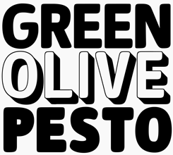
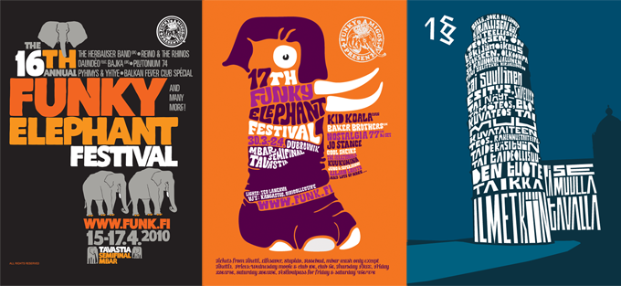
Illustration became my main livelihood. I drew painstaking pencil illustrations for magazines, advertising, stamps, etc. I often designed my own fonts for the festivals and hand-drew the lettering in posters; I also did a few pencil illustrations based on lettershapes and that got out of hand so that I had to do a lot more of them. I did illustrative lettering for the opening credits of a popular TV show and they also used the letters huge on the set. Some of my latest illustration work (see below), I did together with my wife Kea for two bands, Burning Hearts and Magenta Skycode, who are friends of ours here in Turku.
Eventually, having worked as a full-time illustrator and graphic designer for several years, I started designing fonts again. Stuart Sandler began selling my fonts at Fontbros. MyFonts’ Joshua Lurie-Terrell contacted me in 2008 about selling my typefaces; in fact, I had already requested the MyFonts contract as early as 2006 or 2007, but somehow never got around to filling it out and sending it back. It took some time to shape up the old stuff and fill in the missing characters; I also made some dingbat fonts from vector illustrations I had drawn over the years. I finally signed up with MyFonts in 2009. My brother Erik’s fonts were also released under the Fenotype label, but recently he started his own collection.
salamander
Salamander, Bertell’s latest offering, combines some of the best qualities of other Fenotype scripts. It is a playful and agile connected script in two weights, with ornament sets for both. The character sets have ample language coverage; in OpenType-enabled programs click on Swash, Contextual or Stylistic alternates for vivid alternate characters and ligatures.
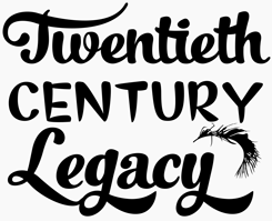
Mercury Script
Mercury Script, last year’s most popular Fenotype font, made the 2012 Fonts-of-the-Year list. Loosely based on hand lettering found in a vintage lingerie advertisement, it displays the same lust for life as his earlier scripts, but its curves are more luscious, its features more ambitious. When used in an OpenType-savvy application, Mercury Script offers a wealth of swashes and alternates; it also has a lively set of capitals under the Small Caps button. The family comes in three weights, each with its own set of ornaments.
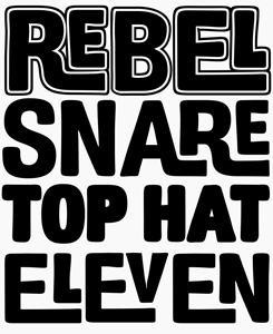
Barber
Barber is a versatile, informal script font family in four weights plus italics. As the stroke thicknesses get heavier, the character of the fonts subtly change as well. While Barber 1 (the lightest version) is elegant and charming, Barber 4 (the heaviest) is cheerful, strong and full of warmth. When used in OpenType-supported software, Barber’s Contextual Alternates, Swash and Stylistic Alternates work their magic.
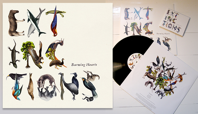
Emil collaborated with his wife Kea Bertell on the artwork for Extinctions by Finnish band Burning Hearts. It was nominated for an Emma Award (the Finnish equivalent of the Grammys) for Best Album Cover Art of the Year.
In your early fonts, you tried just about every display style available: geometric, distressed, psychedelic, historic. Was type design a kind of laboratory or self-study for you?
I had not had any proper design education yet and I hadn’t read books on the subject. I just did whatever I felt like doing. So for a new typeface I either began with a grid — the grid was a big thing for me back in 2000 — or just drew random shapes until I had some letters or some visual reference to try and make a font.
Are there any fonts from that early period that you’d now be inclined to delete?
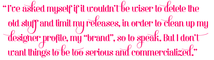
I shouldn’t be too hard on myself for those fonts because they were all part of the process. Although they were designed as early as 2002–2004, I did not release that stuff on MyFonts until 2009. I selected the ones I liked best and forgot about the rest. In fact, I did ask myself if it wouldn’t be wiser to delete the old stuff and limit my releases, in order to clean up my designer profile, my “brand”, so to speak. But I don’t want things to be too serious and commercialized, and I don’t want to restrict myself in the future either. The freeware fonts are a different story. They were never meant to be commercial and I don’t mind letting them run wild around the Internet. They’re free, so I would say it’s the users’ responsibility to decide how to deal with them.
A lot of the fonts I made in the beginning were so experimental that I wouldn’t use them myself, especially the distressed ones. I started making them simply because I could. Rock It for example is a font I encounter wherever I go. I released it as freeware — it’s still available as such, lacking any punctuation or accented characters. It’s been used on T-shirts and posters, in shop logos and magazines; it was even made into a stamp set you could buy. I never liked the font much to begin with; it was named after a Herbie Hancock hit released in the year I was born that I kind of liked-disliked. Rock It was the bestseller at Fenotype throughout the years I only sold fonts via my own website — and it’s probably going to haunt me forever!
In 2010 you hit upon a style of your own, with informal scripts like Linguine, Verna and Verner. Where did that style come from?
I had wanted to do script fonts for a long time, but somehow never got it right. It always looked really bad when I started drawing something. Finally I made Verna — a trembling pseudo-historic font that is somehow quite aesthetic, and I derived Verner straight from it and it became my first big hit. So Verner worked well, and I actually continued developing new fonts from the same original work file, deriving Pepita Script, Barber and eventually Mishka from it.
Was it a surprise to you when these more personal designs suddenly became so successful?
The first surprise was Billboard. It became my first Rising Star on MyFonts and that made me realize that I could actually make a living by designing fonts. I’d been wanting to do some serious interlocking fonts since learning about Fontlab in UIAH and I did a couple of them. But after that I realized that there’s actually a market out there that I could become a part of.
Then with Verner I got that slight shiver I feel when I’m working on something and I know that I’m doing it right. I just couldn’t bring myself to finish the font but kept on working on it and adding features. I made countless variations of the first Mishka poster before deciding on the sort of dirty-pink it is now — my wife Kea always helps me with this stuff (she’s also picked the names for all my recent fonts) so she probably told me which version to choose. I had a bad case of stage fright before releasing it.
Billboard
Bertell made several fonts based on the “interlock” principle, the click‘n’jump-ligature style that was seen in some 1960s lettering. Billboard is the most successful of the lot. A soft and chubby variation on a familiar theme, it comes as a family of six fonts: three weights, a condensed and an outlined version. To make customized settings for every word, the family members all have a load of ligatures, accessible in any OpenType-aware layout application.
Mishka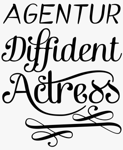
Released in 2011, Mishka was Bertell’s first typeface to be featured on our yearly list of Most Popular Fonts. As Bertell reveals in this interview, it was derived from the same basic ideas as some of the other scripts shown here, like Verner and Pepita Script. Mishka mixes clear and informal lettershapes with a taste for the exuberant. It offers plenty of options to customize headlines — just activate Swashes, Stylistic Alternates or Contextual Alternates in any OpenType-capable program. Its small caps are a font within a font: an energetic set of caps that combine well with the scripts but offer a distinct style.
Has your success in type design brought about any changes in your working life?
In the course of 2012 I quit most of my commissioned work (except the commissions via Agent Pekka) to concentrate fully on fonts. With the economic and social crisis that seemed the only reasonable decision.
Becoming a professional type designer, which I guess is what I am now, has changed my life considerably. To have no deadlines meant a tremendous relief from stress, and it makes planning my life much easier. To have no briefing or guidelines is both a good thing and a bad thing. I do believe I can achieve more interesting results when I work according to my own intentions, without anyone telling me what to do. But the lack of feedback can be somewhat puzzling.
At times it doesn’t feel like work, more like practicing some kind of ritual. Last fall I worked on several fonts at the same time, and I did not even release them when they were ready. It felt a bit like that movie Groundhog Day, just repeating the same thing, drawing letters every day. I actually still have five or six unreleased script fonts that are more or less finished. They only lack names and graphics.
Is the work rhythm of Emil the type designer different from the way you used to work as a freelance graphic designer?
In my previous life I used to work 10 to 16 hours a day. Sending countless emails, working on many different projects simultaneously, and wasting a lot of time opening different documents and programs. Now that I’ve cut all that out, the one remaining activity is the actual work process.
I usually work two to five hours each day designing fonts. One reason for these limited working hours is that I’m in the middle of a renovation that got a bit out of hand. But I get a lot done even if I just work for a few hours because it’s very intense. I work on the font until it’s done, and don’t need to take time to reflect, the way I have to when I’m doing illustrations or graphic design. If I have trouble, for example to draw the letter ‘s’, I just draw different types of ‘s’ until I see which one of them works. So the point might be that while having limited work hours, I’m more effective than ever because I’m progressing each minute I work.
What aspect of the work do you enjoy most?
There are usually two phases in the process that give me most joy. The first is when I try out the font in Fontlab for the first time, writing phrases and seeing that it works; the second time is when I start putting things together — naming the font, designing the graphics. That’s when the font comes alive to me. Working on the font posters and releasing the font is pretty much the most significant link, work-wise, to the outside world that I have in my current occupation.
Signor
Signor is a soft and easygoing all-caps font in four weights, from Signor (a kind of Semibold) to Signor Ultra Black. In addition, there’s an inline called Signor Ultra and a three-dimensional version called 3D. The family is a good choice for creating compact, stacked headlines for magazines, posters and book covers. Use when you want your display type to make a strong impact yet ooze a casual feeling.
Slim Tony
Slim Tony is a distant relative of Mishka but bolder and more extravagant, which makes it ideal for logos and packaging. Users of OpenType-friendly software can turn on Swash, Stylistic or Contextual Alternates for some serious extra pizzazz. Activate small caps for clear capital letters designed to work perfectly with the script. Slim Tony’s ornaments is a set of over one hundred swooshes, swashes, ornaments and pictograms. For the best price, purchase Slim Tony in combination with other Fenotype fonts – see the buying choices page.
A few of Bertell’s hand-lettered and illustrated posters. The lettering in the poster on the left became the font Killer Elephant.
Many young designers realize that looking into old techniques such as letterpress, signpainting and calligraphy (which many people thought were totally obsolete) is a good way of generating original letterforms and finding inspiration. Is there a specific manual technique you would like to learn more about, or get really, really good at?
I tried to study calligraphy but I somehow never get it right. I’m left-handed and I haven’t even decided how I should write the letters without messing the text and I can’t read the manuals because all the instructional arrows are pointing the wrong way. However, I bought a really good calligraphy book a couple of months ago and I’m going to give it another try. Signpainting is another technique I’d definitely like to study one day.
A question from one of our readers. He wants to know about the logo of the TV series Shake It Up on Disney Channel, which uses your free font Lakmus. How did the contact with Disney come about? And why isn’t Lakmus part of your MyFonts portfolio?
I received a call in the middle of the night, which I didn’t pick up because my phone was on silent. The next morning my illustration agent rang up saying that someone from the US had called asking about me, and I finally checked my email. There was a message from Disney: they had seen Lakmus on one of the free font sites, were really enthusiastic about it and wanted a quote for commercial use. As the show airs only in the States, I never saw the finished logo until I looked it up for this interview — I somehow thought it was for some kind of computer game. Lakmus is one of many free fonts that is still available on a lot of sites offering that stuff. It is one of those fonts I didn’t find too original when I got back to my old fonts in 2009 and of which I never made a proper version. It lacks plenty of accents and punctuation.
Your Mercury Script (one of our Most Popular Fonts of 2012) is smoother and more refined than most of your earlier scripts. Does this indicate you’re getting more interested in type design that is formally more sophisticated? Is there a text family or sans serif on the horizon?
For the reason explained above, my first script fonts were kind of rough. Mercury Script is definitely smoother than the earlier fonts. I’ve tried even more polished shapes a few times, but they just don’t seem right. I have the feeling that if I were to make a really classic and elegant script it would be boring. I tend to think that the informality, crudeness and small flaws give flavor to my fonts.
I’ve tried a lot of different genres of typefaces but I guess they can all be labeled display faces. I’ve always wanted to design a “real” text font but still think that would turn out to be somewhat out of my league. I’ve been talking to Erik about collaborating to make more extensive font families containing both script fonts and text faces. But we’ve both been too busy during the last year.
As I said, I currently have about half a dozen scripts that are almost finished. They range from almost geometric to hand lettering, but all in all I guess the direction is towards a more sophisticated approach. I think I’m going to stick to scripts for quite a while longer, exploring the genre, evolving into new directions until I end up somewhere else or just had enough of it.
Show us those six typefaces soon, Emil! Many thanks for this interview.
FT Grandpas Script
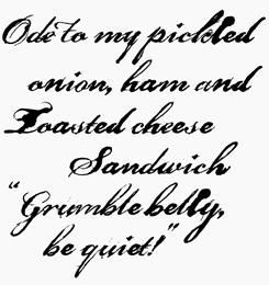
Among the many distressed and grungy fonts that Bertell selected from his back catalogue of free fonts when joining MyFonts, Grandpas Script occupies a special place. A blotted and hand-drawn joined script font, it is based on the handwriting that was taught in European schools many generations back. Executed with deliberate sloppiness, it has many alternates and ligatures to create a convincing impression of real writing.
Verner & Verna
In late 2010 Verna was was one Fenotype’s first hits. Verner was released a few months later as its “script brother”. The male/female contrast shouldn’t be taken too seriously: while Verna is playful yet strong-willed, Verner is clearly in touch with ‘his’ feminine side. Verner strikes just the right balance between the handwritten and the orderly, between legibility and decorative whim. It comes with a set of nicely drawn ligatures, swash characters, a selection of ornaments and some alternate characters, all of which can be easily accessed in any OpenType-compatible program. For the best price purchase both fonts together!
MyFonts is on Twitter and Facebook!
Join the MyFonts community on Twitter and Facebook. Tips, news, interesting links, personal favorites and more from MyFonts’ staff.

Who would you interview?
Creative Characters is the MyFonts newsletter dedicated to people behind the fonts. Each month, we interview a notable personality from the type world. And we would like you, the reader, to have your say.
Which creative character would you interview if you had the chance? And what would you ask them? Let us know, and your choice may end up in a future edition of this newsletter! Just send an email with your ideas to [email protected].
In the past, we’ve interviewed the likes of Gerard Unger, Emily Conners, Jonathan Barnbrook, Nick Cooke, Chank Diesel, PintassilgoPrints and Jos Buivenga. If you’re curious to know which other type designers we’ve already interviewed as part of past Creative Characters newsletters, have a look at the archive.
Colophon
This newsletter was edited by Jan Middendorp and designed using Nick Sherman’s original template, with specimens by Anthony Noel.
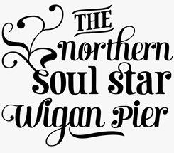
The Creative Characters nameplate is set in Amplitude and Farnham; the intro image features Salamander and Mercury Script; the pull-quote is set in Barber; and the large question mark is in Farnham.
Comments?
We’d love to hear from you! Please send any questions or comments about this newsletter to [email protected]
Subscription info
Want to get future issues of Creative Characters sent to your inbox? Subscribe at www.myfonts.com/MailingList
Newsletter archives
Know someone who would be interested in this? Want to see past issues? All MyFonts newsletters (including this one) are available to view online here.