
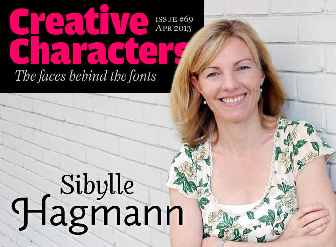
Photo by Fabrizio Gabbiani
Swiss-born Sibylle Hagmann came to California in the 1990s to continue her graphic design studies at CalArts. With teachers like Jeffery Keedy and Ed Fella, the school was the perfect counterpoint to her Bauhaus-infused, functionalist Basel education. Hagmann’s contrasting influences have resulted in a unique body of work. As a type designer she has created a small but distinguished collection of typefaces that mix an adventurous spirit with a thoughtful and precise way of working. To complement her own fonts, we invited her to present a collection of favorites. New to MyFonts: Sibylle Hagmann and her well-established one-woman foundry, Kontour Type.
Sibylle, you’re Swiss but you’re based in Houston. How does a designer with a Bachelor’s from Basel end up in Texas?
After I graduated from the Basel School of Design in 1989 and had been working for a couple of years as a designer in Swiss studios and agencies, I was lucky to have the chance to continue my studies in California at CalArts (California Institute of the Arts).
The Basel ideology had a profound impact on me. The core curriculum was still heavily focused on Modernism and the Bauhaus: Asymmetrical compositions, sans-serif type, line art, and muted color palettes were the core ingredients. I highly valued the formal education I received there, but sensed that in other parts of the world graphic design had been evolving.
At some point I came across Emigre Magazine and, in an attempt to rebel against the modernist “overdrive” I was in, became very interested in the discussions about design and typography that were happening in that magazine. Richard Feurer was one of a few designers in Switzerland who were part of a post-modernist wave; he contributed to Emigre magazine #14 and later I worked with him at Eclat. The CalArts faculty, Jeffery Keedy, Lorraine Wild and Ed Fella also contributed to Emigre’s content. Keedy Sans was an often-discussed face and my biggest hope was that I would learn how to draw type from “Mr. Keedy” (as he was usually referred to).
My move to Texas was a consequence of academic offers — one in St. Louis and one in Houston. I favored Houston for the city’s size and international character. Looking back on my first few months there, I was most impressed by the size of the roaches and the number of churches. Houston is the fourth largest US city and offers a broad cultural spectrum from world-class art to the annual 20 days’ Rodeo. So, all fronts are covered.
Is your work influenced by your location?
It’s not. I am flexible as to where I live. I like exploring new places, finding out how a country’s system works and getting to know new customs. Having lived on two different continents, Europe and America, for about the same amount of time, I came to have a good comparison of how life and work is on either side of the Atlantic. I’m more acclimated to America; but my gut feeling is that Houston isn’t directly influencing my design work. The context is broader. It is the US as a surrounding framework that affects the work and outcome to some degree.
You studied at the Basel School of Design at the end of the 1980s. Probably the school’s most famous teacher was Wolfgang Weingart, who has a very personal and rather subversive take on Swiss typography. How did the school influence you?
My education at the Basel School of Design and its ideology had a much bigger immediate influence on my work than Wolfgang Weingart’s typography. In fact, the students from the “Grafik Fachklasse” (professional graphic curriculum) had relatively little contact with Wolfgang Weingart. I remember one or more sessions with him when he introduced us to letterpress printing, and worked with us on typesetting exercises.
One day, he surprised us by presenting a Macintosh SE to us. He entered the typesetting workshop with it, put it on a table, gathered us around and proclaimed that this tool would be our future. I can’t remember the ensuing discussion, except that we seem to have accepted that this was what we would be dealing with. Computers had just been introduced in the graphic profession and the training at Basel was then also predominantly off-computer. The focus was on craftsmanship and the involvement of the eye and hand. Looking back, it was the drawing classes — and we had lots of those — that taught me to look closely.
Wolfgang Weingart’s work was was already edisned while I was there, and I rediscovered it when I started teaching typography in the US. His typographic compositions (like for example his 1970s covers for Typografische Monatsblätter/Swiss Typographic Magazine), typify my appreciation for superior typography: choreographed negative space, hierarchical play, experimentation and challenging of convention. His take on modern Swiss typography was ahead of its time, amplified by an extraordinary feel for detail and craftsmanship.
Only later did I understand the connection between his introducing the Mac to us as students, and his search for novel ways to exploit technological evolution.
While studying and working in the US, did you somehow stand out because of your Swiss background and education?
I think so. I always felt that any potential employer or graduate program were mostly interested in my Swiss background, and in particular my time at the Basel School. Armin Hofmann and Emil Ruder were responsible for the School having gained an international reputation by the mid ’50s. Hofmann had teaching engagements in the USA and other places in the world. Hofmann, Ruder and Kurt Hauert developed the Advanced Class for Graphic Design in 1968.
The post-graduate program was a course favored by many young US designers. I’ve met many of them over the years. Some of them carry on with the teaching they received at Basel and extend it to their students. Continuing my studies at CalArts reminds me today of a lab experiment. I threw myself from one extreme into another. Adjusting to that “post-postmodernist” environment has been very challenging, but also highly rewarding.
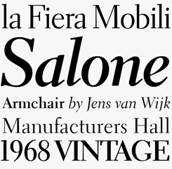
Odile
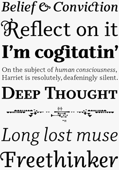
Odile is a contemporary serif typeface which draws on unpublished work by W.A. Dwiggins for inspiration. It’s an amazing hybrid, mixing unadorned basic shapes with a wealth of alternates, swashes and fancy ligatures. The result is a useful text face family with an inventively different structure. In addition to the expected six weights with matching italic styles, there are a pair of initial caps fonts, an upright italic in a single weight and a set of alluring and imaginative ornaments. Here’s what a jury of specialists wrote about Odile in Eye Magazine.
Elido
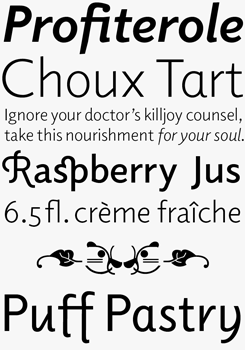
Elido is Odile’s sans serif companion; structured along the same lines with a range of weights from Light to Black and complementary initials and ornament fonts, Elido does more than just slice off the serifs. A reduced stroke contrast results in a more open, airy outline with a hint of geometric construction that is softened by several distinctively calligraphic features, such as the arched stroke off the stem. Together, Elido and Odile combine to form a sophisticated and adaptable superfamily well suited to both text and display uses.
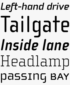
Axia
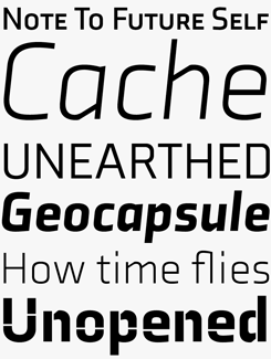
Axia was designed by Hagmann to retain the same line length regardless of which Roman or Italic weight is chosen. Substitute the Regular weight with any of the others — from Light to Black — and the overall layout will not reflow. The accompanying Stencil font is something of a statement by Hagmann on the redundancy of gaps in a digital font, instead choosing to place them where they make the most aesthetic sense.
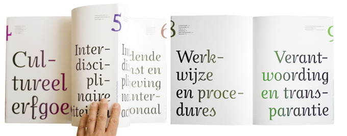
Dutch designer Ingeborg Scheffers used Odile’s upright italic to spectacular effect in the 2007 Annual Report of the national cultural foundation, Mondriaan Stichting. Photos by Eva Czaya.
What kind of jobs did you hold once you graduated from Basel?
After finishing my studies at Basel I worked for a couple of years in several Swiss studios and branding agencies. One of them was Zintzmeyer & Lux (now part of Interbrand) where I met Hans Eduard Meier, the designer of Syntax and many other typefaces. When Jörg Zintzmeyer was appointed to design the new Swiss bank notes in 1989, he commissioned Mr. Meier to design a custom sans serif for the notes. The banknotes were produced in what we employees referred to as the “bunker”, a secure room in the basement of the agency where the design of the bank notes was developed. Mr. Meier occasionally came to the agency and worked outside of the inaccessible space, and I was lucky enough to be able to look over his shoulder. That was the first time I observed a type designer working on digital type in Fontographer. I became interested in the detailed process and got hooked on the idea of designing type.
What prompted you to go all the way and make a complete type family?
I started sketching Cholla, my first complete type family, at the end of my final year at CalArts. After graduation I kept working on the family in my spare time and during vacations. In the meantime Denise Gonzales Crisp, a former classmate from CalArts, became the design director at Art Center College of Design in Pasadena, California. She was on the lookout for an unpublished typeface that could be employed for the school’s annual catalog and knew that I had the font in the works. In hindsight, her interest in my experiments probably contributed quite a bit to me carrying on and developing a type family that originally included 12 fonts. At the time OpenType [which opened the door to fonts with thousands of glyphs] had not found its way to font users yet. The required character sets of 256 glyphs were encouragingly achievable, relatively speaking.
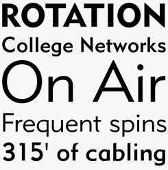
Cholla
Cholla began life as a personal project for Hagmann which evolved into her first professional commission when she was approached by the Art Center College of Design in Pasadena, California to develop a new typographic identity for the school. A wide variety of styles that could represent the school’s nine different departments was required, yet that would retain unifying elements such as the stroke that tapers as it connects to the vertical stem. In all, the family contains 20 fonts that include various widths, a slab variant and a couple of unicase options.
What factors determine your choice about what kind of typeface to work on?
The most important factors are its conceptual potential and possibilities for end use. The shaping of form and the experience of form are very personal things, but letterforms as an agreed shape are well defined. Designing type is to interpret a preexisting system — to work within a well-defined set of restrictions. Differences appear in the details that create stylistic variances. I’m interested in exploring things like the structure of a family beyond the standard interpolation of weights; an example of that would be subtle variations of letterform details, such as the lowercase ‘g’ descenders in the Cholla family that vary slightly in each weight.
The Odile family, inspired by the unpublished type Charter by W.A. Dwiggins, explores how stroke and curve might vary in intensity and yet still be coherent within an atypical family structure. Axia deals with the constraints involved in maintaining consistent line lengths across different weights. I adjusted the weights by hand and eye without interpolation tools. The accompanying Axia Stencil challenges ideas about non-digital letter drawing by playing with the bridges and the gaps that are, after all, superfluous in digital type.
Axia grew out of a pair of commissioned font families, namely the TwinCities fonts (unpublished), that go back to a 2003 competition by the Design Institute of the University of Minnesota, and the RSA font family commissioned by the Rice School of Architecture in 2011, which became the direct predecessor of Axia.
You’ve released only a handful of type families since 1999, when Cholla came out at Emigre. I assume you have good reasons for taking your time. Have you ever felt envious of type designers who churn out one or more families each year?
Most families I’ve released have been expanded, or re-released as bigger families. But it’s true, Axia would have beaten all records as it was distributed two years after Odile and Elido were published.
For many years I couldn’t devote as much time to type design as I might have wished. Graphic design and type design were parallel practices; I’m a full time design educator, and I have a family, so planning my time wisely is key. In 2011 I finally decided to focus more exclusively on type design, but I needed some time to take the necessary steps in this direction. Being a microfoundry, our advertising budget is proportionally small. Anticipating that it would be difficult to draw attention to a micro-foundry and reach a wider audience, I decided to collaborate with font resellers like MyFonts.
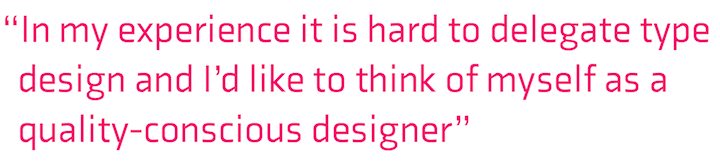
As far as the churning out of typefaces is concerned, my studio’s infrastructure is modest in every sense. In my experience, it is hard to delegate type design and I like to think of myself as a quality-conscious designer. Many steps in my design process are not fully automated. I sometimes find that typefaces whose design has been overly automated can lack some lifeblood.
Experimenting is a substantial part of my practice. Innovative ideas mean more to me than producing similar-looking families, or close matches of already existing font designs. It sometimes happens that ideas form in the midst of an already advanced design. In these instances I don’t mind rebuilding everything from scratch to get it the way I want it to be. A good strategy for allowing time to slip through one’s hands, I know. But the good news is that new type will be coming.
Designer’s choice:
Metro by W.A. Dwiggins
To complement the small but exquisite collection of her own designs, we asked Sibylle Hagmann to propose a choice of favorites that have influenced her throughout her career. The oldest one of these is Metro, designed by the American maverick genius W.A. Dwiggins. Commissioned in 1929 by Mergenthaler-Linotype’s Chauncey Griffith, Metro is a warmer and less mechanical geometric sanserif. “Metro,” says Hagmann, “with its subtle traces of calligraphy convinces in its harmonized feeling. I was always very much drawn to Metro’s details, such as the elegantly angled stroke terminals on several lower case letters, such as ‘u’, ‘a’ and ‘t’. One of the unique qualities is that these stroke ends differ in their angle, which gives the font a lively, harmonized, and humanist quality. Dwiggins disliked European modern designs such as Gill Sans, Futura and Erbar. Mergenthaler Linotype invited him to come up with a more convincing design and Metro was his answer. An impressive result for a first typeface!”
Designer’s choice:
Electra by W.A. Dwiggins
W.A.Dwiggins developed Electra, also labeled as Experimental 55 at the Linotype offices, between 1930 and 1939. As Hagmann explains, “with his desire to create a typeface that is ‘warm, full of blood and personality’, Dwiggins succeeded beyond that. I especially enjoy the shapes of the lower case ‘a’, ‘g’ and the beautiful ‘r’, a form that I sometimes find challenging to design. Electra’s letter design foreshadowed his ‘M-Formula’ and remains one of my favorite American-made book typefaces.”
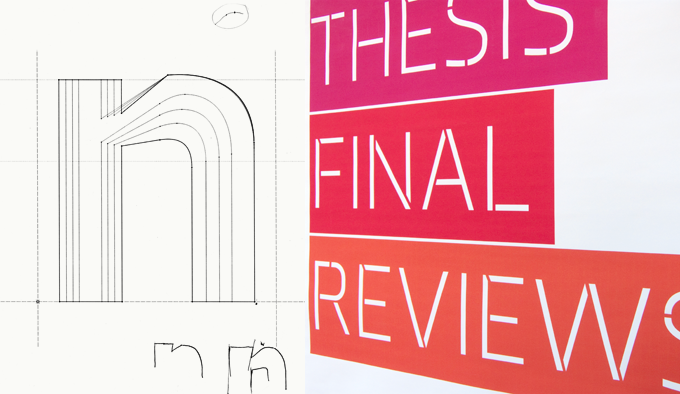
Aspects of Axia. Left: Axia’s inner arched strokes, in lowercases such as ‘d’ or ‘n’, progressively open the letter forms and express conceptual clarity throughout the system. The feature does double duty, contributing to great legibility in the heavier weights and to the versatility of individual weights. Right: Beta version of Axia Stencil in the Thesis Final Reviews poster, Rice University School of Architecture, 2012. Designed by Carolyn Moore.
You are currently in Europe for a sabbatical. Why did you choose Munich for your temporary stay? And, what kind of projects are you working on during your sabbatical year?
Munich has an interesting typographic scene and history. There is the TGM, Typographische Gesellschaft München (Munich Typographic Society), the largest typographic society in Europe, founded in 1890 by typographers and printers. Prominent personalities like Jan Tschichold, Paul Renner and Hans Rudolf Bosshard have been active within the society. Today TGM offers an amazing, almost unmatched, program of lectures, conferences, and more.
I’ve also always been intrigued by the relationship between form and political power, and Germany has its own particular history in this regard. The nazification of Blackletter is well documented. Somewhat less discussed is the typographic development in former Eastern Germany (GDR). I’d like to take advantage of being here and scratch the surface a little, find out more about the creative decisions that took place at Typoart and how these influenced existing typographic cultures and applications of type that reached the public.
In a few days from now, you’ll be giving a one-day type design workshop in Munich. How important is teaching to you? And where do you start when you have so little time to teach relative newbies what type design is about?
Teaching takes up a large amount of my time within a typical week, so as far as its level of importance is concerned, it is up there. Students should have every opportunity to explore and experiment. Following this philosophy, I’m especially interested in bringing students to a point of experimentation they have never imagined being taken to.
I pursue this philosophy for workshops, although within a substantially limited timeframe. The workshop in Munich, titled “Drawing Parallels,” is concerned with the contrast of working off-computer and large-scale vs. digitally in smaller scale. Participants will be encouraged to get their hands dirty and freely draw from existing glyph examples single large-scale letters to study proportion, stroke contrasts and counter spaces. Contrasting that, we will explore the modular design of letters. For a couple of years I’ve been using Fontstruct as one of the methods to introduce students to type design. It’s a great tool for novices to quickly understand the basic principles of type design, and hopefully it will work its charm again during the workshop.
Years ago, you wrote an article about women in type design. There were very few active female type designers at the time, and you wrote that was in part due to the fact that there were hardly any role models. Have things changed for the better?
I think things have shifted a little for the better. Digital type design has expanded enormously during the last few years and with that there are more female designers. Is it mostly due to the relatively new educational programs that offer a degree in the discipline? I’m not sure — but it certainly helps.
It remains questionable whether the female participants in these programs carry on working and continue to be active in the field beyond their educational years. One of the biggest issues is that women tend to jump off a career path at some point due to, for example, raising a family. Speaking from my own experience, it is still rather challenging to unite all things under one umbrella. I sure hope though that the number of female type designers keeps growing since their work contributes to an increased level of diversity.
Thank you so much for this conversation! We hope to welcome more Kontour typefaces on MyFonts soon.
Designer’s choice:
Syntax by H.E. Meier
Syntax, writes Hagmann, “was designed by the Swiss typeface designer Hans Eduard Meier for the Stempel foundry in 1968. The typeface family is modeled on a Renaissance serif typeface. Discovering Syntax within the overpowering presence of stiff Sans serif typefaces such as Akzidenz Grotesk or Helvetica, was an important discovery for me as a young designer. It was an ‘aha’ moment to perceive the calligraphic traces visible in, for example, diagonal strokes ending in right angles (‘x’ ‘y’ etc.). To this day I’m still smitten with Syntax’s Roman harmonized forms.”
Designer’s choice:
Steile Futura by Paul Renner
Amazingly, there is no state-of-the-art digital version of Steile Futura. So instead we present Font Bureau’s Tasse, close enough as a multiple-weight interpretation of Paul Renner’s 1950s display family (which bears similarities to the pre-war geometric sans-serif Futura in name only). On MyFonts’ Flickr pages, there is an original type specimen of Steile Futura’s italic. Hagmann has always been very attracted to Steile Futura. She studied it closely during the time she developed Cholla, and traces of influence can be detected in Cholla Italic’s ‘e’, or ‘t’.
MyFonts is on Twitter and Facebook!
Join the MyFonts community on Twitter and Facebook. Tips, news, interesting links, personal favorites and more from MyFonts’ staff.


Who would you interview?
Creative Characters is the MyFonts newsletter dedicated to people behind the fonts. Each month, we interview a notable personality from the type world. And we would like you, the reader, to have your say.
Which creative character would you interview if you had the chance? And what would you ask them? Let us know, and your choice may end up in a future edition of this newsletter! Just send an email with your ideas to [email protected].
In the past, we’ve interviewed the likes of Veronika Burian, Laura Worthington, Jonathan Barnbrook, Dave Rowland, Gerard Unger, Pintassilgo Prints and Jos Buivenga. If you’re curious to know which other type designers we’ve already interviewed as part of past Creative Characters newsletters, have a look at the archive.
Colophon
This newsletter was edited by Jan Middendorp and designed using Nick Sherman’s original template, with specimens and type descriptions by Anthony Noel.
The Creative Characters nameplate is set in Amplitude and Farnham; the intro image features Odile and Elido; the pull-quote is set in Cholla; and the large question mark is in Farnham.
Comments?
We’d love to hear from you! Please send any questions or comments about this newsletter to [email protected]
Subscription info
Want to get future issues of Creative Characters sent to your inbox? Subscribe at www.myfonts.com/MailingList
Newsletter archives
Know someone who would be interested in this? Want to see past issues? All MyFonts newsletters (including this one) are available to view online here.