|
|
Photo © Jan Middendorp
|
|
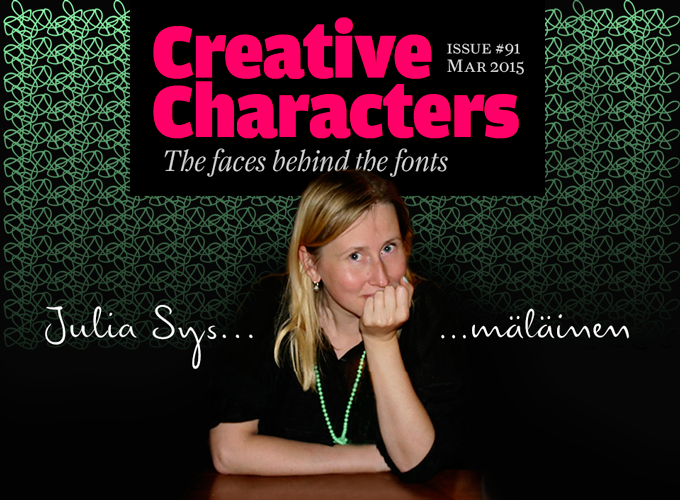
She runs Juliasys, her own foundry, and has published some of her most successful typefaces at Berlin’s FontFont library and Moscow’s Art. Lebedev Studio. She discusses mushrooms in Russian and fish in Finnish, but uses neither language in her daily work as a senior designer at Edenspiekermann in Berlin. She has worked on major corporate design projects, designing websites and print publications as well as thousands of icons and dingbats. Having studied both linguistics and graphic design, she often develops fonts that represent “writing” in all its possible aspects — typefaces based on the handwriting of authors and artists. Meet Karelian philosopher Julia Sysmäläinen.
|
|
|
Julia, being a Finnish woman with a Russian mother, living in Berlin, Germany, and writing English right now — what language do you think in? Is it confusing sometimes?
Actually it is like this: My father is Finnish, my mother is Russian, and I am both — or, in other words, I am exactly in the middle. I feel equally at home in either language when speaking, but also when reading or writing, regardless of whether I’m using Latin or Cyrillic characters. In other respects, too, my Finnish and my Russian characteristics are pretty much in balance. I have the proverbial Finnish dislike for small talk and I find excessive politeness dishonest. At the same time I love the Russian warmth and conviviality. And I have the Russian fondness for trial and error, and improvisation. I come from a region called Karelia, which belongs partly to Finland, partly to Russia. My parents got divorced when I was quite young, and after that I traveled back and forth for many years.
German and English came much later, and I feel much less close to them. But I like to read literature in all four languages, no matter how well I know them. I seldom feel confused, actually: mushrooms, berries, and everything that has to do with the forest, are Russian. Water and fish are Finnish. And now that I have been working at Erik Spiekermann’s various agencies for more than 10 years, design is German and English.
You are fascinated by the meaning of language as well as its visual form. You first studied philology and then graphic design. How does the one connect to the other?
My first somewhat serious preoccupation with language began with my passion for reading — mainly Finnish and Russian literature. Later I discovered that besides literary content and literary form there was also the visual shape of the text. What fascinates me most is where it all comes together — in manuscripts, letters, everything that has been written down. The National Library here in Berlin has a wonderful manuscript department.
And this promptly brings us to my typefaces, which are often based on just this kind of material. FF Mister K is the best known of these: a complete type family based on Franz Kafka’s manuscripts — sometimes closer to the original, sometimes a few steps away. I proceeded in a similar way when developing Emily In White and my most recent typeface for the Lebedev Studios, ALS FinlandiaScript. For the former, the starting point was a series of poems by Emily Dickinson, written on slips of paper sewn together (she called them “fascicles”). For the latter, letters written by the composer Jean Sibelius. Even my ALS SyysScript (Finnish for “Autumn Script”) had a model — a Soviet postcard that my Aunt Katri sent me long ago to invite me to go mushrooming.
|
|
|
|
|
|
|
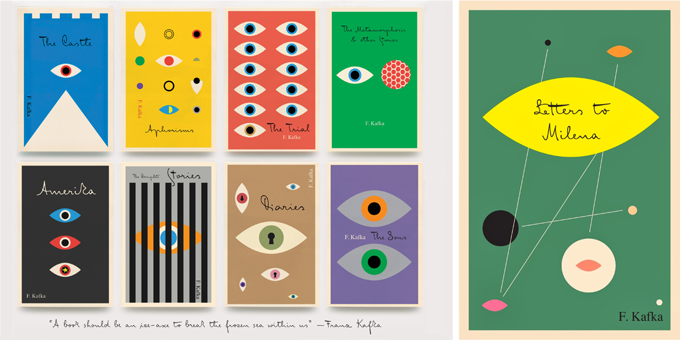
A series of Kafka’s books translated into English, with wonderful cover designs by Peter Mendelsund using FF Mister K. Published by the Knopf Doubleday imprint Pantheon, where Mendelsund is art director.
|
|
|
|
Could you tell a bit more us about your motives and ideas behind FF Mister K?
“Mister K is not putting on a show — he is just being Mister K.”
Originality, authenticity, and honesty are crucial qualities to me. I think Mr. K has all of that, just like Frank Kafka’s manuscripts do. While I was working on it, I realized that while Mister K is a font, it is also the visualization of a personality. The font is not pretty, or beautiful in the classic sense — and it doesn’t want to be.
It’s a bit like Kafka’s work. There is no beauty in it as such, but rather a confrontation with reality that goes so far as to be repellent. There are all kinds of attributes — stupidity, cunning, weakness, strength, bitterness, humor, lightness, etc. The authenticity of this confrontation is visually reflected in the manuscripts — and also in Mister K Regular, the style in the font family that is most similar to the original Kafka manuscripts.
Whoever wishes to use the typeface must be willing to embrace this ambiguity. Mister K is not particularly suitable for lending a consumer-friendly smoothness to some brand; but there are corporate identities to which it fits very well. I was pleased to see it used by the Norwegian band Flunk, for Stokke highchairs, and for wellness products by Dresdner Essenz; and, of all things, in the logo of an upmarket design hotel in Berlin, Das Stue. What I found even more astounding was its appearance at the international insurance company Watson Towers (an ironic coincidence, as Kafka himself was an employee at an insurance company). But somehow it made sense: “The organic, hand-drawn nature of the logo and graphic system creates a personal and distinctive look amidst the impersonal, corporate, language of its competitors…” — that’s how Interbrand, the design agency, described the project. In its semi-perfection the typeface simply oozes a kind of honesty. That’s its strength, and brings it closer to a lot of people.
|
|
|
|
|
|
|
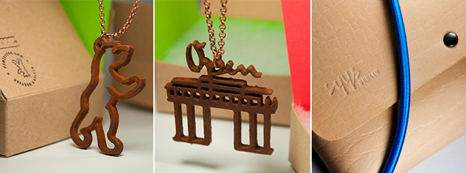
Left and middle: Sysmäläinen’s K-Rusties, rusted jewelry formed from glyphs and icons of the FF Mister K family, first presented at the Traveling Letters exhibition in Finland and Latvia. Right: SyysBerlin/SyysМосква clutch bag, designed and hand-crafted by Juliasys.
|
|
|
|
You have put on a number of exhibitions featuring your typefaces. A couple of years ago at the Mota Italic gallery in Berlin, you showed a collection of products based on Mister K glyphs… textile bags and curtains, sculptures, rusty-looking jewelry. You are obviously a woman of many talents. Do you have plans to move beyond graphic design and become a professional product designer?
I am not inclined to think in terms of “career prospects” and “professionalization.” I have learned a lot and love learning new things, but that isn’t a sign of some calculated professional planning. Professionalization often means acquiring standard thought patterns, tastes and methods. As a designer who works artistically, I simply have a need to avoid digital numbness, and come to grips with the material world — textile, metal, plastic, wood, impact drills, chisels, etc. This is a good remedy against narrow-mindedness and back pain, and makes you more balanced. By making objects and installations I can introduce my fonts to the real world. On disks and servers they only have a potential life. The Rusty jewelry series based on FF Mister K characters gets Mister K in touch with a whole new crowd of people who don’t often have much to do with typography — not just with graphic designers or type designers.
You’re one of the few type designers who is equally fluent in Latin and Cyrillic scripts. Has that influenced your work?
When I began to get interested in type design, people usually developed the Latin character set first, and then derived the “Kyrillitsa” from it. There was a lot of fussing about the Cyrillic; people would nag that it had too few ascenders and descenders, that the lowercase was too similar to the uppercase, or that there was too little rhythm in the word image. That annoyed me a lot. I found it embarrassing that Russian designers took on that attitude from Western designers, and transferred their feelings of inferiority toward the West to the “Kyrillitsa”. So I turned the tables around, and when developing my first typeface I made the Cyrillic character set first and then transferred as many properties as I could to the Latin. That was my graduation project. Today things are different. Russian type designers have become much more confident.
You are publishing your typefaces through your own foundry Juliasys, and also via the FontFont library and the Moscow company Art. Lebedev Studio. What determines where you publish what?
My involvement with the people running the FontFont library is long-standing and very pleasant — but it’s just like the stock market: I try to diversify.
I came in contact with Artemy Lebedev a few years ago, and I’ve learned to appreciate their straightforward manner. The Art. Lebedev Studio is the leading design agency in Russia by far, and in spite of the doubts about the feasibility of type trade in Russia, my Latin-plus-Cyrillic fonts sell pretty well there. It’s quite probable that more of my fonts with a Cyrillic character set will receive an “ALS name” in the future.
Finally, from time to time, when I feel like it, I release something on my own label: Juliasys — Karelian Type Foundry in Berlin. Sometimes I love the one more, sometimes the other. FontFont, ALS and Juliasys are all looking good. And each of them gets on my nerves from time to time.
|
|
|
|
|
|
|
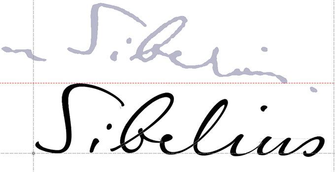
A fine example of Sysmäläinen’s sophisticated technique when interpreting a handwriting style. Some characters are faithfully reproduced, others are interpreted more freely for better legibility. The typeface is ALS FinlandiaScript, named after the most famous composition by Jean Sibelius, whose handwriting (top) inspired this font.
|
|
|
|
Let me return to your work for Erik Spiekermann, with whom many of our readers are familiar (we interviewed him last December). It’s been about ten years since you started working at his studio, which was then called United Designers Network (UDN). Could you briefly describe the kind of things you’ve done at the various agencies? What has it been like to work with him?
Erik is an icon — and has been for decades. Without him, Berlin certainly would not have become the “type design capital” it is today. Like so many others, I also ended up here because of him. I first came to MetaDesign — but that was a misunderstanding, because Erik was no longer there; he had left Meta in 2000. A bit later I joined UDN, where Erik was a very strong presence indeed in a team of only five designers.
A lot has changed over time. The agency has grown from five to 70 employees. I often hear people saying that “Corporate design is dead,” while in the past it was at the center of everything. Of course, corporate design is still there, but it is now just one aspect of a complex and often predominantly digital project.
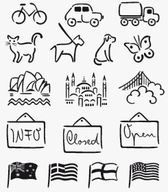
Yet in my own work solving typographical problems and structuring information are still important factors. Besides, within the agency I have become a kind of specialist on dingbats and icons — elements that are, of course, quite in vogue nowadays. They are a way of bringing something cheerful and personal to an otherwise rather dry corporate identity. When deciding on the visual language for a set of icons I allow myself to be influenced by the project’s corporate typefaces. I usually generate the icons as fonts — multi-layered and with OpenType features.
|
|
|
|
|
Has it been fun working with Erik? What are the most important things you have learned from him?
So much has been said and written about Erik — those who don’t know it should absolutely read the beautiful book Hello I am Erik, which Johannes Erler published last year at Gestalten. What has always impressed me is Erik’s wide horizon. He is really a person who is able to look and think “outside the box.” I have learned so much from him, in so many fields — too much to mention!
Erik is now no longer participating in the agency’s everyday business. But directly across the street from the office he runs his letterpress workshop P98a (named after the street address Potsdamer Straße 98a). It has become a new attraction for many of us. I, for example, used his platen press for my SyysBerlin/SyysМосква leather bags — to emboss my logo (set in my SyysScript and Erik’s Unit).
How do you combine your corporate design work at the agency with the work you’re doing for your own label?
For me, the client-driven work at Edenspiekermann complements my “own” projects for Juliasys pretty well. The client projects come with significant limitations. You don’t get all your ideas accepted; you have to justify your decisions; sometimes you need to bargain. But then in my own projects I can let off steam. I don’t need a briefing and there are no rules to follow, I can make totally confused icons that no one probably needs… I think both have their right to exist, and can coexist side by side.
Mir is your only type family that was designed for setting long texts — and even Mir is perhaps a bit too quirky for a book typeface. But you’re a very literary-minded person. Do you have any plans to design a real workhorse as a major text family?
Yet another question! You do know, don’t you, that we don’t talk that much up north? But while we’re at it, I’ll give you a few random thoughts on the matter.
I agree that Mir (the Russian word means both “world” and “peace”) is a bit special, but it is positively the most legible of my typefaces. I had three major objectives when designing it: an idiosyncratic but calm personality; broad language support; and special suitability for natural sciences (key word: “relaxed science”). So I wanted the family to have support for Central European, Greek and Cyrillic, and come with a huge set of scientific symbols and mathematical symbols. Right now I am back working on Mir — me and my Japanese colleague Toshiya Izumo. The family will get more weights, and soon there will be a Hiragana character set.
I sometimes have the impression that there are now more wonderfully legible text fonts than texts worth reading. To make a text typeface, which, after a quote from Jan Tschichold, should serve any text “like a good servant… silent and smooth” — well, I’m probably not the best placed designer for that. I like having at least some influence on how my typefaces are used. A German saying goes “lying as if it’s printed.” As everyone knows, that’s no less true for digital media. A blatant lie “but eminently readable”, that’s something that will please type designers.
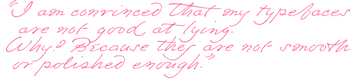
I am convinced that my typefaces are not good at lying. Why? Because they are not smooth or polished enough. Typographically speaking they make a fundamental mistake: They draw attention to themselves and, in doing so, place themselves between the reader and the text. In principle, this is like the “estrangement effect” that Berthold Brecht described — in literature, it has a long tradition. It is the introduction of a tool or technique, in my case the personality of the font, which impedes the unthinking consumption of a text. You should remind readers, again and again, that what they are reading are not truths, but the authors’ opinions, fantasies and beliefs. Viktor Shklovsky and Brecht did that in their own way with what they called “ostranenie” or “alienation”. I do it with the “quirks” in my typefaces.
Am I exaggerating? Sure, and there are also smooth transitions in many of my fonts. But generally speaking this irritating meddling with the reading process is very important for me.
Final question: Your fonts are technically very well-equipped and the OpenType-programming is very sophisticated. Do you enjoy these technical aspects of digital design? And do you think the font designer should not only be craftsman, but also a bit of a coder?
Yes, I think the coding aspect is great fun — but that’s also a craft, isn’t it? I don’t know if type designers in general need to know about programming. Everyone should decide for themselves. But with my fonts it is absolutely necessary, because their personality partly depends on it.
During the design process I need to be able to have direct control over the glyph sequences that develop — how to connect various alternates and ligatures, what happens to the beginnings and endings of words, where do unnatural glyph repetitions occur? When a sequence is too monotonous, I can make a somewhat flashier ligature, but then it should not occur too often in a text. Whenever something does not behave the way I want it to when inputting text, I need to change glyphs, draw new ones and/or modify the code. Plus, my fonts also tend to have different underlining and strikethrough variants, ornaments, etc. I have to write the code for that too. Most of my feature codes are so complicated that I am the only one that can make sense of them. And when I take a long break I need some time to get into it again.
Julia, many thanks for giving us some insight into your motives and methods!
|
|
|
|
|
|
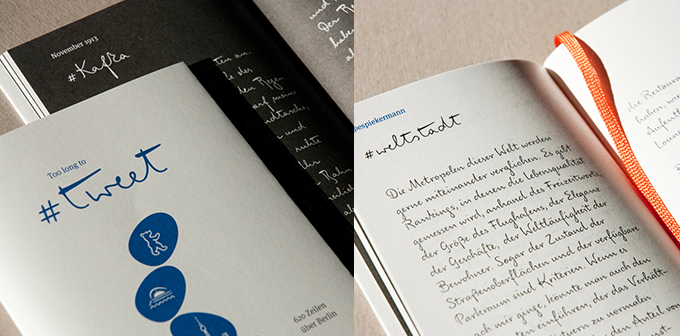
As a very personal specimen booklet for FF Mister K, Sysmäläinen edited and designed Too Long to Tweet, a lovely collection of short texts about Berlin, specially written by friends and colleagues. |
|
|
MyFonts on Facebook, Tumblr, Twitter & Pinterest
Your opinions matter to us! Join the MyFonts community on Facebook, Tumblr, Twitter and Pinterest — feel free to share your thoughts and read other people’s comments. Plus, get tips, news, interesting links, personal favorites and more from the MyFonts staff.
|
|
|

|
Who would you interview?
Creative Characters is the MyFonts newsletter dedicated to people behind the fonts. Each month, we interview a notable personality from the type world. And we would like you, the reader, to have your say.
Which creative character would you interview if you had the chance? And what would you ask them? Let us know, and your choice may end up in a future edition of this newsletter! Just send an email with your ideas to [email protected].
In the past, we’ve interviewed the likes of Maximiliano Sproviero, Sumner Stone, Typejockeys, Charles Borges de Oliveira, Natalia Vasilyeva, Ulrike Wilhelm, and Laura Worthington. If you’re curious to know which other type designers we’ve already interviewed as part of past Creative Characters newsletters, have a look at the archive.
|
|
Colophon
This newsletter was edited by Jan Middendorp and designed by Anthony Noel.
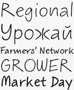
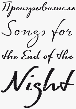
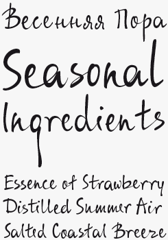
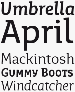
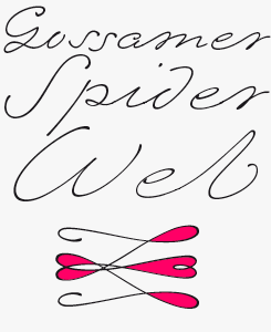
The Creative Characters nameplate is set in Amplitude and Farnham; the intro image features FF Mister K Informal; the quote image is set in Emily In White; and the large question mark is in Farnham. Body text, for users of supported email clients, is set in the webfont version of Rooney Sans.
|
Comments?
We’d love to hear from you! Please send any questions or comments about this newsletter to [email protected]
|
Subscription info
Had enough? Unsubscribe immediately via this link:
www.myfonts.com/MailingList
Want to get future MyFonts newsletters sent to your inbox? Subscribe at:
MyFonts News Mailing List
|
Newsletter archives
Know someone who would be interested in this? Want to see past issues? All MyFonts newsletters (including this one) are available to view online here.
|
|
|
<
|
MyFonts Inc, 600 Unicorn Park Drive, Woburn MA 01801, USA
MyFonts and MyFonts.com are trademarks of MyFonts Inc. registered in the U.S. Patent and Trademark Office and may be registered in certain other jurisdictions. Mister K is a trademark of Monotype GmbH and may be registered in certain jurisdictions. FF is a trademark of Monotype GmbH registered in the U.S. Patent and Trademark Office and may be registered in certain other jurisdictions. Other technologies, font names, and brand names are used for information only and remain trademarks or registered trademarks of their respective companies.
© 2015 MyFonts Inc
|
|
|