|
|
|
|
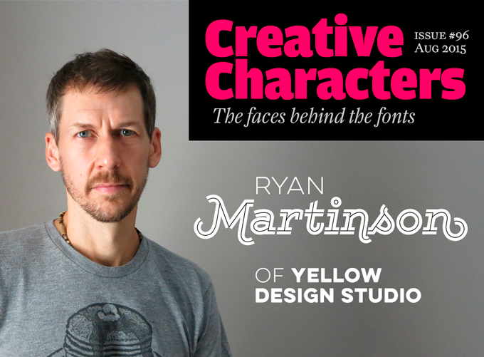
If anyone exemplifies the changing landscape of the modern type design world, it’s this month’s interviewee. Like contemporaries such as Hannes von Döhren, René Bieder and Cindy Kinash, he is a former graphic designer who turned to type, forging a career as the principal of a successful independent microfoundry. Like his peers, he developed an approach to type that explores current tastes and trends, but also manages at times to enrich these trends, and set new ones. His feel for surface and texture is a defining feature of his typefaces, which are as consistently bright and energetic as the name of his studio, Yellow Design Studio, suggests. Meet Ryan Martinson from Sanibel, Florida.
|
|
|
Ryan, you signed up at MyFonts in 2010. What did you do before you began publishing typefaces? And what brought you to type design?
I was working as a graphic designer both at a small design company and for Yellow Design Studio.
I am a self-taught type designer. I fell in love with fonts as a graphic designer and immersed myself in them. I ordered every type specimen book I could get my hands on… FontFont, Emigre, Hoefler & Frere-Jones, Veer, House Industries and many more. When a new job came in I’d pore over them trying to find the perfect font that had just the right feel. Picking fonts was my favorite part of almost every project.
Through that process I laid the groundwork for my future interest in type design. I studied the little details that made certain typefaces stand out over others, and I was always intrigued by how slight differences in a font’s outlines could have a huge impact on the emotion it conveyed. I started to gain an understanding of the countless choices a type designer makes when drawing letters and developing a typeface.
As far as the technical aspects are concerned (which at times seemed like half the battle), I just acquired the software — FontLab Studio — and went at it. Google was my best friend. The Typophile forum saved me on countless occasions when I ran into issues that I couldn’t resolve. And although it’s definitely not my strong suit, I’ve learned enough OpenType coding to be able to do pretty much everything I need.
From your earliest published fonts onwards, your work referred to old techniques such as letterpress printing, with the imperfections of manual techniques. Do you have a personal fascination with the hand-made? Have you done research in this field?
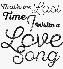
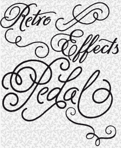
Absolutely, “a fascination” is a good way to put it. I think textured typefaces offer a beautiful diversion from the clean lines of more traditional typefaces. I’m amazed by great “clean” fonts as well, but distressed and hand-drawn fonts have a certain character that’s alluring. They’re warm, relatable and human as opposed to the more mechanical vibe that standard fonts can have.
For me everything goes back to the mid-2000’s when Rian Hughes of Device came out with a bunch of distressed fonts that blew me away. Faces like Battery Park, Chase, Wormwood Gothic and Roadkill brought a new level of realism… really just awesomeness that I hadn’t seen before. I was hooked. These were still fresh in my mind when I started designing fonts a number of years later.
I did a lot of research and experimentation to try and recreate the same level of authenticity. I studied old books and antique prints and played around with rollers, rubber stamps and block printing. I used both analog and digital techniques on different fonts, favoring analog early on and relying more on Photoshop of late. And while I’ve also put a lot of effort into developing my clean fonts, texture continues to be a big fascination. I don’t know… something about distressing a font just makes me happy.
Do you study historical sources — and have you built up a kind of collection of vintage lettering and printed matter?
I have a few things, but not any large collection of vintage lettering to speak of. I admire historical typefaces, but it’s really more the effect of a font looking old that interests me.
You’re obviously very conscious of current trends; sometimes you follow them, sometimes you discover or even set new trends. And sometimes you create letterforms that are very much your own. Do you think it is important for a type designer today to be as original as possible?
I see type design as a giant churning mass of ideas that’s constantly driven forward by originality. Originality is essential to the type world’s evolution and overall success. But it’s an interesting topic, because we all build on a foundation that has already been laid, and while occasionally a completely new idea is presented, for the most part originality comes in the form of more subtle twists on existing concepts.
So for a type designer I think following trends is OK, setting trends is better, but to always be pushing forward in some way or to pursue some new angle on each project is a fundamental responsibility.
|
|
|
|
|
|
|
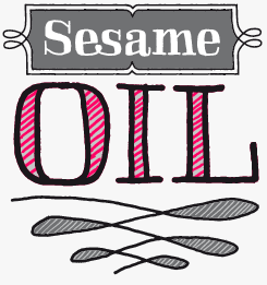
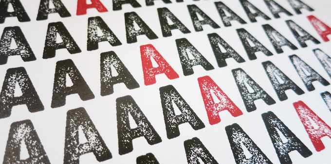
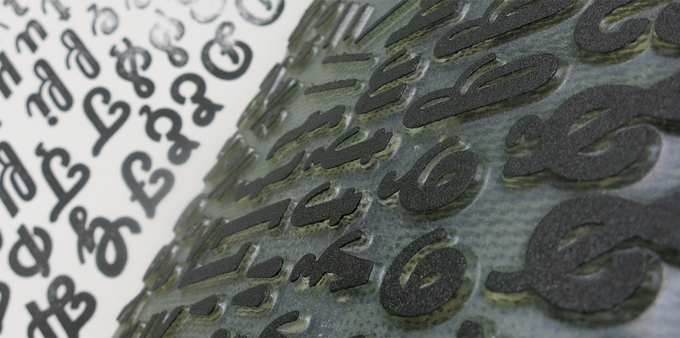
Martinson prints off sheets of variations of each letter to choose different texture levels for each letter.
|
|
|
|
Your company is called “Yellow Design Studio” — where did that name come from? Any reference to the meaning that the word can have in American slang?
Yellow Design Studio came from a brainstorming session with my wife Rena when we were starting our design company. She came up with it. It separated itself from a long list of lame attempts that were trying too hard to be cool. We liked how it felt. Yellow is an energetic, optimistic color which was how we saw ourselves. Of course it can mean other things too, but no ironic reference was intended.
So you’ve always run Yellow Design Studio together with Rena. How are the roles divided?
We started as a graphic design studio, but things evolved quickly. I put more and more time into type design and Rena became more interested in painting and other fine art mediums. Even though we’re both pursuing different passions, there’s a lot of collaboration and dialog about each other’s work. I really appreciate having someone to bounce ideas off of who has a great eye and excellent artistic sensibilities.
What has been your favorite font project — and why?
I can’t decide… can I give two? I’d say Gist and Sant’Elia for different reasons. With Gist I really wanted to challenge myself to create something completely new… to sort of flex my creative muscles to an extent I hadn’t before. It’s probably my most original typeface to date. With Sant’Elia I wanted to take my “friendly with an edge” mantra from Thirsty Script and push it even further. Some of the ideas are carried over, but I think all-in-all it’s my best work so far.
Apart from those you’ve already mentioned, which type designers or lettering artists do you admire, and what is it you like about their work?
I really admire Hannes von Döhren. His versatility is second to none. It doesn’t matter what genre he’s working in, everything he releases is among the best. Plus his slides are awesome. Daniel Hernández has a great collection of work, too. I love how he manages to infuse a human quality into all of his corporate faces. And I think René Bieder’s work is amazing. His typefaces are just so fresh, which is hard to do working in the crowded arena of corporate sans and serifs.
Do you think your experience as a graphic designer helps and informs your type designs? Do you look at your own typefaces as a user would?
Yes, that’s definitely a constant part of my thought process. Usability is crucial to a font’s success, so I try to put myself in my customer’s shoes and imagine how they would use a typeface and what features they would want. An example is using a high level of detail in my distressed fonts because I remember being disappointed with a lot of textured fonts when I used them at large sizes. The illusion fell apart. I also loved choices as a graphic artist, so I try to include alternate letters, ligatures and other goodies.
|
|
|
|
|
|
That use of detailed textures makes your fonts very sophisticated and subtle for use in print, while on the web they may sometimes be a bit difficult to use for their sheer complexity. What’s is your take on that?
That’s partly true. Even my most detailed family (Veneer) can work great online if it’s used sparingly and at larger sizes. At smaller sizes, and especially if it is used to set a lot of text, there can be issues. It’s unfortunate, but I think it’s a price worth paying for the added sense of authenticity.
What does your production process look like — do you design your type families one after the other, or do you usually have multiple projects in the works?
In the past I’ve always worked on one project at a time. It’s been better for me to be single-minded and focus all my efforts in one direction. But currently I have a few things in the works and I’m feeling more comfortable with it. I can see myself working in that way going forward.
Is it a thrill for you to see your work in use? What the kind of use that is most satisfying?
Oh, for sure! It’s always a kick seeing my fonts out in the real world, and I love it when people send photos of sightings. I guess more than anything it feels great to know that someone else appreciates my work. It’s pretty cool seeing my fonts on big campaigns or in places where I know a lot of people will see them, but no matter the size of a project it’s most satisfying when I think they really fit the design well and help to make it successful.
Your typefaces have been very successful on MyFonts these part few years. Did that popularity take you by surprise — and has it changed your lifestyle?
It was a complete shock! To start with, I just wanted to design a font. My first attempt was a complete disaster, but I thought my second try, Magesta Script, turned out alright so I submitted it to MyFonts to see what would happen. I had no expectations whatsoever. It was so exciting when a sale actually came in. I remember thinking, “NO WAY … someone just bought my font!!”
I really held the designers that made the Rising Stars newsletters in high regard and I thought to myself, “How cool would it be if one day I could do that?” When it happened with Skitch it was amazing. I was floating. That showed me there was some real potential there. From that point on I’m not really sure what happened, but I’ve just been incredibly lucky. I wish I could thank everyone that’s supported my work and helped me make a go at this. And yes, it’s been quite a lifestyle change. Before I released my second font Wausau, the company I worked for had fallen on tough times and I had been reduced to just a few hours a week. I was receiving unemployment benefits and was deeply in debt. Fast forward to today and I’ve been able to buy a house and help support a family by working from home doing something I love. I couldn’t have asked for more.
|
|
|
|
|
|
|
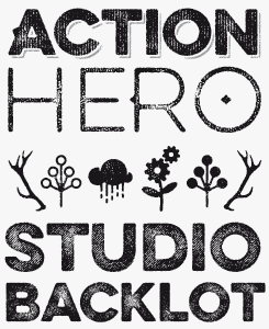
Martinson had this rubber stamp made for Thirsty Rough.
|
|
|
|
Do you work for clients a lot, making custom fonts? Have you done any logo and lettering projects recently?
I haven’t done any custom fonts for clients, and since I switched to full time type design I haven’t done any logos, lettering, or anything… just fonts.
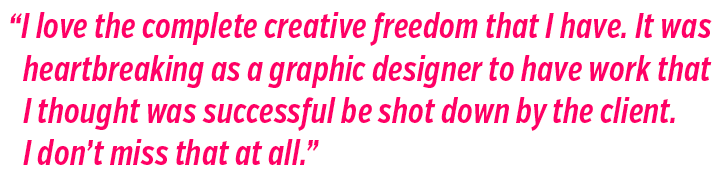
One thing that I love about type design is the complete creative freedom that I have. It was heartbreaking at times as a graphic designer to have the work that I thought was the most successful, and that I was most proud of, be shot down by the client. I don’t miss that at all, so I’m not that eager to take on client projects. I enjoy (for better or worse) being able to make all of my own artistic decisions.
What is your biggest unfulfilled wish or ambition as a type designer?
I can’t say I have any unfulfilled wishes. Having a Rising Star font was one, and being on the Best Sellers list was another. Otherwise I don’t have any goals set or specific achievements I’d like to accomplish. My ambitions revolve around what I want to do with my work and where I want to take it. I’d like to push myself out of my comfort zone and explore new areas in my drawing of letterforms and with corporate typefaces. For me there’s still a lot of uncovered ground there. So many different genres of type design interest me, and I feel like I’ve barely scratched the surface.
More and more type designers today are graduates of university programs dedicated to type design — from [email protected] in the US, or the Reading and The Hague Master’s in Europe, to programs in Mexico and Argentina. Being completely self-taught, do you miss having done a school like that? Would you say it could still be useful to you at this point in your career?
I don’t miss having a formal eduction in type design. The whole learning process for me has been challenging and rewarding, and something about doing it all on my own has been great. There’s no doubt I’d become a better designer in some areas, but who knows, maybe I’d be worse in others. I think classes would be very useful and I might do that some day, but for now I have a bunch of ideas for upcoming typefaces and I’m excited to get to work on them.
Conversely, do you think you could enjoy teaching at a design college?
My parents were both teachers and my brother has taught a college course, but I never got the bug. I could see it being fun, but I guess I’m more driven by creating things and working on my own projects.
Finally, could you tell us a bit about your interests and inspiration sources beyond typography — music, art, the outdoors…?
I love music. It keeps me entertained while I’m working through some of the more repetitious parts of type design. I also love sports, with tennis being at the top of the list. I manage to get out to the courts a couple times a week. Otherwise my free time is usually spent hangin’ with Rena and our 5-year old son Cash.
Thanks, Ryan — it was good to get to know you better.
|
|
|
|
MyFonts on Facebook, Tumblr, Twitter & Pinterest
Your opinions matter to us! Join the MyFonts community on Facebook, Tumblr, Twitter and Pinterest — feel free to share your thoughts and read other people’s comments. Plus, get tips, news, interesting links, personal favorites and more from the MyFonts staff.
|
|
|

|
Who would you interview?
Creative Characters is the MyFonts newsletter dedicated to people behind the fonts. Each month, we interview a notable personality from the type world. And we would like you, the reader, to have your say.
Which creative character would you interview if you had the chance? And what would you ask them? Let us know, and your choice may end up in a future edition of this newsletter! Just send an email with your ideas to [email protected].
In the past, we’ve interviewed the likes of Maximiliano Sproviero, Sumner Stone, Typejockeys, Charles Borges de Oliveira, Natalia Vasilyeva, Ulrike Wilhelm and Laura Worthington. If you’re curious to know which other type designers we’ve already interviewed as part of past Creative Characters newsletters, have a look at the archive.
|
|
|
|
MyFonts Inc. 600 Unicorn Park Drive, Woburn, MA 01801, USA
MyFonts and MyFonts.com are trademarks of MyFonts Inc. registered in the U.S. Patent and Trademark Office and may be registered in certain other jurisdictions. Other technologies, font names, and brand names are used for information only and remain trademarks or registered trademarks of their respective companies.
© 2015 MyFonts Inc.
|
|
<
|