January 2016
January 2016
Issue #100 | January 2016
Highlights from the last 99 issues
Creative Characters, MyFonts’ series of monthly type designer interviews, is in its tenth year. More importantly, the newsletter you are now reading is a jubilee issue — number 100! When embarking on the series in 2007, we never thought we’d find this many interesting stories from this many type designers. But MyFonts kept on growing, and new voices from around the world joined us each year. With Creative Characters, MyFonts’ editorial team hoped to step beyond the bland web format of standard questions and one-liners, and offer some insight into the motives, methods and personal histories behind today’s typefaces. Our main message: fonts are made by creative and passionate individuals — not by anonymous corporations. There is no better occasion than #100 for a brief retrospective. So here is an anthology — some of the most entertaining and inspiring statements chosen from the previous 99 newsletters. Enjoy!
“The path that led me to type design is as long and winding as a Michael Mann film, but here goes…”
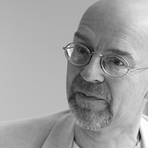
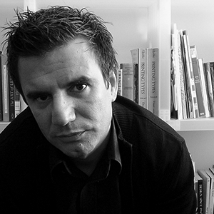
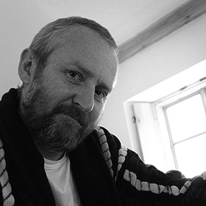
Neil Summerour | Issue #30 | January 2010
At sixteen I took a job as an usher in a theater, an arthouse cinema in southwest Berlin, because I wanted to stick the letters into the marquee sign. That was my main motivation. I just loved being poised on a ladder and handling those big plastic letters. … So in a way that was the start of my career. But it’s not really true because I’ve always been interested in letterforms. I knew I wanted to be a graphic designer; to make graphic work, and use lettershapes. I had no idea that you could make typefaces yourself; I only became aware of that during my studies. When they told me that, I was delighted.
Verena Gerlach | Issue #97 | September 2015
Like many people, I feel that I fell into my career rather than chose it. At school I was the kid in class who was good at art, so it seemed quite natural that I would have a career in art or design. My father had the most beautiful handwriting. He was a bookkeeper, and his accounts books were beautifully written and laid out. I suspect my interest in typography grew from there. At that stage I did not realize there was any such thing as a typeface designer, I thought that typefaces were just there and it did not occur to me that someone had to design them.
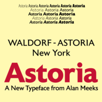
Alan Meeks | Issue #95 | July 2015
One could possibly summarize it this way: From the Czechs I learned expressionism and vitality, from the Germans perseverance and methodology, from the Italians openness and warmth, and from the Brits I got contacts and marketing skills.
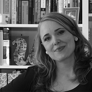
Veronika Burian | Issue #15 | October 2008
[We had type and lettering in art school,] but in a very boring, uninspiring way. We had to very carefully trace the quick brown fox jumps over a lazy dog in a 60pt sans serif font, all in lower case. I remember one lecturer saying that typefaces don’t have personality. I thought that was wrong, but he was the one who set the exercise and he was a big fan of the Helvetica typeface. I’m not. We were also introduced to the delights of copyfitting tables, casting off, and all that archaic stuff used for trying to estimate what size of type would fit in a certain area. … We had to do a lot of hand rendering of 10pt type for various mock-ups of stationery, brochures, leaflets etc. Good training I suppose, but sooooooo tedious. But for some reason I wasn’t deterred, and learnt virtually everything after I left college.
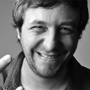
Nick Cooke | Issue #56 | March 2012
Unless you count a couple of lettering classes I took in college, I’m completely self-taught when it comes to type design. Ever since I can remember, I’ve been drawing letters, often out of boredom or when I was supposed to be doing something else. It’s the default thing I do when I’m doodling. I fell in love with type while working on the newspaper and yearbook in high school.
Mark Simonson | Issue #18 | January 2009
Satya Rajpurohit | Issue #92 | April 2015
I wouldn’t say that a self-taught type designer is by default worse than somebody that was formally educated. However, I do think that it is faster and easier to learn when attending a type course such as the one offered in Reading. There is better and broader access to resources such as archives, teachers and guest-lecturers. This will deepen one’s knowledge and skills and it will establish future contacts. There is also intellectual and direct exchange with people with similar interests, who will give you important feedback. I learned almost as much from my fellow students as from the teachers themselves.
Veronika Burian | Issue #15 | October 2008
It’s not over ’til it’s over. Going backwards, I’m still learning a lot from the people I’m supposed to be teaching. Each person has a lot to give and the first time one learns something is not always right, or complete. I think this is especially true in a field as wide as ours historically, stylistically and culturally. So in big way, all the designers whose work is published through Font Bureau are my latest teachers. From them I learn how to look at things related to type today from a variety of stylistic and entrepreneurial perspectives.
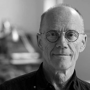
David Berlow | Issue #3 | September 2007
I really felt quite comfortable from the beginning. Type design is a very forgiving activity. You’re still allowed to make huge mistakes because the majority of your blunders will go completely unnoticed or even be praised for “breaking the mold.”
Silas Dilworth | Issue #20 | March 2009
I’d bash out an alphabet, autokern it, come up with a funny name and upload it to my website. I didn’t have to deal with accents, proper kerning, proper metrics, OpenType coding, promo graphics, ad copy, keywords, testing, multiple formats, etc. Within minutes of finishing a font it was on my site. One Saturday I created 3 fonts.
Ray Larabie | Issue #22 | May 2009
My biggest influence on the way I draw was my mother, who is an artist. She taught me to look at negative space. The lesson came one day when I was frustrated that my drawings of trees never really looked like trees. They just looked like a bunch of lines. I could not get a feel of the shape or structure of a tree. She taught me to draw the shapes between the branches instead of the branches themselves. When you do that, you quickly come a lot closer to actually drawing something that resembles a tree. When I am drawing letters I use the same approach. I am drawing the white shapes, not the black strokes. So the relationship between the white shapes on the inside of the character and the outside of the character is something I am very interested in.
Cyrus Highsmith | Issue #19 | February 2009
Early in my studies I did everything on the computer — I was so fascinated by its possibilities. I very rarely did any sketching on paper by hand. But then I went to study in Florence for one semester. It was the complete opposite of my digital habits. I studied painting at the Accademia di Belle Arti and designed nothing on the computer for half a year. So I learned to work manually: mixing colors, preparing canvases, trying out painting techniques, working with every possible kind of tool … Working manually opened my eyes to a whole new world. It fundamentally influenced my way of working when I was back in Germany to finish my studies. I started putting much more effort into working with materials in the design process and noticed that the results were suddenly more interesting and much more lively than before.
Ulrike Rausch | Issue #70 | May 2013
With lettering, you have more possibilities and fewer restrictions. The letters may be designed and intertwined any way you want, and since they only exist in this particular combination (whether it’s a word or a phrase), there is no need to worry as to whether or not they’d work when recombined — which is of major concern when designing type. All letters have to work together in almost every combination possible. Letters colliding — not very attractive. Therefore there has to be more uniformity, so they all work well together. Uniformity can take out some of the spontaneity of the letters. Fortunately we have OpenType features that allow for more choices with the letters so you can introduce alternate versions of letters that might add more style to a word.
Laura Worthington | Issue #37 | August 2010
Learning OpenType was a whole different ballgame. But I’m the type of person who likes to figure things out. In the past, I’ve written code for various random things including stock market analysis. So, I felt semi-confident in my ability to figure out OpenType programming. It definitely wasn’t as easy as I expected! But I’ve learned a lot along the way. Mainly through trial and error. Did I mention error?? Originally, I thought creating a font would be a relatively quick process… and then I learned about glyph naming, Unicode and kerning…
Emily Conners | Issue #59 | June 2012
Computer technologies always interested me. By nature I’m much more of a developer and researcher rather than a user. Ever since childhood I’ve been wondering (for a variety of objects and processes), “How is it organized, how does it work?”
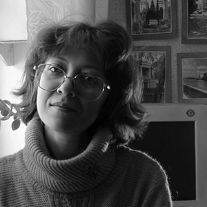
Natalia Vasilyeva | Issue #46 | May 2011
Steve Matteson | Issue #58 | May 2012
[When I began working as a type designer] for Rudolf Hell in 1974, their Digiset machines were still equipped with cathode ray tubes — a low resolution light source. All designs were [drawn by hand] on graph paper with small black squares. The letterforms were constructed from these building blocks. I made large scale drawings, looked at these frequently through a minifier, the opposite of a magnifying glass, and made corrections with white and black paint. These drawings were scanned and stored into the machine as groups of numbers, as commands for yes and no, light on, light off. Then in 1977–78, another German company, URW, introduced the Ikarus system, meaning I could draw my letterforms as pencil outlines on transparent paper.
When the Macintosh quickly penetrated the graphic industry from 1985 onwards the change was dramatic for the industry, but not for me. Many type foundries, typesetting machine manufacturers and typesetting studios disappeared. Rudolf Hell stopped being a client, and I began working with URW instead. Bitstream asked me for a design, and there were several other big clients. So I had a good escape.
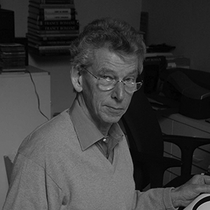
Gerard Unger | Issue #47 | June 2011
Jan [Solpera] lives 7 km from my house in South Bohemia and we work together on his projects. When it’s cold and rainy — we call it “typographic weather” — he comes to visit me and we drink tea, sitting at the computer screen and doing some béziers. I love all aspects [of designing type], including research, exhausting computer work, printout samples, first public appearance, and… the money, because business is part and parcel of our occupation. I like to contemplate my sketches, compare them to existing typefaces, and select one of several possible forms. When I release a typeface, it’s like a child being born, with lots of bugs to be improved. I love the silence in my studio, my tea on my desk, my music during endless hours of work at night.
František Štorm | Issue #2 | August 2007
I consider type design the most self-indulgent career that ever existed just short of being a winemaker, brewmaster or chocolatier — every single aspect of the process is based solely on personal judgment.
Stuart Sandler | Issue #38 | September 2010
Emil Karl Bertell | Issue #66 | January 2013
…the only thing I was sure of was that I didn’t want a real job. I had this idea that I would do lettering for people and they would pay me for it. It finally worked out that way, but it took about ten years of struggling to make that happen. In the meantime I was doing design, illustration, whatever. Just as long as it involved doing some kind of art. I worked for money and for trade. I lettered for beer. I lettered for furniture. I did a logo in exchange for a 1946 Chevy. For a while I painted big canvas “grand opening” banners for a chain of Pizza Palaces. I did about two banners a month and I was paid with free pizza coupons. So for several years I lived on pizza and beer.
Jim Parkinson | Issue #10 | April 2008
I find it a bit frustrating when people think that they can make a hand-made looking font as a side project in two or three days. Of course it is possible to make a font with little effort. But the font is not done when all the little boxes have been filled — that’s actually where the real work starts. People are usually stunned when I tell them that developing a typeface, from the first sketches to the final OpenType font, takes me half a year! Of course there are tools that will make a font in the blink of an eye. You can probably find the results of those on free font websites, if you are looking for that level of quality. These fonts are not necessarily badly drawn, but in my experience most of them have bad spacing and a very limited number of glyphs. The more exotic characters (if they’re there at all) have not received a lot of love, or are just plain wrong.
Ulrike Rausch | Issue #70 | May 2013
I simply enjoy all of this tremendously, and when you work on something with passion you often don’t notice how time passes. This kind of thing is not a nine-to-five job — to me, it’s a way of life.
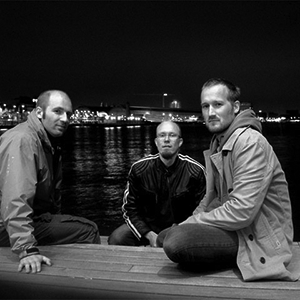
Hannes von Döhren | Issue #36 | July 2010
[Staying together as a group] is much harder and it takes more alertness than starting up a cooperation. While studying we didn’t only spend lots of time together on projects, but also in the pub and on the beach. Now, with our multiple locations, it can easily happen that we only discuss work and drift apart on a personal level. That’s why we get together a few weekends a year, where we do nothing but have a sauna. The main thing is trust. If one of us does something stupid, we don’t lose faith. Next time it will be the other guys’ turn to make a foolish mistake. What keeps us working together is that we keep appreciating the differences. We still get surprised by the stuff on the other side of the wire, and we’re aware that none of us would be able to achieve on his own what we can do together.
Underware | Issue #7 | January 2008
History is often seen as something that passed away, and that’s it. But for me history is one of the most relevant aspects of type design. The modernist movement rejected history as part of the design process, with the results that we know. I believe that we do need to understand history in order to understand ourselves. I believe we are made of history, but I also believe that we should take a step forward by connecting it to the present and the future, and we can do that through technology. With OpenType we can now bring back historical forms, ligatures, swashes and alternate characters into one single file. Since the early days the history of type has always been full of avant-garde ideas, and it is possible to introduce old letterforms to the future generation of readers and designers.
Dino Dos Santos | Issue #5 | November 2007
Type design is a cultural expression … It’s very complex, there are sociopolitical aspects to it. Take the script phenomenon. Scripts have become immensely popular. In America, there is a kind of retro-ironic nostalgia, and I can’t decide whether it’s a backlash to the freedom and experimentation of the ’60s and ’70s — very conservative — or whether it’s a reaction to the high-tech world we live in being so hard-edge that people want something softer and more human. Also, people aren’t writing by hand any more because it’s not necessary, and we kind of miss that in our culture. So there are all these different reasons that script fonts are interesting and people want to use them and design them.
Nick Shinn | Issue #14 | September 2008
Mark Simonson | Issue #18 | January 2009
I think every graphic designer should have a proper knowledge about the history of typography. When you sit down at the computer you should be aware of all the ideologies and influences that have brought you to that moment. Typography in particular relies on existing models of familiarity which influence legibility and the message that people get from a font. It seems false not to acknowledge that when you draw the letterforms. Of course, most designers base their work on historical research in a fairly conventional way, but what I am talking about is whether or not you are explicitly saying something positive or negative with your models of letterforms. For instance, I use the cross a lot in my designs, and on one level it is saying that historically western typography has been linked with the church, while on another level it’s a symbol that a lot of people have a negative view of. On yet another level it plays with the idea that once a word is printed it still seems to have an authority in quite a totalitarian way and finally it’s a direct reminder of the ‘classical’ aesthetic which influenced me so much. I like the fact that all that can coexist in one font.
Jonathan Barnbrook | Issue #39 | October 2010
As a student I had to make my designs unique in order to stand out. Type is a design element that helps accomplish that in a big way. At first it was just things like applying type effects, or slightly modifying a letter here and there to make the design more personal. After graduation, real-world packaging design was an eye-opening experience as it implied looking at type very closely. For example, when you have to design the front of an ice cream container, common “fashion” fonts almost never work exactly the way you want them right out of the box. There are millions of containers that use the word “light”, and the last thing you want as a packaging designer is your design to be plain or impersonal or look like someone else’s.
Alejandro Paul | Issue #25 | August 2010
Ever since there was that big ruckus about the IKEA catalog changing from Futura to Verdana, which I had nothing to do with and didn’t even know about, people ask me about that everywhere I go. I give a talk about something historical and then at the end someone will get up and say: “I started a petition to go back to Futura. You’re a villain!” You get blamed for something you had nothing to do with. There’s a strange misunderstanding. A friendly guy came up to me at a conference recently and said: I signed that petition to go back to Futura. So I asked: what caused you to do that? And he said, well, Verdana is a screen font. You mustn’t use it in print. So I said: OK, well, so you open the IKEA catalog, it’s set in Verdana, with the big prices and everything… how do you tell it’s a screen font? What is it about Verdana that says: this is a screen font? He had no idea. He just knew it because he’d been told. There are many people who make judgments without really understanding what the typographic issues are. Students are interesting — they’ll say things to me like: my professor told me I cannot use Verdana and Georgia in print because they’re screen fonts, but I tried it and it looks perfectly alright. And I can only say: Thank you! Go ahead!
Matthew Carter | Issue 74 | October 2013
Erik Spiekermann | Issue #88 | December 2014
Type is, in my opinion, the foundation of advanced visual communication. You cannot communicate advanced themes in commercial art with only space, size or color. You need type to convince, to persuade. In order to have truly distinctive and interesting branding you need custom type, or at least unique letterforms, to set the brand apart.
Jeremy Dooley | Issue #51 | October 2011
Unlike many designers I do think the world would be a really boring place if everything was perfectly designed. We need a clashing of visual styles, naivety, alien influences to keep design alive and what is often bad can become what we regard as rather good.
Jonathan Barnbrook | Issue #39 | October 2010
?
We’d like to thank you for sticking with us this far — and we hope you’ll find the next 100 issues just as enthralling!
Creative Characters is the MyFonts newsletter dedicated to people behind the fonts. Each month, we interview a notable personality from the type world. And we would like you, the reader, to have your say.
Which creative character would you interview if you had the chance? And what would you ask them? Let us know, and your choice may end up in a future edition of this newsletter! Just send an email with your ideas to [email protected].
In now past, we’ve interviewed the likes of Mika Melvas, The Northern Block, Matthew Carter, Ulrike Wilhelm, Maximiliano Sproviero, Dave Rowland, Crystal Kluge and Steve Matteson. If you’re curious to know which other type designers we’ve already interviewed as part of past Creative Characters newsletters, have a look at the archive.
This newsletter was edited by Jan Middendorp and designed by Anthony Noel.
The Creative Characters nameplate is set in Tabac Slab and Rooney; the quotes are set in Lust, Pilcrow Soft, Massif, Tea Biscuit, Bookmania and FF Meta® Headline. and the large question mark is in Tabac Slab. Body text, for users of supported email clients, is set in the webfont version of Rooney Sans.
We’d love to hear from you! Please send any questions or comments about this newsletter to [email protected]
Want to get future MyFonts newsletters sent to your inbox? Subscribe at:
MyFonts News Mailing List
Know someone who would be interested in this? Want to see past issues? All MyFonts newsletters (including this one) are available to view online here.