|
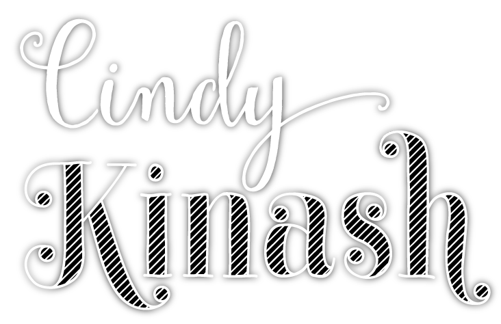
Handwritten fonts have always exerted a special attraction, for they imbue text with warmth and a casual personality. For as long as she can remember, our interviewee this month has always been a fan of hand-drawn letter forms. What began as a passion for decorating page covers for her school assignments as a child turned into an occupation as a successful apparel designer. In her second career as a type designer with her own studio Cultivated Mind, she broke free from the constraints of the apparel industry and now creates popular handwritten and hand-drawn fonts for everyone to use. From Canada’s Pacific Northwest, please welcome Cindy Kinash.
|
|
|
|
|
Have you always been artistic?
I remember that already at a very young age I loved to color and draw. My mother — who is also an artistic person — always encouraged me to practice art, and that played a major role in my passion for anything creative. I joined my first art club at nine years old. That was a lot of fun. When I was twelve I started selling watercolor paintings at local art events in my town. I enjoyed painting watercolor flowers and portraits, as well as painting acrylic on canvas and drawing wildlife.
You started your career in apparel graphic design. How did you land in this specific area of design?
By the time I was in high school I knew I wanted to have a creative career. I took a break after I graduated and snowboarded for a couple of years in Banff, Alberta. Around that time I started to teach myself Photoshop. I loved creating graphics on the computer and thought it would be amazing if I could do this as a career. I got accepted to the Graphic Communications program at NAIT (Northern Alberta Institute of Technology) where I got my certificate in Graphic Communications.
Upon completing the program I decided to move to Vancouver to pursue my career. At first I didn’t exactly know in which direction I should go as a graphic designer, as there were lots of options. Then I got two job offers to choose from. One was in downtown Vancouver doing desktop publishing; the other one was in Maple Ridge just outside of Vancouver designing graphics for t-shirts. I went for t-shirt design because I knew I was more of an artist than a typesetter. This was the beginning of my passion for apparel graphics. I started doing a lot of freelance work for the action sports industry designing graphics for snowboards, skateboards, products, and clothing. At one point I spent a couple of years in Los Angeles working for a company down there. After a while my passion for apparel began to wane, and I realized I needed something new. I was also missing my family in Canada a lot, so I decided to move back home and take a short break to figure out what I should do next with my career.
Before we go on — did you snowboard professionally, or just for fun?
I participated in amateur snowboard competitions from 1999 till 2005. I started snowboarding in 1994 at age 14, then after my high school graduation I moved to Banff so I could snowboard more. I enjoyed snowboarding fast and hitting jumps, and ended up competing in women’s boardercross races. The best I’ve ever placed was fourth in a FIS (International Ski Federation) event. After I chipped my front tooth at my last race, I decided not to compete anymore. Courses were becoming way too dangerous for me.
When I relocated to Vancouver in 2001 I got into freestyle snowboarding and lived in Whistler for a winter season. I loved snowboarding on rails, boxes, spines and jumps. I participated in a lot of local rail jam competitions. Even though I did okay at the events I decided to return to Vancouver to focus on my graphic design career. Now I only snowboard a couple times a year. It’s different now because I’m older — it’s more about spending time with friends and having fun than being competitive.
Where did your interest in typography and lettering come from?
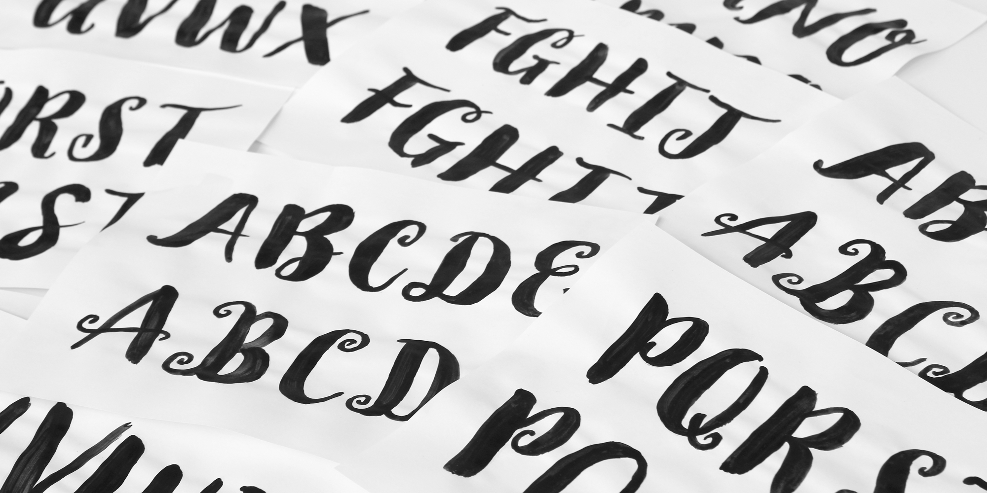
I became interested in typography when I was around twelve years old, when I had to do page cover assignments for school projects. I loved drawing fun bubble letters and frames for them. Around that time my mother had given my sister and me a book with fun fonts and all kinds of different frames. I loved using it as a source of inspiration for my page covers. Throughout my career as a graphic designer the projects I enjoyed the most were the ones where I could draw letters by hand. It just felt so natural and was so much fun. Creating hand lettering was one of my strongest abilities as a graphic designer. Later on in my career I became obsessed with fonts. One thing that struck me time and again was that I really wanted to see more variety. I guess that is one of the reasons why I began to design fonts. I just didn’t see many handwritten fonts out there and felt there needed to be more of them.
|
|
|
Kinash’s latest is the freshly cultivated Garden Grown, a pair of inky, free flowing brush scripts — one for all caps settings, the other a connecting lowercase script, stacked with alternates for each character for a more natural looking hand-drawn effect. Ideal for magazines and brochures, brands, packaging or websites needing an organic touch.
|
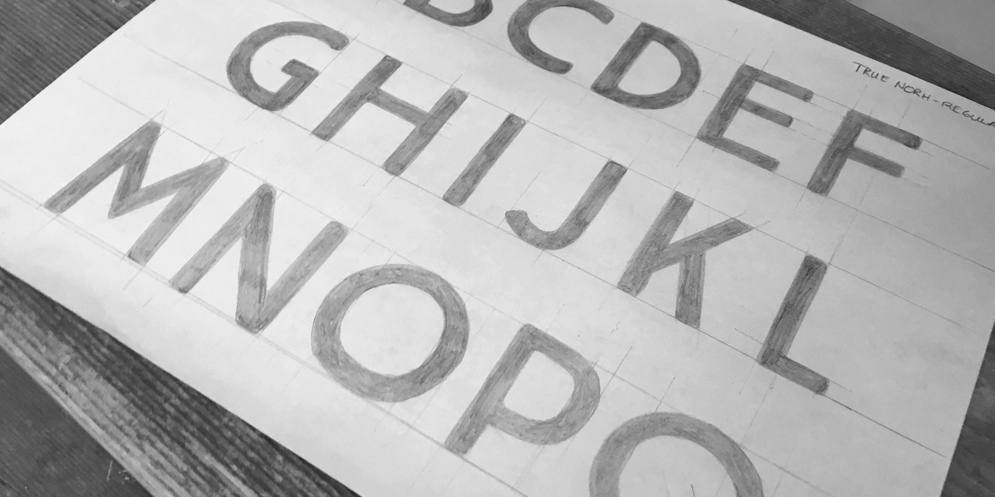
True North is inspired by Kinash’s father’s passion for Canada’s breathtaking outdoors. Together with its supplementary appendix suite True North Textures, these two families make for a comprehensive graphic kit of distressed and rugged display type. Kinash and her collaborator Charles Gibbons have created 38 distinctly characterful variations on the theme of handmade type, with a wide range of effects including Inline, Shadow and 3D, plus connecting scripts and a rich assortment of useful banners, pictograms, catchwords and symbols.
|
|
|
|
Left: Promotional artwork created for Wanderlust Letters using Kinash’s favorite Raphael paintbrush. Right: Production sketches for Wanderlust Letters.
|
|
Why?
Handwritten or hand-drawn letters appeal to me because they add a personal touch that is often lacking in typographic fonts. A handwritten font can make a design look more personal. There is something about handcrafted items that seems to touch people more directly and create an emotional connection. Don’t get me wrong — I definitely love typographic fonts and use them on a daily basis, but for creative projects I really like using a handwritten font. I love pairing them with hand-drawn graphics for an authentic look.
How did you transition from apparel graphic design to typeface design?
After I moved from Los Angeles back to Canada I needed to figure out if I was going to keep working as an apparel graphic designer or go back to school for something new. I didn’t want to throw all my experience and passion away so I thought I should do something similar. My sister had suggested to me at the time “Why don’t you sell clipart?” That sparked a new idea “Why don’t I sell fonts?” I reckoned I had nothing to lose. First I taught myself how to design a basic font. In 2012 I felt ready to release my first typeface Hello I Like You, a hand drawn all-caps design. Since I received a good response I knew this was what I really wanted to do. Even though at the time I still had interviews for apparel design jobs, I rejected them and decided to pursue my love for type design instead.
Do you approach drawing letters for a t-shirt differently to how you draw letters for a font?
When I draw letters for a t-shirt I first take the clothing it will go on to into consideration. This becomes like a painter’s canvas: its dimensions and proportions will influence the design, which will be “framed” by its shape. Then I start sketching and composing stacked or individual words. I never draw individual letters for t-shirt designs, because those letters will only need to work in one single context, in that unique setting. This grants me more freedom to have letters interact with each other - I can have letters interlock, nest a letter into another one, stack letters, and so on.
When I draw letters for a font, my approach is quite different because I cannot predict the context in which that font will be used. My primary concern becomes the usability of the letters. To get a better feel of the character shapes I draw the letters larger than I would for a t-shirt design. Sometimes I create chains of words to get a feel of the design, or sometimes just individual letters; I never create stacked letters like I do for t-shirt designs.
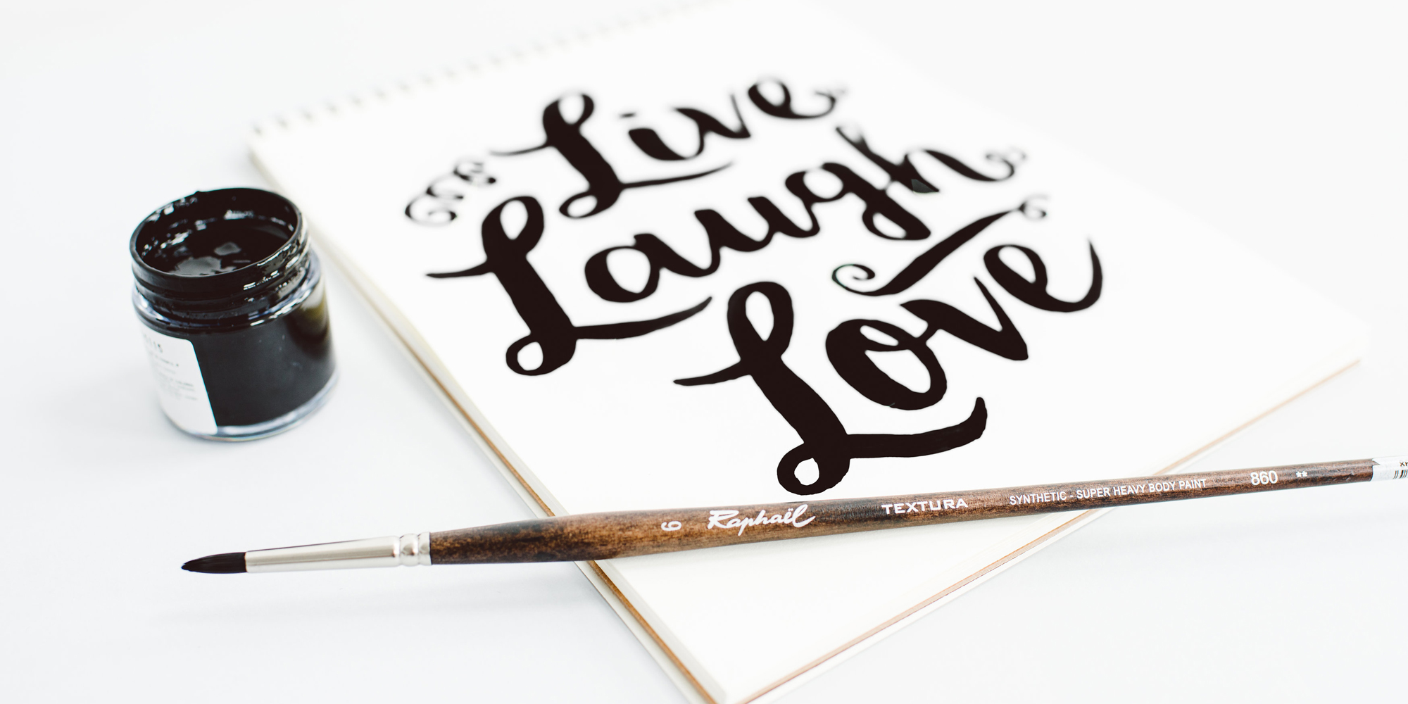
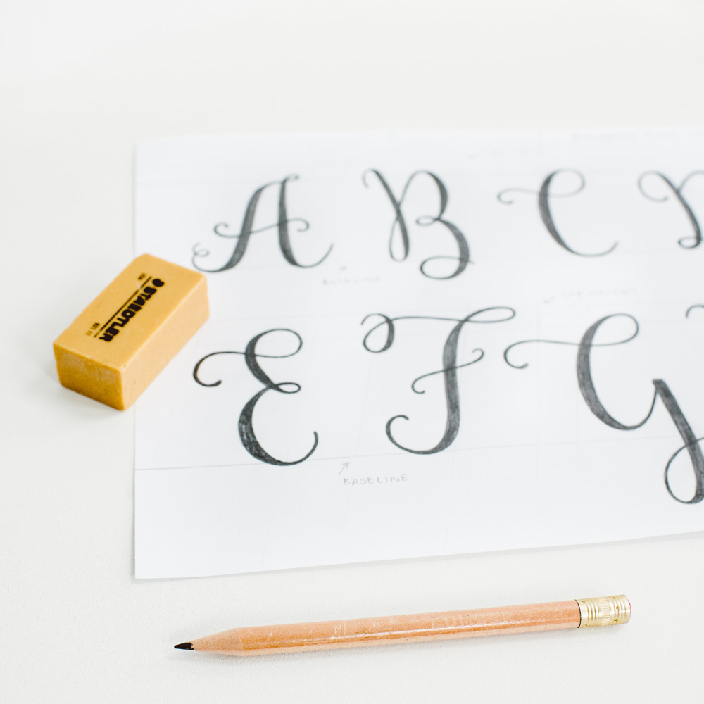
Although I approach both differently in the beginning phase, eventually the end of the creation process is the same. I either ink or paint over my final letter drawings before erasing the pencil marks. If the drawing is too dark to erase then I will trace over my final letter sketches with an ink pen or brush of my choice.
Your fonts start as letters drawn or painted on paper. How do those lead and ink renderings become vector nodes along a path?
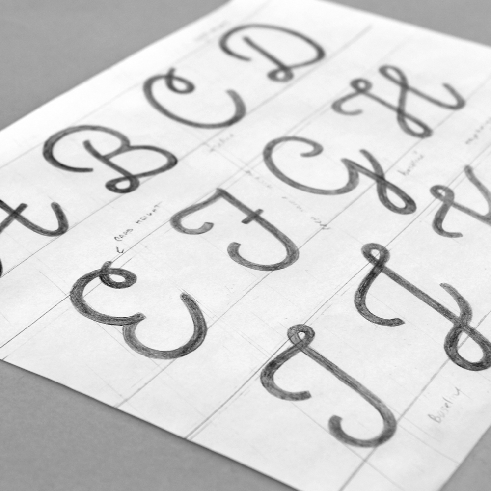
I scan the final letter drawings and then adjust the threshold in Photoshop. Then I convert all the letters in Illustrator using Image Trace. I often have several forms for each letter to choose from so I pick out my favourite ones. Most of the time I will make the extra letters into alternates. I like to keep the letters rough and untouched. In the past I used to clean up the vector letters by smoothing the path and minimizing the nodes. After a while I disliked that my fonts were so clean and the handwritten feel was kind of lost. This convinced me that the letters didn’t need smoothing unless I wanted a cleaner type style. The final step in Illustrator is resizing the letters and preparing them for importing into the font editor.
|
|
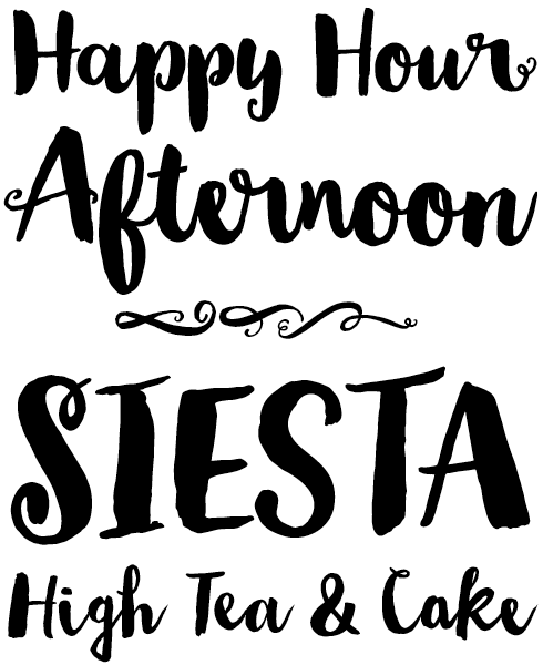
Mulberry Script is a cheerful, charming calligraphic script that dances restlessly across the baseline. Its convincing handmade aesthetic is powered by smart OpenType features that offer a wide range of ligatures, alternative glyphs and ornamental details. Mulberry Script is a great choice for anything from labels and packaging design briefs that require a homely, crafty touch, to personalised items like invites and postcards.
|
Built on the success of her earlier Wanderlust Letters, Kinash’s Wanderlust Collection is a package of thirteen casual, painterly brush scripts whose seemingly artless effect is actually powered by some sophisticated OpenType programming that provides lots of ligatures, alternates and decorative characters to achieve its natural look. The various styles all evoke an energetic, hands-on creativity and will work very well as a companion to lively photographic projects, especially for irreverent, free-spirited lookbooks and fashion shoots with lots of black and white, contrasty pictures.
|
|
|
|
Can you imagine starting a new typeface on a computer, or are your pens, pencils and brushes critical?
I could imagine creating a typographic font on the computer — that would be a new challenge — but not a handwritten typeface. My art tools are critical in how the shapes of the letters turn out: I couldn’t fake it on a computer and wouldn’t want to. I love drawing and painting the letters too much! Plus I am not really a big fan of spending too much time on the computer. I’m much more productive drawing or painting.
Do you see parallels between your love for snowboarding and the style of fonts that you design?
I think my approach to drawing letters for a font is similar to snowboarding down a mountain. I like to feel free and spontaneous when I do both. When I’m snowboarding I often don’t know where I’ll end up: I like to take random trails and try new things. The same thing applies to creating hand lettering for a font. I can seldom predict what my final letters will look like.
How do you marry the spontaneity of a hand-drawn or handwritten font to the systematic approach of a typeface?
When I design a handwritten font I try to maintain the spontaneity of hand lettering by having the letters bounce at the baseline. I make sure the typeface flows nicely from one character to the next, so it captures the same feeling as the chain of words I’ve painted or drawn. One important characteristic of hand lettering is that the shapes of letters tend to change according to which other letters come before or after them. This is why I create many alternates and ligatures by drawing lots of word chains and multiple versions of individual letters to mimic actual handwriting. I just love creating alternates and often end up with too many of them. I can get really absorbed in this process, adding more and more extra versions of letters. Because I find it’s never enough it tends to slow down the process, so I often need to force myself to stop, or my typefaces would never get published.
Something that must also be lots of fun is creating the borders, the little illustrations, the catchwords and so on.
Don’t get me started, haha! I love creating borders, illustrations and catchwords. When I started designing type, art was a higher priority to me than it is now. I created the fonts, the posters and the art simultaneously, and just like with the alternates I often ended up with too many illustrations. There’s a lot of art included in Luella, one of my older font families, as I didn’t want to see all my little drawings go to waste. Now I only decide what type of art will be included with my font family at the end, when I am creating the specimen graphics and it is much easier to see where the art will fit in. The art has more purpose and works much better with the fonts.
Creating different weights in typographic fonts is quite different from creating them in handwritten or hand-drawn fonts. What technique do you use?
It really depends on what kind of handwritten font it is. For a design with soft contours like Mulberry Script I add a stroke to the letters in the type design program, because adding a stroke will not affect the character of the type style. However if I want to maintain the rough edges from the regular weight like in True North, I add a stroke to the regular letters in Adobe Illustrator, then print them in grayscale and redraw each black letter. This is a much longer and more involved process, but adding a stroke in the font program or Adobe Illustrator would turn a font with rough edges too smooth.
|
|
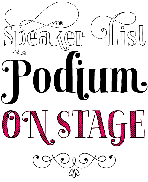
La Chic is a set of three hand-drawn Bodoni-esque faces, each with a different fill style (Solid, Outline and Shaded), plus a complement of matching frames and flourishes. A Pro version of each style adds eye-catching enhancements like swashes and ball terminals for extra headline impact, while the basic versions will be great for users of non-OpenType enabled software and for web designers looking to bring some flair to their title settings and mastheads.
|
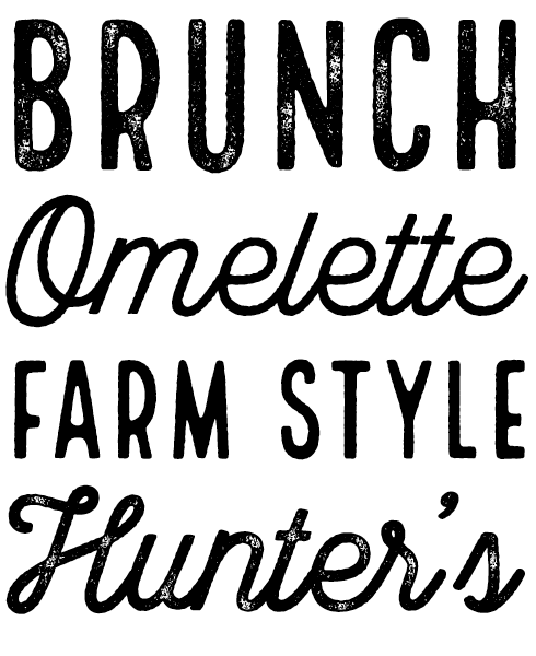
From earlier this year, Local Brewery is Kinash’s most successful release to date. It’s a relatively modest eight font family, a collection of six vintage-styled scripts of varying degrees of roughness and degradation, together with a pair of upright, narrow, all-caps grotesques. These two contrasting yet complementary display faces combine to make an appealing and handy package for those contemporary merchandising projects that call for a brand of unpolished, organic authenticity.
|
|
|
|
From left: Sketches for True North, Local Brewery and Mulberry Script
|
|
You said earlier in the interview that a handwritten font can make a design look more personal. Do any of your fonts have a personal story behind them?
True North is inspired by my father’s life. He was an outdoors enthusiast from northern Canada. He recently passed away in 2012 so I wanted to dedicate a font family to him that reflected what he loved most. The wilderness of northern Canada reminded me of him. I also found all these old photos he took and this inspired me to make this collection with a 1940s to late ’50s feel. I even used my father’s vintage photos for the True North posters.
For the font inspiration I wanted a combination of a vintage script and a useable sans serif. During my research of vintage graphics I found a lot of imperfect sans serifs paired with monoline scripts. Originally I was only going to include the script and a single sans serif design. As I liked how the sans serif turned out I thought it could work great in different styles and developed all those variants.
Has running your own type design studio been everything you hoped it would be?
Yes and more: it is insanely busy! This is a dream come true but I wish I could make fonts faster and do everything faster. I’m a perfectionist who obsessively looks over everything. I have tons of ideas for typefaces yet I can’t do them all. For True North and Local Market I collaborated with Charles Gibbons. He developed the script fonts for these collections, working from the vector letters I sent him. At the time I had no experience in creating scripts so it was great to have someone as experienced as Charles to take care of that aspect. Now that I know how to properly build scripts I prefer to do this myself for my own type families.
Furthermore I get help from a font developer who does my final font updates and programs OpenType features when needed. Recently I wanted to try something new and showcase my latest font collection Garden Grown in a different way. I collaborated with graphic designer Corinne Alexandra who designed all the poster art for this type family. She’s very talented, and I really admire her work. I think getting other designers to collaborate on posters is something I would like to do again. I love seeing other designers use my fonts.
Thanks Cindy, it was a pleasure talking to you!
For some more peeks behind the scenes at Cindy’s studio, check out her recent #fontface takeover on our Instagram feed.
|
|
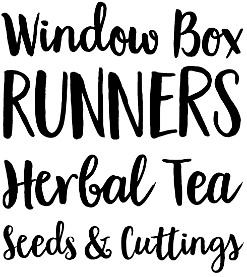
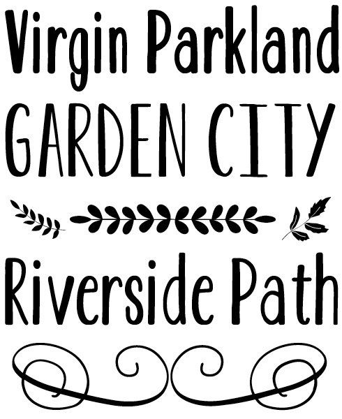
The wobbly, roughly hewn letters in Pacific Northwest Letters recall the character of driftwood ornaments and furniture, and belong firmly to the church of shabby-chic stylings. Children’s book illustrators will appreciate their sympathetic, non-threatening character, while the carefully constructed irregularity of the forms will appeal to designers working within the craft-anything revolution. The family is rounded out by a selection of Kinash’s imaginative border and label designs.
|
Kinash made her first impact on our Hot New Fonts list with Luella back in the fall of 2012, and as she mentions in our interview, is the family where she really got to indulge her passion for making series of frames and borders and other art — the family has no less than six fonts dedicated to non-letter art! The lettering itself has a pleasing naivety, with the lowercase letters in particular showing a kind of intrinsic irregularity. Its natural feel and untutored simplicity will make it a good choice for organic food packaging.
|
|
|
|
|
Who would you interview?
Creative Characters is the MyFonts newsletter dedicated to people behind the fonts. Each month, we interview a notable personality from the type world. And we would like you, the reader, to have your say.
Which creative character would you interview if you had the chance? And what would you ask them? Let us know, and your choice may end up in a future edition of this newsletter! Just send an email with your ideas to [email protected].
In now past, we’ve interviewed the likes of
Mika Melvas, The Northern Block, Matthew Carter, Ulrike Wilhelm, Maximiliano Sproviero, Dave Rowland, Crystal Kluge and Steve Matteson. If you’re curious to know which other type designers we’ve already interviewed as part of past Creative Characters newsletters, have a look at the archive.
|
|
|
MyFonts on Facebook, Tumblr, Twitter, Instagram & Pinterest
Your opinions matter to us! Join the MyFonts community on Facebook, Tumblr, Twitter, Instagram and Pinterest — feel free to share your thoughts and read other people’s comments. Plus, get tips, news, interesting links, personal favorites and more from the MyFonts staff.
|
|
|
|
|
Comments?
We’d love to hear from you! Please send any questions or comments about this newsletter to [email protected]
|
|
|
Newsletter archives
Know someone who would be interested in this? Want to see past issues? All MyFonts newsletters (including this one) are available to view online here.
|
|
|
|