|
Typefaces passed through many different media before arriving at the digital fonts that are installable on our PCs today. The careers of our interviewees this month have followed a parallel path, moving through each successive typesetting technology — each began their type design careers in analog media, producing fonts for photo-typesetting or dry-transfer lettering, back in the days when digital type was still in its infancy. After working for various studios and collaborating with other type designers, they joined forces in 1989 to create their type design studio The Foundry in London, going on to fill dozens of custom type commissions, and publishing 34 commercial typeface families (all now available in OpenType format and as webfonts). Nowadays their collaboration bridges the North Sea, with Freda living and working in central London, while David is based in Amsterdam. Please say hello to Freda Sack and David Quay, maestros of modern type founding.
|
|
|
|
|
Freda and David, you’re each among the most experienced designers working in type today. Where did your love of letterforms develop?
Freda Sack: That is very kind of you to say! I discovered my fascination for letterforms at school, when we practiced calligraphy in art class. In addition to a natural love for language and literature, my school experiences with art led me to enroll at the Maidstone College of Art’s School of Printing. Their hands-on approach suited me well, and I learned traditional typography there. We had classes in typesetting, printing, and photography, too — even bookbinding and lithography. Whatever we didn’t typeset ourselves, we would letter by hand.
David Quay: When I was ten, I bought a book on the American Wild West at a jumble sale. Its illustrations excited me more than the stories. I loved the wood type Wanted Posters, and I tried my hand at making a whole alphabet inspired by them. Later on, at 14, my art teacher encouraged me to apply to art school for commercial art, as it was then called. I turned my hobby into a profession at Sidcup College of Art and Design. They introduced me to illustration, as well as etching, lithography, screen-printing, and wood engraving. A year later, Sidcup was absorbed by Ravensbourne College of Art and Design. That school had a strong modernist tradition, and the Bauhaus and the new Swiss typography greatly influenced the graphic design curriculum. However, Ralph Beyer was one of the lettering teachers; he had been an assistant to Eric Gill. The large stone panels in Coventry Cathedral had made Ralph successful, and I starting working for him as a freelancer. The knowledge about the underlying structure of letterforms I gained from him was invaluable — a great contrast to what I learned in school.
Freda: My college was near Letraset in Kent. Once I was finished, I started working there. My first job in the type industry! Since they were unionized, or a “closed” shop, I had to earn my union card by retouching film for Letraset’s dry transfer lettering and Letratone sheets for six months. After this painstaking work, I finally made it into the type studio as a trainee, where my five-year apprenticeship began. We drew artwork for all possible kinds of letterforms. My next job was with a London design company called FONTS/Hardy Williams. I was a senior type designer for Adrian Williams; we produced phototype fonts that the advertising industry used to set headlines. Type directors from design consultancies would brief us, and our jobs were done under pressure, subject to ridiculous deadlines. Still, we put every effort into creating beautiful handcrafted type. Clients understood that type and typography are the essence of communication. Each typeface elicits a different audience reaction, however subtle.
David: After college, I kept busy with various graphic design jobs. These always involved some form of lettering. For a while, I was a freelance art director for Secker & Warburg, one of the last small independent publishers in London. In one year there, I designed or art directed over two hundred book covers! Colin Brignall, who was then the type director at Letraset, saw some of these in an exhibition. He asked me to expand my cover lettering into full alphabets. This is how I met Freda; in the Letraset studio, she was secretly redrawing my rather dodgy attempts at type design. After my Letraset typefaces were published, I received my first serious typeface commission for Berthold, and named it Helicon.
Freda: David and I decided to go it alone after that, and start our own business. This is how The Foundry was born. The rest is history, as they say!
The Foundry’s first release was your Foundry Old Style family. How did this typeface come about? Is it a Venetian revival?
David: Foundry Old Style is loosely based on late incunabula models, like the typefaces cut by Nicolas Jenson and Francesco Griffo. However, the design is more of a free interpretation; it isn’t based on any specific historical type (you can trace some Jenson or Griffo revivals back to specific Renaissance books). Instead of reviving pre-existing letterforms, I wrote out all the letterforms myself, with a broad pen. As much as possible, I wanted to retain the structure of the pen stroke in the fonts’ final digital outlines.
Brody Neuenschwander’s Letterwork, published by Phaidon and designed in your studio, uses Foundry Old Style and Foundry Sans. Did you intend for those typefaces to be used together?
Freda: Well, it is true that they are used together there. We actually favour very reduced typographic palettes ourselves; one specific typeface, used in a limited range of weights.
David: Exactly; I try to never mix typefaces. Since Foundry Old Style and Foundry Sans were The Foundry’s first two designs, we did tend to use them a lot ourselves — sometimes we combined them together. The best way to prove a typeface is to try it out on live projects, like in this book.
Freda: While creating Foundry Sans, David was inspired by the forms and proportions of Garamond’s typefaces. It is little known that the first sans serifs were pre-twentieth century. Their individuality can act as an inspirational model, so that news sans faces can also have a hint of personality in them. You just shouldn’t go overboard too much!
|
|
|
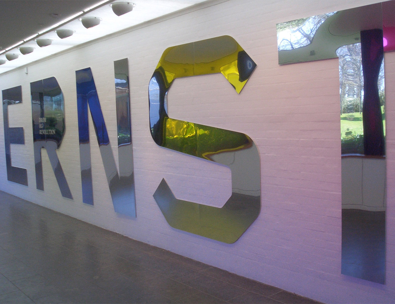
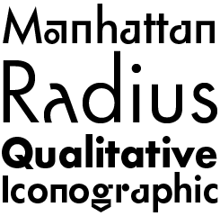
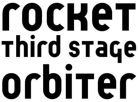
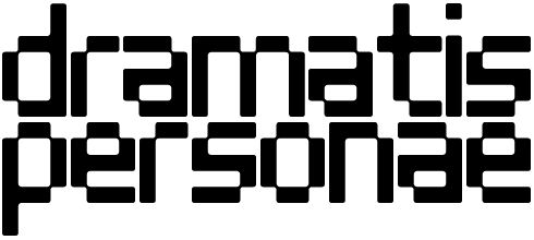
In the 1960s, Dutch designer Wim Crouwel created a single-weight monospace typeface. Intended for typewriters, it was never manufactured. The Foundry initially transformed it into a single weight digital face as part of the Architype collection in 1997. It was expanded to a four weight family due to popular demand, with the italics and an extra bold weight added just last year. Thanks to his devotion to systems in graphic design, Crouwel’s contemporaries affectionately called him “Mr Gridnik.” This is how Foundry Gridnik received its name. It also explains its aesthetic: Foundry Gridnik is grid-based, with a human dimension setting it apart from other geometric fonts.
|
|
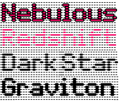
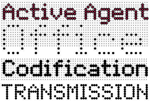
The double families Foundry Flek/Foundry Plek and Foundry Dit/Foundry Dat share a graphic language derived from the same dot matrix grid system, with Flek/Plek based on dots, and Dit/Dat on long dashes. The four families each include four weights, with a selection of dot patterns that can extend the grid vertically and horizontally. Each weight’s underlying matrix allows experimentation with overlays, and mixing weights produces stunning effects. Foundry Plek works well for serious correspondence, since it looks like a “typewriter font.” Foundry Flek and Foundry Dat’s letters all have integrated dot/dash matrix points in the background.
|
|
|
|
|
|
|
|
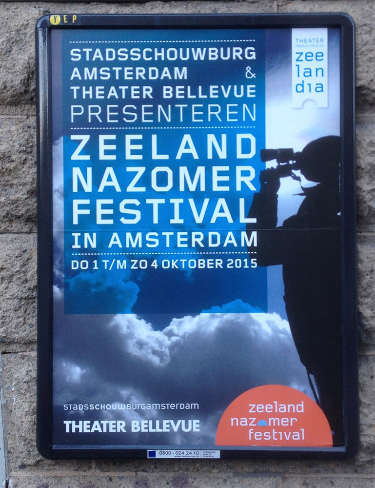
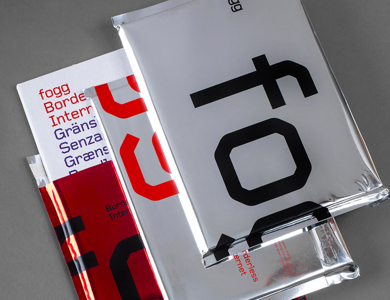
Foundry Gridnik in use, from left: Louisiana Museum of Modern Art, Humlebæk, Denmark; on a Theatrical poster from Amsterdam; Gridnik is integral to this new brand for Swedish telecoms enterprise Fogg, by Kurppa Hosk.
|
|
|
If Foundry Old Style is a synthesis of some incunabula roman types, did you exercise a similar process while designing Foundry Wilson?
David: No, Foundry Wilson is a true revival. Personally, I prefer to make new typefaces, but we were asked to submit a “very English typeface” design to ITC. We tried a revival of Alexander Wilson’s types out. Interestingly enough, ITC rejected our submission. Perhaps they considered it too idiosyncratic? Nevertheless, their decision turned out to be fortunate for us. We carried on developing the typeface, and it became very successful. We were faithful to the original in our design process; even the bold weight is based on an existing type.
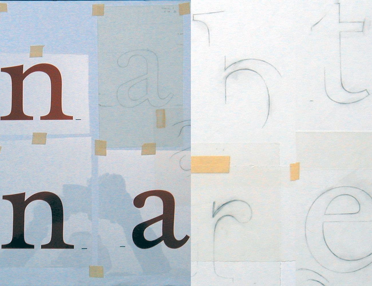
Freda: Yes, we thoroughly researched the history. Foundry Wilson is based on metal type from the mid-18th century; Alexander Wilson was a contemporary of John Baskerville, but Wilson’s type was much more robust and we thought these letterforms were very elegant and beautiful. As David says, Foundry Wilson is our only real historical revival. It was also the last typeface where we drew the whole design by hand. We love drawing, and this was a joy to create. Although our work is all digital now, I do still like to sketch ideas out first — with a pencil, on paper. Clients always love drawings. Believe it or not, we’ve even had several requests to purchase the original drawings or concept sketches behind our typefaces.
David: I still think drawing is an essential skill. When I teach, I make students draw with pencils. They may all moan loudly at first, but about halfway through, they really start enjoying it. Once they’re finished, they’ll often tell me that the experience taught them to see things differently.
Freda: When I started working as a freelancer, I created artwork for designers like Erik Spiekermann and Matthew Carter. I learnt so much from working with their drawings; it was really a privilege to meet some of the greats of that time (still are great of course!). In the same way, Veronika Elsner was my guru in the digital arena. Back then, we were all trying to learn the extreme intricacies of the early, rather counter-intuitive computers. This was long before more user-friendly applications came along.
|
|
Foundry Wilson revives eighteenth-century types from Scottish typefounder Alexander Wilson, a learned and cultured figure who produced many exclusive faces for the Foulis brothers’ classics, published by Glasgow University Press. The Foundry’s digital interpretation is robust and lively, displaying a beautiful color and texture on the page. Freda and David consulted original prints at the St Bride Library, London; Foundry Wilson’s letterforms are faithfully redrawn from these sources. Each font includes several printers’ flowers.
|
|
|
|
Published in the pre-OpenType era, Architype Renner was one of the first geometric sans serifs in digital format to include alternates, ligatures, and oldstyle figures. Now, it’s common for fonts to have hundreds or thousands of alternate glyphs. When you designed the Architype Collections, how much did you have to diverge from your source material to create good, working typefaces?
Freda: For the most part, the Architype Collections are revivals of lettering, not actual typefaces. In fact, some of them are based on just a few letterforms, originally made for a single poster. We remained as true as possible to the original source material. This is why most of the Architype Collection fonts, aside from Architype Renner, have such limited character sets.
David: Freda and I both share a deep passion for the early years of the European avant-garde. This includes work from De Stijl and the Bauhaus, as well as other art movements from the 1920s through the 1940s. Some of the designers behind the lettering that inspired these typefaces were architects. They constructed their letterforms geometrically, as any engineer would. This was intriguing for us; it isn’t necessarily the type designer’s approach. We developed the characters in the Architype Collections’ fonts so that they would be as close to the original letterforms as possible. Certain new symbols had to be drawn to offer today’s users a workable character set. The source material for these typefaces was groundbreaking and art-historically significant, so we wanted to be sure to credit it. We also wanted the Collections to be something of an educational exercise. For the first Collection, we created a poster that was a fold-out type specimen, with contextual history.
Freda: It isn’t uncommon for type designers to have to create new characters that match pre-existing letterforms. Before starting The Foundry with David, a good portion of my work for other typefoundries — and also for Letraset, much earlier in my career — was re-mastering typefaces designed for previous technologies into new formats, as well as extending their character sets. It was both a learning process and a creative one, too. Often, my task would be to amend and enhance submissions from artists who weren’t really type designers, per se. They had developed a good idea, and I filled in the gaps and made their alphabets work as entire typefaces.
FontsInUse collects samples of typefaces used in the real-world. Currently, they’ve received more examples of designs with Foundry Gridnik than any other of The Foundry’s typefaces. Why do you think Foundry Gridnik speaks to so many graphic designers?
Freda: Foundry Gridnik is definitely one of our most popular faces — a sans with an informal geometric look. You might think its personality would limit its use, but this hasn’t been the case. Many designers select it for work whose subject matter is about architecture or design. It had a bit of a cult following with some very good designers in various parts of the world, and it was taken up quite quickly by Arena magazine in New York. The letters work well in three-dimensional materials, too, so it’s often implemented in signage. The fact that it originates from Wim Crouwel also increases its appeal. Foundry Gridnik is also regularly ripped-off — proving rather well the axiom that imitation is the sincerest form of flattery.
David: A lot of geometric typefaces are hard and cold, but Foundry Gridnik is subtly humanistic. This lends the design a sense of machine modernity; at the same time, it has accessible warmth. Foundry Gridnik is a rational typeface, and Crouwel made the initial design in the 1960s, when modernism was still in its ascendancy. It has strong and appealing geometric forms, although they are tempered with the friendliness of the typewriter style — no surprise, since it was originally commissioned for use in that environment. We’ve heard people call it “the thinking-man’s Courier.”
|
|
David and Freda’s Architype Collection includes 23 fonts based on the lettering of 10 early to mid-twentieth-century modernist architects and designers, such as Herbert Bayer, Theo van Doesberg, Jan Tschichold, or Wim Crouwel, who collaborated with The Foundry on nine of the fonts. Previously, designs like Architype Bill, Architype Van der Leck, or Architype Vierkant hadn’t been cast as metal printer’s typefaces; the Architype Collection represents the first time these letterforms were made available as fonts.
|
|
|
|
|
|
|
|
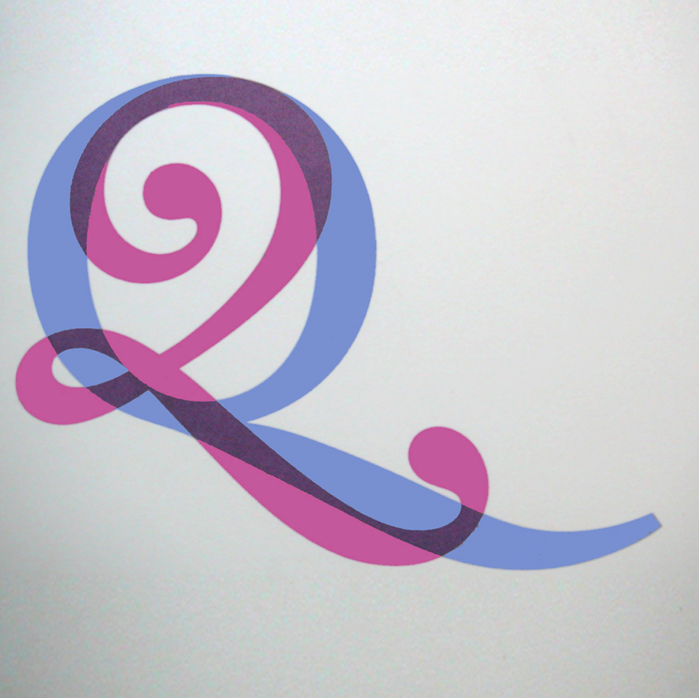
Foundry Wilson is a revival of metal type cast by the eighteenth-century Scottish typefounder Alexander Wilson. Left: some of Freda and David’s drawings for Foundry Wilson. They drew each letter in the typeface family by hand before digitizing them. Center: Overlaid Qs showing Foundry Wilson’s alternate swash style. Right: A poster by David and Freda shows Foundry Wilson set together with Foundry Flek.
|
|
|
In addition to creating retail fonts, The Foundry also develops custom typefaces. Do you have examples of client work that influenced your retail projects?
David: Of course, both influence each other. Two of our custom typefaces directly inspired Foundry Sterling. The first was Brunel, a sans serif face that we designed for British Rail. We also made another sans for British Gas.
Freda: When you work on a custom typeface, you’re often working to much stricter criteria. I think that the tighter the parameters are, the more creative you need to be. I like that challenge. I think some of our best typefaces evolved from working in areas where we perhaps might not have initially ventured.
Since 2013, The Foundry’s typefaces have been exclusively distributed by Monotype, including on MyFonts. When this deal was arranged, you hoped that the agreement would help you focus on what you want to do most: make more typefaces. How has this worked out?
Freda: It’s certainly given me more creative space. As The Foundry grew, my career turned into a full-time business occupation, eclipsing hands-on designing. In many ways, it eclipsed my other creative pursuits, too. Although I had been art directing a lot of projects, I missed the hands-on approach. Since working with Monotype, the pressure of dealing with customers, licensing and technical issues has been alleviated. I’m pleased to say that this has given me the freedom and opportunity to follow all sorts of avenues I wouldn’t have previously considered. Time still dictates when and if an idea will be developed into a new typeface at The Foundry; we have a drawer full of typefaces at various stages.
You’re both involved in education. Students entering the design profession today have access to a broader range of media than before; they also work with different tools than those common forty years ago, or even twenty years ago. Is there anything that you’d like to impart to students reading this interview?
Freda: Regardless of the tools or media used, a designer’s job is first and foremost to communicate. You are the bridge between an author or originator on the one hand, and readers, users, or viewers on the other. Make sure you understand what you’re designing. Find a way to communicate the original message. Utilize type and typography to capture the essence of the subject, and enhance the reader’s assimilation of it. Being visually literate doesn’t necessarily mean looking at lots of other designs; have an open mind and look around your environment to see how different materials, spaces, and experiences communicate. Above all, I recommend reading on lots of subjects.
David: Keep a sketchbook with you at all times and jot down ideas. Observe constantly. Sketch what you see around you. When out with friends, scribble on beer mats. Type is a passion, and can become an obsession, too. There are a great many sources of inspiration out there in your own surroundings, in second-hand markets, on old hand-bills, posters, bookplates, etc.
Freda: When we were starting out, the transition from lead type to dry transfer lettering and photo-typesetting opened up more opportunities for designers who wanted to create typefaces, providing they had the necessary skill, knowledge and patience. Type designers were nowhere near as numerous as they are today, so it’s a much more competitive area to work in. However I’d still recommend the same ethic whatever media you are working with or for — keep true to yourself and your passion for type, be individual and strive to say something different with your designs.
David: I recently had an interesting conversation with Toshi Omagari, a type designer at Monotype, about the soul of a letter. Many of today’s fonts are rather bland. After drinking a few pints, we decided this is caused by the technical production method for fonts today. Designers often create a family by making their Extra Bold and Extra Light masters first. After these are finished, the intermediate weights are all interpolated by font-editing software. This makes the Regular weight just a result of the interpolation process, but that’s the weight which gets the most use! A compromise between the two extremes has no soul. Toshi says that he always makes three masters — those common two, plus a third for the middle weight. This is where the soul of the typeface resides, and that is the way we have always worked — from the regular weight outwards.
It was a pleasure to meet you both!
Until midnight EDT, Nov 4th, The Foundry are offering 50% off a selection of families, including many of their Architype series, along with Foundry Dit/Dat, Flek/Plek and a few others. See a full list here. Enjoy!
|
|
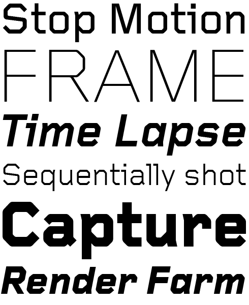
Foundry Form Serif was developed concurrently with Foundry Form Sans, and both typefaces were released together. Their cap and x-height proportions match each other; however, the two families can function independently, too. Foundry Form Serif has a more refined contrast between its thick and thin strokes, and it also has a true italic. Foundry Form Serif works well on low grade papers; its sharp serifs and angularity retain maximum clarity there.
|
A modern humanistic sans, Foundry Form Sans is drawn with a strong horizontal emphasis, to maximize readability. The design aims to appear like a series of short low waves, flowing in a strong rightward direction. This powerful lateral dynamic makes it ideal for on-screen use. Its design simplicity is balanced with enough character to achieve a unique and timeless look. Slightly condensed proportions ensure an economic use of space. However, counterforms remain quite open, improving legibility at small sizes.
|
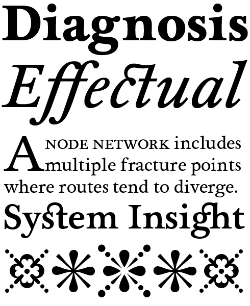
Like Foundry Form, this typeface also has a strong horizontal emphasis. Foundry Origin works well in print and on screen. It is a quiet slab serif for text sizes. The design’s elemental quality hints at its “Egyptian“ roots, making it different from other serif text faces. Foundry Origin’s elegant upright fonts are paired with one lyrical cursive italic font. A generous x-height and classical proportions make this family ideal for editorial and information design.
|
|
|
This edition of Creative Characters was edited by Dan Reynolds
Dan Reynolds is an independent designer with a focus on letters: he draws typefaces, builds fonts, writes about typography, and teaches, too. Originally from Baltimore, he’s spent most of his adult life in Germany, living in Berlin since 2009. From 2011 he has been part of the communication design faculty at the Braunschweig University of Art, following seven years at Linotype GmbH — first in the product marketing department, and then in the font development group. He was a co-founder of the Offenbach Typostammtisch; similar type-focussed meet-ups have since opened in Basel, Berlin, Hamburg, Saarbrücken, Stockholm, and Zürich.
|
|
|
|
|
Who would you interview?
Creative Characters is the MyFonts newsletter dedicated to people behind the fonts. Each month, we interview a notable personality from the type world. And we would like you, the reader, to have your say.
Which creative character would you interview if you had the chance? And what would you ask them? Let us know, and your choice may end up in a future edition of this newsletter! Just send an email with your ideas to [email protected].
In now past, we’ve interviewed the likes of
Mika Melvas, The Northern Block, Matthew Carter, Ulrike Wilhelm, Maximiliano Sproviero, Dave Rowland, Crystal Kluge and Steve Matteson. If you’re curious to know which other type designers we’ve already interviewed as part of past Creative Characters newsletters, have a look at the archive.
|
|
|
MyFonts on Facebook, Tumblr, Twitter, Instagram & Pinterest
Your opinions matter to us! Join the MyFonts community on Facebook, Tumblr, Twitter, Instagram and Pinterest — feel free to share your thoughts and read other people’s comments. Plus, get tips, news, interesting links, personal favorites and more from the MyFonts staff.
|
|
|
|
|
Comments?
We’d love to hear from you! Please send any questions or comments about this newsletter to [email protected]
|
|
Subscription info
Get our monthly designer interviews, popular new fonts, the latest trending promotions and free font goodness to your inbox. Sign up here: MyFonts Mailing Lists
|
|
Newsletter archives
Know someone who would be interested in this? Want to see past issues? All MyFonts newsletters (including this one) are available to view online here.
|
|
|
|