|
Our interviewee this month hails from Japan, but since 2001 he’s been working in Germany, designing typefaces and art directing type projects first for Linotype, and now Monotype Imaging Inc. His original designs show a love for the hand-made and the analog — his first typeface for the western market, FF Clifford, is an object lesson in how digital outlines can attain the quality of the finest letterpress printing and won him awards and international recognition. He’s worked intensively alongside three 20th-century greats, Hermann Zapf, Gudrun Zapf von Hesse and Adrian Frutiger, to create major new releases of their classic designs. A recent MyFonts bestseller, the multi-personality Between type family, and the massive new Latin/Japanese Tazugane Gothic type system, the first original Japanese typeface in Monotype’s history, are only the latest milestones. Meet Akira Kobayashi, prolific analog interpreter to a digital world.
|
|
|
|
|
Since its release a few months ago, the Between family has been a big success. It’s unusual for its combination of three distinct sans serif styles under one “roof.” Does this kind of variety within one typeface family have any precedents?
Well, I was working on three different sans serif typefaces at first, all at the same time. These eventually got combined into the new Between font family. A few years ago, I showed sketches of those designs in progress to my colleague, Nadine Chahine. She came up with the idea of having them all be part of the same system. That idea hadn’t entered my head before, but it made sense. All three designs did share the same sort of DNA. Other type designers have used “informal” variants to expand their families before. Sumner Stone’s ITC Stone family not only includes a sans and a serif, but also the third ITC Stone Informal sub-family. Gerard Unger’s ITC Flora also relates to his Praxis and Demos in a similar way.
Aside from Between you’re also behind the design of a number of successful commercial sans serif families, like the Avenir Next, DIN Next, Eurostile Next, and Neue Frutiger designs. How did working on those previous sans serifs influence Between?
For Between 1, I was strongly influenced by DIN Next, Eurostile Next, and Neue Frutiger. They are all my favourites, and I wanted to develop a good mixture between squarish-looking types — like DIN Next and Eurostile — and humanist sans serifs like Frutiger. For a long time I’ve been asking myself, “What makes types like DIN Next and Eurostile Next so attractive?” “What makes Frutiger so easy to read?” “Why don’t we integrate squarish letterforms into the rhythm of humanist sans serifs?” Between 1 is my answer to those questions. My first sketches for Between 2 date back to the 1990s. I had conceived it as a sans to accompany a casual slab serif design that was also in progress (this later became my Cosmiqua). Between 3 is a more casual version of Between 2, so these two variants have little influence from the type families I have been working on over the last several years.
You started designing type with analog tools, and also studied calligraphy in England for a time. Do Japanese graphic designers of your generation typically have strong analog backgrounds, or was it your interest in letters that drove you to focus on the mastery of these tools?
Most of the influential Japanese type designers I know do have a strong analog background, but I don’t think mastering calligraphy is the one and the only way to understand type design. What really matters is to realize the importance of counter forms. For me it was easy to understand this because I learned both Japanese and Western calligraphy, but I believe learning it through other tools or methods is also possible. Traditional crafts such as paper cuts can be a good option. We can still see exquisite paper cuts as a kind of folk art in China, and also in the Berner Oberland in Switzerland. Many of them are patterns cut out from a piece of red or black paper, sometimes without a single letter appearing in them. Whenever I see these, I feel like they could be good training exercises for type design or graphic design students. In Adrian Frutiger’s atelier in Bern, there was a small paper cut. I think this craft had a great influence on his very fine sense of finding a good balance of black and white.
When you joined Linotype in the early 2000s, you began to undertake collaborative projects with Hermann Zapf and Adrian Frutiger, bringing the Optima and Avenir designs into the OpenType format. Regarding OpenType features like ligatures, oldstyle figures, and small caps, did your co-designers need any convincing?
Both Hermann and Adrian were very open-minded and understood very quickly what was required in the updated versions of their classics. At an early stage of the Avenir Next project, one day Adrian surprised us by drawing oldstyle figures without hesitation. One of my archive photos taken in Adrian’s atelier in April 2003 shows him drawing the oldstyle figures with the red pen I was using to mark up corrections on the print-outs. At that time, while taking notes on the proofs in front of me, I was making a proposal to add oldstyle figures and small caps to the family. I was going to explain the OpenType format, and possible typographic variations that made use of that then-new technology. But Adrian immediately started drawing figures; I didn’t have time to pass him a more suitable pen for sketching. Hermann also had similar ideas for Zapfino, a typeface he designed in the 1990s. It had at least a couple of variations for each letter of the alphabet. So I did not need to convince them. It seems that the OpenType technology was developed to catch up with their ideas.
|
|
|
The Between project is Kobayashi’s most recent design, and is something of an individualistic take on the structure of the type family. Comprising three “states of being”, it’s an unusually flexible proposition: Between 1, is a technical modern square-ish sans; Between 3, a smooth and cheerful informal variety; and Between 2, which straddles the two extremes, marries the trustworthiness of 1 and the friendliness of 3. It’s perfect for those situations where a typeface family has to be both sober and robust, yet approachable and reassuring in different contexts.
|
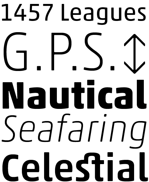
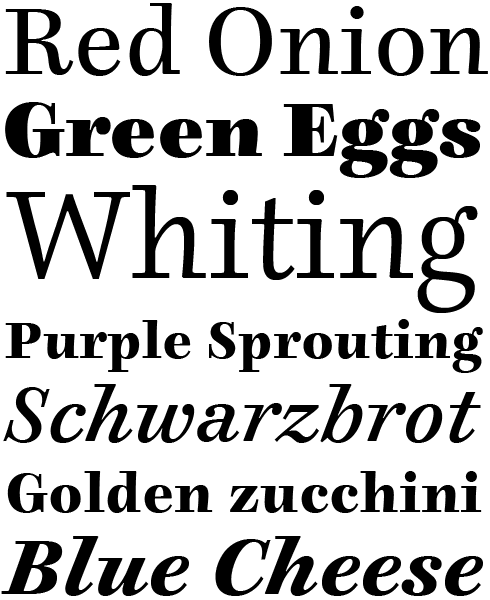
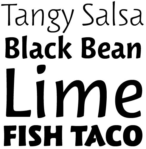
The extended Akko family is characterized by simple forms and compactly-drawn letters. They blend the industrial-strength feeling of the Isonorm typeface with the organic qualities of Cooper Black. The fonts may be used to save space in your layouts. Particular attention has been paid to the letters’ counterforms, as well as to the junctions of strokes—these won’t clog up, or get too dark. Akko is really an autobiographical work; not only does it riff on some of Kobayashi’s own personal favorite typefaces, but the term “Akko” itself is taken from the first two letters of his first and last names.
|
|
|
|
|
|
|
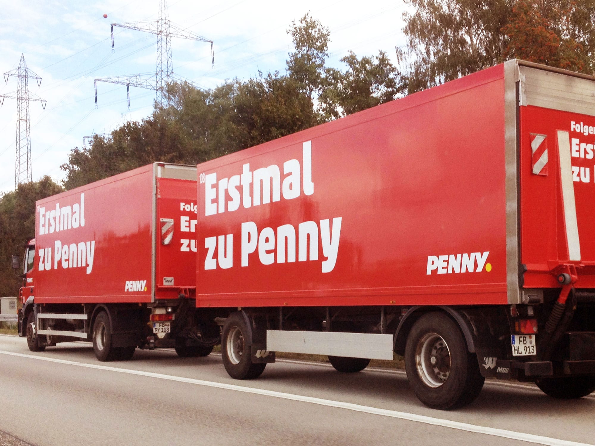
Akko in use for the Penny supermarket in Germany (left) and in an exhibit in the Boston Science Museum (right)
|
|
|
After the Akko fonts were published in 2010, the German discount supermarket chain “Penny” began using the typeface. Do you shop there? In lectures, Luc(as) de Groot has stated that he frequents Germany’s “dm” drugstores, since they use his Thesis fonts.
Yes, I love to shop at Penny supermarkets from time to time. Unfortunately there is no Penny in the town where I live. I would go more often if a store was closer. On the Autobahn, I often see big red trucks with the Penny logo and tagline, “Erstmal zu Penny.” It makes me feel happy whenever I come across my type in action. Recently when I was looking for study-aid books for my son in a bookshop in Germany, I spotted my Akko Heavy on the cover of Ulrich Knoll’s 33 Lehrer, mit denen Ihr Kind rechnen muss. In the United States I see paperback covers with my ITC Luna very often. Art Deco styles never go out of fashion!
You worked together with Gudrun Zapf von Hesse to create Diotima Classic — a lovely and delicate serif family. Decades ago, Hermann Zapf set their wedding invitations with the original metal-type version of Diotima. How was working with her different from collaborating with her husband?
Working with Gudrun is pretty much the same as it was with Hermann. They were both always very flexible and open, but they had severe eye for quality. During my collaborative projects with Hermann — Optima Nova (2002), Zapfino Extra (2003), Palatino Nova (2005), and Palatino Sans (2006) — he drove his car from his home in Darmstadt to Monotype GmbH (then Linotype) in Bad Homburg, where I work. But when the Diotima Classic project started in 2007, Hermann had already stopped driving. Since they didn’t use e-mail, our correspondence on the design was made by sending proofs per post. When I visited their home in Darmstadt to discuss the design details with her, I always carried my laptop with me so that I could make corrections in front of her eyes. Of course Hermann was always sitting with us and enjoyed watching our collaboration. He sometimes gave her advice about the details, but they never got into a quarrel. They were always in a good, harmonious mood. I also enjoyed to see how they discussed and respected each other. During the design refinement sessions, they told me about the old days of the D. Stempel AG type foundry, including the techniques their punchcutter August Rosenberger used, and their collaboration with him. The most exciting fact they told me was the story behind the design of a lowercase g in the original Diotima type. While studying proofs of Diotima from the 1950s, I found that the initial shape of g was completely different from the current one, so I asked Gudrun the reason for it. She explained to me that the first version of g, taken from her calligraphic work, never satisfied her. Then in 1953, three years after the first trials, when Hermann drew g on one of the proofs, she found that his letter g perfectly fitted the rest of the alphabet. So the Diotima type we know now is the result of a perfect marriage of the two talents.
I recently visited the design department at a university in China. The typography teachers there used Chinese-language editions of two books on western typography that you wrote in Japanese. I purchased these, and particularly enjoyed the photographs you included in Font No Fushigi; these books could also be useful for design students in English or German-speaking countries. Have you considered more writing projects for the future?
Both Oubun Shotai and Font No Fushigi were intended for the Japanese market, so I never imagined that they would be translated into Chinese and Korean. That was a pleasant surprise. In my books, I explain the basics of Latin typography to young designers who are interested, but do not know where to start. In other words, I wrote the books that I wanted to have myself when I was a student. In 1983 I graduated from an art university and began my career as a type designer in a Japanese font foundry. Six years later I left the foundry to study type design and typography in London. Up to that time, I had never been outside Japan, so I was simply overwhelmed by the big gap between Western and Japanese environments surrounding the type industry. Everything I saw was new to me. Even an ordinary-looking local library near my flat in Earl’s Court had a dozen books on typography. Stonecutters, calligraphers, and book designers gathered regularly to exchange their ideas; this was unimaginable in Japan in the 1980s. What I wrote in my books are the simple fundamentals I learned. People who’ve read my books — including well-known graphic designers — have commended them for their plain and uncomplicated explanation of the basics. On the other hand, they may be redundant for students who grew up in countries that use the Latin alphabet. Currently, I’m interested in public signs in Japan; I want to write a book about that, and I already have an idea in my head.
Almost 20 years ago, you designed Calcite for Adobe, and this has always been one of my favourite typefaces! It is amazing how it combines design elements from Renaissance chancery scripts with the aesthetic of digital post-modernism. Have you brought reinterpretations like that into other typefaces?
Glad to know that Calcite is one of your favourite types! Calcite was kind of inspired by Freeman Craw’s Ad Lib typeface. I had been fascinated with its contrast of round and straight lines, and outer and inner forms. I thought that a progression from complex to simpler forms could make an interesting typeface, and Calcite was my first such attempt. When I tried to simplify the inner forms of the alphabet to parallelograms, I was reminded of something I’d seen before — Arrighi’s calligraphy manual, published in the 16th century. My simple and systematic design principle and the Renaissance letterform matched very well and I liked it. Since then I have been developing my sans serif types based on more or less the same principle. Capturing the inner forms separately from the outer ones was what I learned from Japanese and Western calligraphy. When I drew a letter with black sumi ink on white paper, I realized that I was not looking at the black part. My eyes followed the edge of the writing tool, focusing very carefully on the shape of the inner counter which is the white part. My typefaces like Calcite, Tx Lithium, and Akko are typographic interpretations of how I see things.
|
|
The Avenir typeface is Adrian Frutiger’s great humanist take on the rational geometric style, designed in 1988 and updated in 2004 in collaboration with Kobayashi, who reworked the typeface as Avenir Next Pro for the on-screen age. Several display issues were addressed, and extra weights and a condensed width were added, bringing the family up to 32 styles. It remains one of the masterworks of contemporary sans serif type.
|
The Palatino nova typeface is a reworking of the classic Palatino typeface by Hermann Zapf and Akira Kobayashi. Zapf’s Palatino was certainly one of the most-used typefaces of the 20th century. In fact, you’ve probably been reading texts set in various iterations of Palatino for your entire life! In addition to adding new weights to the repertoire, many of the Palatino nova fonts also include Greek and Cyrillic support. The family includes two titling faces as well—based on Zapf’s older Michelangelo and Sistina design — and a series of fonts optimized for setting texts printed in smaller sizes, too (Aldus nova).
|
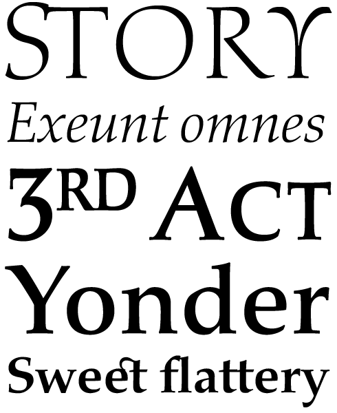
In the early 1990s, inspired by his time in London learning calligraphy and typography, and yet dissatisfied with the digital versions of classic typefaces (especially at text sizes), Akira set out to craft his own. He took as his inspirations two 18th century types: the upright a design by renowned Scottish typefounder Alexander Wilson, which had been used to set a beautiful book Akira had been given; the cursive muse was Joseph Fry and Sons’ Pica Italic No. 3. The result worked very well at text sizes, but digital limitations soon became apparent: “In larger than 18 pt, it already started to look too bold and clumsy, and too dark and compressed when used in 6 or 7 pt.” he writes. The solution was to create distinct designs for use at different sizes, something that came naturally in the pre-digital era. The “Eighteen” weight has delicate features, a higher contrast and a tight fit for larger settings; the “Six” weight, for captions, has sturdy serifs and a looser fit. In the 18th century it was not the practice to design a matching bold for each roman face, and there is none in this typeface. “I tried to design a bold variant but it looked awkward so I abandoned it,” writes Akira with refreshing frankness. This typeface was not going to be compromised by an ugly bold. The resulting type family of six styles — certainly no workhorse — is a typeface that rewards careful use with a supreme elegance and a timeless ease. Read more:
Akira Kobayashi on FF Clifford [FontFeed, 2007].
|
|
|
|
Your latest release is, surprisingly, something of a first for you and Monotype: can you tell us about your involvement in the Tazugane project?
In 2013 I was assigned to direct a project to design a new Japanese type, and I started to look for talented Japanese type designers qualified for this project.
The Tazugane design team was set up in January 2014, when two designers joined Monotype Japan: Kazuhiro Yamada and Reiko Hirai. Kazuhiro, working as senior type designer, is an award-winning type designer and book designer, and Reiko, serving as Japanese typography consultant, is a master’s degree holder in typeface design from the University of Reading and bilingual speaker of Japanese and English. As the project advanced, we realized the need for another type designer with a very high level of design skill. So in August 2015, we welcomed Ryota Doi as a new team member. Ryota is also a graduate of the MA Type Design program at Reading and had worked as an intern at our Tokyo office since February the same year.
How would you describe your role in the Tazugane project? Were you the art director — coordinating the other designers’ work on the fonts — or did you also draw parts of Tazugane yourself?
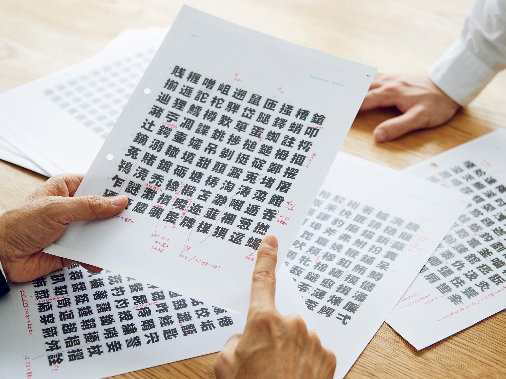
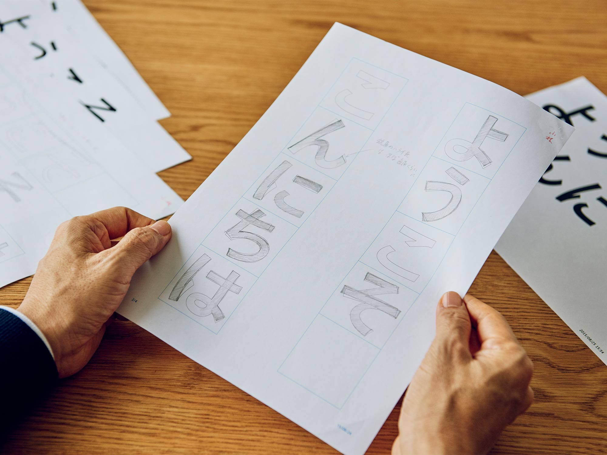
A decent Japanese type should have more than several thousand kanji glyphs. This normally requires long periods of time and a team of experienced designers. Having to develop Tazugane with only two designers in less than three years was a challenging task, but solid teamwork made it possible. Kazuhiro drew the first sketches, and I gave him feedback. Our first hiragana and katakana letters had too much of a traditional calligraphic flavour, but intensive collaboration in the summer of 2015 helped evolve them into a design that was much more contemporary. Directing kanji design was conducted by exchanging sketches and PDFs with my feedback. Sometimes it was necessary for me to travel to Japan to give them direct instructions. But here I have to emphasize that it was not the only task I had to manage: I was also working on my own typeface Between and had to give presentations and lectures about Latin type design at art universities in Japan and China. Amid such a hectic schedule, at one time I even made design instructions by drawing on a small memo paper in a hotel room in China during one of the lecture tours and sent it off to Japan.
Our team was now in full swing. Kazuhiro and Ryota drew thousands of kanji glyphs, while Reiko supported multiple tasks, including schedule management and helping the teams in the US and Japan communicate. I was very lucky to be able to work with such highly-skilled designers.
In the run-up to our interview, you mentioned that you hoped Creative Characters readers who knew you would be surprised and say “Look, Akira also does Japanese!”. Prior to working on Tazugane, had you ever designed Japanese typefaces yourself?
Yes. When I started my career as type designer in 1983, my main job was to design dozens of kanji glyphs using fine-pointed brush and sumi ink. From 1990 until 1993, I worked at Jiyu-Kobo and was engaged in developing Japanese digital typefaces such as Hiragino Mincho and Hiragino Gothic.
|
|
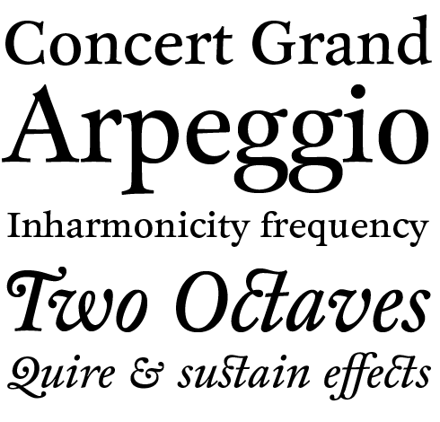
The name Cosmiqua is an amalgamation of the French word for cosmic (cosmique) and German term for serif type (Antiqua). The font family, in other words, offers cosmic serifs. Cosmiqua is a typeface for the future, at least as the future was seen in the 1950s. The design is inspired by letter styles that were popular with advertisers in the ’50s, as well as the 19th century type that those letterforms were based on in the first place. Cosmiqua exudes an old-fashioned, retro hope for the future. Today, that might feel a little odd or kitschy; however, this typeface is a great evocation of a bygone era.
|
ITC Woodland is a typeface based on Kobayashi’s own experiences hand-lettering with flat brushes and broad-edged pens. Each weight in the ITC Woodland family acts out its own part. The light version tends to look almost fading in small sizes, but the heavy weight is as dark as Cooper Black’s letters. Because of its cheerfulness, ITC Woodland is ideal for use on greeting cards, or in correspondence and other graphics that require a light touch.
|
|
|
|
|
|
|
Development work for Monotype’s new Tazugane typeface
|
|
|
The family has been on sale now for a couple of weeks, and it’s doing pretty well. It’s almost as if designers in Japan — and elsewhere, too — had been waiting for something like this. What sets it apart from families currently on offer for Japanese?
From the very beginning of the project, the goal for the Tazugane typeface was clear. We saw hight demand for a new Japanese sans serif, with a humanist touch. It would need t be legible, and its weight range should be just as wide as the scale you see in the Neue Frutiger family. Tazugane has 10 different weights, and that degree of variation is still very unusual in Japanese typeface families. There was already an indication for us that this would work. That large families could be successful had already proven by the success of Yu Gothic, a system font in use since Mac OS X Mavericks and Windows 8.1. We believed that we could make another contemporary sans serif, with an original approach.
The roman and Japanese sides of the family are intended to be very harmonious; we made several adjustments to the metrics so that the scripts could optically co-exist within the same block of text, and work both for horizontal and vertical settings.
Akira, thank you very much for your time! We’re looking forward to seeing how designers will put Tazugane to use. We’d also like to wish you and all of your collaborators the best of luck in the future, whether you’re creating new typefaces for the Latin script, Japanese, or any other writing system.
|
|

The new Tazugane family is a dual Japanese and Latin type system, designed by Kobayashi and his colleagues Kazuhiro Yamada and Ryota Doi to be a uniquely versatile solution for applications where the two scripts need to co-exist. The Latin portion of the family is the Neue Frutiger typeface, with spacing and metrics adjusted to match the Japanese. Elements of traditional Japanese handwriting are combined with an original, humanist style making it suitable for all kinds of multi-lingual contexts, from magazines and corporate literature in print and digital media to environmental signage and wayfinding.
|
|
|
This edition of Creative Characters was edited by Dan Reynolds
Dan Reynolds is an independent designer with a focus on letters: he draws typefaces, builds fonts, writes about typography, and teaches, too. Originally from Baltimore, he’s spent most of his adult life in Germany, living in Berlin since 2009. From 2011 he has been part of the communication design faculty at the Braunschweig University of Art, following seven years at Linotype GmbH — first in the product marketing department, and then in the font development group. He was a co-founder of the Offenbach Typostammtisch; similar type-focussed meet-ups have since opened in Basel, Berlin, Hamburg, Saarbrücken, Stockholm, and Zürich.
|
|
|
|
|
Who would you interview?
Creative Characters is the MyFonts newsletter dedicated to people behind the fonts. Each month, we interview a notable personality from the type world. And we would like you, the reader, to have your say.
Which creative character would you interview if you had the chance? And what would you ask them? Let us know, and your choice may end up in a future edition of this newsletter! Just send an email with your ideas to [email protected].
In now past, we’ve interviewed the likes of
Mika Melvas, The Northern Block, Matthew Carter, Ulrike Wilhelm, Maximiliano Sproviero, Dave Rowland, Crystal Kluge and Steve Matteson. If you’re curious to know which other type designers we’ve already interviewed as part of past Creative Characters newsletters, have a look at the archive.
|
|
|
MyFonts on Facebook, Tumblr, Twitter, Instagram & Pinterest
Your opinions matter to us! Join the MyFonts community on Facebook, Tumblr, Twitter, Instagram and Pinterest — feel free to share your thoughts and read other people’s comments. Plus, get tips, news, interesting links, personal favorites and more from the MyFonts staff.
|
|
|
Colophon
This edition of Creative Characters was guest-edited by Dan Reynolds. Managing editor and designer: Anthony Noel. Editorial assistant: Michael Pieracci. .
The Creative Characters nameplate is set in Tabac Slab and Rooney; the foundry’s name is set in Tazugane Gothic and ; the quote is set in Cosmiqua and the large question mark is in Tabac Slab. Body text, for users of supported email clients, is set in the webfont version of Rooney Sans. |
|
Comments?
We’d love to hear from you! Please send any questions or comments about this newsletter to [email protected]
|
|
Subscription info
Get our monthly designer interviews, popular new fonts, the latest trending promotions and free font goodness to your inbox. Sign up here: MyFonts Mailing Lists
|
|
Newsletter archives
Know someone who would be interested in this? Want to see past issues? All MyFonts newsletters (including this one) are available to view online here.
|
|
|
<
|