
Welcome to another jam-packed issue of In Your Face! This quarter, we have more new type than ever, both from new foundries as well as from designers who are already established with MyFonts. Highlights abound — from full-featured multi-weight/width sans-serif families to some of the most original display type in the world — and we are certain that you'll find plenty of useful bits and pieces to add to your type library.
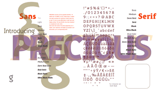
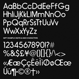
Since our September issue, almost two dozen producers of type have added their work to the nearly 500 foundries already in the MyFonts library. We are particularly proud to be able to sell the G-Type Collection; Nick Cooke's wide range of faces — from Olicana, whose rough and smooth variants make one of the most useful calligraphic scripts of recent years even more flexible, to cool sans families like Chevin, Digitalis, Precious Sans and Morpeth. Nick's technical skill and eye for original detail — like the sharp corners of Amulet and the flavor of Gizmo's brush lettering — have made his faces a favorite of newspaper and packaging designers in a wide range of industries.
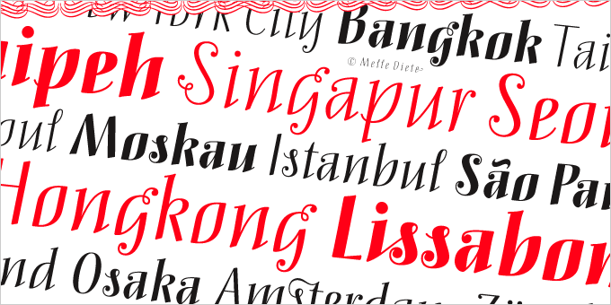
Melle Diete is a designer and illustrator in Berlin, and studied typedesign at FHP, the University of Applied Sciences in Potsdam. She began working on Mary Read in 2004, as a student in Luc(as) de Groot's type design course, and its wave-like rhythm — Diete reports a strong oceanic influence — and spiky grace, combined with a large character set and interesting ball terminals, make it one of the most interesting and kinetic display faces of recent memory. Mortelle, her second release, predates her studies with De Groot and is fun and informal.
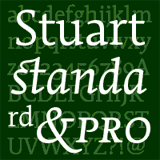
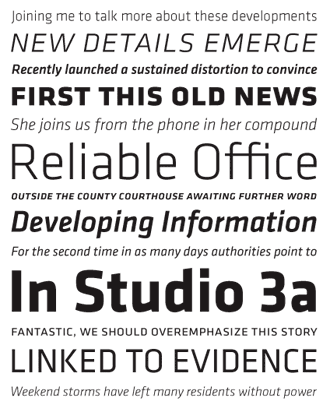
Another exciting addition is Matthieu Cortat's Stuart Pro, released through his foundry Nonpareille. This beautiful and flexible text family contains faces in three optical sizes and a variety of weights, making it ideal for book and newspaper designers and others looking for a cohesive type solution throughout a wide range of publications. The large character set includes accents and special characters for setting type in many different languages, lining and old-style numerals, ligatures and other goodies. Given the amount of work that obviously went into this very polished family, it will be interesting to see where the 26-year old Cortat— a type researcher, designer, and guide/lecturer at the Printing Museum of Lyon, France — goes next!
English book designer Andrew Ashton won the British Book Industry "Nibbie" Award for Design and Production(the highest award a book designer can win in the UK) in 2007 for The Dangerous Book for Boys. His first release is Bowen Script, inspired by the persistent demands of editors for scripts which actually looked like real handwriting, a lot of historical fiction projects and a love of maps. Hopefully this will open the door for other new designs based on historic type — we'd certainly like to see more from Andrew!
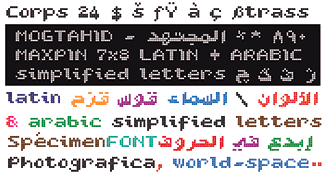
Mogtahid is Algerian designer Nasri Abdallah's font foundry, and he brings us four experimental faces and the promise of many more in multiple alphabets. Color.com is a layered display face ideal for multicolor setting; Maxpin approximates a pin printer, and includes both Latin and — given the 7 × 8 modular grid — a surprisingly readable Arabic character set; Actualite integrates a halftone background into an interesting, horizontally-connected display face, and Authentic Quartz is just that — a digitization of an authentic quartz-matrix display — and is very attractive in large display settings. Abdallah has been a very active member of Algeria's graphic and type design community since the early 1960s and today, as a 56-year-old grandfather, pours his energy primarily into research and type design.
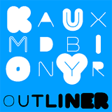
Many of our newest members come to us with only one or two releases, but a promise of much more. Outliner — the first release from Czech designer Ondrej Jób's foundry Urtd — is specifically designed to be used with outline strokes, and comes in two styles and would shine in multi-color use.
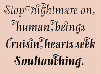
Andrea Stuart, a "certified font addict" in the Philippines, brings her love of handwriting fonts to the world with Andrea's Handwriting in four styles, including roman and script variants.
Hiekka Graphics, the child of Finnish designer Ossi Gustafsson, brings us the very fat slab face Akimoto, ideal for extremely powerful and authoritative display work.
Californian Azelea Rodgers balances type design with the full-time job of taking care of her "two young clones;" she solved the problem of how to make tracing the alphabet fun for her two preschoolers by designings her first font — Kerp — which has so far received an excellent reception from young and old users. Her second face, Rosebud, is a delicate display face built from rose stems and branches.

At just shy of 13 years old, Jasper de Waard is one of MyFonts' youngest designers (the youngest is Lydia Barnes, co-designer of Pickle Pie), and is one of only three residents of Designtown, his foundry and an imaginary suburb of Rotterdam; his father offers invaluable technical assistance ("I like my dad having a look at what I designed, as long as I am able to ignore his comments") and his mother makes sure he remembers to eat and drink when he's caught up in type development. His first release is Rotterdam, named for his home city. The six weights of this tall, narrow display family are an exceptional accomplishment for a type designer of any age or experience level. Currently, Jasper divides his time between homework, table tennis, drums and type design. He looks forward to making enough in sales to afford a copy of FontLab, which is right now "just too expensive," and has a number of other projects in the works.
DizajnDesign is the type foundry wing of Slovakian designer Ján Filípek's own design firm; his first release is Deva Ideal, a smooth and subtle sans-serif family in 10 weights. It includes small caps and ligatures as well as accents and special characters for typesetting a wide variety of Eastern and Central European languages.
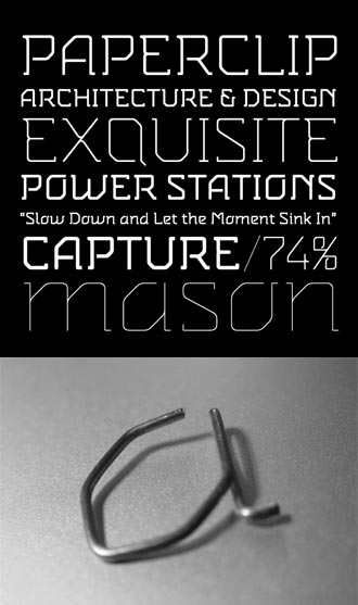
Another new designer with two well-imagined faces is Mugur Mihai. Agrafa, Mihai's first published typeface, takes its inspiration from bent paperclip forms, and is — mostly — monolinear. It works equally well at large and small sizes, and can be reduced significantly without losing detail or legibility.
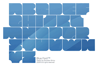
Bulgaria-based Fontfabric brings us three faces that are in many ways counterpoints of each other. Blou, a very unique fat slab meant for large display work, is powerful and strong, while Snail is all fine lines and delicate curves; the third and newest of the three, Cubic is an interesting 3-weight experiment with isometrics. Designer Svetoslav Simov is an accomplished branding and identity designer, and his ability to mix organic curves with geometry is a rare trait; hopefully his future releases will be just as surprising and original.
Utah-based Lettering Delights gives us a bunch of new faces, including many manually distorted and handwritten fonts, such as the narrow upright Absurd, curly Honeydukes, monoline Softy and many others; this enormous collection contains lots of animated and aggressive display faces for just about any informal use you can imagine.
Tim Barnes, a graphic designer in the UK who does print work for contemporary art galleries, brings us the Chicken Fonts foundry and an exciting first release in the childish and funny Picklepie, which begs to be used in a brightly-colored layout; it would be ideal for children's books and any similar use. Tim's daughter Lydia came up with the basic letterforms at age 6, so it certainly speaks to a certain age. It contains a number of "hidden" characters, based on Lydia's drawings, including one of her pug Zooey. Lydia, MyFonts' youngest designer, is very excited that people all around the world may be using her font. Keep an eye out for Tim's next release, Pigeon Pie, in the months ahead.
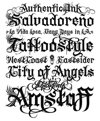
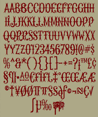
The spiky and gothic blackletter Authentic Ink is the first release from designer Florian Schick, and was recently published in the excellent new book Fraktur mon Amour. Since the age of 14, Schick has been "under the spell" of typography and in his formal studies in design has moved more and more toward print typography. He is gratified that so far Authentic Ink seems to be most popular in advertising for fashion design, but this particularly graffitti and tattoo-art inspired aesthetic is making inroads into all sorts of design, and will be appropriate for many "street culture" and related display uses.
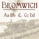
Greater Albion Typefounders could hardly have a more promisingly-named home town. Based in Success, Western Australia — a southern suburb of Perth — their goal is to address the question "whither elegance in this modern world?" typographically. Designer Paul Lloyd answers with an initial release of three elegant faces, chief among them Edwardian display faces Helenium and Bromwich; various other bits of type (and a Christmas-themed dingbat face), all original designs based (sometimes loosely) on historic specimens, round out the varied collection.
The scrawled, natural handwriting font Palma (which contains numerous ligatures and alternates designed to make it look more like real handwriting), puffy Doll & Dollbats, and the abstract picture font Anymals are the first four releases from FaceType, a Viennese foundry created to market the work of designers Marcus Sterz and Andrej Waldegg.
Zach Risso's Found Receipt — the first release from his uppercaseTYPE foundry — integrates serifs into the dot-matrix display face, which is an interesting classical treatment of a particularly modern style. Found Receipt is based on type Risso discovered on found paper ephemera, and is most useful when set large.
Finally, only one new foundry comes to us this quarter with a dingbat font. Argentinian designer Victor Garcia is no stranger to type design, and has released a number of other faces, including Ole for Neufville Digital and several fonts for Linotype, but GarciaToons is his first foray into self-publishing. Available in three styles (expressive mice, cats and rabbits), this family of animals is sophisticated, stylish and funny.
The number of new faces this past quarter from established MyFonts foundries is truly awe-inspiring. As such, and to save your valuable time, we can't possibly address all of them, and so instead have focused on the highlights…
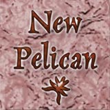
Several recent additions are notable, principally the new faces from Massachussetts-based calligrapher Arthur Baker, the accomplished designer of beautiful calligraphic faces like Duckweed Sans and Hiroshige Sans and the more well-known Baker Signet, Kigali, and Sassafras. Baker has brought a dozen new faces to MyFonts, some of which are redrawn and reconfigured versions of his most popular designs. Check out the redrawn New Pelican, New Oxford, and the under-used and beautiful New Marigold; the cartographic Mercator, or the many new calligraphic symbols and swashes he's recently offered up.
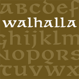
Ludwig Übele is a recet graduate from the Royal Academy of Arts (KABK) in Den Haag, and is the designer of the very successful and original Marat text family. His newest release is Walhalla, a novel and very modern approach to the uncial: available in a serifed regular as well as a sans (making it one of the few gothic uncials ever produced); rarely is a mixture of modern shapes and historic style so successful, but perhaps Walhalla will instigate a revival of uncial use in graphic design!
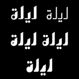
Arabetics, a small foundry in New York City, specializes in Arabic and Arabetic (extended arabic) typefaces. Their emphasis is on the Mutamathil (Arabic for "symmetric and unified") type style, which was emphasizes generic, compact, calligraphy-free typefaces and families — in short, Arabic type that is all about clarity and communication vs. the ornate decoration that some format Arabic calligraphy often emphasizes. Saad Dean Abulhab's newest release is the condensed upright Layal font, available in five weights and accompanying italics; its slight calligraphic flavor never overwhelms its eminent legibility. It includes all required Lam-Alif ligatures (as well as the Allah ligature) and uses OpenType glyph substitution for ligatures and selected marks positioning.
Another stellar group of scripts comes from Rob Leuschke's TypeSETit. Corinthia, Oh Ley, Ruthie, Petemoss and the more formal Imperial Script all contain the bounciness and quality you expect from this veteran calligrapher's catalog, which includes several of MyFonts' best-selling scripts.
066.Font's Piotr Wozniak, usually the producer of in-your face distressed display faces, steps out of character with Longinus Pro, an antique script straight out of 14th-century incunabula. Packed with alternates and ligatures, swash beginning- and end-of-line characters and accents, it's all you need to recreate your own historical manuscript.
Other scripts include Canada Type's happy Chikita with all of its ligatures and the sharp-edged modern Styx; GLC's pen-drawn 1890 Registers Script; Autographis' curvy Quiana / Quirina and sharper Novido / Novita; Insigne's formal Youngblood; profonts' Unger Chancery; Lián Types' narrow Intima and upright Kalligrand Scripts; Hubert Jocham's brush-lettered Tasty; Blambot's gothic Clairvoyant, Re-Type's original and fun Tomate, Okaycat's fat brush Japoneh, Blue Vinyl's simple and elegant (and alternate-packed) Lavender Script, and plenty more.
One additional noteworthy script is Art. Lebedev Studio's original — and very unique — Klinkopis, from Yana Klink and Irina Smirnova, two very talented young Russian designers. Klinkopis' large character set is jam-packed with Roman and Cyrillic alphabets and multiple alternates for both languages, and is an excellent solution for bilingual advertising and other display uses.
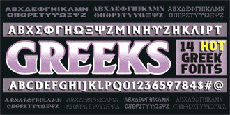
Talk about knowing your audience: Michael Stirling's The Fontry brings us two new items, one of which is marketed specifically at fraternities and sororities. His Greek Font Set #1 contains "14 hot Greek fonts," all of which include roman alphabets in addition to the Greek and the necessary numerals and punctuation. Some styles may be layered for interesting color effects.
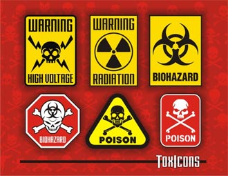
The Fontry West — which is actually about 88 miles west of Watts in Tulsa, Oklahoma — has been busy as well, giving us ToxIcons, an extremely useful picture font given the subject of much of our news cycle in the past decade. Four fonts chock-full of skulls, biohazard symbols, radiation warnings and other scary stuff, it will certainly be useful to the Department of Homeland Security and other folks who make their living keeping us safe — or, as others might say, keeping us scared.
Quebecois designer Charles Leroux, principal of the Grype Type foundry, recently finished what is certainly one of the spiniest and most dangerous typefaces on MyFonts. Rendezvous is an all-caps display face reminiscent of the most painfully sharp wrought iron ever devised, and the large character set includes accented characters and a pi glyph that looks more like a medieval weapon than anything mathematical.
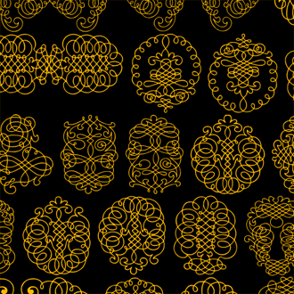
Intellecta has been busy, recently adding a number of their usual highly-detailed classic calligraphic faces: decorated initials, in Calligraphia Latina Soft; very ornate ornaments in Calligraphia Latina Soft 2; frames and other decorative items in AllerleiZierat; some rather naughty alphabetic nudes in Silvestre Weygel, an almost unbelievably decorated lombardic in Syl, and a dozen others, all of which will be attractive to fans of historic type.
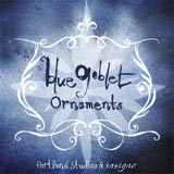
Other new ornament faces include Insigne's Blue Goblet Ornaments, great for building frames and borders; GLC Ornaments One, which consolidates historic ornaments from a dozen different faces and several historic periods; Gerald Gallo's Art Nouveau Ornaments; three faces from Outside The Line's Rae Kaiser, including a set of holiday ornaments, and Ornata F, part of Gert Wiescher's growing suite of Ornata square border elements.
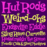
Informal, comic-tinged faces were also present: Pink Broccoli's 5 new fonts include the brush-lettered Lil Rhino and the jumpy Hip Hopper, and the Sideshow foundry presents the curly and spixy Savage Hipsters, hot-rod inspired Weird Bill and several others from the fabulous fifties. Brian Bonislawsky's Good Eatin, from his foundry Astigmatic, is a fat tasty treat and would be even more delicious when set really large; it includes fractions and a large range of accented characters for multilingual typesetting.
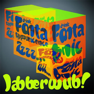
James Arboghast, the Australian type designer who succeeds whether tackling historic forms (his Pykes Peak is one of the best Frank Lloyd Wright-influenced types ever digitized), informal scripts or the most modern display type, is back with Jabberwub and Soft Serve, rounded faces seemingly made from jelly, and Big Noodle Titling, a tall, condensed all-caps sans ideal for huge display use, available in upright, oblique and block-titling (ideal for layered multi-color settings!) variations.
Ray Larabie (aka Typodermic), late of Canada and now residing in Japan, continues to supply attractive and useful type in an incredibly wide array of styles. His slab-serif Madawaska is tremensouly readable at small sizes and its subtlest features shine when set large; the distressed Ebenezer contains various ligatures and alternates; the wide sans titling face Tussilago, in 7 weights with accompanying italics, radiates strength and sophistication, and Hedgerow mixes '60s pschedelia with the often-woodcut lettering of German Expressionism for a unique and interesting hand-drawn look.
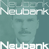
Nick's Fonts, with numerous revivals and original designs, recently hit the 400 font mark in thier catalog, and designer Nick Curtis brings us even more good work with six new display faces including the sci-fi Neubank — an ultra-modern take on Benton's Bank Gothic, as the name suggests — as well as Chromium Yellow, the Benton-inspired Odalisque, and more.
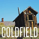
Among more than 30 additions from Jeff Levine are display faces in a variety of historic 20th century forms. Standouts include the Art Deco-inspired Metalet Modern; strong uprights of Coldfield, Cornfield, Eckhardt Block, Movieland, Triborough, Bayview and the stencil face Confirmation; a Hebrew stencil face, Shicken Zoop, and a number of other interesting historically-inflected display faces.
With initial inspiration coming from an alphabet in one of photolettering great Dan X. Solo's many clipart books, Arturo is an angular stressed sans available in a range of weights and numerical figures. Minnesotan designer David Bergsland's eponymous foundry includes ligatures, alternates, a set of dingbats and a few other interesting additions to this clear and readable sans.
TypeArt's large selection of historic revivals and original designs has grown significantly larger with almost 30 additions. Steinburg Modern, the most recent release, is also the most stunning: multiple styles (including a very showy swash italic and inline style), small caps and multiple weights — it's a relatively economical Didone with enough character to make it just as good for titling as it would be for text settings. Other additions include the workhorse grotesk Niteweit, the wide and mechanical Firenza family, a very original stencil face in Mediocre, and the big fat Sunday Best, which includes various types of shadow that would be especially useful in multi-color settings.
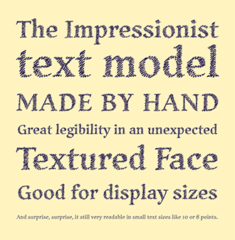
Ricardo Esteves Gomes' Hachura is an interesting and unique case: each letter is made up on sketchy lines, but the general proportions of the letterforms are based on Garalde models. Billed by foundry Outras Fontes as an "impressionist textured face," its full character is most effective at very large settings.
There are a number of interesting geometric experiments: yrmk's Simples, Alex Haigh's terrific Hiruku family, Ronald Underwood / Fontron's Phatron, Urban Pixel's dot-matrix Javelist Head and more. Other styles are equally well-represented — there were many new hand-written faces, too: Fanny, from Autographis; several expressive new faces from the constantly-creative Manuel Corradine, including Mucura, Prissa, Cuento and Salpicon; PizzaDude.dk's Everything; Haiku Monkey's Monumint; Breauhare's monoline Neon Bugler; Japanese foundry Flat-it's narrow Balaghat; also the childlike Wee Ian and graffitiesque Deja Sadk, from m u r, among others.
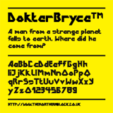
The eight styles of Portabello are the newest release from Derek Vogelpohl and ShyFoundry. Other squared-off and modernist display faces include Edgewater Square, a complement to Cm5Dzyne's earlier faces in that family; Transkrypt's funky Patchwork; sketchy Geometrix, from Australian foundry d[esign]; Jonathan Hill's sharp and edgy DokterBryce, based on a David Bowie movie poster; ActiveSphere has a number of modern faces in this vein, including the science fiction hued Kamaru Sans, BRType has three weights of the tall and pipe-like Boqueta and DTP Types has a dozen new additions, including some interesting sans families
Jack Yan & Associates bring us several additions that are anything but old-fashioned, including the mannered but slightly rough-looking Novalis and the pointy Flax. Last but definitely not least among these edgy and modern faces — but transcending the genre in many ways — is 2004's beautiful and useful Klavika family, from Process Type's Eric Olson, which has very recently been improved and expanded.
Typetrust has Facebuster, one of the boldest and blackest slab-serif display faces ever designed, and their three variations on the Cooter family are equally big and bold, but curvy and cartoony where Facebuster is serious and masculine. Prop-a-ganda brings us a new beautiful and very solid display face, Bravos, inspired by Italian advertising and political propaganda of the 1930s through 1950s; finally, Scholtz Fonts brings us a number of African- and Mediterranean-influenced faces, including the heavy Bongani and the extended round display face Aplomb.
Finally, two distressed faces round out this quarter's new additions. Andinistas, masters of fractured and damaged type, bring us Diad, and Doubletwo Studios has XXII Streitkraft, a 4-font stencil family that includes distressed styles.
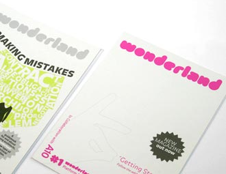
Certainly the biggest news here at MyFonts is our new beta site. Far more than a simple facelift, the new Myfonts is an all new machine: the new site offers easier and much more complete previews, a simplified shopping cart system, customized searching, a greatly expanded user-defined tagging and rating system, easier access to foundry and designer information, and plenty more.
Cameron Moll's letterpress-printed posters showing the front view of the Salt Lake Temple are the talk of typographers everywhere, and if you've ever printed on a flatbed cylinder press (the printer pulled these on his Vandercook Universal 3), you know how difficult it can be to to get this sort of even impression on such a large form, even if one is printing from photopolymer. The posters are gorgeous, and Bryce Knudsen's printing is a marvel.
I guess we're the last ones to know about this, but Face37's Type Trumps — based on the rules of the Top Trumps card game — looks like a fun way to entertain a bunch of type geeks. And we do need constant entertainment.
Typographica breaks its months-long silence with Stephen Coles' fair and balanced article on marketing and selling one's own type, and the pitfalls and benefits of various ways of approaching this problem. We are, of course, biased: we'd urge most designers to bring their type to MyFonts, especially now that our newly-designed site has become a superior marketing tool to any other distributors' online offering, but Coles does a good job of analyzing various reasons why some folks might want to choose an alternate path.
Finally, if you haven't already, please visit Daily Type, a showcase of interesting work - from polished commercial pieces to one-off sketches - by a group of Russian type designers. Publishing regularly since September 2004, it's a worthy addition to your daily RSS feed or list of regularly-read blogs.
Comments
We’d love to hear from you! Please send any questions or comments about this newsletter to [email protected]
Colophon
This issue of In Your Face was written by Joshua Lurie-Terrell and designed by Nick Sherman.
The In Your Face masthead is set in Fakir Display Black Cnd by Underware; headlines are set in Maple Black by Process Type; the pixel type at the top is set in Unibody 8 Italic, also by Underware.
Subscription info
Want to get future issues of Rising Stars sent to your inbox? Subscribe at www.myfonts.com/MailingList
Archives
Know someone who would be interested in this? Want to see past issues? All MyFonts newsletters (including this one) are available to view onlne here.