|
Practicing graphic designer, logo builder, and burgeoning typeface designer, Scott Fuller is the one-man dynamo behind The Studio Temporary. Based in Atlanta, Georgia, Scott is driven by the precept of “good design wherever I happen to be.”
Not afraid to incorporate playfulness or plenty of vibrant color into his design — strong typography also takes a conspicuous role in Scott’s work. Be it utilizing classic typographic stalwarts, or employing display faces he’s designed himself, Scott’s work can best be described as unabashedly bold. Here in our inaugural issue of My Favorite Five Scott shares five of his trusted workhorse typefaces, and how they help The Studio Temporary get the typographic job done.
|
|
|
|
Scott’s Type Recommendations
|
|
|
|
|
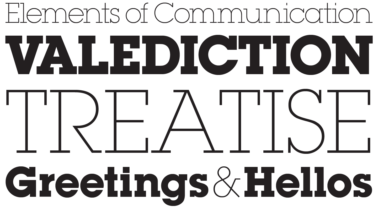
OL LONDON
Typeface family of four weights
|
| |
|
“Say it, and say it with power. Just the perfect bold, no-nonsense typeface.”
|
|
|
|
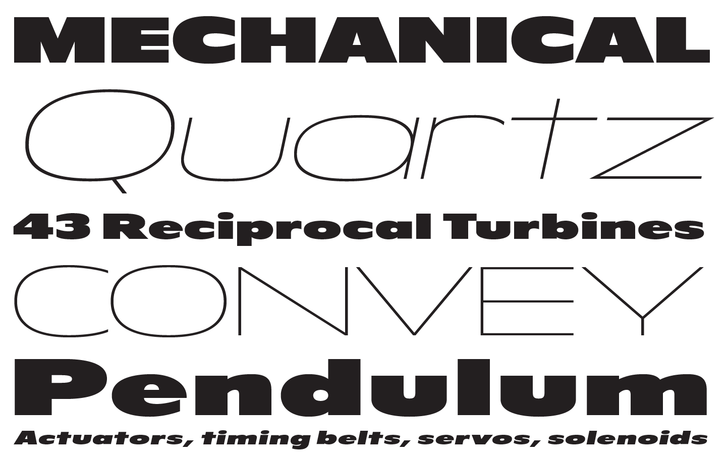
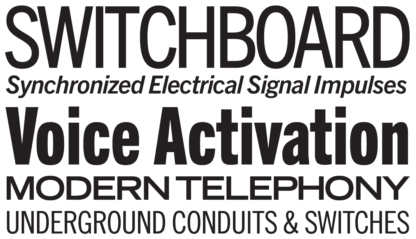
UNIVERS®
Typeface family of 27 weights
|
| |
|
“One of the most versatile and useful font families of all time. Modern, rugged, bold, sporty and industrial, all at the same time! Especially 93 Extra Black Extended.”
|
|
|
|
ITC LUBALIN GRAPH®
Typeface family of 10 weights
|
| |
|
“The CSX logo was my first love, so this typeface will always have a special place in my heart. And my designs.”
|
|
|
|
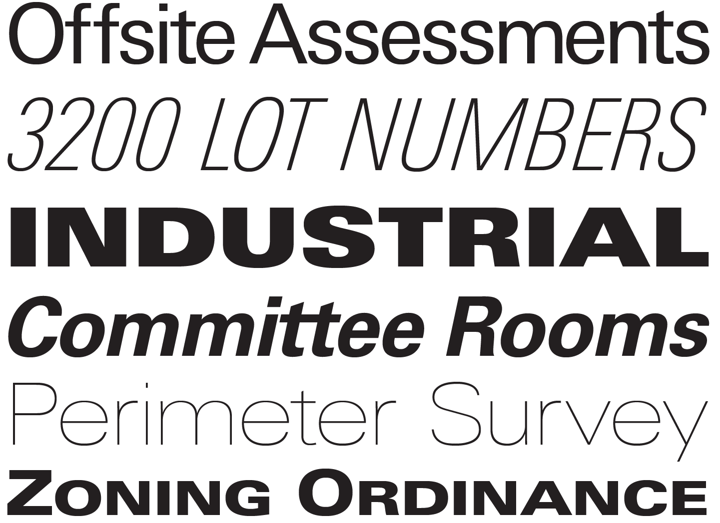
TRADE GOTHIC®
Typeface family of 14 weights
|
| |
|
“Fills up just the right amount of space, especially No. 20 Bold Condensed. Looks fantastic stacked or in a badge, with a beautifully timeless feel.”
|
|
|
|
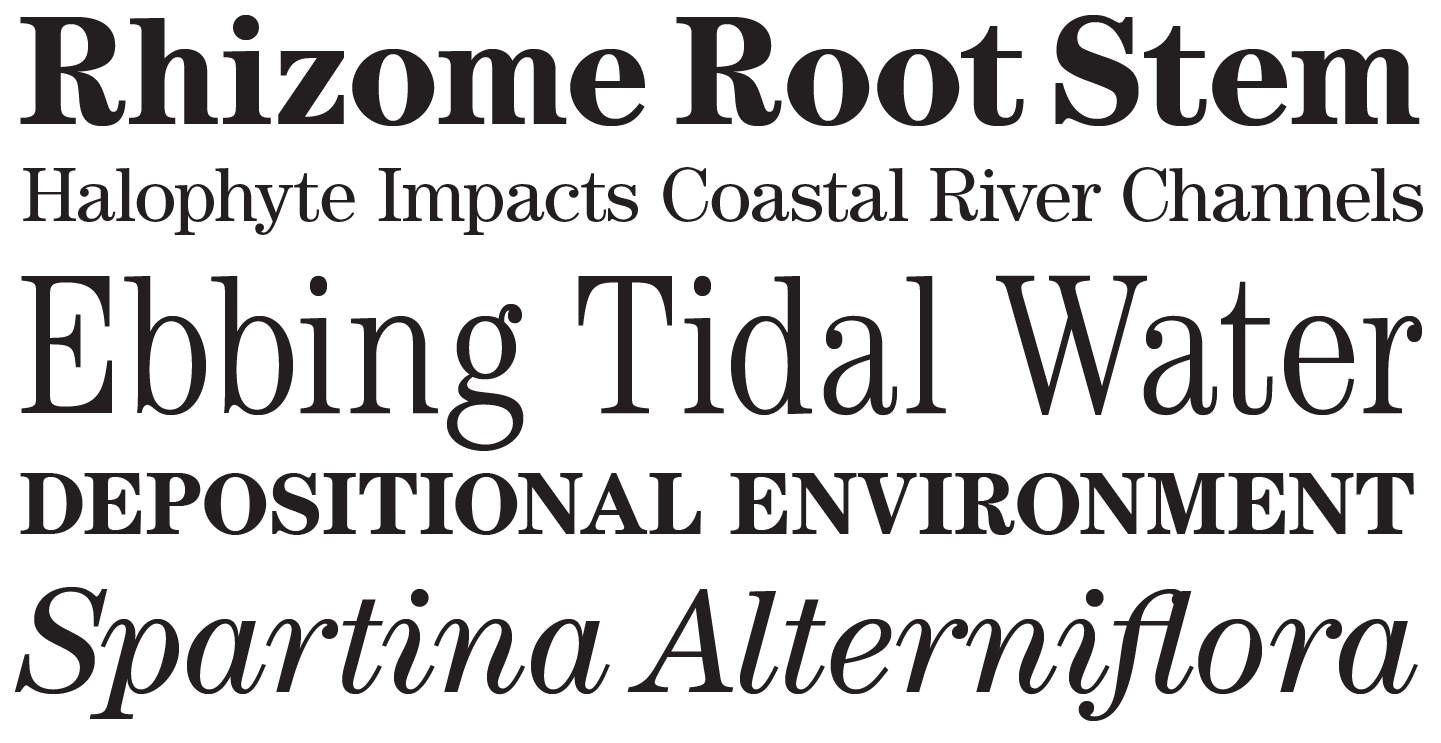
ITC CENTURY®
Typeface family of 18 weights
|
| |
|
“A serif typeface that’s elegant and solid? Sign me up!”
|
|
|
|
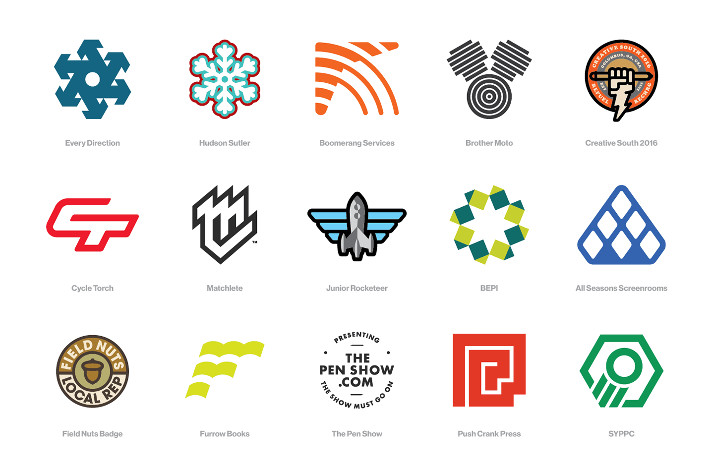
“I grew up working in a CNC machine shop, and I have to say I learned more about design there than I EVER did at college. One of my dad’s favorite sayings, ‘You can always take more off, but you can’t put it back on’, really stuck with me, especially on logo design.”
|
|
|
|
“I always start in my Field Notes, sketches and playing with as many ideas and concepts as I can. Never go straight to the computer, as it can make work look ‘done’ before it’s really complete. Then I start to pare each idea down to its basic elements. A good logo should be simple and memorable, and it HAS TO be able to scale. Some of the best designers, and I’m not just talking about the legends, made beautifully simple logos that can stand the test of time. No fads welcome here.”
|
|
|
|
“Once the initial concepts are complete, I bring them in to illustrator to sharpen them up. Those concepts are then presented to the client, always in context, and not drunk on white space. When the pixels settle, they have a new logo that’ll be unique and memorable. Some of these were done for fun, some for funds and some for friends. Good luck picking out which one is which!”
|
|
|
|
“One of my favorite pastimes… designing icon sets! Keep line weight and style consistent, but it’s harder than you think. Pay attention to those little details.”
|
|
|
|
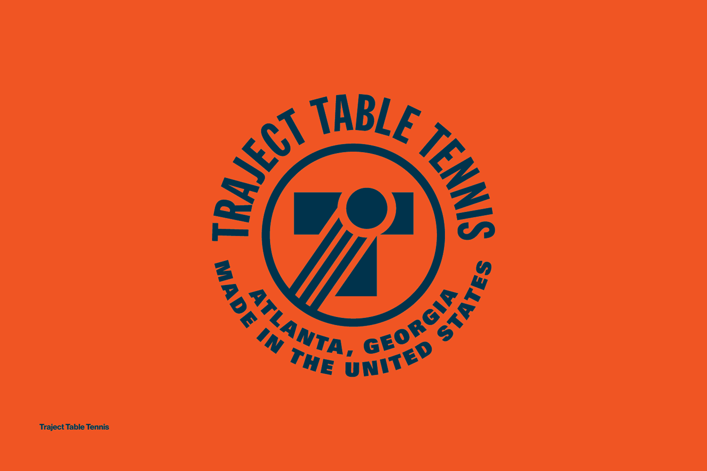
“Easily one of my favorite logos of all time. I used to play table tennis full-time, and while I loved the equipment from the big manufacturers, I HATED the apparel. So like so many of us today, I made my own thing! I wanted something that could be worn in competition, or just around the town. I kicked it off in September of 2016, but 2017 is the year it’s really going to take off! That’s the plan, anyways. By the way, you can pick up a shirt or two by hitting this link. Enjoy!”
|
|
|
|
Where to find Scott & The Studio Temporary
|
|
|
|
|
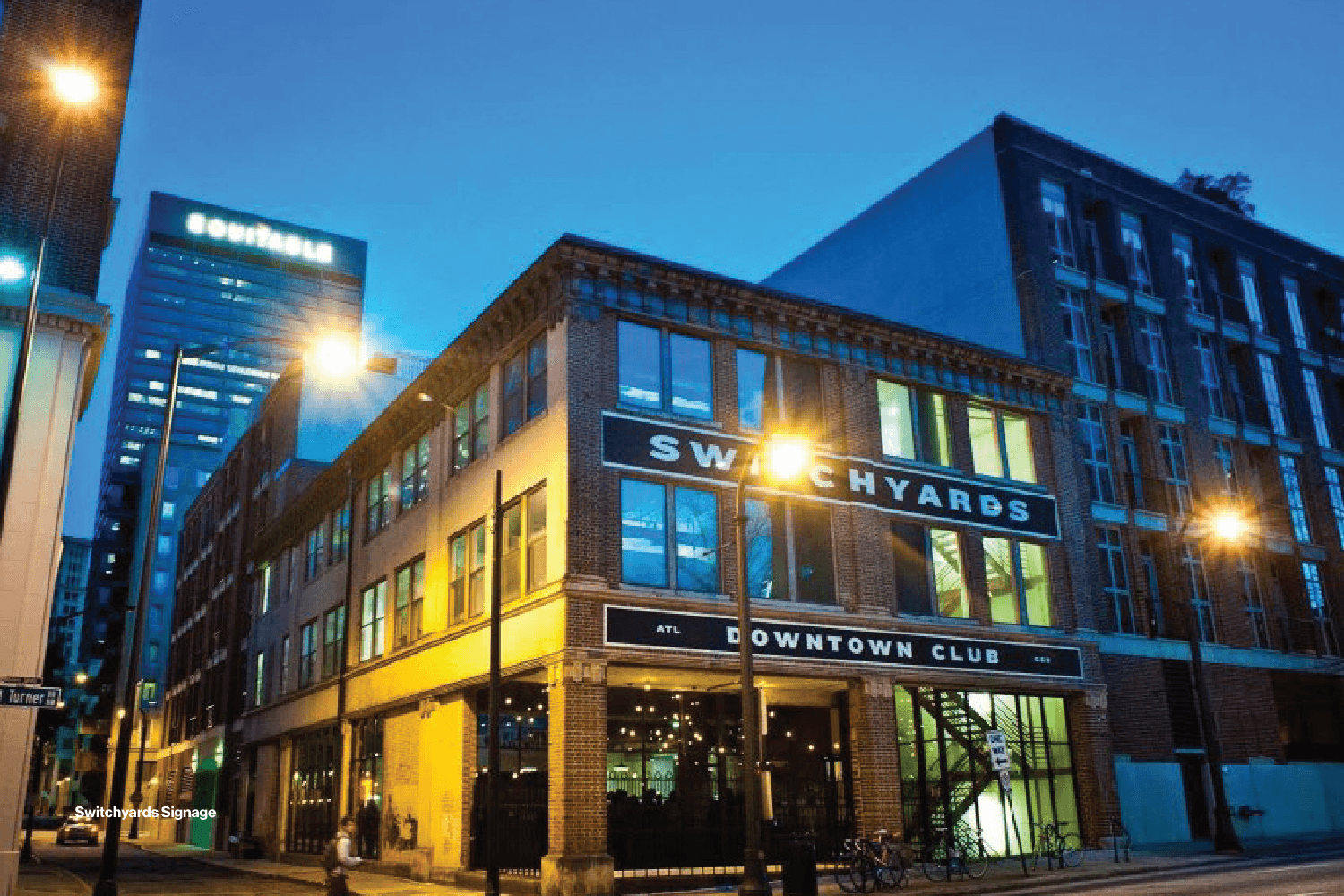
“I’ve been in my current studio for a year now, but the most incredible part for me is walking in every day under the sign that I designed. Michael Tavani hired me for the sign and the branding for the building, affectionately known as Switchyards Downtown Club. The crazy part? They hired one of Atlanta’s best sign painters, my buddy Adam McNeil, to paint it on the bricks of this 90 year-old building. And I got to obsess over every little detail. The ‘H’ that hits that center column right on target? All by design.”
|
|
|
|
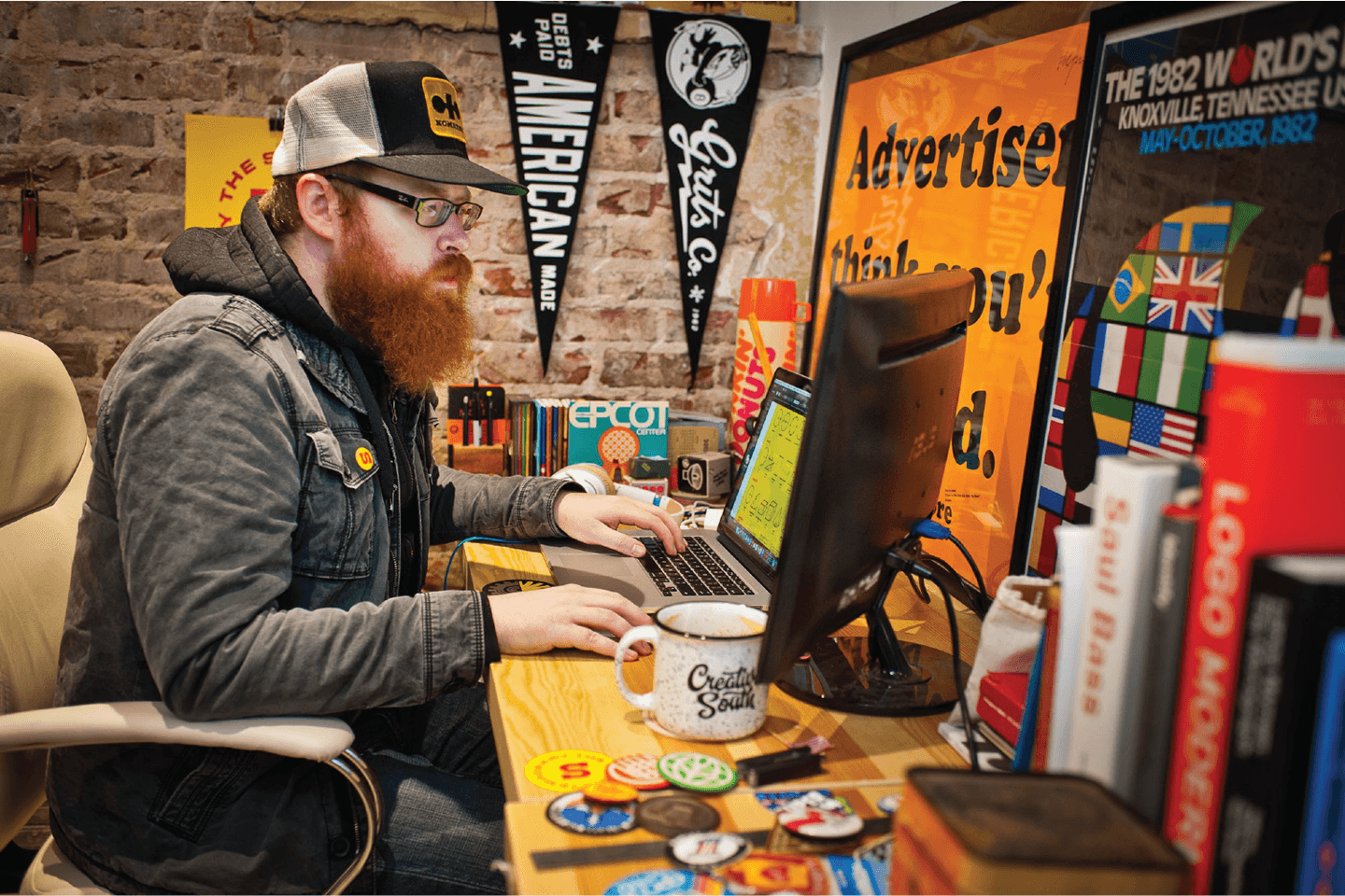
“My space is another story. It’s packed to the brim with books, posters, paraphernalia, Field Notes, Sharpies and a collection of design relics that take up a little too much space. I go all over Georgia and Tennessee to snag these treasures, and they influence my work every single day.”
|
|
|
|
Find Scott on Twitter, Instagram and Dribbble
|
|
|
|
|
We want to know what you think
|
|
|
|
|
Get in touch at [email protected] and tell us what you think of this new series highlighting the type habits of graphic designers and font addicts just like you. Want to share your Favorite Five with us and the rest of the world? We’re looking forward to hearing from you!
|
|
|
|