|
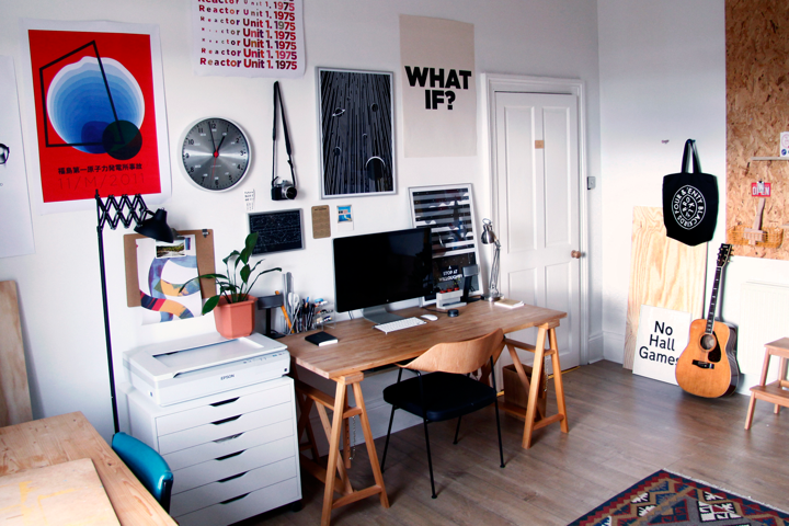
UK-based designer Mike Lemanski could easily be described as a design polymath — his work showcases a deft hand across multiple mediums, including typography, illustration and printmaking. A 2007 graduate of the Bradford School of Arts, today Mike has cultivated an impressive roster of clients since establishing his freelance practice in 2010 — including Intel, Lacoste, Google and TED. Living and working in West Yorkshire with his wife Sarah, Mike is also an associate lecturer of illustration at the University of Huddersfield.
Whether it’s his infographics, poster design, editorial illustrations or icon designs, many of Mike’s projects channel the bright visual spirit of midcentury design, coupled with a decidedly contemporary point of view. As you’ll be able to see, his work features arresting uses of restrained form, color and type, allowing the pieces to make bold gestures with a limited — though thoughtful — palette.
In issue #4 of My Favorite Five, Mike shares his work with us, as well as some of his go-to type families that you too can find right here on MyFonts:
|
|
|
|
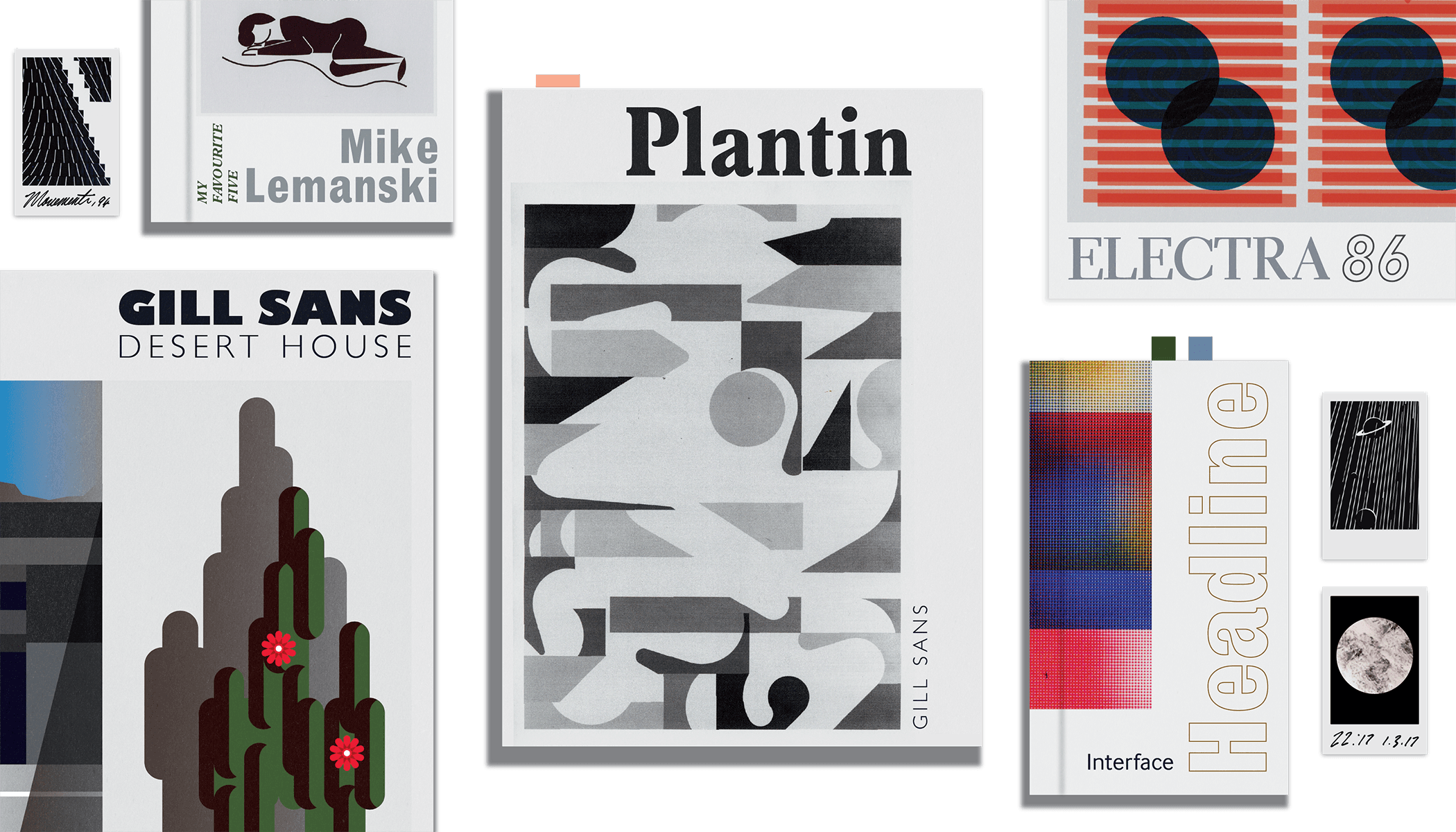
Mike’s Favorite Five Typefaces
|
|
|
|
|
GILL SANS®
Typeface family of 31 weights
|
| |
|
|
|
|
|
“This classic typeface has stood the test of time. To me it always feels quite British; very solid and friendly, really familiar. I mean look at that ‘s’ — dreamy stuff!”
|
|
|
|
PLANTIN®
Typeface family of 17 weights
|
| |
|
|
|
|
|
“The Plantin family, to me, is the perfect modern serif: its use by international publications, such as Monocle, only serves to enhance the contemporary appeal. To me it feels both familiar and warm, but at the same time exotic and front facing.”
|
|
|
|
HEADLINE™
Typeface family of one weight
|
| |
|
|
|
|
|
“I remember first seeing it on an art documentary — they flashed up some old printed matter, and there it was! It totally grabbed me. I paused the TV and took a photo to try and find out what this strange typeface was. It was the Headline family, and I’ve been in love ever since. It always seems like it doesn’t take itself too seriously. The lowercase feels really playful.”
|
|
|
|
ELECTRA®
Typeface family of 14 weights
|
| |
|
|
|
|
|
“The eight weights of the Electra collection tick all the boxes if you’re looking for a classic book typeface that feels human and familiar. The lowercase forms feel light, as if you’re writing with your own hand rather than setting text. I always like a typeface that has display weights too!”
|
|
|
|
INTERFACE
Typeface family of 12 weights
|
| |
|
|
|
|
|
“Super clean and full of life, great for copy, great for titles, great for everything. The InterFace collection just works in a really contemporary way at all sizes all the time — it never fails, and for that reason it has become my go-to typeface.”
|
|
|
|
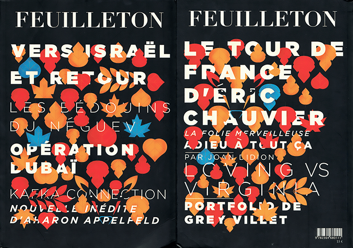
“One of my favourite projects of recent times was created for the French literary publication Feuilleton. They publish four issues a year, one for each season. I came to them with the idea of hiding the titles of the articles within visuals that alluded to the season they were published in — in this case, autumn. I loved the idea of bringing together my illustration work with type, without the type being ‘illustrated’, but instead intertwining amongst the visuals. It’s not only the type that is hidden; I also managed to hide various animals within the cover — in this case a deer. This interplay of set type and graphic illustrations is something that I really feel enhances both parties.”
|
|
|
|
|
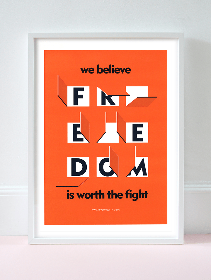
“I created this piece for Hope For Justice, an amazing not-for-profit organization helping to end human trafficking and slavery across the world. Working for big clients across the globe is great, but it was more than a pleasure to work for free with HFJ, and use my designs to help aid a really important cause. I initially worked around the quote, and liked one of their key ideas which is opening doors to people who need help the most. Visually I wanted to create something immediate and intriguing.”
|
|
|
|
|
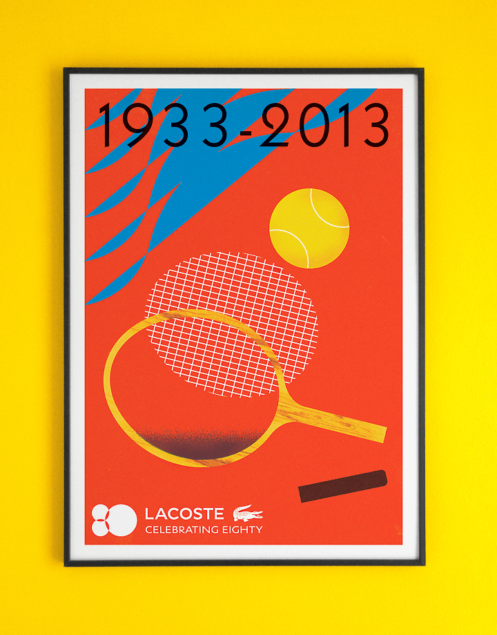
“Although it might not be overly obvious, a lot of the time in my work type is something that I heavily consider. For me it is the signature that ties everything together. Using it like this means that it actually has to work harder than if it was the sole focus. It needs to relate and be able to both stand alone and integrate. In this poster created for Lacoste, I used the beautiful shapes of the numerals to echo the graphic kinetic force of the illustration; I also wanted to use a timeless typeface (Gill Sans) to represent the time that had passed.”
|
|
|
|
|
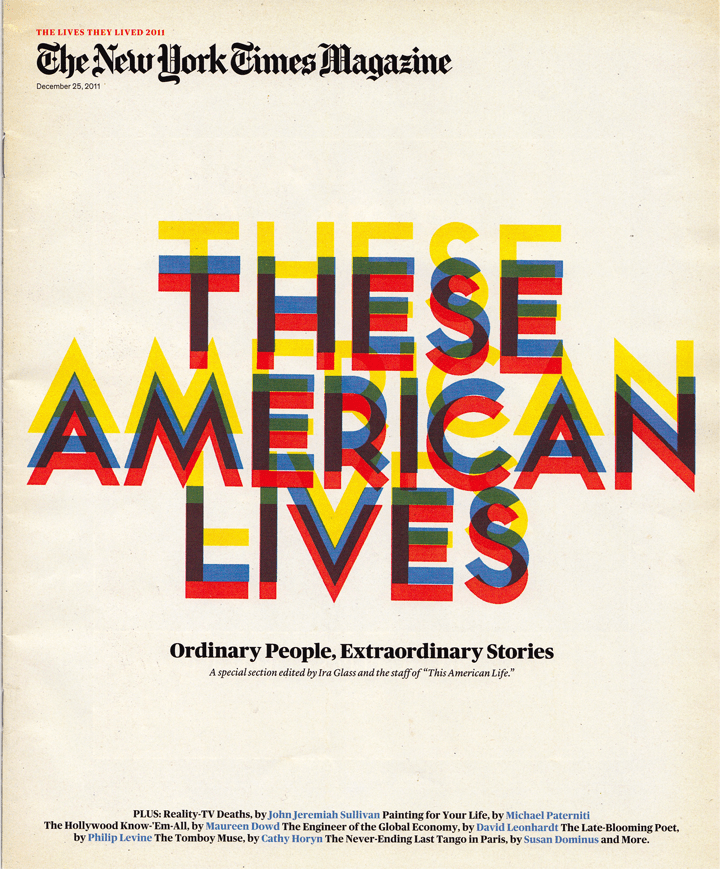
“Published on Christmas Day in 2011, I still regard this cover piece for the New York Times as one of my favorites. To be able to create something that would be so widely seen — and yet need to mean something — was really important. There was a random element involved in the process; by blindly overprinting and not knowing how the type would turn out, I managed to achieve the idea of the passing of time, which gave the type an ethereal feeling, which is something that the piece needed to achieve to have presence. A lot of my work is process driven, using print in unexpected ways — here it allowed me to mix my more experimental ideas with my commissioned work.”
|
|
|
|
|
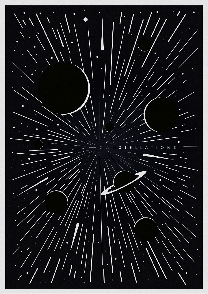
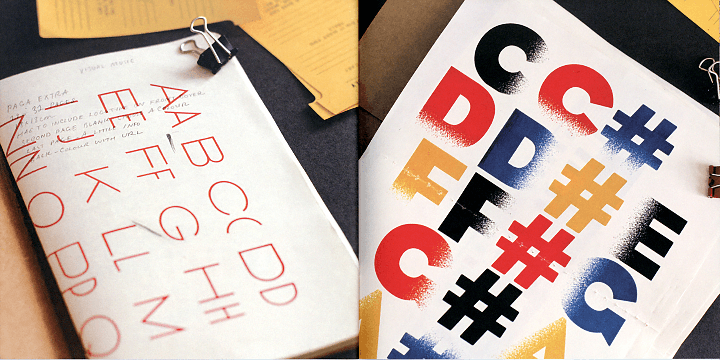
“Finding patterns between art and music is something that I come back to in my work as an ongoing study. I’ve published articles about the relationship of art, design, type and music. In this case, type was used in a more experimental way, utilizing print and trying to find patterns and rhythms found in music within the graphic language of type, image and color.”
|
|
|
|
Available from Mike’s online store
|
|
|
|
|
Pick up this fantastic A2 giclee poster print from Mike’s store, and have a look around at some of the other artwork on offer.
|
|
|
|
1: My tip would be to learn a little bit about why you’re using the typefaces you use. Type should be really well considered and thought out when applied to your work. Typefaces have been designed by dedicated professionals, which means there is a creative process involved in their production. If you haven’t already, do a little research into forms and styles and how the typefaces you love came to be. By going back and looking at this it will make you more aware of why you’re using the typefaces you use, rather than just picking anything. It might even get you to seek out new typefaces that help to diversify your work.
2: Get to know a little more about OpenType, which allows for greater control and diversity within certain typefaces. I don’t think a lot of people realize why the term ‘pro’ is used after certain typefaces — it’s because these are OpenType fonts. You can play around with ligatures and alternative characters, such as adding swashes or interesting links between characters. It allows you to be a little more creative with certain fonts, and makes them work a little harder for you!
|
|
|
|
Find Mike on Dribbble, Twitter
and the Web
|
|
|
|
|
We want to know what you think
|
|
|
|
|
How do you like My Favorite Five so far? Who would you like to see featured? Interested in being featured yourself? Get in touch at [email protected] and let us know. And while you’re tweeting, use hashtag #MyFavoriteFive to let the world know what your favorite five go-to typefaces are. Stay tuned for our next issue!
|

|
|
|