|
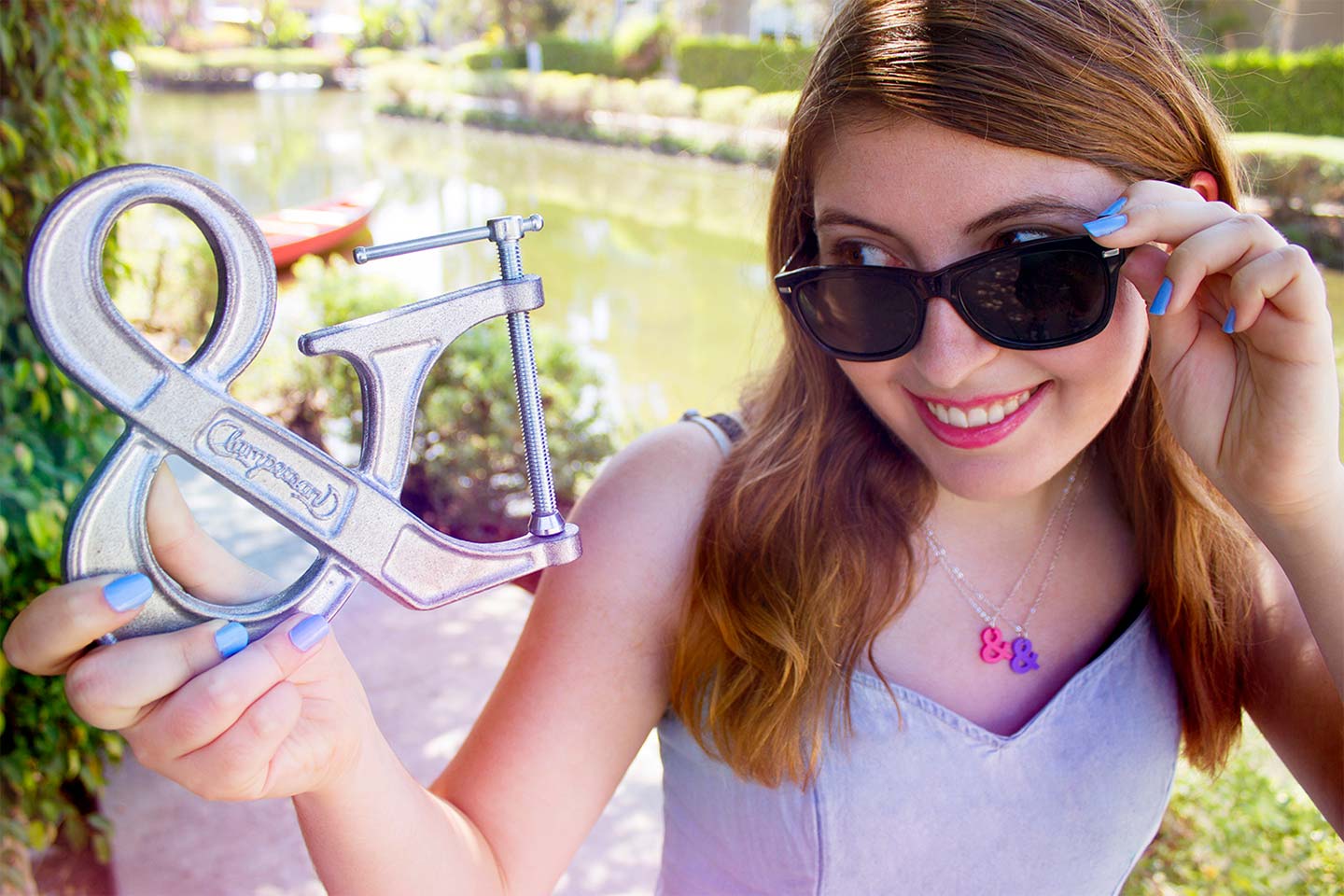
Los Angeles-based designer Karen Kavett is a self-professed ampersand enthusiast — more than possessing just a passing penchant for the glyph, the mark shows up in her products, including posters, jewelry, and even books. That’s right, Karen has published a book on the subject — a charming coloring book that celebrates what she declares to be: “the best typographic character in the world.”
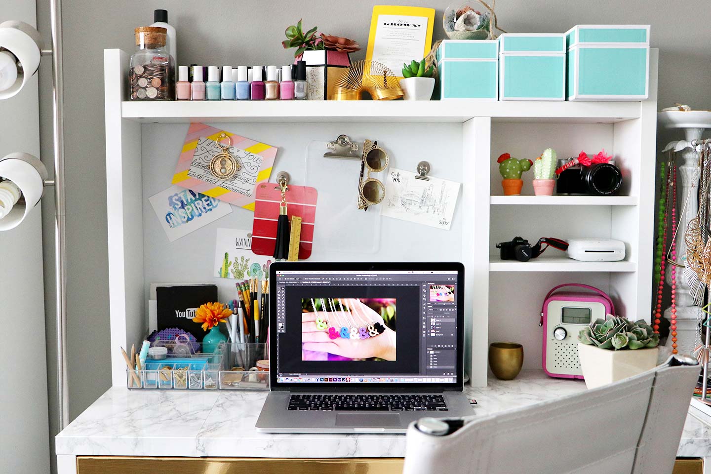
A graduate of the Rhode Island School of Design, Karen’s work possesses a distinct optimism — bright palettes and visual ebullience are its hallmarks, and this energy is aptly represented with equally as buoyant typography.
Aside from a freelance practice, she’s also the creator of her own popular YouTube channel, bringing design projects, DIY lessons, and friendly advice for navigating the world as a creative designer to over 150,000 subscribers. In addition to her own channel, since 2014 Karen has been a member of HGTV Handmade — a supergroup of makers inspiring users with a weekly collection of craft tutorial videos.
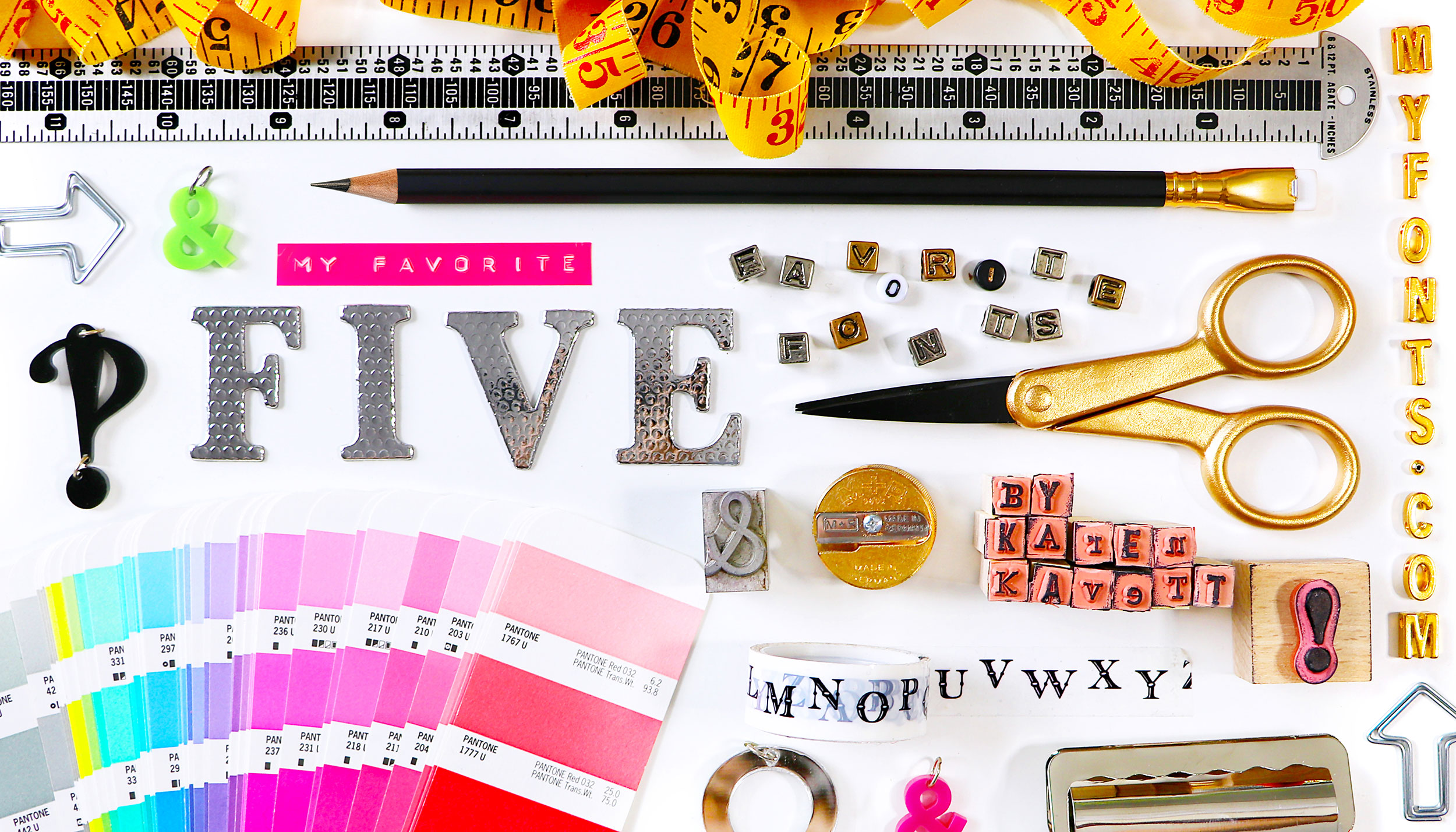
In this issue of My Favorite Five, Karen introduces us to her work as well as five of her go-to typeface families that imbue her designs with personality and verve.
|
|
|
|
Karen’s Favorite Five Typefaces
|
|
|
|
|
STEAGAL
Typeface family of 18 weights
|
| |
|
|
|
|
|
“Steagal is my go-to font when I want a sans-serif font that looks a little more unique than the system fonts we’ve all used a thousand times. The slightly curved corners give it a friendly, inviting look whether it’s being used as display text or for copy.”
|
|
|
|
ENVELOVE
Typeface family of three weights
|
| |
|
|
|
|
|
“As someone with terrible handwriting, I collect script fonts like they’re going out of style so that I never have to rely on my own attempts at calligraphy. I’m a sucker for any designs with nice textured edges, multiple glyph choices for each letter, and a set of matching icons to add that final touch.”
|
|
|
|
FREELAND
Typeface family of two weights
|
| |
|
|
|
|
|
“I think some of my viewers might think the Freeland design is my actual handwriting because I use it so much in all my designs! It’s beautifully textured but still legible, even down at small sizes.”
|
|
|
|
FESTIVO LETTERS
Typeface family of 19 weights
|
| |
|
|
|
|
|
“Sometimes you just need a bold, attention-grabbing sans-serif that doesn’t look too clean cut next to your script fonts, and Festivo Letters fits that bill exactly. The full font family starts with subtle organic edges and ends up at striped and patterned textures that look like the doodles we all used to draw during math class.”
|
|
|
|
THE HAND
Typeface family of six weights
|
| |
|
|
|
|
|
“I love pairing tall, narrow fonts with short, wide ones, and The Hand family is the perfect narrow font to pair with a script front like Freeland. The letters are perfectly spaced, and the different weights give you the option of keeping it light and airy or bold and attention-grabbing — plus a fun dotted version for those whimsical days!”
|
|
|
|
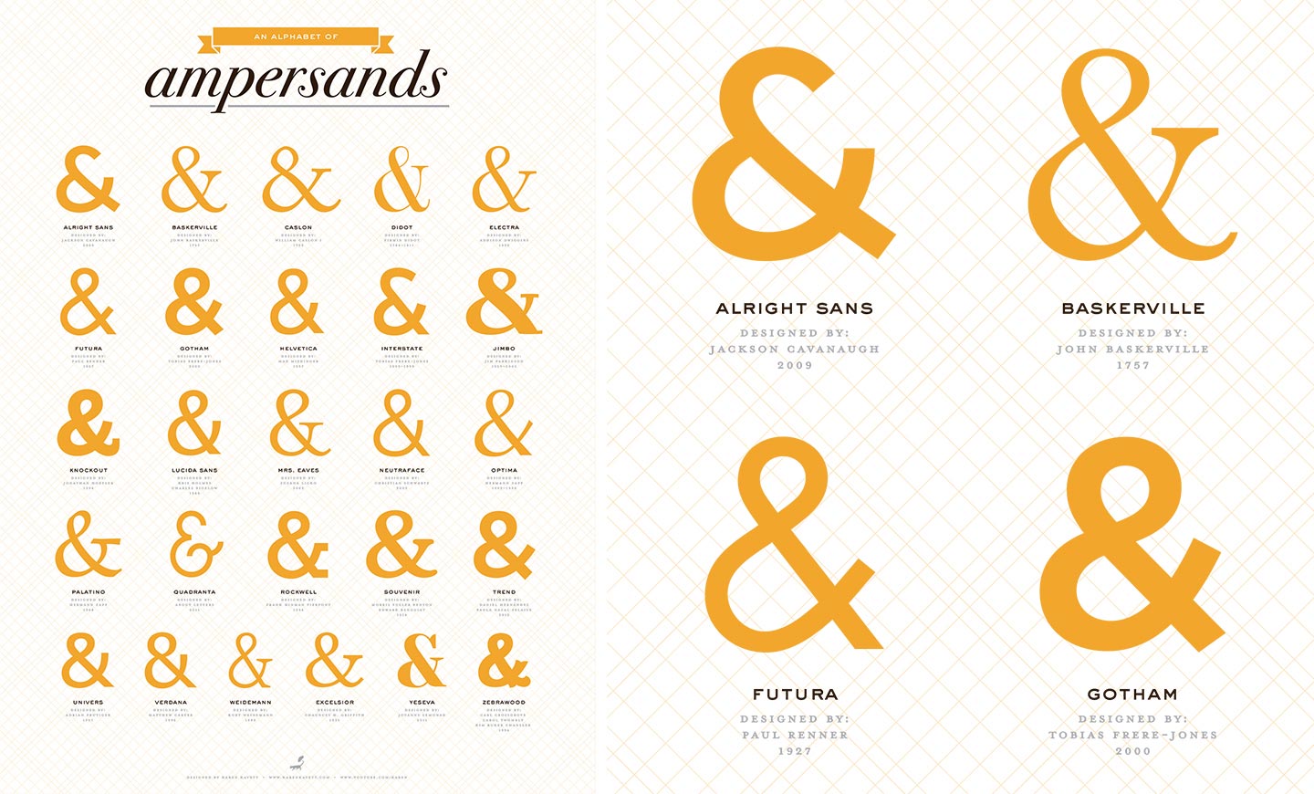
“The Alphabet of Ampersands is a poster I designed to sell in my merch store. I thought it would be fun to compare all the different ampersand designs from my favorite fonts starting with each letter of the alphabet!”
|
|
|
|
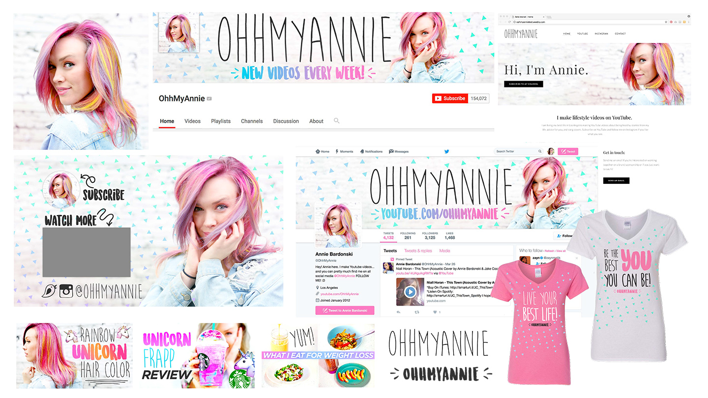
“I recently did a presentation at the YouTube conference ClamourCon all about channel branding, and I was given the challenge to redesign the lifestyle and fashion channel OhhMyAnnie. This was actually an easy and fun project to take on since we have a very similar aesthetic!”
|
|
|
|
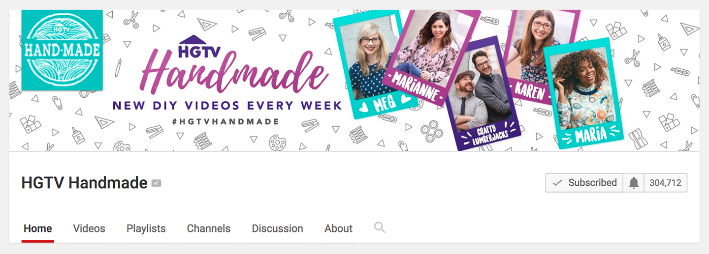
“I contribute DIY videos to the collab channel HGTV Handmade on YouTube, and as the resident graphic designer of the group, HGTV asked me to redesign our branding to include the new members that we’ve brought onto the channel. This is the new banner I designed, including a fun patterned background with icons from The Noun Project.”
|
|
|
|
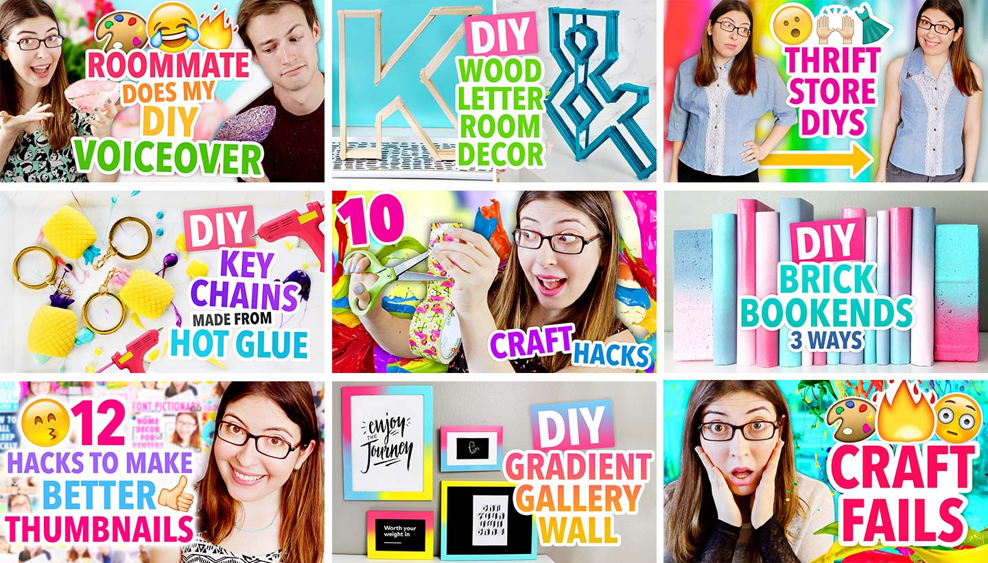
“These days I spend more time on DIY videos and video editing than I do on graphic design projects, but putting together the YouTube thumbnail is a fun design challenge to finish off every video. It’s a small space to summarize what the video is about while needing to be attention-grabbing in sub boxes and search! These are a few of my favorites from the past couple of months from my YouTube channel and HGTV Handmade.”
|
|
|
|
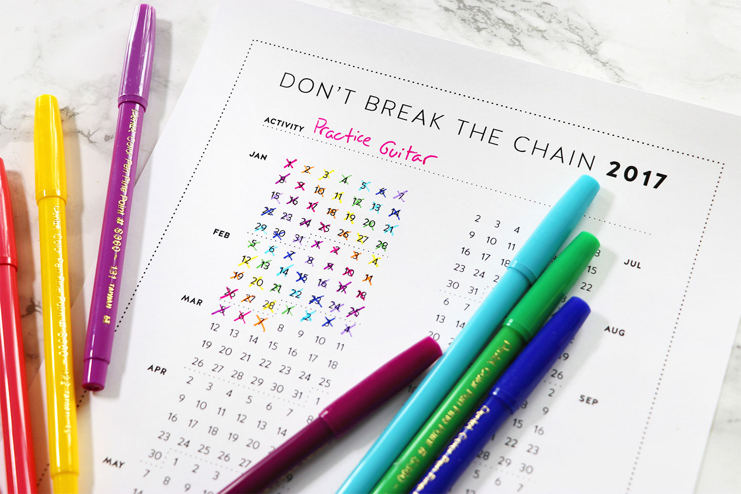
“Every year since 2012, I’ve designed a free motivational printable called the Don’t Break the Chain calendar. The idea is simple — you print it out, decide what task you want to accomplish every day, mark off the days that you do it, and then you end up with a ‘chain’ that you don’t want to break by skipping a day! You can download the 2017 calendar here.”
|
|
|
|
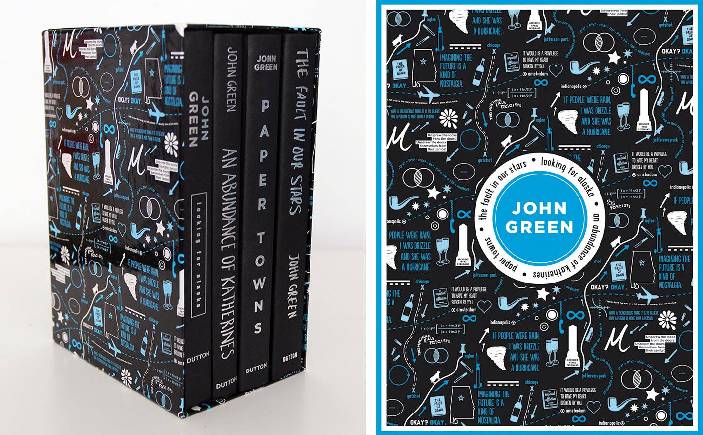
“This project is a throwback from 2012, but it’s probably my most well-known to date. I did a lot of graphic design work for author John Green and his brother Hank Green in the early days of their Vlogbrothers YouTube channel, and John’s publishers also commissioned me to design an illustration for his new box set of books. Learn more about this project.”
|
|
|
|
“If you’re using script fonts, always look for extended families that have alternate glyphs of each letter, so that it’s not quite so obvious that you’ve used a font instead of lettering it yourself!”
|
|
|
|
Get your mits on some merch!
|
|
|
|
|
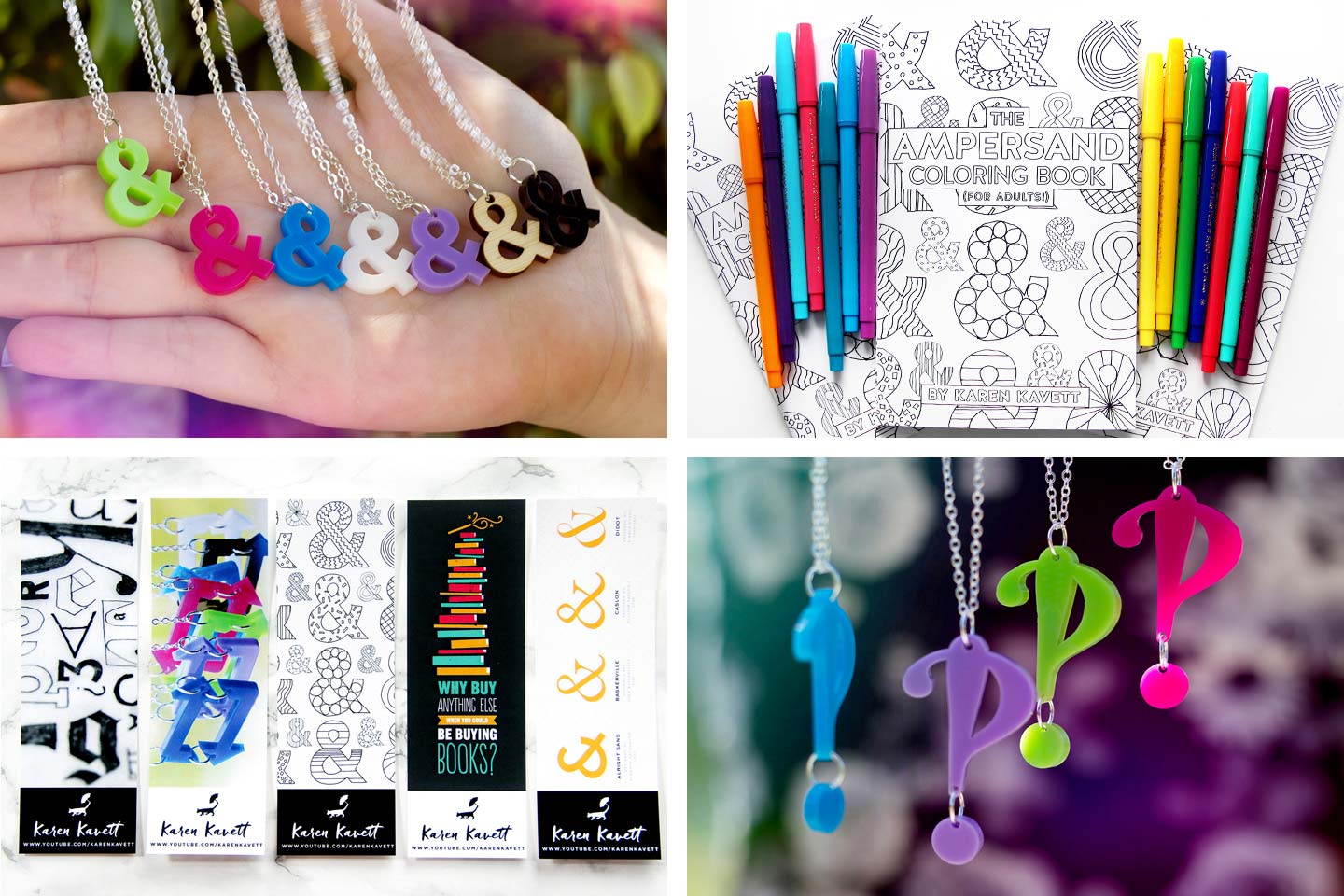
“As a self-proclaimed ampersand enthusiast, I sell graphic design inspired merch at DFTBA.com/karen, including laser-cut ampersand necklaces, interrobang necklaces, The Ampersand Coloring Book and Poster, a set of graphic design bookmarks, and lots of other fun goodies.”
|
|
|
|
We want to know what you think
|
|
|
|
|
How do you like My Favorite Five so far? Who would you like to see featured? Interested in being featured yourself? Get in touch at [email protected] and let us know. And while you’re tweeting, use hashtag #MyFavoriteFive to let the world know what your favorite five go-to typefaces are. Stay tuned for our next issue!
|

|
|
|