
any of you have visited foreign lands during the past few months, and so have probably also seen some foreign supermarkets. The package designer in you will have relished walking through the aisles and inspecting the local labels. For in spite of global consumerism, each culture still has its own preferences when it comes to packaging and branding. One trend is global, though: scripts — elegant, informal or trashy — are all over the place. In case you got inspired to try something new in your holiday scrapbook, music packaging or candy bar design, here are some great fonts to get something going.
This month’s Rising Stars
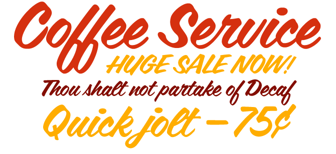
It’s spicy, it’s energetic, it’s attractive: Coffee Service oozes the charm of a loud, busy streetcorner café. The lowercase alphabet connects beautifully, and its natural flow is further enhanced by a series of ligatures for combinations such as cr, er, tr, ns and more. Its generous x-height provides it with good legibility, in spite of its speedy, informal style. Suitable for everything from menus to signs, from film titles to music ads, Coffee Service is a great addition to any display font collection.
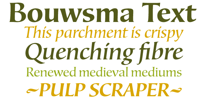
Bouwsma Text is a gracefully calligraphic roman typeface, a fascinating hybrid that will work beautifully in more functions than one. Bouwsma Text was designed by calligrapher Philip Bouwsma (read his fascinating biography) who managed to strike a balance between the flow of the hand-written word and the regularity of a roman printing typeface.
The moving calligraphic stroke brings life and instant familiarity to the letters, combining classical legibility and proportion with the warmth and presence of a manuscript.
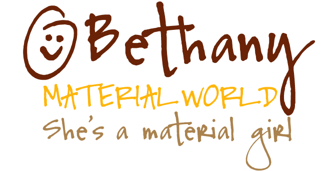
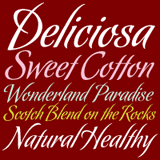
Font Garden’s Ellinor Maria Rapp has been keeping a rather low profile since we interviewed her back in December. Now she’s back with a vengeance. Selling a staggering number of copies in a few weeks, her new font Bethany has confidently strolled to the number one spot on our Starlets list. Bethany is as spirited as any of Font Garden’s handwriting fonts, even maintaining a spontaneous authenticy when setting heavily-accented languages. And for those who have trouble hand-drawing a smiley, Bethany has two of them to use on your computer.
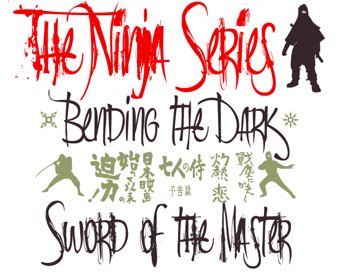
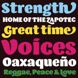
With the Ninja series, Andinistas designer Carlos Fabián Camargo Guerrero does what he does best: take a script face and destroy it by adding lots of noise. The cleanest font in the series, Ninja 1, is an energetic, informal, tightly spaced brush script font. Its lowercase is especially whimsical, mixing uppercase forms like A, B, G, etc, with a lowercase e, f, n and more. The descending k and s are definitely cool. Ninja 1’s shapes are nonchalant and its spacing is deliberately sloppy. But if it is still too smooth for your taste and you want something dirtier and noiser, try Ninja 2. It’s positively messy. And don't forget to check out Ninja Dingbats, an intriguing collection of martial arts silhouettes and mysterious Japanese texts.
Text family of the month
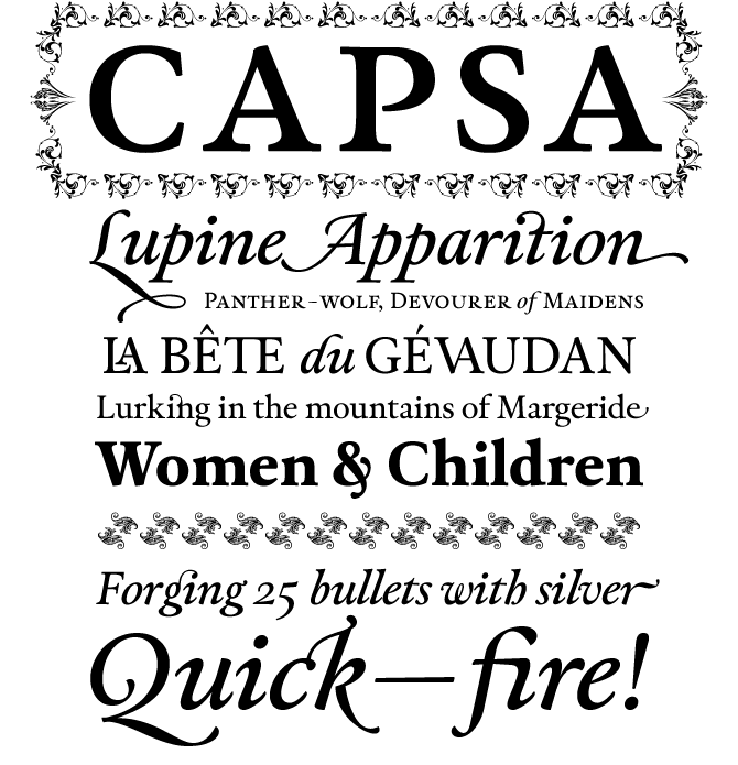
Capsa is a new book face from Dino dos Santos, the Portuguese designer who gave us Leitura, Estilo and a host of other beautifully produced font families. Like its predecessors, Capsa has been drawn with love and care, and is chock full of options and alternate glyphs to design page after page of stylishly arranged text.
Inspired by two faces from the mid-18th century specimen of the printer Claude Lamesle, Capsa is not a revival but a contemporary take on an elegant rococo book face. Instead of a large spectrum of weights, it offers a wealth of swashed italics, fancy ligatures, and ornaments for that one regular weight which the discerning typographer knows how to use to great effect. There’s a very practical collection of figure styles, and the small caps are considerably larger than the x-height, which for some jobs may come in very handy. Delightful!
Follow-Up
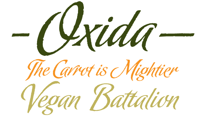
Oxida is a vigorous script drawn by Argentinean lettering artist Angel Koziupa and digitized by type wizard Alejandro Paul. Introduced in our previous Rising Stars newsletter, it has continued to do extremely well throughout the summer. Its rusty edges give it a special kind of energy — perfect for romantic movies and novels, and for packaging of anything roasted.
If you like this font from Sudtipos, check out some of their other recent offerings:
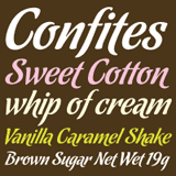
Chocolate
If a typeface could melt on your tongue, Chocolate is it. It comes in three flavors: Dulce (sweet), Caliente (spicy) and Amargo (bittersweet), each offering a different variant of an irresistible lettering style. The OpenType version includes three flavors all in one.
Koziupack
Another freestyle script by the Koziupa-Paul team. Its bent, pointed terminals, its swashy carefree caps and unique figures lend character and sharpness to food and drink product labels or ads. Koziupack is also a great companion to contemporary illustration.
Barricada
Barricada is a jovial font with immediate impact, a kind of contemporary Cooper Black. It is solid and loud-mouthed, but thanks to the curved serifs and playful alternation of thick and thin, it still manages to look fresh and simpatico.
Have your say
— Joe in Bordeaux, France
18 July, 2008
Your opinion matters to us! Feel free to share your thoughts or read other people’s comments at the MyFonts Testimonials page.
Font credits
The Rising Stars masthead and subheading are set in Auto 3 and Bryant, respectively. The drop-cap M in the introduction is set in Sweet Upright Script, and the Have your say quotation in Capsa. The small pixel typeface used at the very top is Unibody 8.
Unsubscribe info
This newsletter was sent to [email]. You may unsubscribe at any time at: www.myfonts.com/MailingList
Want more?
All of our previous newsletters are available online at myfonts.com/newsletters/
Comments?
Please send any questions or comments regarding this newsletter to: [email protected]