
The first weeks of 2009 have gone by at lightning speed. So maybe you are ready to replace some of your New Year’s resolutions with even better ones. Here we go. First, after a few slow months, we’ll get the ball rolling again through positive thinking. Second, we’ll come up with new, daring typography to express our growing optimism. Third, we’re going to work with brand new fonts to create this typographic vision. That is where this newsletter comes in. Because MyFonts is here to help you get your groove back!
This month’s Rising Stars
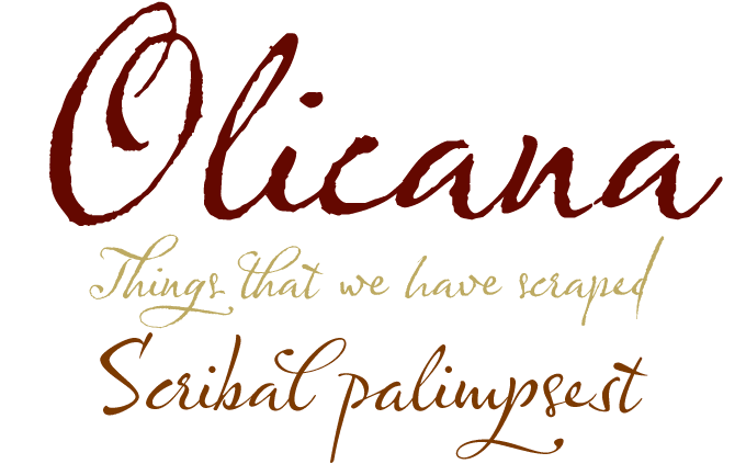
Olicana is one of those scripts that simply radiate good humor and cheerful energy. It comes in two variants: Olicana Rough and its more mild-mannered sister, Olicana Smooth. Both fonts successfully mimic true handwriting with pen and ink. Although the approach is definitely informal, these fonts do not look like just anybody’s handwriting: they have truly professional dash and style. But to mess things up a little bit, designer Nick Cooke has added finger prints, ink splats and cross-outs, each with zero width so that they appear on top of the letters, not in-between them. Each font includes a wealth of swashes, ligatures and stylistic alternates to achieve a realistic handwritten effect.
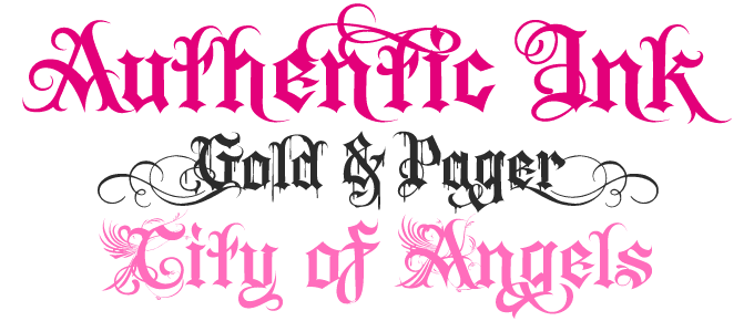
The past few years, blackletter (fraktur in German) has been all the rage — a favorite among hip hop artists, rockers and fashion victims alike. The book Fraktur Mon Amour, a genuine bible of blackletter, displays a staggering number of digital fraktur fonts. Many, though, are revivals of old alphabets; precious few present a personal interpretation of the genre. With Authentic Ink, Florian Schick has done just that, taking fraktur into the 21st Century and investing it with the cool of urban street art and tattoo culture. The font has been very successful at MyFonts — a steady seller since it first appeared. Authentic Ink comes in three versions: Ink Normal, a spirited blackletter with some spiky flourishes, and two outrageous variants called Ink Drips and Ink Initial.
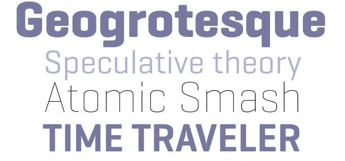
It’s been a while since we last heard from Eduardo Manso, the designer of the successful Relato family. His new type family Geogrotesque is one of the most interesting recent sans-serif designs. Based on a simple basic shape — a rectangle with curved top and bottom — the typeface is very regular without becoming bland or mechanical. Its subtly rounded terminals lend it a friendly appeal at larger sizes, while the sloping horizontals tie the words together into coherent shapes that are legible even at smaller point sizes.
With seven weights, Geogrotesque is a great headline family for magazines or annual reports, but will also work in text of intermediate length and point size.
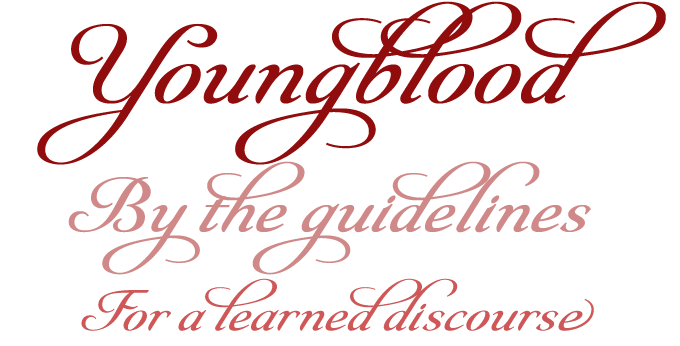
Insigne’s Youngblood is a script font designed with maximum usability in mind. A non-connected formal script with tall, sweeping ascenders, it comes with two alternate alphabets that have a more restrained look. The three matching fonts can be mixed, even within one word, to create a personalized design. Youngblood is slightly heavier in weight than many copperplate-style script fonts. This makes it an interesting hybrid with a practical approach, well-suited for display work, packaging and the like. Youngblood is a well-equipped OpenType font with swashes, ornaments, ligatures, discretionary ligatures and old style figures.
Text family of the month
Professional book typographers make heavy demands on any text font they choose to use. Of course it must be well designed, made to look even and unobtrusive at all text sizes. But there’s more. The ideal family has to provide the discerning book and brochure designer with any features a job may require: plenty of weights, true italics, small caps, both tabular and oldstyle numerals, international character sets, and more.
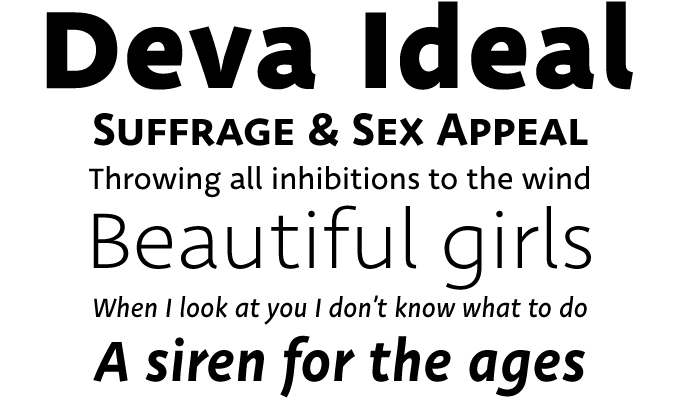
Among the text families that recently hit our shelves, Deva Ideal, a new sans-serif by Slovak designer Ján Filípek, meets those requirements with meticulous attention to detail. Its letterforms are clear and distinctive, the overall image is beautifully open and regular, and the italic has a nice flow despite its simple structure. Deva Ideal comes with any feature you may want for a complex project, including probably the largest set of numerals we’ve ever come across — imagine having two sets of Roman numerals, cap height and small cap height, at your disposal when typesetting a history book! It has arrows, boxes, broken hearts, inferior and superior numerals and letters… Deva Ideal is an exemplary sans-serif text family, raising the bar for text families to come.
Follow-Up
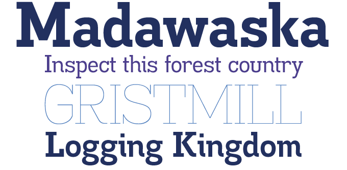
Madawaska by Ray Larabie was among the most successful fonts of past few months. A slab serif family of mixed influences, it offers the usability of a text family combined with the distinctive character of a display typeface. The versatile Madawaska family comes in seven weights, one of which is offered free of charge, courtesy of Larabie’s microfoundry, Typodermic.
If you liked this typeface from Typodermic, check out some of their other fonts:
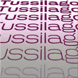
Tussilago
If you like your words to have width as well as depth, Tussilago may provide just the right wardrobe. With seven weights and multiple styles of numerals, Tussilago is a font to be reckoned with for magazine, flyer and identity design.
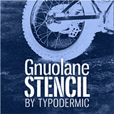
Gnuolane Stencil
Based on Larabie’s Gnuolane, Gnuolane Stencil is a powerful stencil font in five weights. While it borrows from 19th-century grotesque models, its smooth elliptical structure lend it a sixties sneer. A distinctive face for magazine headlines or transport crates.

Amienne
Amienne is a lively and informal brush script that moves with a nimble rhythm. Airy and graceful, Amienne is delicately rounded in all the right places. Great for greeting cards and headlines, surprisingly useful for advertising and signage.
Have your say
— Delina Papit in Raphine, Virginia
15 January, 2008
Your opinion matters to us! Feel free to share your thoughts or read other people’s comments at the MyFonts Testimonials page.
Colophon
The Rising Stars nameplate is set in Auto 3 and Bryant, and the Have your say quotation in Deva Ideal.
Subscription info
Want to get future MyFonts newsletters sent to your inbox? Subscribe at myfonts.com/MailingList
Comments?
We’d love to hear from you! Please send any questions or comments about this newsletter to [email protected]