
July is turning into quite a serious type month here at MyFonts, with some great text fonts and classically inspired titling fonts competing for the top positions in our Hot New Fonts list. We’re not forgetting the fun stuff, though. Check out the great picture fonts that have arrived in our shop lately — like the attractive set of frames and vignettes you find below. All in all, we’re pretty sure your midsummer newsletter (well, midwinter, if you’re in Buenos Aires, Cape Town or Sydney) offers something for everyone.
This month’s Rising Stars
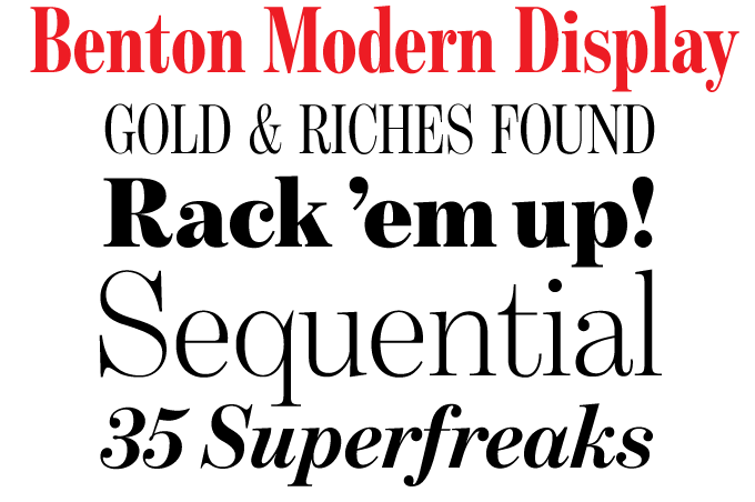
Boston’s Font Bureau has built a solid reputation for developing custom-made fonts for magazines and newspapers. These typefaces often tap into the century-old American tradition of news faces for body text and headlines. Benton Modern is a case in point. Originally produced for the Boston Globe and the Detroit Free Press, the Text version takes its design and proportions from Morris Fuller Benton’s turn-of-the-century Century Expanded. The italic is based on Century Schoolbook. The new Benton Modern Display takes these forms to a new level of subtlety: finer hairlines, gorgeous ball terminals, details perfected for viewing at large sizes. A wonderful job by Dyana Weissman and Richard Lipton.
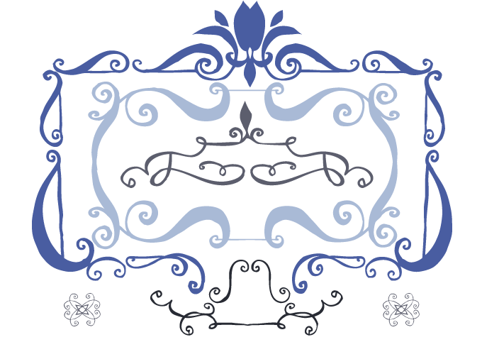
Blue Goblet Frames and Vignettes is a companion to Blue Goblet, a script developed for a series of illustrated children’s books. Both Blue Goblet and Blue Goblet Frames were designed by Cory Godbey at Portland Studios, and digitized by insigne’s Jeremy Dooley. The lively and amusing Frames and Vignettes have a built-in irregularity, which makes it easier for enterprising designers to modify them after converting them to outlines. They can be used in combination with Blue Goblet or a display font of your choice for chapter headings or handouts; single frames can be layered to create unique compositions. Be sure to also check out Blue Goblet Ornaments.
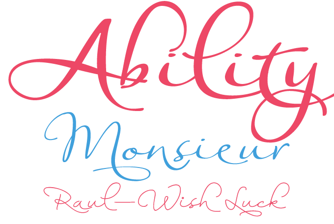
Ability is a new family of handwriting fonts from Anton Scholtz in Durban, South Africa. His recent offerings included the hand-drawn vigor of Affable and the dash of Blythe; Ability has a bit of both. With its swashes and swirls, Ability is great for constructing interesting word shapes (a challenge to your creativity, as it refrains from automated alternates or other OpenType wizardry). The family comes in six styles, including the contrast-rich Black, two Condensed variants and two monolinear fonts. It is recommended for a wide variety of uses, including greeting cards, lingerie labels, music packaging and magazine headlines.
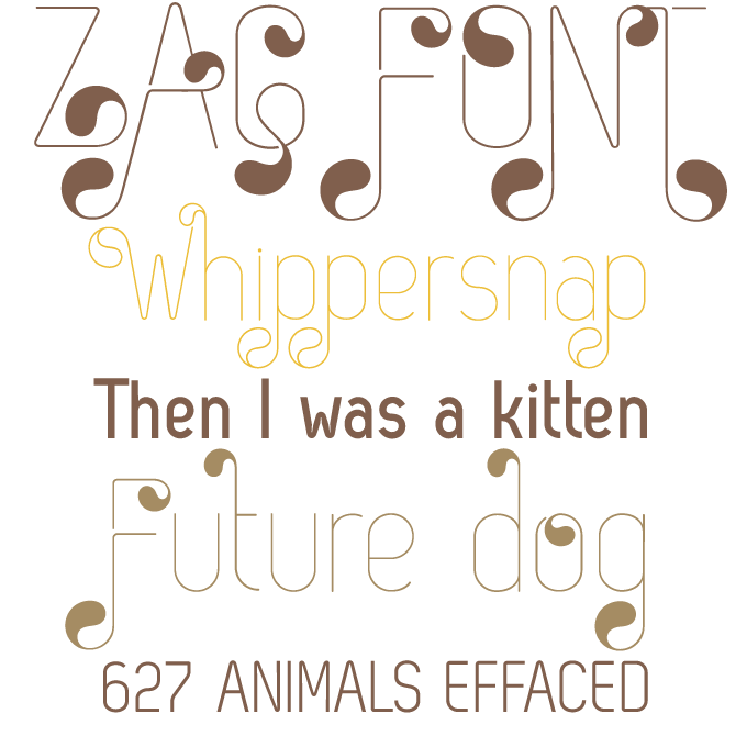
Bulgarian designer Svetoslav Simov has a predilection for geometric fonts with a distinct 1970s–1980s flavor. His successful Zag shows the characteristics of a constructed alphabet made with ruler and compass, yet has some elements that are quite unusual in this genre — such as conspicuous ink traps in sharp corners, or exuberant drop-like ornaments. While Zag’s ‘straight’ weights are industrial sans-serifs along the lines of the DIN typeface, the decorated varieties suggest a different kind of use, from magazine headlines to t-shirts.
Text family of the month

The very first typefaces that looked like our current oldstyle fonts were cut around 1470 by a French punchcutter in Venice, Nicolas Jenson. If you search Jenson’s name on MyFonts, you’ll find that there are dozens of Jenson-inspired typefaces around, from literal reproductions to famous revivals such as Centaur or sassy interpretations like Parkinson’s Benicia. In that long list, Ludwig Übele’s Augustin typeface stands out as something truly new.
Following Marat and Mokka, Augustin is the third in a series of remarkably confident serifed text faces designed by Übele. A rather free reinterpretation of Jenson’s humanistic model, Augustin is totally contemporary in its unadorned forms and crisp detailing. It is not a large family, but with small caps as well as oldstyle and lining figures, both tabular and proportional, it has got what you need for elegant book typography.
Follow-Up
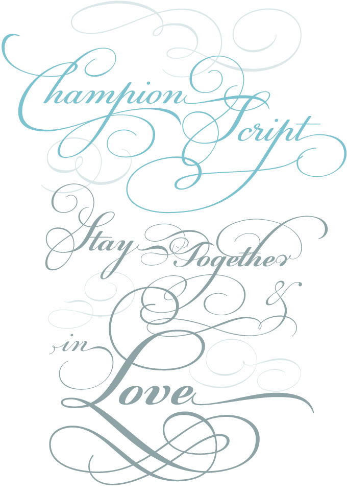
Our users were visibly impressed by Champion Script Pro, a spectacular calligraphic font that Parachute boldly announced as “the most advanced and powerful script ever made.” Having been featured in our June Rising Stars newsletter, the font has continued to do very well. Based on the work of 18th-century calligrapher Joseph Champion, it comes in two weights, each loaded with 4,280 glyphs (!), offering a huge range of alternates and ligatures for all languages. Equipped with savvy OpenType programming, Champion Script Pro automatically creates context-based combinations when used in programs that support full OpenType functionality. Try it — you’ll be impressed.
If you like this typeface by Parachute, check out some of their other fonts:
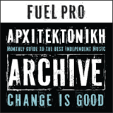
Fuel Pro
A rare ‘grunge-style’ font in the Parachute library, this font evokes the rough reality of the urban cityscape. It has been part of numerous product campaigns – music, mobile telephony, food, beverages, politics, you name it. The ‘Pro’ version includes Cyrillic and matching frames.

Beau Sans Pro
Beau Sans was inspired by Bernhard Gothic, an early 20th-century sans serif designed by Lucian Bernhard. Its first incarnation, named Traffic, was a minimalist text typeface with details drawn from Bauhaus typography. A drastic makeover resulted in Beau Sans Pro, a modern sans-serif family of 16 fonts.
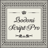
Bodoni Script Pro
Intrigued by Bodoni’s work, designer Panos Vassiliou studied the Italian master’s posthumous specimen book, the 1818 Manuale Tipografico. He set out to create a typeface based on the distinct script capitals presented in the book, selecting matching lowercase italics. Each font of the ‘Pro’ family comes with 725 glyphs including a large number of alternates.
Sponsored font package
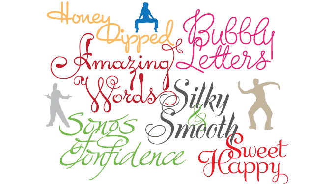
For this month’s Sponsored Font section, Canada Type put together a bargain Script Value Pack featuring some of their all-time favorites. Swan Song, based on a free-form calligraphic alphabet by British artist Rachel Yallop, is a rich-textured and lively handwriting font. Pendulum is a dazzlingly vertical script based on a forgotten Nebiolo font from the 1940s. Dominique, Canada Type’s very first hit, is an endearing, informal upright script, while Chikita is an energetic, happy-go-lucky font inspired by an alphabet from a Dutch lettering book. Add a couple more equally attractive script fonts plus, as a bonus, the dynamic dancers’ silhouettes from Dancebats, and you have a unique Value Pack (priced at less than half the cost of the fonts if bought individually) to keep you swinging all summer long – and beyond.
Have your say

—Devan in Louisville, Kentucky
12 June, 2009
Your opinion matters to us! Feel free to share your thoughts or read other people’s comments at the MyFonts Testimonials page.
Colophon
The Rising Stars nameplate is set in Auto 3 and Bryant, and the Have your say quotation in Augustin.
Subscription info
Want to get future MyFonts newsletters sent to your inbox? Subscribe at myfonts.com/MailingList
Comments?
We’d love to hear from you! Please send any questions or comments about this newsletter to [email protected]