
This month’s Rising Stars are a diverse little gang, but they have one thing in common: they are all convincing examples of the sophistication of today’s typographic technology. Whether it is the virtuosity of connecting scripts such as Maestro and Liza, the fantasy of Mussica or the versatility of multi-weight fonts such as Organic or Geogrotesque Stencil: today’s typefaces often unite aesthetic appeal with functional cleverness.
This month’s Rising Stars
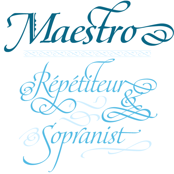
Maestro is the outcome of a collaboration between two complementary minds: American penman Philip Bouwsma and Canadian curvemaster Patrick Griffin of CanadaType. The twosome has worked together before; this time the result is truly spectacular. Maestro is an exemplary reconciliation of calligraphic sensibility and digital sophistication. In Griffin’s words: “Maestro is the font that Arrighi and his colleagues would have made if they had had digital technology”. Ludovico degli Arrighi was one of several Renaissance writing masters who promoted the style we have come to know as “italic”. Neither the engraved wood blocks used to multiply these scripts, nor the metal fonts based on their designs managed to fully capture the subtlety of the hand-written models. With digital fonts, the virtuosity and liveliness of the Italian maestri has finally found its way into type design. The Maestro family consists of forty fonts, but the OpenType version compresses the family with all its ligatures, alternates and swash characters down to just two fonts, regular and bold, each containing over 3,350 characters. For more information on Maestro’s background, read the PDF accompanying the family.
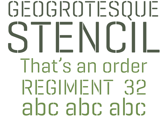
Late last year, Barcelona-based designer Eduardo Manso introduced Geogrotesque, a family of geometric yet very readable sans-serifs that became immediately popular. The new variant Geogrotesque Stencil closely follows the original family’s structure, addressing some of the typical problems most stencil fonts present. While many stencil fonts only have a limited number of weights, Geogrotesque Stencil offers seven weights. Also, in most stencil fonts, the width of the “gaps” works well with a small range of sizes only; Geogrotesque Stencil proposes 3 widths of cuts, called A, B and C. This solution has multiple advantages. It turns the sub-family into a versatile font for headlines, pull quotes and the like; and it makes it technically superior when used for cutting real stencils, allowing the user to choose the version best adapted to the rigidity of the material to be cut. Smart stuff.
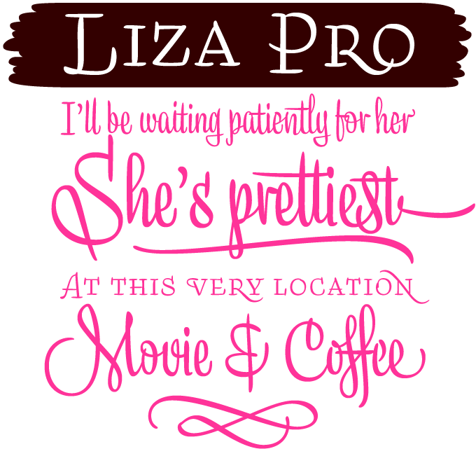
Years ago, the Dutch-German-Finnish trio that calls itself Underware raised the bar for brush script fonts with their Bello typeface, a milestone in the genre. Liza Pro is a further exploration of scripts, using the wizardry of OpenType architecture to create a font that approaches human hand lettering as closely as possible. Out of a stock of 4,000 hand-crafted characters, Liza creates the optimal combination. All of this works like a breeze when using a program with full OpenType functionality; automatic substitution will make your text look different and fresh all the time. Liza’s style recalls 1950s advertising, but without a trace of nostalgia. Flirtsy, stylish, provocative, emotional, casual, moderate, clever & charming — Liza Pro has it all. Check out the introductory and the connoisseurs’ PDFs for details on how Liza’s five fonts work together.
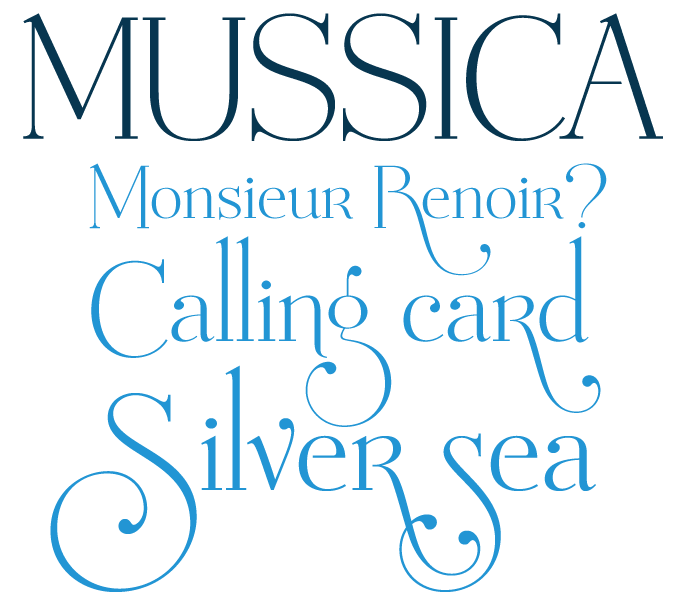
Mussica from Corradine Fonts has many of the characteristics of a Bodoni-style “modern face” — vertical stress, thin hairlines, simple lines for serifs — while the ball terminals and the sloping top serifs suggest a transitional, 18th-century heritage. But it’s more eclectic than that. Mussica has the whimsicality and unpredictability typical of today’s “why not?” attitude in type design. Totally postmodern, as Robert Bringhurst would say. There’s an uppercase “R” in the middle of the lowercase set. There’s a wild set of swashes. The ascenders to ‘f’ and ‘t’ are short while ‘k’ and ‘l’ are long (in the OpenType font, you can have ‘f’ and ‘t’ both ways). The capitals dangle way below the baseline. That the font manages to maintain a certain dignity notwithstanding all this is a little wonder. A fashionable nouveauté for brochures a magazines.
Text family of the month
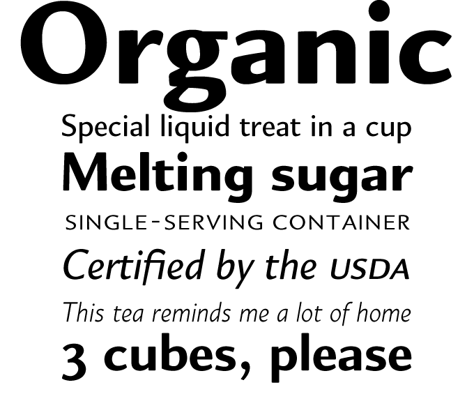
Neil Summerour is known primarily for geometric display fonts like Ginza and energetic scripts such as Fugu; with Akagi and the new Organic he has convincingly shown he is an equally talented designer of original text faces. Organic is a sans-serif with a subtle diagonal contrast or stress — which puts it roughly in the same league as Amira or Le Monde Sans. It is a flexible and highly legible humanist sans that is even more useful thanks to the addition of extensive alternates, small caps, oldstyle figures and a number of interesting ligatures. The balanced range of five weights makes it a useful family for text as well as display settings.
Follow-Up
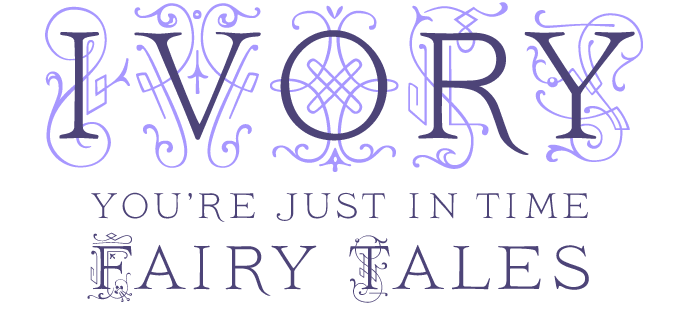
Inspired by a titling typeface from a late 19th-century book, Ivory is a carefully crafted combination of classical capitals and fancy ornaments. By layering text and swashes, nice two-color headlines can be created. A Rising Star in September, Ivory has remained consistently successful, which is why we are giving it an encore here, in the company of a diverse bunch of fonts from the same foundry.
If you liked this typeface from FaceType, check out some of their other fonts:
Doll
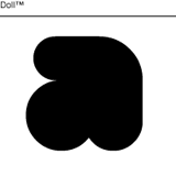
Letters with no counters — it’s a trend! You can remove them yourself, of course, when using a vector drawing program like Illustrator or CorelDraw. But why bother when a few dollars can buy you a snug, bold, fat yet legible set of curves like Doll?
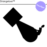
Strangelove
Stanley Kubrick’s Dr. Strangelove, or How I Learned to Stop Worrying and Love the Bomb was a virtuoso satire of the cold war. This font is based on the film’s original titles designed by Pablo Ferro. A special Bombs font completes the set.
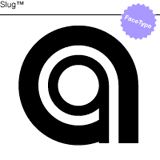
Slug
Slug is a clean, geometric font, the way they were back in the 1970s and early 1980s. FaceType provides both a single- and a double-lane version, plus two fonts that can be layered to create bicolor typography.
Sponsored font
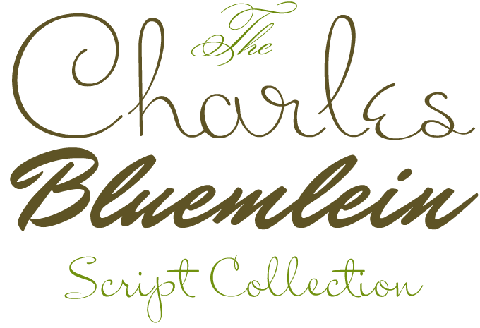
The Charles Bluemlein Collection from Sudtipos was recently welcomed to the MyFonts library, and it has been hugely successful. Designed by Ale Paul, the Collection is based on a 1940s catalogue from the Brooklyn-based Higgins Ink Co, which contained a portfolio of script alphabets credited to lettering artist Charles Bluemlein. Ale Paul took extreme care to render the original scripts authentically, keeping the fictitious names that Bluemlein originally assigned to each alphabet. Miss Le Gatees is one of the most successful: delicate, impeccably connected, beautifully detailed. Mrs Blackfort is wider and more upright than most scripts, which makes it very readable even at smaller sizes. A fine script for invitations, menus and the like. For a more formal handwriting — almost an English script — choose the classic elegance of Monsieur La Doulaise. Or browse the entire list: there are over 30 gorgeous scripts in the collection.
Have your say
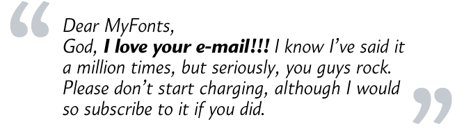
—Danielle in Manila, Philippines
Sept 29, 2009
Your opinion matters to us! Feel free to share your thoughts or read other people’s comments at the MyFonts Testimonials page.
Colophon
The Rising Stars nameplate is set in Auto 3 and Bryant, and the Have your say quotation in Organic.
Subscription info
Want to get future MyFonts newsletters sent to your inbox? Subscribe at myfonts.com/MailingList
Comments?
We’d love to hear from you! Please send any questions or comments about this newsletter to [email protected]