
Many thanks to everyone who blogged, tweeted, or sent up smoke signals to tell the world about our Top 10 fonts of 2010. We’re thrilled by your enthusiasm, and we hope to live up to your expectations in the new year. What better way to proceed than by bringing you January’s Rising Stars, the monthly newsletter covering popular new fonts? And a great selection it is, too: we foresee a splendid future for each of them.
This month’s Rising Stars
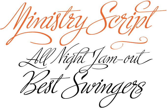
Alejandro Paul of Sudtipos is a pioneer of that fascinating genre in contemporary type design that could be labeled ‘acrobatic scripts.’ Or, in techie terms, ‘OpenType-programmed script fonts with automatic glyph substitution.’ In other words, fonts that behave intelligently and help you select the ideal version of each letter in a particular combination to create amazing headlines and logos. The earliest scripts that could do this (such as Adobe’s Poetica and Bickham Script) were rather conventional in form. What Ale Paul added to the mix was a wildly eclectic choice of letterforms, tapping into the seductive aesthetics of 20th-century commercial art rather than traditional calligraphy. One of his masterpieces is Ministry Script, inspired by 1920s American advertising. A single face with over 1,000 glyphs, Ministry Script comes with a galaxy of alternates, swash characters and ligatures to explore. Check out the Ministry Script Guide PDF for detailed info.
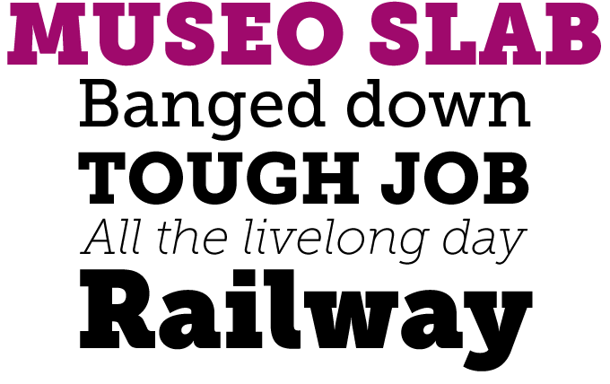
One of MyFonts’ greatest hits of the past two years is the Museo series from Jos Buivenga’s exljibris foundry. The family started out as a semi-serif, then branched out into the sans-serif genre with the cool, fresh Museo Sans. The new Museo Slab logically completes the suite. As it turns out, the sturdy slab serifs combine perfectly with the family’s friendly geometry, resulting in a wonderfully readable typeface. A perfect contemporary alternative for popular classics in the genre, such as Rockwell and Lubalin Graph. For increased clarity in magazines, reports and listings, pair Museo Slab with Museo Sans.
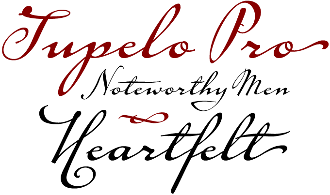
This new font from Canada Type takes its name from Tupelo, Mississippi. Elvis fans know why: Tupelo is the birthplace of the King, and Elvis Presley’s handwriting is one of the two sources of inspiration for the font. The other, believe it or not, is the handwriting of Abraham Lincoln. Designer Philip Bouwsma discovered a striking likeness between the hands of these great men. Research revealed that the King and the President had one thing in common: a writing system they had both learned during their first school years. Tupelo combines the slant, texture and flourish of Elvis’s handwriting, embodied in the lowercase, with the originality of Lincoln’s capitals. A unique fusion of politics and pop culture, Tupelo comes in two main fonts, plus three sets of alternates and extras. All of these are combines in Tupelo Pro, a single font of over 840 glyphs, with sophisticated OpenType programming.
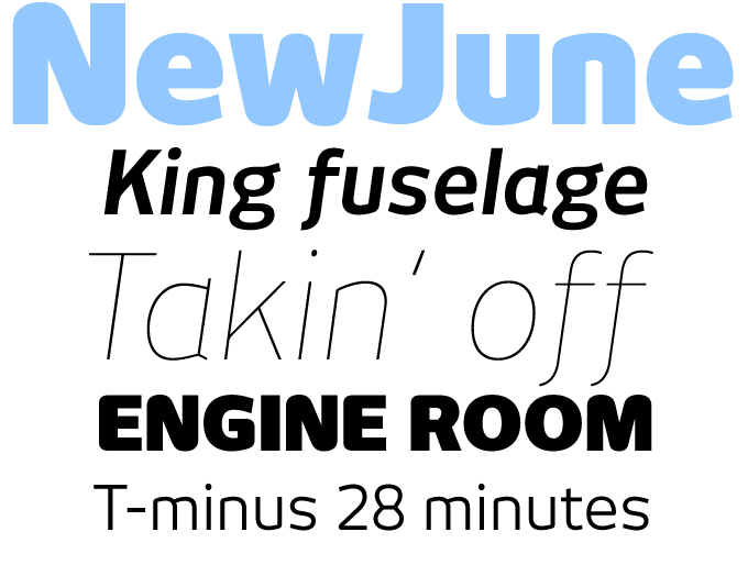
When we interviewed designer Hubert Jocham in November, he introduced his sans-serif NewJune on MyFonts for the occasion. NewJune caught the imagination of many users and has been doing very well ever since. Before becoming available for retail on our site, it had been around for several years as a face used by magazines the world over — including Harvey Nichols (London) and W magazine (New York). It is also the corporate typeface of the Academy of the Arts in Munich. NewJune’s conception is more radical than some of Jocham’s other sans-serifs, such as the smooth NewLibris. The way its stems are joined to the curves — with all spurs removed — results in a very distinctive and strong image. NewJune also includes an interesting serifed version, which will soon be made available here as well.
Text family of the month
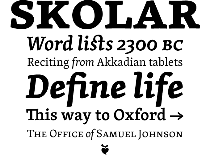
Skolar is a spirited new text family from Czech-born David Březina, a graduate from the Typeface Design MA program in Reading. It is a typeface with a purpose: it was designed with scholarly and multilingual publications in mind. It manages to avoid any stuffiness, striking a balance between academic credibility and a subtle personal style.
Skolar was designed for legibility, with robust serifs and low-contrast modulation. In combination with the relatively large x-height and open, clear italics, these features contribute to the typeface’s readability in small sizes. Skolar comes in three weights, each in roman and italic with built-in small caps. With its large character set, the family is flexible enough for complex text settings and editorial work. It becomes distinctive in bigger sizes, thus fitting corporate design demands.
The typeface contains quite a few sophisticated typographic solutions. The capitals are rather low in comparison to the ascenders to give the typeface an even texture and more space for diacritical marks on the capitals (essential in many European languages). The family includes a complex set of smart arrows which can be easily keyed and combined in infinite ways using OpenType features. It also includes fleurons. Skolar Basic is a more affordable version with limited character set.
Even before its commercial release by TypeTogether, Skolar received international recognition at the ED-Awards competition, and was selected as one of the best typefaces of 2008 at ilovetypography.com.
Follow-up
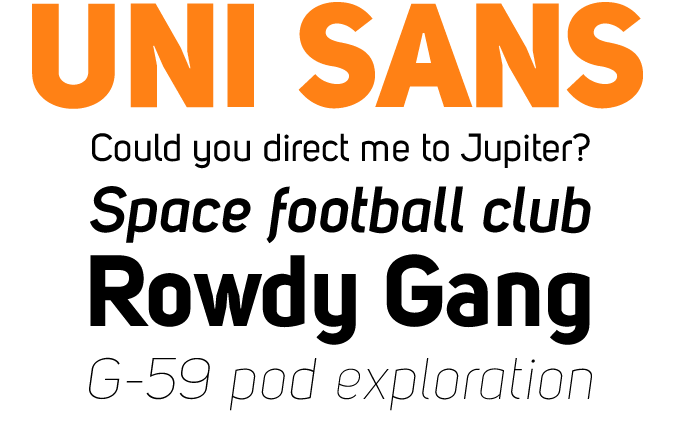
Uni Sans by Bulgarian designer Svetoslav Simov has been one of the most successful sans-serifs of the past few months. A text and display family of constructed sans-serifs, Uni Sans comes in seven weights plus italics. It combines a DIN-like industrial simplicity with some avant-garde details, such as the fluid joining of stems and curves.
If you like this typeface from Fontfabric, check out some of their other fonts:
Zag
Zag shows the characteristics of a constructed alphabet made with ruler and compass, yet has some elements that are quite unusual in this genre — such as conspicuous ink traps in sharp corners, or exuberant drop-like ornaments.
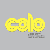
Colo
Colo is reminiscent of 1970s geometric fonts like Ad Werner’s classic, Dubbeldik. Colo is less strictly modular, combining the geometric double-lane structure with shapes that subtly refer to the flow of handwriting.
Avatar
Avatar is an all-caps alphabet that has all but abandoned the idea of counters. However, the fat, black shapes are still recognizable, and emanate a sense of fun. Fontfabric’s outline typefaces like Clou and Dovde play with similar ideas.
Sponsored Font
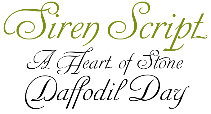
This month’s sponsored font is a brand new typeface: Siren Script by Rebecca Alaccari and Patrick Griffin from Canada Type. Siren Script takes its cue from BB&S’s Stationers Semiscript, produced as a metal font in 1863, and its countless imitations from throughout the 20th century, particularly a variety of uncredited film faces from the 1960s. What makes this kind of script stand out is its mixing of flourished majuscules with mostly subdued, traditional minuscules. The result is a balance between formal and informal lettering — the message is gracefully yet clearly delivered.
The Siren Script family comes in four full fonts, and a fifth one that contains alternates, ending letters, and some ligatures. Siren Script Pro combines all five fonts into a single one of over 880 glyphs, which includes programming for push-button stylistic alternates and various glyph palette conveniences.
Have your say
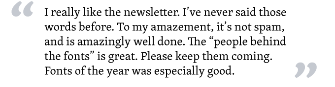
—Bill Evans / Bill Evans Media, USA/UK
Jan 6, 2010
Your opinion matters to us! Feel free to share your thoughts or read other people’s comments at the MyFonts Testimonials page.
Colophon
The Rising Stars nameplate is set in Auto 3 and Bryant, and the Have your say quotation in Skolar.
Subscription info
Want to get future MyFonts newsletters sent to your inbox? Subscribe at myfonts.com/MailingList
Comments?
We’d love to hear from you! Please send any questions or comments about this newsletter to [email protected]