
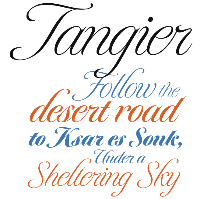
The type industry today is truly a global affair. This month’s newsletter is evidence of that: it features fonts from Germany and North America, but also from Buenos Aires and Ahmedabad, India. Based on the sales of the past thirty days, each Rising Stars is also a way of taking the pulse of the font-loving community. One thing is clear — Spencerian script, the nineteenth-century style that has long been such an important model for American handwriting, is more popular than ever. To compensate for all the flourish, the cool objectivity of geometric sans and slab serifs is going equally strong. It’s June: a month of contrasts.
This month’s Rising Stars
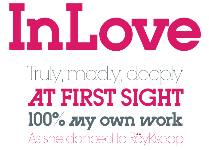
More news from Buenos Aires! The city’s premier type foundry, Sudtipos, recently published Ariel Di Lisio’s InLove, a headline font that displays a passion for geometric construction and strong contrasts. One the typeface’s most prominent features is its set of alternate letterforms for characters such as ‘M’ and ‘W’ which lean to the right — much like the original version of Herb Lubalin’s Avant Garde Gothic, designed for the magazine of the same name. In fact, Di Lisio has been recognized as a kind of heir to Lubalin’s legacy and was invited during 2009 to be part of the Herb Lubalin Exhibition in New York. Digitally produced by Ale Paul, InLove is a great choice for magazines, posters or flyers.
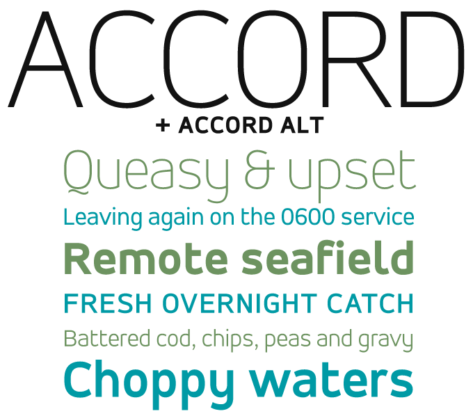
“Acquire me!” says one of the posters on the Accord family page, and many of our users have followed that advice. Of the two sub-families, the one that has done best so far is Accord Alternate, a variety that has the spurs chopped off to create a striking, smooth transition from the verticals to the curves in letters like ‘a’, ‘d’, ‘m’, ‘n’ and ‘p’. Both versions of Accord bring a sense of lucidity and modernity to the page. Accord and Accord Alternate will work well in headlines as well as body text. Following the cool, clean Sone, Accord is the second family released by Indian designer Aakash Soneri. We hope to see more from him soon.
Text family of the month
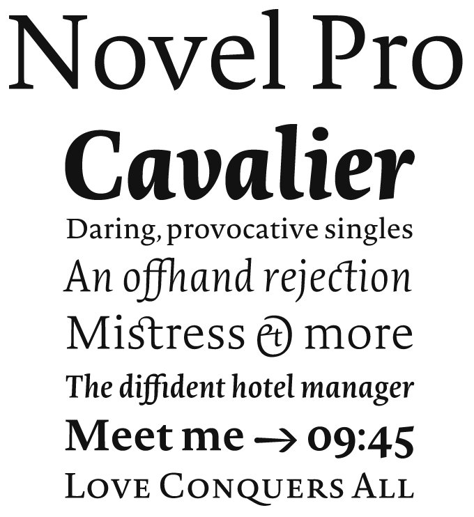
There is little doubt that the typographic world is a bit spoiled these days. Fifteen years ago, the release of a family like Novel — the first typeface by young German designer Christoph Dunst — would have been a phenomenon. With the number of well-made, sophisticated new fonts steadily increasing, an impressive debut like this could easily be overlooked, or receive just marginal attention. Which would be a real shame, because Novel is indeed a great new typeface that modestly does what the best classic text faces do: make text a pleasure to read and a pleasure to look at.
Dunst trained at the Royal Academy in The Hague, and the look and feel of his typeface owes much to the Dutch style — classic in proportion, contemporary in detail, easy on the eye. While the roman is open and neutral, the italic has an unmistakable calligraphic swing. All these qualities make Novel an excellent choice for literary texts. However, its classy clarity also makes it a good choice for anything from corporate identities to annual reports. Novel Pro’s huge glyph set, which offers extensive language support and contains multiple numeral styles, adds to the face’s usability for complex and international projects. For users who don't need that much typographic sophistication, Novel Std offers an affordable set of fonts with reduced character sets and no small caps.
Novel won a Certificate of Excellence at the 2009 TDC Awards in New York, and was nominated for Germany’s national Design Prize by the German Ministry of Economy and Technology earlier this year.
Follow-up
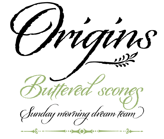
Released in April, Origins is currently leading our bestseller list — no mean feat for a debutante! Origins is based on real hand-lettering with a Crow Quill pen on parchment paper, which has given the font natural rough outlines that contribute to its subtly antiquated look and feel. A semi-connected calligraphic font with a confident, regular flow, Origins features gracious ascenders and descenders for an elegant and somewhat formal look.
If you like this typeface from Laura Worthington, check out some of their other fonts:

Ladybird
Released just a few weeks after Origins, Ladybird is Laura Worthington’s most informal script font to date. Lively and playful, and with some built-in irregularity, Ladybird will bring fun and excitement to packaging, posters, cards and magazines. This OpenType font features lots of ligatures and a few alternates.
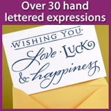
Greeting Cards
An assortment of over 30 hand-lettered expressions for a wide range of uses: greeting cards, flyers, labels — you name it. Many of the greetings come in two varieties. One version has all of the words on one line, and the alternate version has all of the words stacked on two or more lines. For your convenience, the font comes with a folder of GIFs to add to you emails or websites.
Recherché
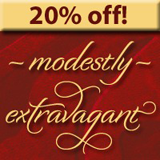
Laura Worthington calls Recherché “modestly extravagant”, and that is a very nice way of putting it. With its many alternate lettershapes, from modest to flamboyant, the fonts offers a surprisingly wide range of possible atmospheres. Recherché is an informal script suited for more than just headlines, such as the text of an invitation or advertisement.
Sponsored Font: Reklame Script
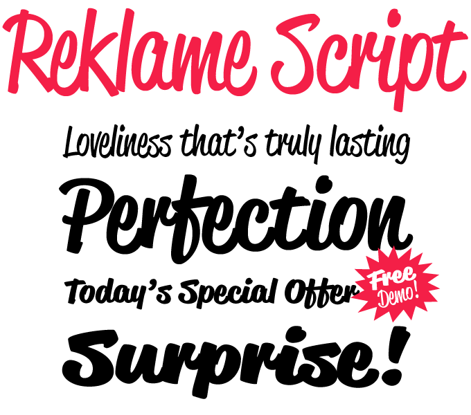
This month’s sponsored font comes from Hannes von Döhren, one of the most versatile and prolific young designers on MyFonts. After the restrained Art Deco style of his besteller Brandon Grotesque, the new Reklame Script explores a completely different area of typographic tradition. Inspired by the handlettering of printed advertisements of the 1940s and ’50s, Reklame Script is a powerful brush script in four weights, from Regular to Black. The four varieties can be combined for extra emphasis—perfect for headlines, posters, and other display uses. The family comes as four OpenType fonts with extended character sets to support a wide range of languages and double-letter ligatures to avoid repetition.
Have your say
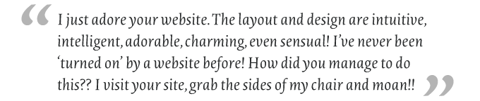
— Anonymous post to “Dear MyFonts”, May 30th, 2010
Your opinion matters to us! Feel free to share your thoughts or read other people’s comments at the MyFonts Testimonials page.
Colophon
The Rising Stars nameplate is set in Auto 3 and Bryant, and the Have your say quotation in Novel Light Italic.
Subscription info
Want to get future MyFonts newsletters sent to your inbox? Subscribe at myfonts.com/MailingList Want to get future MyFonts newsletters sent to your inbox? Subscribe at myfonts.com/MailingList
Comments?
We’d love to hear from you! Please send any questions or comments about this newsletter to [email protected]