
It’s official: webfonts are live
Webfonts are the most revolutionary thing to happen to web typography in years. They allow web designers to choose the most appropriate typefaces for any web page — independent from ‘web safe’ system fonts. Starting this month, MyFonts offers special webfonts packages for thousands of type families — a webfont library of around 28,000 fonts, and growing. Webfonts cost the same as their companion desktop font; if you buy both, the webfont is 50% off.
As you will notice, many of our most popular foundries have already agreed to make their collection available as webfonts via MyFonts. This month’s selection of Rising Stars is a case in point: each of them is also available as a webfonts package. First and foremost, they are simply excellent typefaces for a broad range of uses — in that sense, there have been no fundamental changes since last month. Enjoy!
This month’s Rising Stars
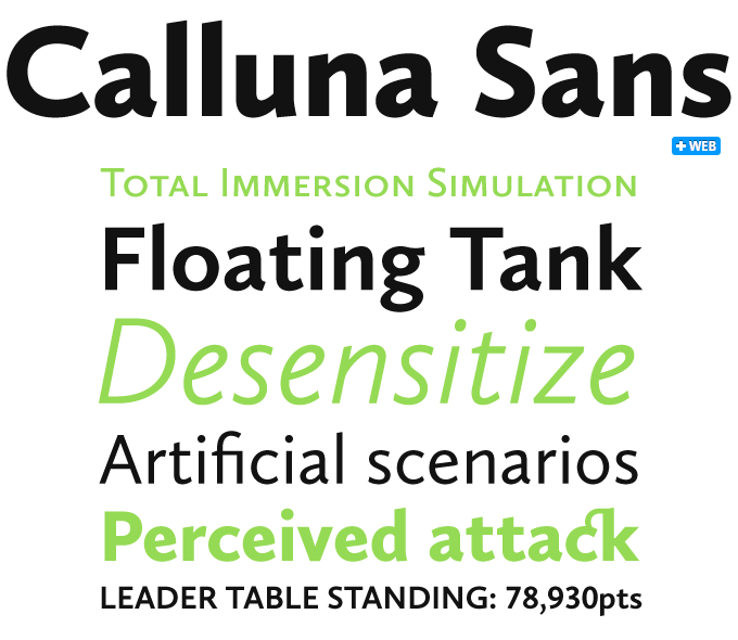
Sometimes there’s this moment in the life of a fine text font when it becomes twice as usable overnight. It happens when it becomes part of a more versatile, extended type system, and that moment has come for Calluna. Designer Jos Buivenga has unveiled Calluna Sans, the sans-serif companion to his successful text face. The new family member does everything the serifed original does — respecting oldstyle proportions, making lucid statements with crisp, contemporary details — but it does so in its own confident, sans-serif way. Its humanist qualities make it a wonderfully readable typeface; it comes with all the attributes needed for sophisticated typography: true italics, small caps, lots of ligatures, four numeral sets and much, much more.
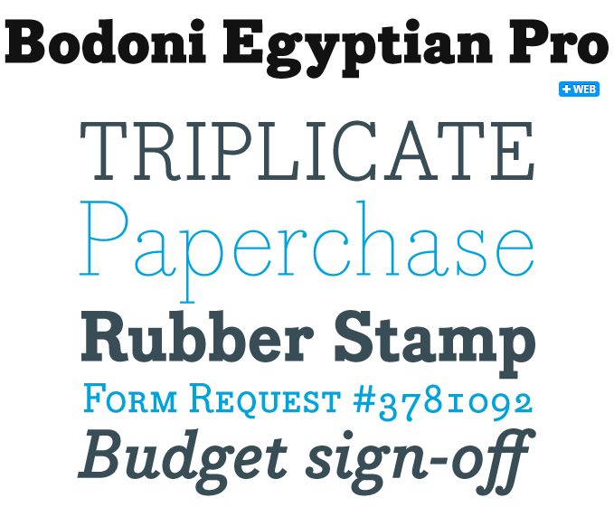
Nick Shinn’s type design studio is a typographic lab where some really idiosyncratic experiments take place. Shinn likes to play with the genetics of type. He explores the possibilities of cross-fertilization, manipulates and combines core properties across historical genres. For Bodoni Egyptian he took away the most famous characteristic of the Bodoni style: the high contrast between thick and thin strokes. That ruthless striptease revealed an interesting underlying architecture, a monolinear family of even width (in all but the heaviest weights). The resulting slab-serif is surprisingly usable, while retaining a certain quaintness that, judging by the success of this new Pro version, makes this piece of historical fiction an attractive proposition for modern users.
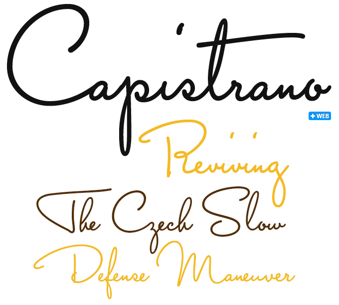
Capistrano BF from Bomparte’s Fonts is an all-connecting, monolinear handwritten script that exudes verve and vigor. With its small lowercase letters, huge capitals and generous ascenders (of b, f, h, etc.) it has an eye-catching dynamic that will work well on book covers and in magazines and brochures — not to mention web pages, where it will lend a touch of informality. As with most scripts, it is not recommended that word settings in Capistrano be in all uppercase, but rather set in initial capitals together with lowercase letters.
Text family of the month
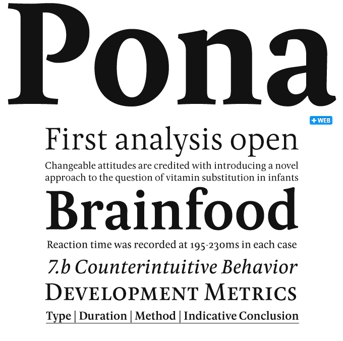
Pona is the MyFonts debut of Barcelona-based Jordi Embodas. The designer characterizes Pona as “a classic serif typeface family” in the vein of such timeless oldstyle fonts as Times, Georgia and Garamond. But while it was obviously inspired by those classics, its details emanate a clarity and efficiency that is utterly contemporary.
Pona is what used to be called a “workhorse” typeface: modest and inconspicuous in text sizes, with enough character to make a good impression when used large. Its large x-height and moderate contrast make for good legibility at small sizes, in low-resolution prints and on the computer screen. Pona has a generous range of five weights, allowing users to bring a variety of tones to the page. The OpenType fonts come with small caps, lining and oldstyle figures in both tabular and proportional spacing, super- and subscripts, fractions and ordinals.
Follow-Up
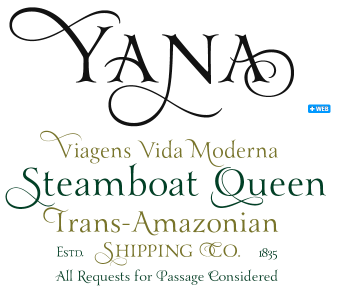
Yana is the first step in Laura Worthington’s current work-in-progress — the Regular weight of what will eventually be an extended family of oldstyle, Victorian-flavored fonts. Yana is loaded with flamboyant swash initials which are accommodated in two separate, very affordable Swash Caps fonts. The basic font comes with lining and oldstyle figures and has three sizes of capitals — normal caps, small caps and petite caps — which give the font great versatility as a titling face. OpenType-enabled layout programs recommended!
If you like this typeface from Laura Worthington, check out some of her other fonts:

Bianca
Bianca is one of Worthington’s most recent typefaces. A lively hand lettered script full of excitement, Bianca captures attention and calls for a closer look. It will have your audience wondering — is it a typeface, or was it was written by hand?
Regina
Regina is a somewhat old-fashioned, beautifully flowing connected script. Worthington has written that it was named after and dedicated to her mother, “whose beautiful handwriting always inspired me.”
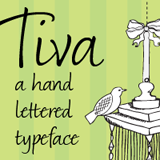
Tiva
Tiva is Worthington’s latest offering. It has retained some of the quirks and irregularities of handwriting, with letters that hover above or below the baseline. Tiva comes with several two-letter combinations as well as alternate letters, enhancing the impression of hand-rendered lettering.
Sponsored Font: Always
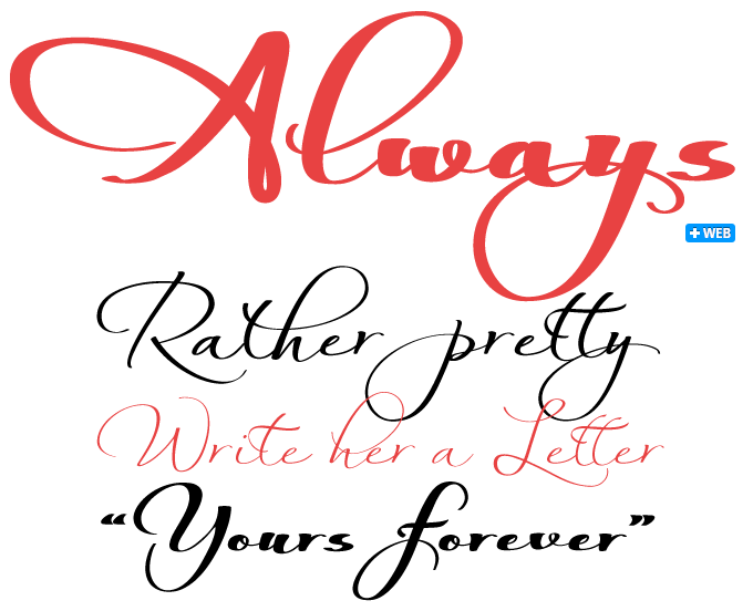
The successful Always from Scholtz Fonts is an interesting variation on the well-known theme of informal scripts. While it has the dash and nonchalance of everyday handwriting, it is rather fancier when you take a closer look. Its ascenders and descenders are somewhat ornate, and the marked thick-thin contrast betrays the use of the broad-nibbed pen. With its four weights, from Light to Fat, Always offers four distinct flavors, giving you plenty of variety for all possible uses — from packaging and book covers to greeting cards and advertising. All weights come with a set of automatic ligatures for a more natural, handwritten effect (OpenType-savvy software recommended).
Have your say
— Simon, Mainz, Germany, December 7, 2010
Your opinions matter to us! Feel free to share your thoughts or read other people’s comments at the MyFonts Testimonials page.