
While some parts of the world are going through heat waves, others are just hoping for the rain to stop. Here at MyFonts, the season is characteristically sunny, with a crop of new fonts that successfully combine the playful with the usable; friendly faces with a sassy swagger. Plus, this past month has also brought us the most successful new font we’ve ever seen anywhere, since, well, forever. Enjoy!
This month’s Rising Stars
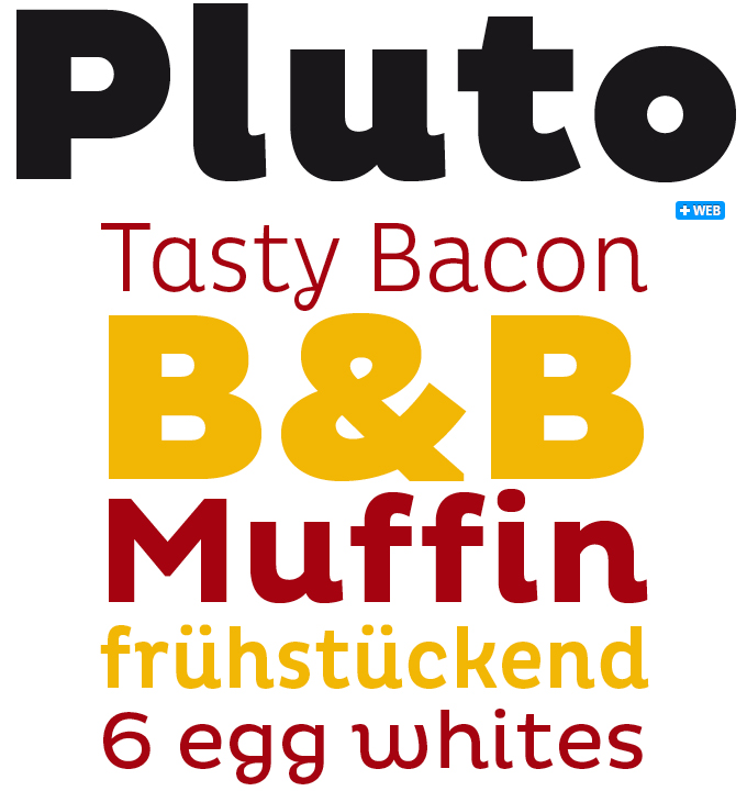
The phenomenal success of Pluto from HVD Fonts has left us all in awe here at MyFonts. The immediate appeal of its friendly shapes, combined with an introductory offer that sounded almost too good to be true, immediately convinced hundreds of our users, carrying the newborn star to the highest spot of both our Hot New Fonts list and our Bestseller list. Even at its current list price, the Pluto family is an excellent value, with Normal and Condensed weights in two widths — 16 fonts in all. Informal yet sturdy and readable, Pluto works well in both text and display settings, and is a good choice for cosmetics and food packaging and advertising — and so much more.
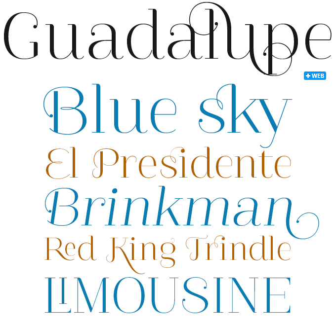
Guadalupe is very nice and a little crazy. In fact, with all the cheerful swashes and ligatures going on, this font from Latinotype might just as well have been called Guadaloop. With OpenType enabled layout software, the user has access to inventive combinations seldom seen before. How about an ‘si ’or ‘ri’ ligature? While in other fonts such novelties may seem far-fetched or a bit pompous, the lightness with which Guadalupe binds one character to the next is simply endearing. Combining the simplicity and clarity of a modern face with the flourish of an ornamental font, Guadalupe is a great choice for menus, luxury goods and romantic literature (the covers, not the body text). The Gota (‘drop’) variant adds tiny ball terminals for extra finesse.
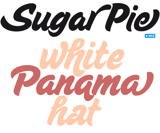
Alejandro Paul drew Sugar Pie after some experiments trying to concoct an italic to match his successful Candy Script. As suspected, his first trials confirmed that “an italic Candy Script would be a bad idea. However, some of these trials showed conceptual promise of their own, so I decided to pursue them and see where they would go.” Where they went was what is now Sugar Pie: a lively bold script in a typical Sudtipos vein, recalling some of the clean brush scripts found in the different film type processes of late 1960s and early 1970s. Ideal for packaging design, Sugar Pie’s alternates and ligatures contain quite a few nice variations on the main character set (OpenType-enabled software recommended). Very likeable, very sweet.
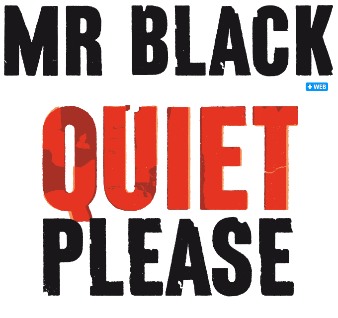
Hipopotam Studio in Warsaw, Poland, is a great little design company that specializes in children’s books, from which they often create their font spin-off projects. Mr Black, a set of distorted capitals, was originally designed for a book titled Who eats Whom, which you can find on their wonderfully whimsical website. Designers Aleksandra and Daniel Mizielińscy based Mr Black on dry transfer lettering sheets used decades ago for making military maps. With just two lettering sheets at their disposal, damaged and almost used up, they made a rather complex font with detailed outlines (allowing for high resolution large-scale use) and up to three alternate versions for each letter. Grunge 2.0, so to speak.
Text family of the month
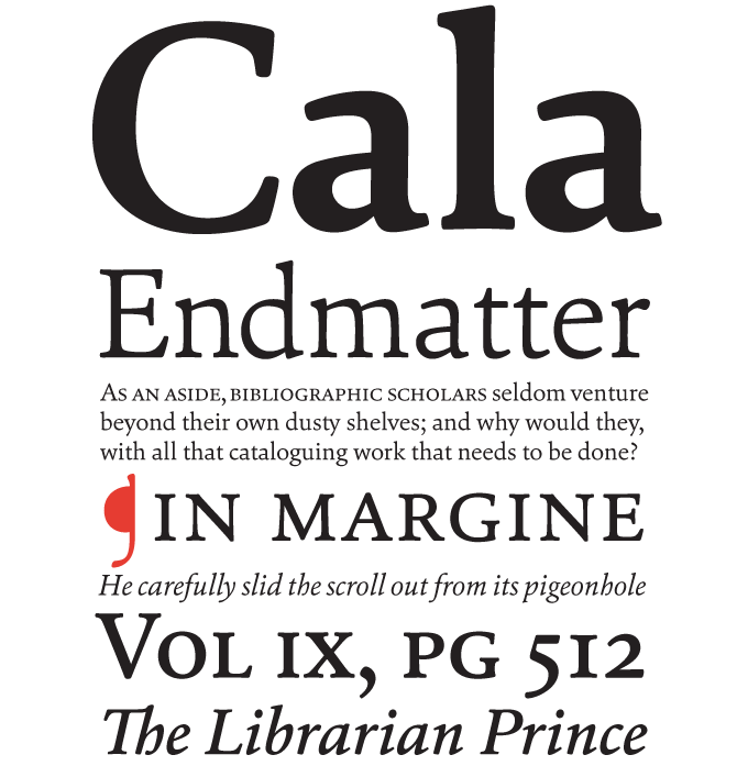
Type designer Dieter Hofrichter learned from some of the greatest masters of German typography. He studied under Herbert Post and later became one of Günter Gerhard Lange’s trusted collaborators at Berthold. He recently joined MyFonts with his personal foundry, Hoftype, bringing a small but exquisite collection of accomplished, functional text faces, of which Cala has been the most successful so far.
Cala is an interpretation of late 15th-century Venetian types like those use by Aldus Manutius, but with a contemporary look. Cala has an energetic profile, achieved through soft outlines and a flowing rhythm. It is lively, remains stable in small sizes and reveals beautiful detailing in display sizes. Cala comes in eight styles, each containing standard and discretional ligatures, small caps, and a broad range of figure styles with matching currency symbols. Stylish and very usable.
Follow-Up
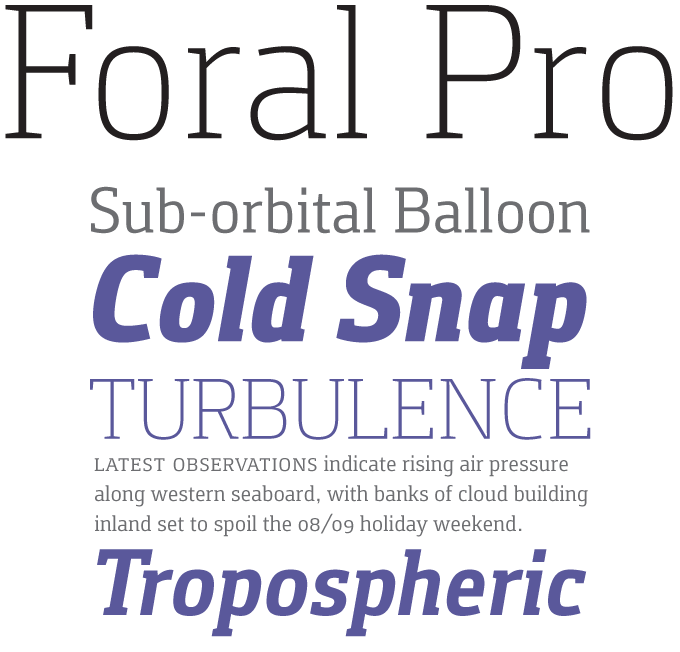
Having been featured as July’s Text Font of the Month, Foral Pro by Portuguese designer Rui Abreu has continued to do well. Its basic shape is the rounded square from which so many recent sans-serifs are derived; but here the squarish shapes have a subtly humanistic touch, lending the typeface just the right balance between cool, clean clarity, and friendly readability. With a good range of weights, distinctive italics, small caps, and multiple figure sets, Foral Pro has what it takes to be useful in demanding environments.
If you like this typeface by Rui Abreu and Fountain, check out some of their other fonts:

Catacumba
Rui Abreu’s Catacumba is a six-weight typeface inspired by painted inscriptions found in the catacombs of a church in Porto, Portugal. While the letterforms are influenced by Victorian and French style, they somehow convey a decidedly Portuguese sensibility. The family has two contrasting titling styles, of which the exuberant Excelsa is absolutely spectacular.

Aria
When Abreu discovered a finely drawn epigraph on the frame of a nineteenth-century painting, he was fascinated by its high-contrast capitals. Their quirky shapes inspired him to draw Aria, a lush and romantic display font. In the calligraphic italic the flow of the curves leads the way. The font comes with a set of ornaments, a good amount of ligatures and a special set of ornamental numbers.

Orbe Pro
Orbe Pro is a blackletter font intended to interpret the feel of Portuguese calligraphy. With its flourished details it is slightly exotic, while its light and spontaneous feel make it a good decorative and titling font. The glyphs are a mix of lowercase and uppercase, all aligned at same height. The balanced white spaces result in a pleasant rhythm and a nice texture.
Sponsored Font: Aviano Sans
Have your say
— Gabrielgbox, via Twitter, June 12, 2011
Your opinions matter to us! Feel free to share your thoughts or read other people’s comments at the MyFonts Testimonials page.