
It’s that time of the year again. Festive scripts reign, supported by a cast of restrained text fonts and sans-serifs. That, basically, sums up what the December newsletter is about: a joyous dance of swirls and swashes to end the year in beauty — and a parade of all-purpose typefaces to enter 2012 with a set of brand new tools. Charm meets usability in this last Rising Stars newsletter of the year. Enough said. A big hand for the month’s most successful new fonts.
This month’s Rising Stars
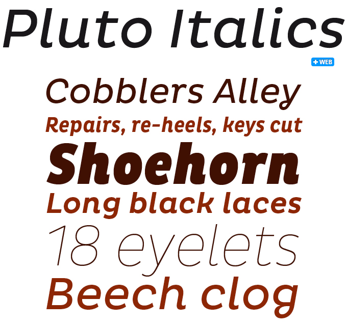
HVD Fonts’ latest family Pluto has been easily the most successful release of the last year. Initially, designer Hannes von Döhren was not convinced that his new display family actually needed an italic, but he soon gave in to popular demand and released Pluto Italics, again with a very attractive introductory discount. It came as no surprise that Pluto Italics soared to the #1 spot of our list of Hot New Fonts. Even at its current list price, the extended Pluto family is excellent value, with Normal and Condensed weights in two widths and with matching italics — 32 fonts in all. Informal yet sturdy and readable, Pluto and Pluto Italic work well in display as well as longer text settings. Great for cosmetics and food packaging and advertising — and much more.
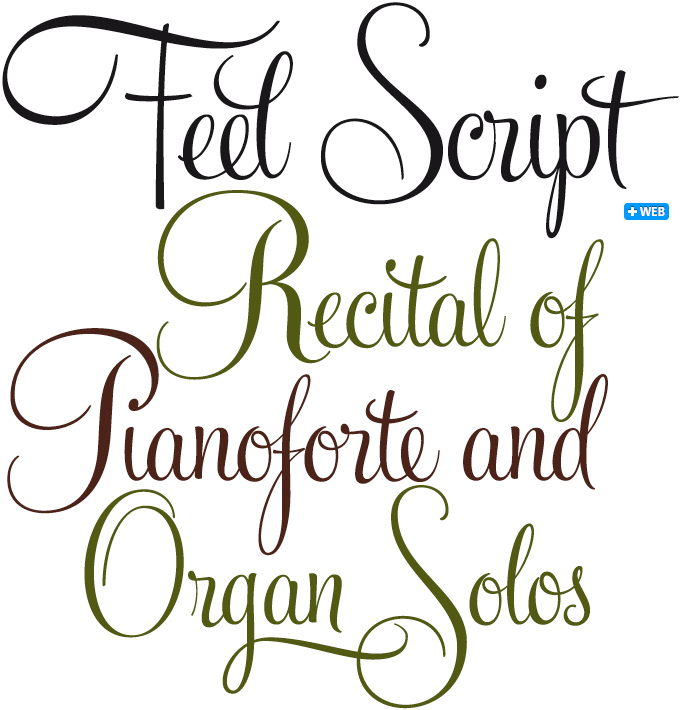
Among the many fine script fonts from Sudtipos the recent Feel Script occupies a special place. Based on 1950s lettering by calligrapher and logo designer Rand Holub, it is, to some extent, an update and an extension of Holub’s font Monterey. Freed from the technological constraints that Intertype struggled with fifty years ago, Ale Paul was able to more faithfully represent the hand-lettering from that era and in a more complex way using today’s OpenType technology. Some letterforms were redrawn from vintage American magazine ads (some by Holub himself), along with many new alternates, ligatures, ending forms, and strangely beautiful character combinations. Feel Script comes with a wealth of alternate letters, including three-letter ligatures and “the dreamiest swashes” Ale Paul could imagine.
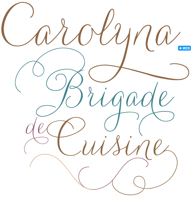
Carolyna technically belongs to the same broad category of exuberant connected scripts as Feel does, but it is in fact a very different kind of creature. While Feel pays tribute to the stylized, masterful curves of mid-century commercial lettering, this new font by the Emily Lime foundry reflects the spontaneity and whimsicality of some of today’s calligraphic work. The font uses OpenType wizardry to connect letters seamlessly, automatically replacing letter pairs as you type. With over 1,000 characters, there are many stylistic alternates and fun swashes to choose from. If you go for the Pro version, you don’t need the other two fonts, as Carolyna Pro contains all the available characters. But if the programs you work with do not support full OpenType functionality, designer Emily Conners recommends choosing one of the other options, in which what you see is exactly what you get.
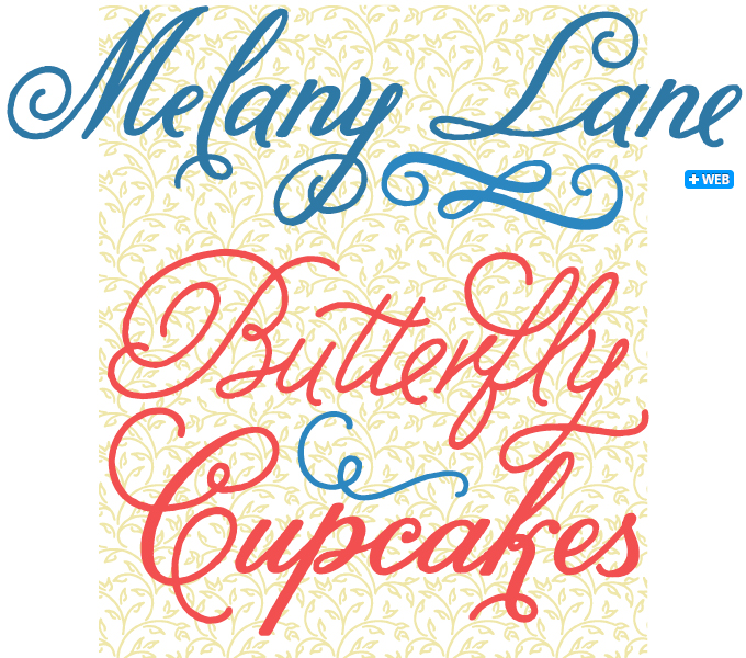
Melany Lane is the third connected, swashy script in this newsletter, and again it is surprisingly different from the previous two. Its designers at Yellow Design Studio took the flourished shapes of traditional lettering, and added the quirks and warmth of informal hand-drawn type. The regular version is monolinear, i.e. its strokes don’t change in thickness, which gives it the feel of a font drawn with a round technical or felt-tipped pen. Melany Lane’s basic character set has traditionally connected letters and expressive charm. The font’s Contextual Alternates (which can be activated using your design software’s OpenType panel) add flair with unconnected letters and additional contour options. Melany Lane comes with swashes and stylistic alternates for extra funkiness and fun, as well as 118 lovely ornaments and a free set of fourteen seamless background patterns.
Text family of the month
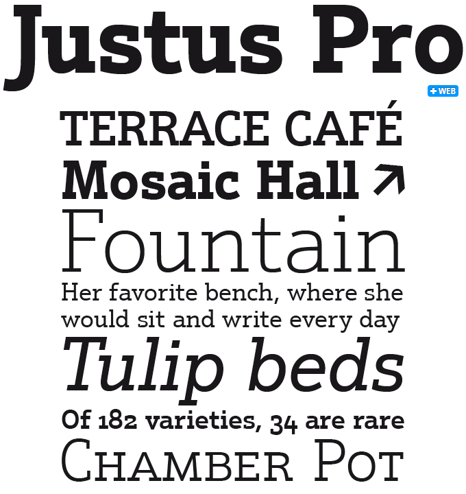
In his recent Creative Characters interview, Jeremy Dooley predicted that 2012 will be the year of the slab serif (aka Egyptian). The success of Justus Pro seems to confirm Dooley’s gut feeling. The new typeface by Volker Schnebel, chief designer at URW++, sums up some of the qualities that may give this 19th-century genre with its blocky serifs a newly found relevance. Its shapes aren’t as mechanical and rigid as many of its predecessors (think Stymie); with its subtly humanistic touch, Justus Pro offers a high level of elegance and readability. Its open ‘e’ and ‘a’ as well as the simplified ‘S’ and ‘s’ accentuate the family’s contemporary look and feel. Not unlike Font Bureau’s 2009 Trilby (but less conspicuously so) Justus Pro has stressed horizontal strokes, lending the text on the page a somewhat unorthodox charm and functional forward flow. The family comes in five weights with italics, and small caps for the uprights. Its multiple figure styles make it a versatile tool for typographically complex assignments.
Follow-Up
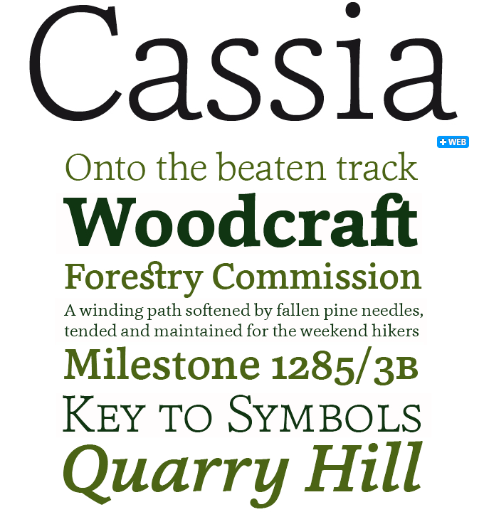
Since type designer Dieter Hofrichter joined MyFonts with his Hoftype foundry in April of this year, his output of beautifully drawn, functional and affordable text faces has been impressive indeed. Cassia, November’s Text Family of the Month, is his best-selling font so far — a dynamic low-contrast book face, somewhere between a humanized slab serif and an updated Clarendon. More individual and agile and decidedly warmer than most slab serifs, it oozes dynamism and vitality, and is superbly readable. Each of its five weights comes with small caps and a generous range of numeral styles — so it’s a great solution for financial and economic documents as well as literary texts.
If you like this typeface from Hoftype, check out some of their other fonts:
Cala
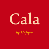
Cala has been almost as successful as Cassia. It is an interpretation of late 15th-century Venetian types like those used by Aldus Manutius, but with a contemporary look. Cala has an energetic profile, achieved through soft outlines and a flowing rhythm. Cala comes in eight styles, each with small caps and a broad range of figure styles with matching currency symbols. Stylish and very usable.
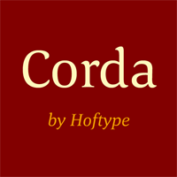
Corda
Corda has a distinct, modern swing to it — an elegant serif family with an easy-going, flowing feel. With its subtle contrast between thin and thick strokes, the family appears light and breezy even in the heavier styles, making for a pleasant reading experience when used for body text and an attractive appearance in display sizes. Corda comes in five weights plus italics, each with lining figures, tabular figures and oldstyle figures.

Sonus
Sonus is Hoftype’s latest offering, and it shows just how broad a range of styles Dieter Hofrichter masters. A monolinear sans-serif family with a dynamic drive, Sonus was influenced by early English sans serifs such as Gill Sans and Johnston’s Underground alphabet. Its firm structure makes it great for text and shows off its lively linearity in displays. Sonus comes in eight weights plus italics, with multiple figure styles.
Sponsored Font: Populaire
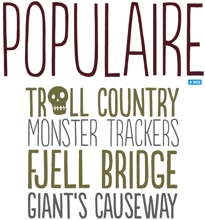
Many readers were impressed by the enthusiasm and dedication of last month’s interviewees in our Creative Characters series, Erica Jung and Ricardo Marcin of Brazilian studio PintassilgoPrints. Their Populaire is one of their most successful fonts so far. Intended as the first of a series of fonts based on revolutionary movements, Populaire was based on the posters created during the May 1968 uprisings in Paris. Created for the strikers by the screen-printing workshop Atelier Populaire, these posters have become influential icons of low-budget, do-it-yourself design. In the digital Populaire, each letter has four versions, all painstakingly kerned and tested by hand for the best visual effect. With a set of gutsy and imaginative pictograms and illustrations, Populaire is a handy all-round digital screen-printing atelier for office anarchists everywhere. Just this week PintassilgoPrints added a Light version of Populaire, which all but doubles its range of possibilities.
Have your say
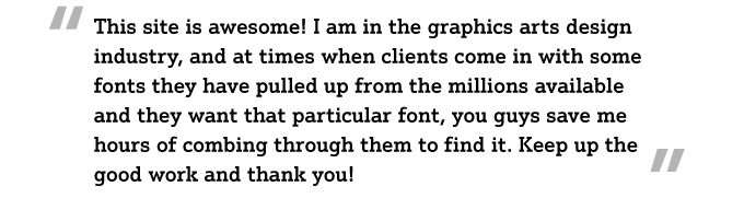
— Mouchet S.P., November 25, 2011
Your opinions matter to us! Feel free to share your thoughts or read other people’s comments at the MyFonts Testimonials page.
Webfont Showcase wants your work!
Let us know about the exciting work you’re creating with MyFonts webfonts.
We want to see webfonts used in navigation, layered over images, in logotypes and mastheads, in extended body settings… basically anywhere text can be set.
Find our submission form here, tweet us @myfonts or share something with us at our Facebook page.
We’ll feature the best examples in our Webfonts In Action pages, plus we’re on the lookout for projects to cover in more depth in our case studies.
Colophon
The Rising Stars nameplate is set in Auto 3 and Proxima Nova Soft, and the Have your say quotation in Justus Pro Medium. The font samples were conceived and designed by Anthony Noel with contributions from the editor, Jan Middendorp.
Subscription info
Want to get future MyFonts newsletters sent to your inbox? Subscribe at myfonts.com/MailingList
Comments?
We’d love to hear from you! Please send any questions or comments about this newsletter to [email protected]