As the northern hemisphere slips into summer — almost imperceptibly, in some places — our type designers make every effort to provide us with fonts that lighten up our screens and emanate a sense of fun. This month’s display fonts offer soulful grooves, well-wrought decoration, soft-spoken clarity and bouncy mirth; and our text fonts are the latest in smart, elegant yet modest functionality. It’s June: the new season in typographic finesse begins here.
This month’s Rising Stars
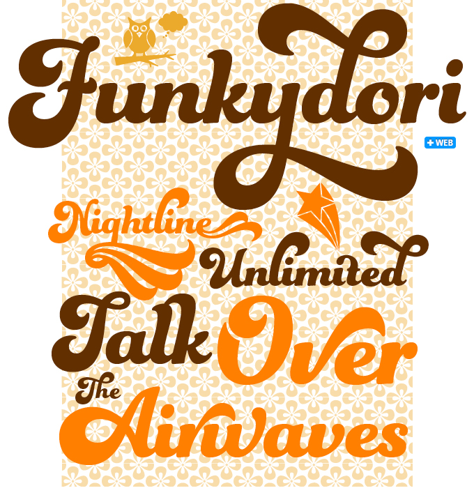
“I am a child of the Seventies,” writes Laura Worthington, and sends us into a time warp that includes rainbow striped bellbottoms, unicorn posters and The Electric Company. Somewhere in that scene there must also have been orange lampshades, afro hairdos, and an Isaac Hayes LP on the stereo. Often dubbed “the decade that taste forgot” the Seventies were actually an exhilarating time for formal experiments in popular culture, and Funkydori perfectly captures the groovy and far out atmosphere of the era. The font is wickedly usable too, with 213 alternates, 13 discretionary ligatures and 38 ornaments allowing for a wide variety of looks. When used with OpenType-enable software, the automatic Contextual Alternates keep it looking ideal; enabling Titling Alternates switches the design to an unconnected script.
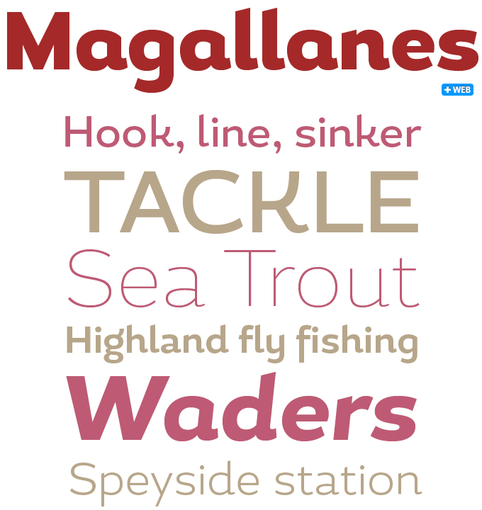
Magallanes, a new display family from Latinotype designer Daniel Hernández, successfully combines the cool, clean look of contemporary sans-serifs with the calligraphic elements of humanist typefaces. Part of its distinctive personality is its wide skeleton, with interesting details such as a the low, stretched bowls of the roman lowercase ‘a’ and ‘g’, and energetic upstrokes on the terminals of ‘a’, ‘d’, ‘h’, ‘m’, ‘R’ and others. Magallanes comes in 8 weights, from UltraLight to Black, each with true italics. Equipped with alternative glyphs for a more varied use, Magallanes is a powerful titling font in magazines, web typography, branding, and much more.
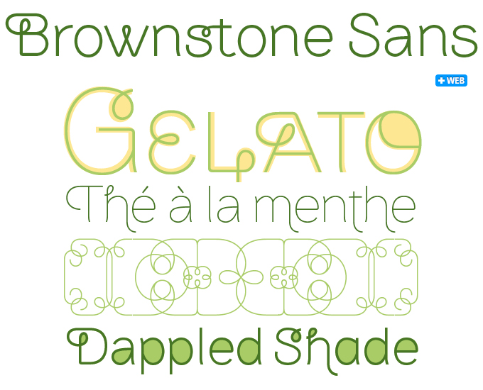
Brownstone Sans results from a mixture of influences, from the business handwriting of the early 1900s to the rare type specimen books Alejandro Paul studied when visiting the New York Public Library, and explorations into Brooklyn’s neighborhoods. While the result is unmistakably of the 21st century, Brownstone is subtly infused with all these historical references and bears some similarities to decorative typefaces of 19th-century foundries. A soft, monoline sans-serif with geometric elements, its marriage of highly legible, draftsman-like letterforms with decorative swashes and ornaments reflects the old-meets-new aesthetic of the DIY craft culture seen in Brooklyn and other urban centers. It’s ornamental but unfussy, romantic but understated — a design theme well-suited to recession-era cynicism.
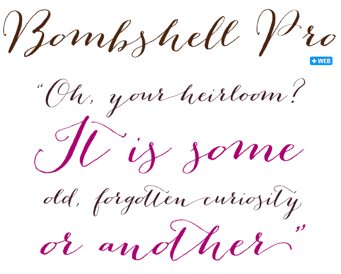
Emily Lime, the up-and-coming foundry of South Carolina’s Emily Conners, has scored an unprecedented series of hits on our Hot New Fonts list, and her recent Bombshell Pro is in pole position as we speak. It is a whimsical, passionate hand-calligraphy font that uses OpenType programming to create realistic informal calligraphy. Bombshell includes long connections between letters to create beautiful headings or signature looks, as well as initial and terminal letters for that extra dash. It comes with roman numerals (III & IV), and “run-on” letter connections. In short, Bombshell Pro has everything needed for going seriously crazy with letters that hop, skip and jump without letting go of each other.
Text families of the month
Text typefaces for demanding editorial work need to possess special qualities: excellent readability, italics and small caps for all weights, multiple figure sets (lining, oldstyle, table) and ample language coverage. In this section of the newsletter you’ll find recent releases that meet these standards.
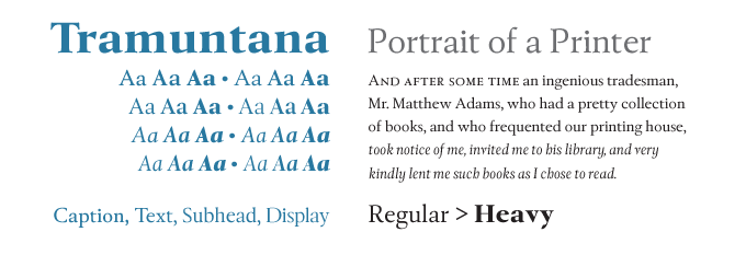
Tramuntana 1 Pro by Ricardo Santos is a family with quite an elaborate structure. It has four versions, optimized for specific point sizes — from very small (Caption) to headline sizes (Display). Each has just three weights, but together they cover an impressive range of subtle differences, which will satisfy the most demanding typographers. While Tramuntana’s aesthetic is inspired by the late Renaissance models of Granjon and Garamond, its details are crisp and contemporary. Designed for editorial purposes — especially for books and magazines — its dynamic design ensures a supple text flow in immersive reading. Also check out the very affordable set of Tramuntana Dingbats.
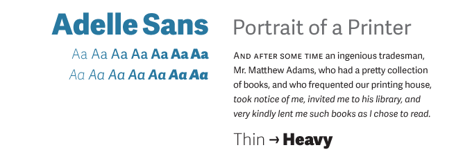
Adelle Sans is the sans-serif companion to TypeTogether’s award- winning Adelle family. It proposes a cleaner and more spirited take on the traditional grotesque sans, combining the unobtrusive appearance of a grotesque with lively detailing. Engineered for demanding editorial design, Adelle Sans is an utterly versatile tool for any imaginable use, whether it is branding, signage or advertising. With seven weights and wonderfully readable italics, it is a perfect match for its slab serif counterpart, ensuring a graceful fit between both font families on the same page. Equipped with small caps, several sets of figures, support for over 90 languages and a set of 35 icons, Adelle Sans epitomizes flexibility and functionality.
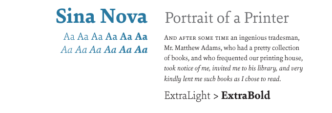
Sina Nova from Hoftype is a useful variation on that foundry’s Sina. It is slimmer and somewhat more elegant, and its higher x-height makes it more open in small text sizes. With its economical proportions it allows for an even more universal use than its counterpart. Sina Nova is a quality typeface for sophisticated typography; with six weights and matching italics, it offers great value for money. All styles contain standard and discretional ligatures, small caps, proportional lining and oldstyle figures, tabular figures, matching currency symbols, fractions and scientific numerals, and ample language support.
Follow-Up
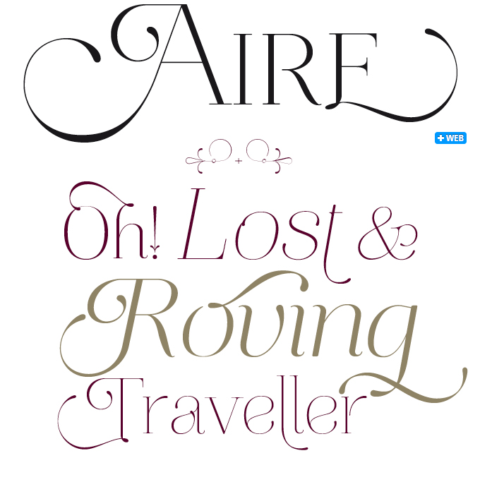
Featured in last month’s Rising Stars, Aire from Lián Types has continued to be very popular — so we’re revisiting it in our Follow-Up section. With seven varieties, Aire is an impressive typographic toolkit loaded with ligatures, alternates, and the entire Cyrillic alphabet — even the very affordable Std versions offer Cyrillic. It was designed to emanate lightness and delicacy — “aire” is Spanish for “air”. With three weights plus italics (all delicate, but some more feathery than others) Aire offers possibilities for combining large and small sizes within one headline, or for creating subtle stylistic variations within one design project.
If you like this typeface from Lián Types, check out some of their other fonts:

Reina
The award-winning Reina is one of Lián Types’ most sophisticated typefaces. With its vertical stress and strong contrast between fat strokes and gossamer hairlines, Reina is a display Didone with bells on. Inspired by the classics Didot and Bodoni, and spiced up with influences from 1960s Spencerian lettering, Reina is up there with the most whimsical of modern-face titling fonts.

Breathe
In the well-established genre of exuberant formal script fonts, Breathe is a special case. Designed to look alive, fresh and airy, the font takes a jump from the work of Didot and his contemporaries from around 1800 to today’s fashion for endless swashes and flourishes. Breathe Pro comes with over 1000 glyphs, including huge sets of alternates, swashes, historical forms, ligatures and more.

Parfait Script
Parfait Script Pro takes influences from the nineteenth-century Spencerian scripts and combines them with pointed brush lettering to create a flourishing and whimsical font with over 850 glyphs. Many of the alternate characters have elaborate swirls and curlicues attached, with charming and sometimes dazzling results.
Sponsored Font: Swung Note
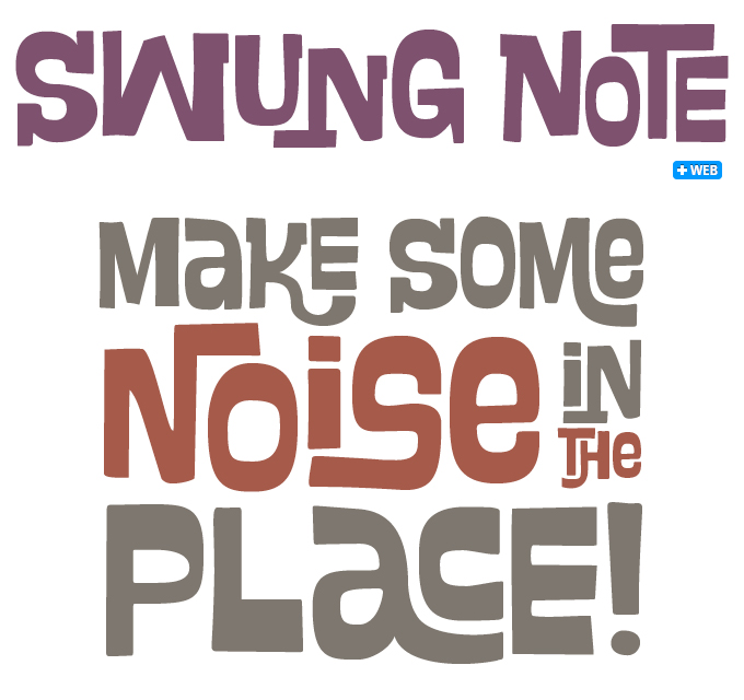
Brazil’s PintassilgoPrints are known for playful and nonchalant display fonts that exude fun and lust for life. When interviewed for our Creative Characters newsletter, they quoted a note from American composer Charles Ives to his copyist: “Mr. Price, Please don’t try to make things nice. All the wrong notes are right.” They explained that, although they like to insert charming “wrong notes” in their typefaces, the fonts have to be technically impeccable. Swung Note is a case in point. Packed with hundreds of smart interlock pairs, the font works magic in OpenType-savvy applications. As the letters assume different shapes in different ligatures, the result looks surprisingly natural. A great and playful tool for creating impressive custom-lettered-looking designs with a subtle 1960s feel. Check out the special promotion for Swung Note for the month of June 2012!
Have your say
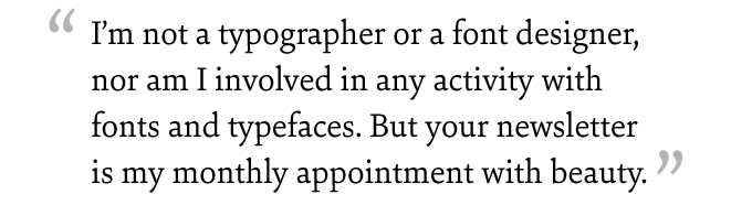
— Stefano, Italy, May 9, 2012
Your opinions matter to us! Feel free to share your thoughts or read other people’s comments at the MyFonts Testimonials page.
MyFonts is on Twitter and Facebook!
Join the MyFonts community on Twitter and Facebook. Tips, news, interesting links, personal favorites and more from MyFonts’ staff.