This month’s Rising Stars
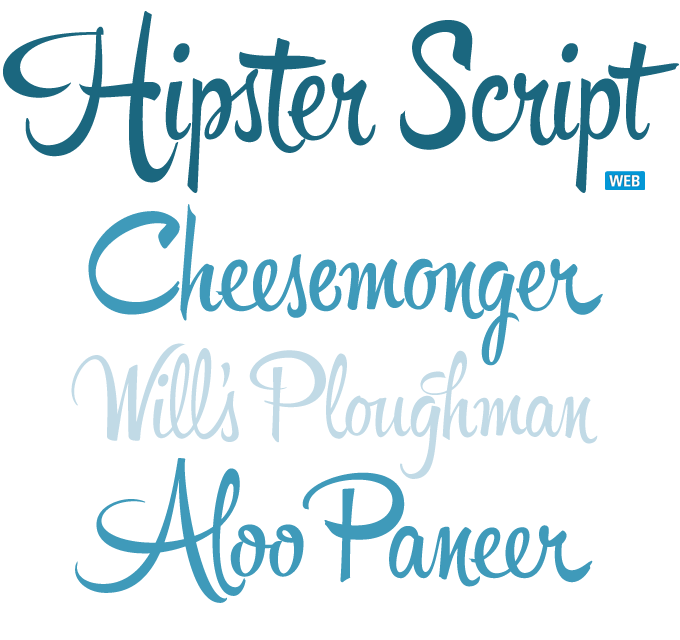
The award-winning Hipster Script by Alejandro Paul is based on a style of hand lettering that was created for advertising in the 1940s and 1950s yet stills looks fresh today. While the lettershapes have their roots in copperplate script styles, it’s the tool that made the difference. Painting the letters on board or paper with a round brush, the artist created thinner and thicker strokes by exerting less or more pressure, varied letterforms according to context, interrupted the connected flow by lifting the brush. A faithful digitization must emulate all these aspects of brush lettering, and Hipster Script does it very well. Have a close look at the various letter combinations in the sample above, such as the recurring “-er”, or letter pairs such as “ee” and “ll”. These variations are selected automatically for specific combinations using OpenType’s Contextual Alternates function. The result is a convincing imitation of hand-painted letters. Use with OpenType-enabled layout software!
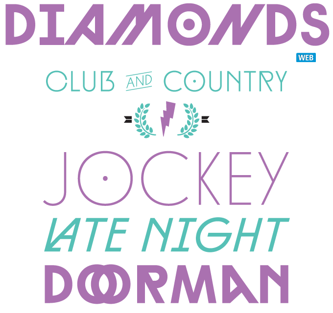
Today’s cutting-edge graphic design seems to have a predilection for display fonts that are somehow self-referential — in other words, typefaces that in their shapes and structure say something about the history and mannerisms of type design itself. Diamonds from HVD Fonts responds to this trend in a smart and witty way. Designer Hannes von Döhren created a family in five weight plus italics that shows influences from Art Deco and Modernism; its letterforms are geometric and somewhat experimental, yet readable and clear. The Italics are in fact slanted romans, lending themselves very well to setting lines at an angle — as show in HVD’s posters. Each font includes alternate letters, fractions and scientific superior/inferior figures and arrows; check out the Ornaments font, an ideal toolkit for making banners and labels.
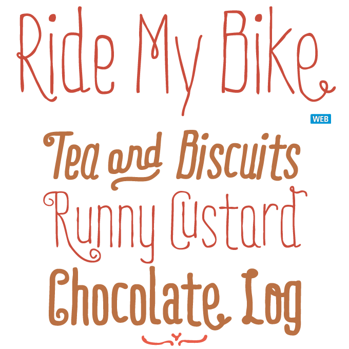
Skinny, narrow typefaces with a hand-made feel have been everywhere in the past couple of years, but some have more character than others. Ride My Bike is particularly lively. Playful and irregular, it is a typeface with a sassy, streetwise attitude and a mischievous smile. It is the first alphabetic font family by Chilean illustrator-bookbinder Guisela Mendoza who previously contributed several charming picture fonts to the Latinotype collection. Ride My Bike’s Pro version has initial caps, terminals, alternates and dingbats — more than 600 glyphs per font — but for those who don’t need all that, there’s the cheaper Essential version, with no OpenType features. Have fun!
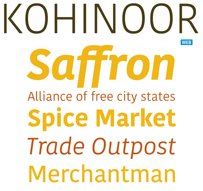
Diamonds galore in this newsletter: Kohinoor Latin was named after one of the most famous precious stones in history, a diamond that probably originated from Andhra Pradesh in India. The typeface comes from India as well — MyFonts is proud to welcome the Indian Type Foundry, an independent foundry established by Satya Rajpurohit and Peter Bilak. India uses about a dozen different writing systems, and the Indian Type Foundry is the first independent company to offer original fonts for all of them; Kohinoor Latin shows that Rajpurohit also is a confident and talented designer of Latin fonts. With its subtly humanistic approach, Kohinoor Latin is a fine sans-serif suitable for both body and display text in five weights with italics.
Text families of the month
Text typefaces for demanding editorial work need to possess special qualities: excellent readability, a generous range of weights with italics and small caps for all of them, multiple figure sets and ample language coverage. In this section of the newsletter you’ll find recent releases that meet these standards.
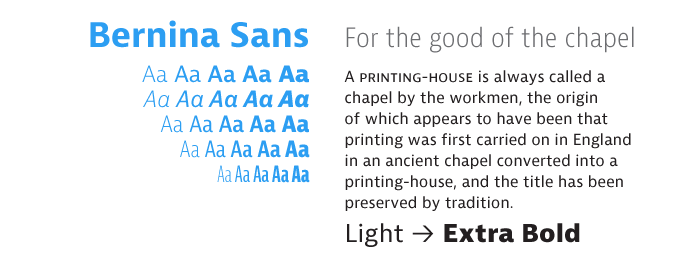
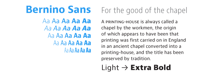
Just Another Foundry is a rather casual name for a foundry that sets such a high value on quality and thoroughness. Working in close collaboration with his Japanese partner Shoko Mugikura, German type designer Tim Ahrens develops finely tuned text and display fonts as well as highly valued software tools for type designers. JAF Bernini Sans is an impressive new design, consisting of two sub-families (Bernina and Bernino) that share the same skeleton but are different in atmosphere and design details; each style in the family comes with these two variants for the price of one. Finely balanced weight distribution and open shapes make Bernini a great text face, while the wide variety of weights and widths provide the designer with a rich toolbox for headings and display typography.
Follow-Up
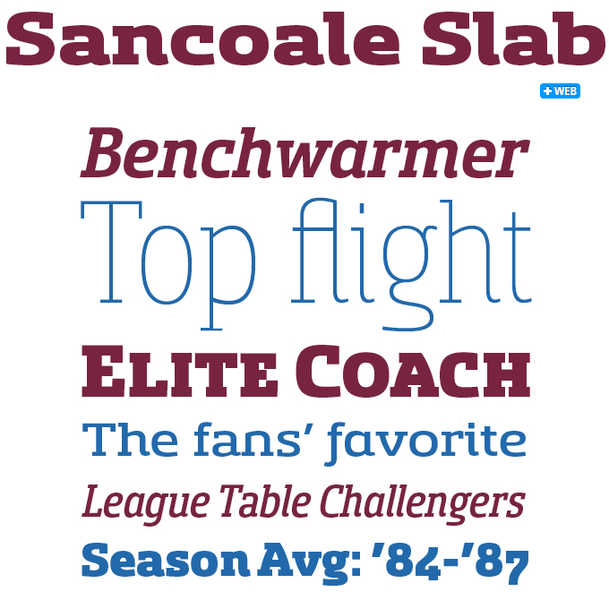
Sancoale Slab is the serif companion to Sancoale, Jeremy Dooley’s personally flavored take on the contemporary sans serif. Combining a lucid silhouette with unusual detailing, the Sancoale superfamily is both readable and full of character. In Sancoale Slab, several letters have alternates that can transform the nature of the set text: a single and a double story “a”, two varieties of the “e” and “n”, and more. Have a look at the informative PDF brochure for details.
If you like this typeface from insigne, check out some of their other fonts:

Ashemore
With its references to early 20th-century lettering and display type, Ashemore looks almost too fancy for a text face. Yet its standard width works well in longer body text settings. Quirks such as the bent strokes on the capitals and the Popeye-like arm on the lowercase “k” blend nicely into the overall harmonious text image.

Sancoale
Sancoale is the sans-serif on which Sancoale Slab was based. Its contemporary design is distinctive and unique, but not too far outside the box. The design is simplified with no stems or spurs in the default character set. The OpenType alternates do include alternates with stems, and there are six weights with true italics.

Donnerstag
Donnerstag is one of a series of insigne fonts that have the German word for day (‘Tag’) in their names. Donnerstag conveys power and personality with its strong slab letterforms and ball terminals. With seven weights it offers a versatile range of atmospheres, from its beefy and masculine Black to the delicate and feminine Hairline.
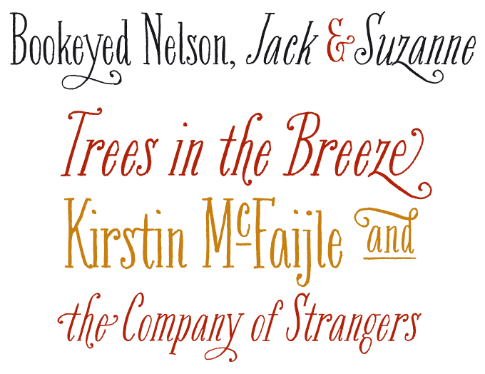
Sponsored Font: Bookeyed Nelson
with type designer Stuart Sandler of the Font Diner. She draws her whimsical illustrations and alphabets by hand; he expertly vectorizes them and makes them into highly usable fonts. Bookeyed Jack, Suzanne and Nelson are three of their most recent fonts — a trio of condensed display typefaces that resemble hand-drawn roman and italic printing faces. Bookeyed Nelson is the straightest of the lot, with handsome good looks that were drawn with a pointed pen dipped in walnut ink. Reliable Bookeyed Nelson does what you need him to do, with a number of alternative glyphs & ligatures to customize his appearance in any OpenType-aware application. He adorns books and music, posters and stationery and enjoys spending quality time with Bookeyed Suzannne, his italic companion.
Have your say
— Shalini from India, August 10, 2012
Colophon
The Rising Stars nameplate is set in Auto 3 and Proxima Nova Soft, and the Have your say quotation in Classic Grotesque. The font samples were conceived and designed by Anthony Noel with contributions from the editor, Jan Middendorp.
Subscription info
Want to get future MyFonts newsletters sent to your inbox? Subscribe at myfonts.com/MailingList
Comments?
We’d love to hear from you! Please send any questions or comments about this newsletter to [email protected]


