This month’s Rising Stars
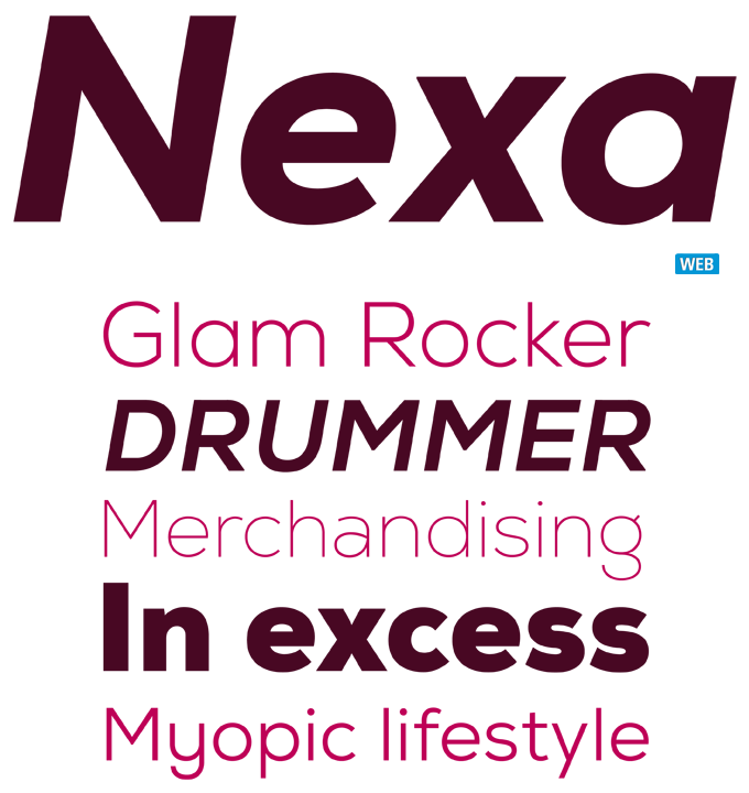
Released in early October, Nexa from FontFabric was offered at a record-breaking, too-good-to-be-true introductory price, and sailed smoothly to the number one spot on our Hot New Fonts chart. But as we’ve said before, a great offer alone does not guarantee a hit. Even at a 90% discount, a font family must be original, well-made and complete in order to deserve its success; and Nexa is all that. The Nexa family comes in 16 weights — eight uprights with matching italics. With its geometric yet optically balanced design, it offers excellent legibility in web and print design, both in headlines and longer blocks of text. An accomplished and very usable family, Nexa is likely to remain successful at its (very affordable) full price.
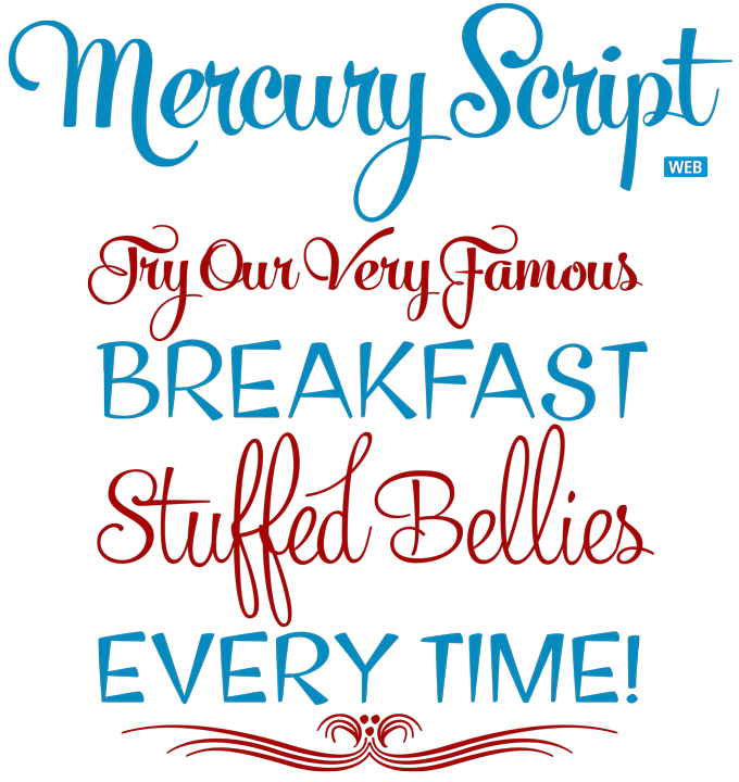
Helsinki-based designer Emil Bertell has carved out a personal, recognizable style with attractive informal scripts like Mishka and Slim Tony. His latest offering, Mercury Script, is his most elegant typeface to date. Loosely based on hand-lettering found in a vintage lingerie advertisement (only containing the words “light control”) it displays the same lust for life as his earlier scripts, but its curves are more luscious, its features more ambitious. When used in OpenType-enabled layout software, activating Swashes, Contextual or Stylistic Alternates results in what the designer describes as “plenty of extra grooviness”. Check out Mercury Ornaments for additional excitement, or turn on Small Caps to activate a complete set of block capitals designed to go with the font.
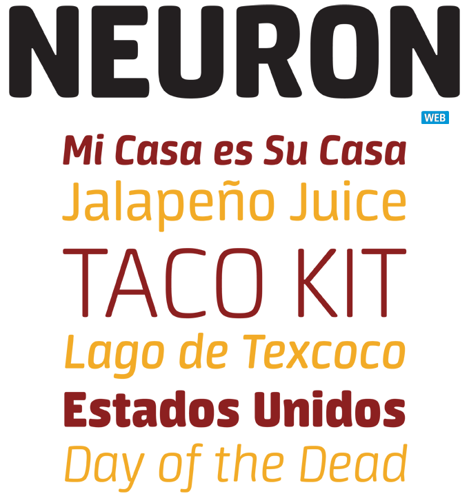
Colombian designer Manuel Eduardo Corradine has been very successful with a long string of script fonts in many styles. His new type family Neuron belongs to a completely different genre but the attitude is the same. It’s a smooth, clean sans-serif, but it is clearly the work of an expert lettering designer who likes his letterforms lively, fresh and human. Neuron comes in eight weights plus matching italics, suggesting a broad spectrum of uses — from subtle headlines to tasty packaging, with readable body texts in between. Besides a full Latin and Central European character set the family also offers Cyrillic. The italic shapes are subtly influenced by humanist cursive writing but keep their sleekness at the same time.

Text families of the month
Text typefaces for demanding editorial work need to possess special qualities: excellent readability, a generous range of weights with italics and small caps, multiple figure sets (lining, oldstyle, table) and ample language coverage. In this section of the newsletter you’ll find recent releases that meet these standards. For the sample texts we used a fragment from Benjamin Franklin’s Autobiography — as we always do.
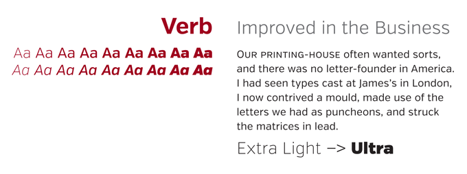
Verb from Yellow Design Studio is a clean sans-serif family with a friendly face. In Verb’s case “human” and “approachable” doesn’t imply huggable roundness: this text and display family oozes confidence and energy. The typeface is packed with features including true italics, small caps, special ligatures, oldstyle and tabular numerals, automatic fractions, extensive language support, and more.
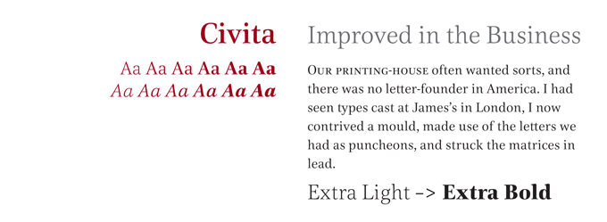
No designer of text fonts is currently more productive than Dieter Hofrichter. His Hoftype foundry has published high-quality fonts in rapid succession, and Civita adds yet another flavor to its broad range of styles. With its high stroke contrast and vertical stress, Civita can be labeled a ‘modern face’ or Didone, but it has none of the stiffness usually associated with the genre. It has a strong and lively personality, its fluid curves modelled on a solid structure. Offering six weights with small caps, multiple figure styles with matching currency symbols and ample language coverage, Civita combines charm with serviceability.
News Round-Up
Starting this month, we’re going to pick out a handful of interesting news snippets from MyFonts’ own kitchen and from the greater world of fonts, lettering and typography.
Specials page: looking much better
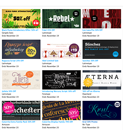
Foundries offer amazing discounts these days, so we realized it was high time to redesign MyFonts’ Special Offers page. It now offers all you bargain hunters a more useful, at-a-glance overview of all the discounted fonts, sorted by expiration date, newest, Alphabetical, or by Foundry. There is a specially designed poster for each of the families.
TypeCast acquired by Monotype Imaging
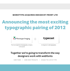
Belfast design agency Design by Front, whose TypeCast web layout service has been gaining a huge following during its year-long beta phase, was acquired last week by MyFonts’ parent company, Monotype Imaging. Read the official announcement and the FAQ page on the Design by Front/Typecast blog.
Seb Lester, making letters
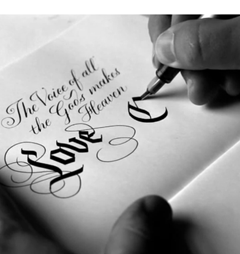
“Calligraphy makes you a better type designer, and type design makes you a better calligrapher,” says Seb Lester in this new video showing how he works wonders with pen, ink and the computer. The designer of the wildly popular Neo and Soho typefaces now specializes in custom lettering and limited-edition typographic posters.
Rising Stars webfont specimens
We’ve taken this month’s four Rising Stars for web font test-drives. See the results as full webfont-powered specimens along with usage notes and tips over at webfonts.info.
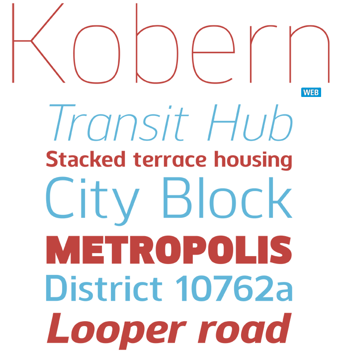
Sponsored Font: Kobern from The Northern Block
Have your say
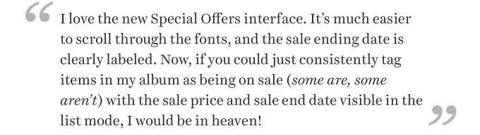
— Posted to MyFonts’ Feedback page on October 22, 2012
MyFonts says:
Hmmm. Interesting idea - we’ve passed it along to our Development team for review and consideration!
MyFonts is on Twitter and Facebook!
Your opinions matter to us! Join the MyFonts community on Twitter and Facebook, and feel free to share your thoughts or read other people’s comments. Plus, get tips, news, interesting links, personal favorites and more from MyFonts’ staff.