This month’s Rising Stars
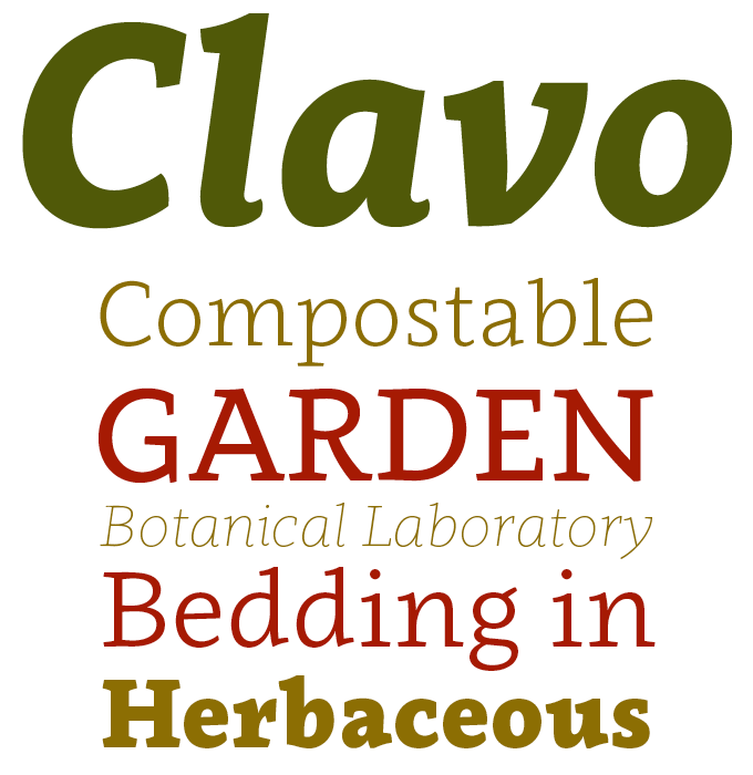
Clavo is the third font family from Warsaw’s Dada Studio. Its approach to the contemporary oldstyle genre is somewhat similar to Ludwig Übele’s Marat or Elena Albertoni’s Acuta (while being in no way an imitation). With its distinctive shapes, pronounced serifs and marked transitions, it has an animated energy about it that makes it stand out at display sizes. When used in smaller texts, Clavo is attractive and flexible, with proportions that are easy on the eye and help immersive reading. It comes in ten weights with matching italics, carefully adjusted for optical harmony. With a large set of numerals, small capitals, fractions and other OpenType goodies, it’s a bargain at its full price… and almost too good to be true at its current 90% discount, valid through July 28, 2013!
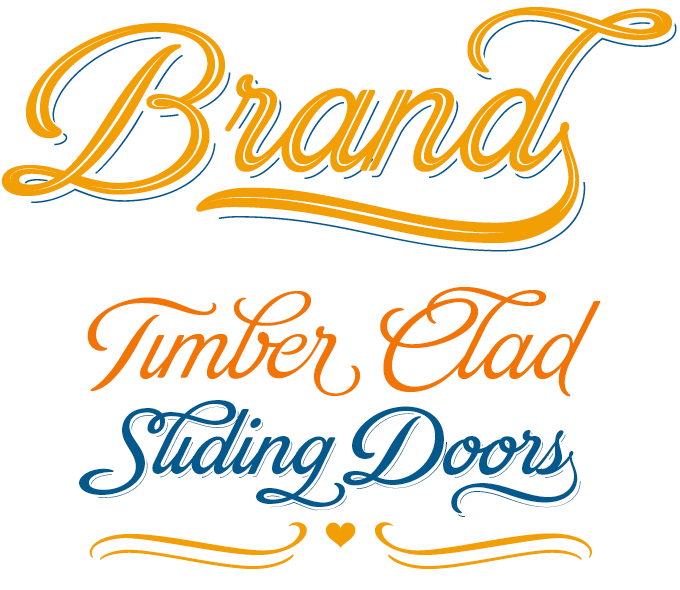
With the aptly named Brand family, Maximiliano Sproviero of Lián Types explores American-style lettering, citing a broad range of references including jam jars, soup cans, and chalk lettering. Not surprisingly, Brand was designed with packaging in mind; it will look great in many other contexts as well, including pub signage, magazines and invitations. Brand comes with decorative Inline and Shade versions; the Pro fonts, with their many ligatures, alternates, and ornaments, offer endless possibilities for personalization and therefore are perfect for branding and logo design. The Standard styles are smaller and cheaper versions of the font, with no decorative alternates.
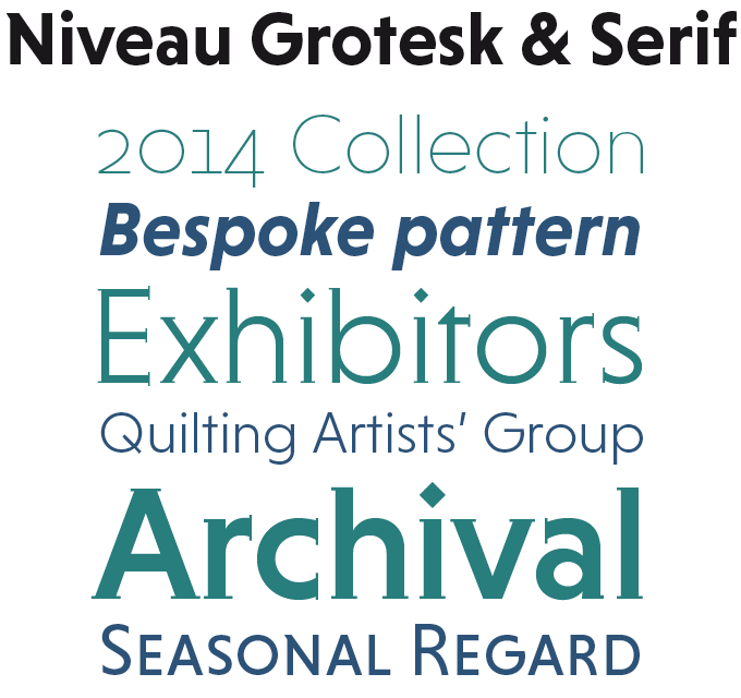
It is always exciting to see what Hannes von Döhren, the man at the helm of Berlin’s HVD Fonts, will come up with next; his range of styles seems almost limitless. The recent Niveau brings to mind the unorthodox 1970s and ’80s typefaces by the likes of Herb Lubalin and Albert Boton. However, van Döhren’s references are subtle and include classic nineteenth-century faces as well. The outcome is a text and display family with a high level of originality. Niveau is a double family of Grotesque and Serif versions, both in six weights plus matching italics and small caps. With their clean, geometric architecture, the fonts are striking in big sizes yet very legible in smaller sizes and longer texts — in print or on screen. So, which of the two will it be? The introductory offer may make your decision easier. Why not get both? Each of the families is a mere $49 through August 10, 2013.
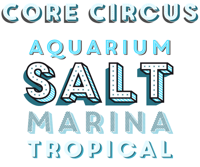
One of the microtrends we referred to in our introduction is that of display typefaces designed for layering. By piling different styles of these families on top of each other in multiple colors, graphic designers can create stunning chromatic typography. Typo-ø-Tones’ Wilma was a 1990s pioneer in this genre; more recently we have seen the success of Frontage and Trend. With Core Circus, the S Core foundry raises the bar a little: it has an impressive arsenal of seven 3D effect layers, eight 2D effect layers and one shadow effect layer. The family is all-caps; but there are marked differences between the Deco-inspired shapes that are found in the lower case set. While the basic shapes are simple, the system offers endless possibilities for layering, coloring and combining. Core Circus is 40% off through August 18, 2013.
Text families of the month
Text typefaces for demanding editorial work need to possess special qualities: excellent readability, a generous range of weights with italics and small caps for all of them, multiple figure sets (lining, oldstyle, table) and ample language coverage. This month we’ve selected three releases from new foundries that meet these standards. As usual, the text fragment is from Benjamin Franklin’s Autobiography.
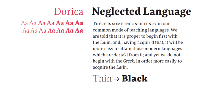
Having joined MyFonts in February of this year, NooType from Switzerland has since released half a dozen type families; considering their quality, these type projects must be the fruit of a development phase that started long ago. Dorica is designer Nico Inosanto’s latest — a well-drawn oldstyle book face that mixes classic proportions with contemporary details. It comes in seven weights with very readable, round italics and offers multiple sets of numerals and a nice range of ligatures; all in all, an eminently usable book and magazine typeface. Good news for bargain hunters: it’s 70% off through August 19, 2013.
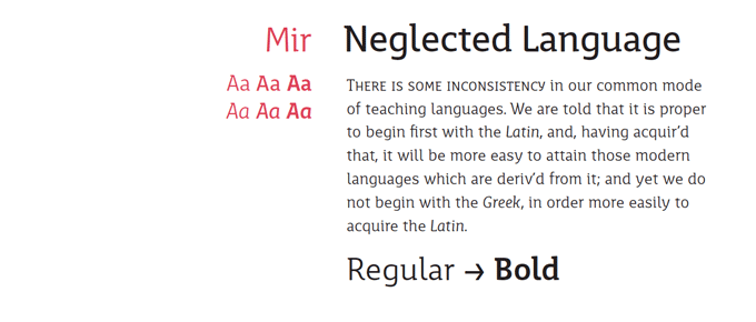
Mir is the first text typeface by Julia Sysmäläinen, a talented Finnish-Russian designer based in Berlin, whose FF Mister K (a smart adaptation of Franz Kafka’s lively handwriting) made her famous in typographic circles. Mir, released on her own label Juliasys, is clearly the product of an unorthodox and inquisitive mind. A semi-serif with pleasant but somewhat unusual shapes, it won’t be an “invisible” text face in the conventional sense — but it will certainly help the user create a crisp, contemporary typographic style. While its range of weights is limited, its huge character set (which includes both Greek and Cyrillic) makes it suitable for demanding editorial and scientific projects.
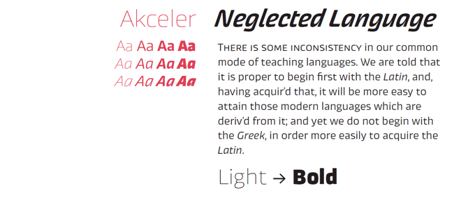
Ad Typo is another foundry new to MyFonts. Their Akceler aims at an interesting niche: sports publications. Designer Andrej Dieneš argues that the editorial world lacks typefaces specially designed for sports communication, opting for mechanically slanted or otherwise deformed standard fonts instead. Akceler is meant to fill this gap, by offering various degrees of excitement within what is basically a very usable neo-futurist text face. Open shapes, built-in softness and pace, expressive numerals and a crazily accelerated second italic style should offer the sports publications designer all she has hoped for.
News Round-Up
In this section we pick out interesting news snippets from MyFonts’ own back yard and from the greater world of fonts, lettering and typography.
Typecon comes to Portland
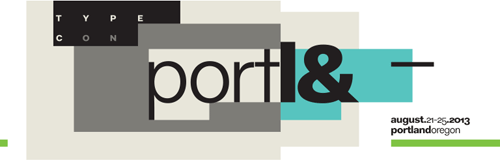
It’s almost time for Typecon, the yearly get-together of typography geeks that takes place in a different North American city each year. The fact that this year’s Typecon is in Portland (or, as the organizers playfully write it, Portl&) may be an extra incentive to many. But of course, the main attraction is the program itself, with workshops, exhibitions and speakers of international allure. And for the first time ever, the MyFonts team is giving its own workshop, hoping to help indie foundries market their fonts more effectively.
Special Offers: Ending in your timezone
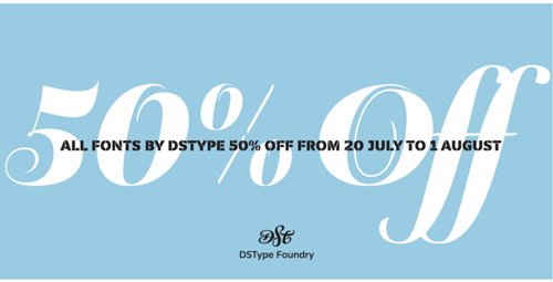
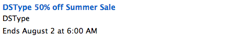
The image above, including the caption, is from our newly revamped Special Offers section. MyFonts sometimes received complaints from customers in timezones across the world who had hoped to catch a special offer on its last day — only to discover it had expired at midnight EST (US Eastern Standard Time). We’ve made those pages interactive, so that the expiring date and time will usually show up based on the timezone in which your computer is located. Make sure that co-workers in a different timezone double-check at their own desk!
By the way, the offer shown above is worth an extra plug: for a few more days, Portugal’s DS Type is holding its Summer Sale, offering all of its splendid fonts at half price. Ends August 1 at midnight EST, or 6:00 am the next day in Western Europe, where this screenshot was taken.
Webfonts at MyFonts

All of the top four Rising Stars fonts, and often the Text Fonts as well, are available for licensing as webfonts. Visit Webfonts.info for HTML and CSS versions of this month’s Stars, plus lots of articles, resources and a showcase of web typography in the real world.