Sorry, purists among you. This newsletter has turned out a little exuberant. It must have been something in the air, or perhaps it was the sheer quantity of sunlight that shone on so many of us over the past few months — the font-loving public seems to have been lusting for flourish. Most of the stars of the moment bathe in ornament and swashes. What’s true for hip-hop probably goes for typography too; you either love the bling, or you hate it. Should the latter be the case, please scroll down to our impressively serious Text Font section. We also have some great MyFonts news for screen typography addicts. Enjoy!
This month’s Rising Stars
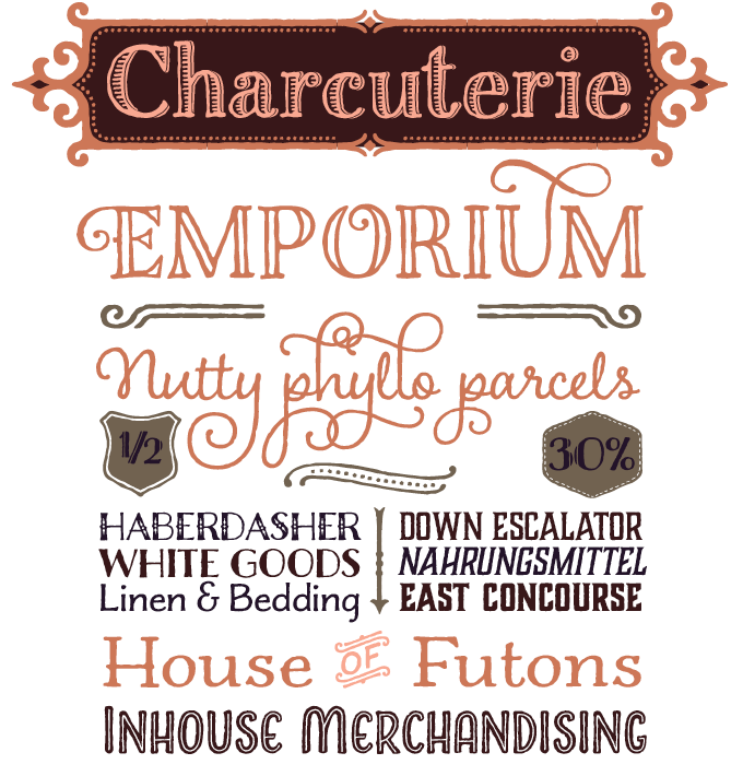
Laura Worthington is known for her elaborate and charming script fonts, but with Charcuterie she is trying a whole new course. It’s a suite of 22 hand-drawn display fonts in very different styles that nevertheless combine well together. The styles are vaguely based on historical letterforms you might find in European magazines or shop lettering from the early twentieth century; there’s a distinct Parisian feeling to some of them. As the designer says, “Charcuterie is a Smörgåsbord of delightful type inspired by our sense of a happy time at a splendid table,” and what can we add to that? Select your own favorite ingredients to create tasty headlines, logos, display, packaging, signage, or advertising.
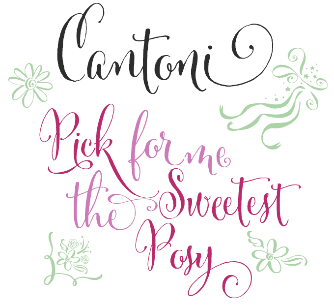
Debi Sementelli is an experienced lettering artist who ventured into type design two years ago when she embarked on a joint venture with type designer Brian J. Bonislawsky. Their Belluccia, drawn by Debi and digitized by Brian, became a huge success. Encouraged, Sementelli decided to take digital matters into her own hands (with a little help from some friends) and recently presented her first self-produced font. It’s called Cantoni, it’s a beauty and it has become an immediate hit. Based on the designer’s fluid upright style of brush lettering, Cantoni comes with 1265 glyphs including hundreds of swash letters, ligatures, pre-designed letter combinations, and more. The Pro version has all of that, plus a limited set of ornaments. The Basic version comes without alternates and is ideal for simple web use and for office software like MS Word. There are separate fonts containing more ornaments and pictures, flourishes, and wedding invitation key words. Lovely and useful.
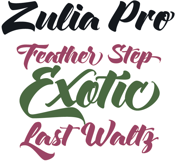
Zulia Pro is named after Zulia, the part of Venezuela where its designer Joluvian grew up — a region of sunshine, high temperatures, oil and cheerful people. Based on Joluvian’s favorite calligraphic styles, italic and brush pen, Zulia oozes Latino energy and charm. The typeface was developed from simple, contrasted lettering on paper with brush and marker. Various options were then developed for each character, based on a set of handmade shapes that could be connected in different ways according to the user’s needs. With the help of Sudtipos’ Alejandro Paul the handmade letterforms were digitized and made into a well-programmed font chock full of alternates, best used with OpenType-aware applications.
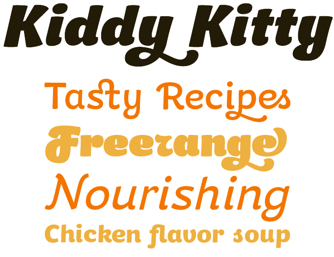
Kiddy Kitty is the latest font family from Alexandra Korolkova’s foundry — one of the few internationally operating microfoundries in Russia, run by the determined young woman we interviewed together with two of her colleagues in 2009. The foundry has published several typefaces by the talented Vasily Biryukov, and Kiddy Kitty is his latest. A soft and friendly sans-serif type family, it is as much a font for setting medium-sized texts as it is for appealing display designs. Consisting of six upright italic and five conventional italic weights, the family comes with a set of ligatures and swashes and 16 carefully drawn cat dingbats in each font. Great for greeting cards, children’s books and packaging design.
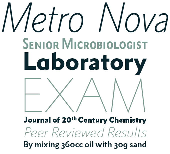
Metro from 1929 was one of the great innovative sans-serifs of the last century. The lettering artist and designer W.A.Dwiggins drew the face in response to a challenge from Chauncey Griffith at Mergenthaler Linotype, who wanted an American competitor for Futura. With its humanist warmth and unorthodox solutions, the result was more human than the European geometric sans-serifs and became a modern classic. Now, Metro Nova by Monotype-Linotype staff designer Toshi Omagari finally introduces Metro to the 21st century. Seven weights with italics and small caps, a condensed version, and a wonderful set of alternate shapes make Metro Nova a serious contender for editorial projects that require a readable sans with personality. Great introductory offer: the complete Metro Nova family is only $99 until September 28, 2013!
Text families of the month
Text typefaces for demanding editorial work need to possess special qualities: excellent readability, a generous range of weights with italics and small caps for all of them, multiple figure sets (lining, oldstyle, etc.) and ample language coverage. In this section of the newsletter you’ll find recent releases that meet these standards.
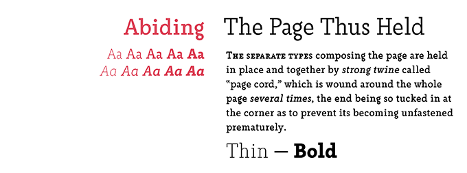
One of the international terms for slab-serifs is “mecanes”, which refers to the machine-like nature of slab-serif fonts such as City and Rockwell. Abiding from Suomi has some of the geometric structure of these modern classics, but none of their static stiffness. Designer Tomi Haaparanta has made a lively text family that is as usable as it is friendly: with small caps, oldstyle figures and five weights, it is well-equipped for magazine and book typography.
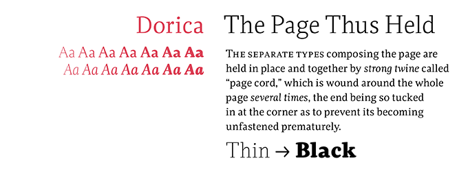
Nootype is the one-man foundry of Nico Inosanto, who joined MyFonts a mere seven months ago and has published as many font families since. Dorica is one of his most promising so far: a clean, contemporary oldstyle text face based on ancient principles, with expressive Thin and Black versions for striking headline typography. The family is, in fact, two-in-one: activating the Stylistic Alternate feature triggers a variety that is practically another typeface.
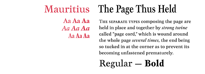
Mauritius is based on Barock-Antiqua, the last typeface by the German master Georg Trump. Published in 1968, Barock-Antiqua was produced for metal typesetting and, due to the foundry’s folding, died before it could fly. Canada Type has now revived it as a versatile family in three weights plus italics, with small caps, multiple figure styles and a condensed version. Powerful and elegant.
News Round-Up
In this section we pick out interesting news snippets from MyFonts’ own kitchen and from the greater world of fonts, lettering and typography.
Letraset: A Celebration
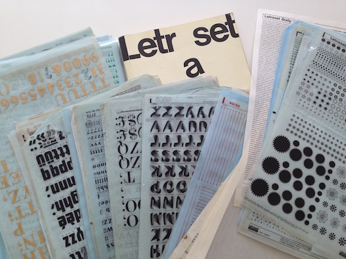
Dan Rhatigan’s personal Letraset collection includes a near-pristine sheet of Roger Excoffon’s amazing Calypso. Photo: Dan Rhatigan
Letraset — the dry transfer lettering that introduced many to high quality type and, via book covers, LPs, posters, advertising and magazines, helped define the typography around us from the ’60s to the ’80s — is in the news. On September 10 Monotype’s Dan Rhatigan and John Walters of Eye Magazine organized a celebration of all things Letraset at the St Bride Library in London. Guests of honor were typeface designers Colin Brignall and Dave Farey, and also Tony Rushton who used Letraset in his layouts for Private Eye magazine. Dan showed Letraset samples from his wonderful collection, and how he’s still using it. At its peak there were 11 million Letraset sheets produced per year by 400 staff — in recent years production is down to a mere 14,000 sheets. The evening ended on a sad note — production in the UK ended on September 6, though continues in France and China. The digital library is handled by Monotype and remains available.
Now live: Retina-optimized font samples
From one end of the technological spectrum to the other — let’s look at the hardware that the MyFonts website is viewed on. More and more users have a MacBook Pro or iPad with a Retina screen. While this means the sharpness of their screen has improved enormously, images produced for the old resolution often look kind of blurry. MyFonts is working with the foundries to gradually double the resolution of the thousands of colorful font flags and posters used on the font pages. And from now on, the one-line samples on these pages are also optimized for Retina screens and future hardware with similar sharpness.
Webfonts at MyFonts

All of the top four Rising Stars fonts are available for licensing as webfonts. Visit Webfonts.info for HTML and CSS versions of this month’s Stars, plus lots of articles, resources and a showcase of web typography in the real world.