
This month’s catchword is “more”. First of all, the MyFonts website itself has been receiving some major (and rather amazing) updates, offering more and smoother ways of testing and installing fonts. Scroll down to the news section for more details. As for our Rising Stars, they are certainly not of the “Less is More” persuasion. Each offers a huge choice of options beyond the basic functions of a font — more ornaments, more swashes and ligatures; or fancy shadows and dynamic fillings for multicolored layering. Finally, this month’s recent text fonts are also rather maximalist in their approach, offering up to eight weights and lots of extra features.
This month’s Rising Stars
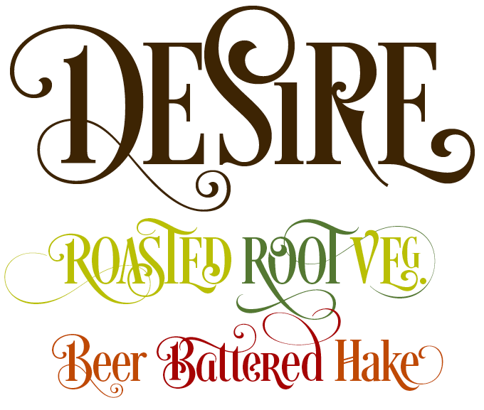
With Desire, master lettering artist Charles Borges de Oliveira moves away from the lively fifties-style scripts he is famous for — check out his wonderful Alpine Script and Bounce Script. Desire is equally attractive, but it’s a different animal altogether. Paying tribute to hi-contrast classicist display faces such as Bodoni Poster Compressed, Borges has taken this genre to a new level of baroque flair, producing one of his most extensive fonts to date. With 644 alternate letters, 98 ligatures, eight flourishes and six catchwords, Desire offers a huge toolkit to create logos, headlines and titling. It is well-suited for book covers, editorial, packaging, advertising, branding and more. Watch this video to see how to experiment with flourishes and ligatures in Adobe Illustrator CC. Desire is a different font every time you use it.
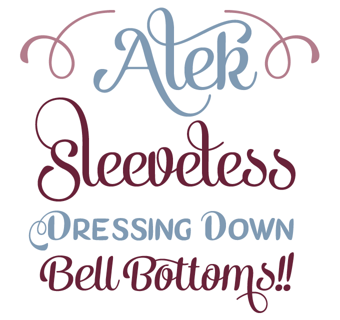
Many of Fenotype’s fonts are variations on the unique style of display scripts that designer Emil Karl Bertell has developed over the years. Alek is his latest offering: an elegant yet playful upright script family of two weights. One thing that makes it stand out from its predecessors is its charming set of small caps, and its extensive font of mustache-like Ornaments. Alek is equipped with plenty of OpenType features: in OpenType-aware applications, alternates can be activated via options such as Contextual, Stylistic or Titling Alternates, or Discretionary Ligatures: they can also be selected manually from the Glyph Palette.
For the best price, purchase the complete Alek Family.
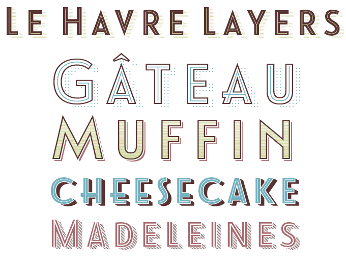
Le Havre from insigne is a fine example of a sans-serif display face in the style of 1920s–1940s posters and signage. Designer Jeremy Dooley has now added a wonderful chromatic variety called Le Havre Layers. “Chromatic typography” is when multicolored headlines are created by layering (or overprinting) fonts consisting of complementing letter parts: an outline with a fill, a basic letter with an inline and/or shadow, etc. Le Havre Layers explores the possibilities of this technique to the max. By layering frames and altering opacity and color, you can build effects which include realistic 3D appearances reminiscent of the storefronts of old and adding centerlines, dotted centerlines, and shadow variations. Needless to say, the new all-caps display version is a perfect match for the other members of the Le Havre hyperfamily.
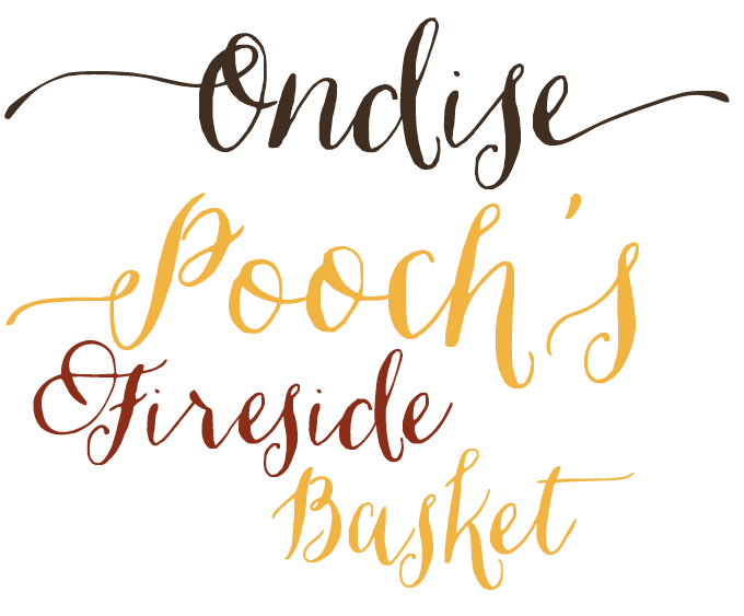
Ondise by Jessica McCarty is part of that new generation of informal hand-lettering scripts exemplified by the successful work of Emily Lime and Crystal Kluge. Based in rural Illinois, Magpie Paper Works are relatively new to the game but they have clearly hit a soft spot with Ondise, a playful calligraphic script with a dancing baseline. Created with the pointed pen, the handwriting was made into an OpenType font whose features include a swash function that automatically substitutes beginning and ending letters to create fancy-looking words. It also comes with six different ampersands for those that want to say “and” in many ways.
Text families of the month
Text typefaces for demanding editorial work need to possess special qualities: excellent readability, a generous range of weights with italics and small caps for all of them, multiple figure sets (lining, oldstyle, table) and ample language coverage. This monthly section shows recent typefaces that offer just that. Sample texts are taken from a splendid 1906 collection of essays about book production titled The Building of a Book, with thanks to Project Gutenberg.
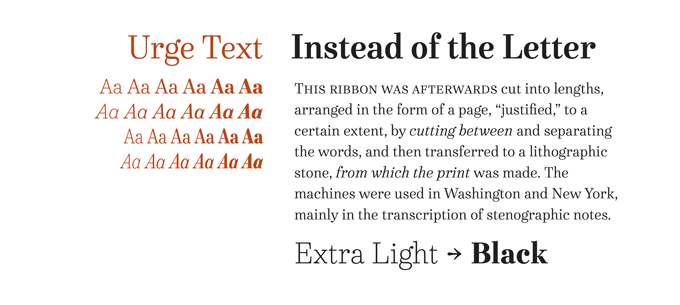
Having started out as a maker of whimsical display fonts, Dave Rowland from Schizotype has rapidly developed into a type designer of increasing sophistication and scope. He is also someone who prefers to do things somewhat differently — his Urge Text shows that while the design of text fonts is helped by a sense of tradition, what makes a typeface truly refreshing is imagination. The italics are bipolar, mixing italic shapes at the top with bottoms that are more roman in their construction. The weight organization is equally unorthodox. The light weights are almost monolinear; the bolds have a high-contrast, tasty “Modern-face” style. With six weights and two widths, all with italics and small caps, multiple figure styles and more, the 24-font family is a highly usable text typeface with an array of OpenType features.
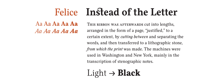
Switzerland’s Nootype joined MyFonts in February of this year and has since released an amazing string of well-made text and display families. Felice is probably the most classic-looking oldstyle face of the collection. Designer Nico Inosanto combined traditional humanistic proportions with contemporary detailing to create a warm and readable book typeface that never looks nostalgic or stuffy. Felice comes in ten styles with italics. With small caps, multiple figure sets including Numerators, Superscript, Denominators and Scientific Inferiors, and many ligatures, the family is a fine tool for demanding typographic projects.
Also, check out Nootype’s latest, a cool, clean geometric sans-serif called Radikal.
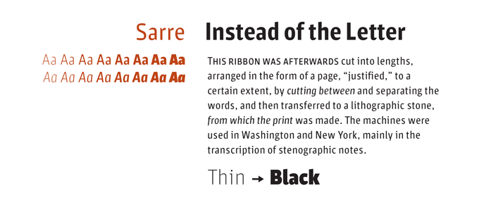
Sascha Timplan’s one-man foundry Stereotypes made something of a splash several years ago with a series of playful titling faces of which St Marie and St Ryde were the most successful. Timplan continued in a more contemplative mode with sophisticated sans-serif Elsa, and now the impressive new Sarre family. While in some respects Sarre is reminiscent of Amplitude, it is very different and very personal in its detailing. There’s a smart game going on of pronounced contrasts and sharp ductus changes, lending a striking personality to large headlines and briskness to small text settings. The typeface is rather narrow for a text face, so settings should be medium-sized. Small caps, real italics, and multiple figure sets are all in place.
News Round-Up
Following last month’s live webfont previews announcement, choosing and trying out webfonts on MyFonts just took another quantum leap towards awesomeness with the arrival of MyFonts webfonts in Typecast, and our new free 30-day webfont trial service. More details below.
Want to be among the first to receive MyFonts news? Follow our Meta MyFonts blog on Tumblr.
Try this month’s Rising Stars in Typecast
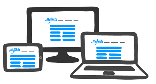
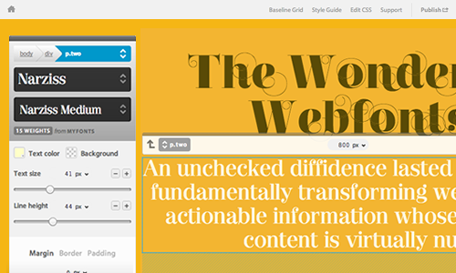 As of this week, the entire MyFonts webfont collection has become available in the already pretty superb Typecast app. MyFonts customers can now hop straight over to Typecast from any webfont preview page and create sophisticated layouts with their chosen fonts, try out pairings and download kits of HTML and CSS complete with a free thirty day trial to use on their own site.
New: free webfont trials
 Last month, we told you how previewing webfonts on MyFonts got a whole lot better: now you can see how any of our webfonts actually perform in the browser. Every webfont we sell now has a Webfont Preview tab that lets you play with headlines, subheads, and body copy.
The best news is that we just added a 30-days trial option. Once you find a font you like, grab the code to see how it looks on the site you’re building. We’ll let you try out any webfont for 30 days, completely free. After you buy, you can use our flexible kit builder to set up your fonts just the way you want them before downloading a self-hosted kit.
Check out our short video for a basic introduction of Webfont Previews and Webfont Trials.
Chank Diesel, travelling font salesman
 Chank Diesel, the maverick designer of hundreds of playful, sassy, anarchic and striking fonts, is currently producing a type specimen in the shape of what he calls a “typographic novel”. The book, made with designer Anne Ulku and writer Peter Hajinian, combines sample pages of around twenty brand new typefaces with a short story about Chank’s life as a “Travelling Font Salesman” — which is also the title of the book. The project is being crowd-funded via Kickstarter. As its rather modest goal of $5,000 has already been reached, Chank will be announcing a “stretch goal”, hoping to find more backers in order to upgrade the production quality of the book. You still have time to jump on board until November 20, 2013.
Webfonts at MyFonts

All of the top four Rising Stars fonts are available for licensing as webfonts. Visit Webfonts.info for HTML and CSS versions of this month’s Stars, plus lots of articles, resources and a showcase of web typography in the real world.


ColophonThe Rising Stars nameplate is set in Auto 3 and Proxima Nova Soft. |
Subscription infoWant to get future MyFonts newsletters sent to your inbox? Subscribe at myfonts.com/MailingList |
Comments?We’d love to hear from you! Please send any questions or comments about this newsletter to [email protected] |