|
Trends in type come and go the way they do in fashion and music (anybody remember grunge?) but sometimes here at MyFonts we are surprised by the things that catch on. Take the current craze in chromatic fonts. That’s the specialist term for display alphabets in a range of variations that can be layered to decorative and dazzling multi-colored effect. We figured that layering text frames would be a bit too laborious for this technique to become a massive success, but guess what? Thousands are buying these fonts, and several recent families in this genre have become hits. We are getting curious to see what people make with them; scroll down to the news section for details on how to share your work with us.
|
|
|
This Month’s Rising Stars
|
|
|
|
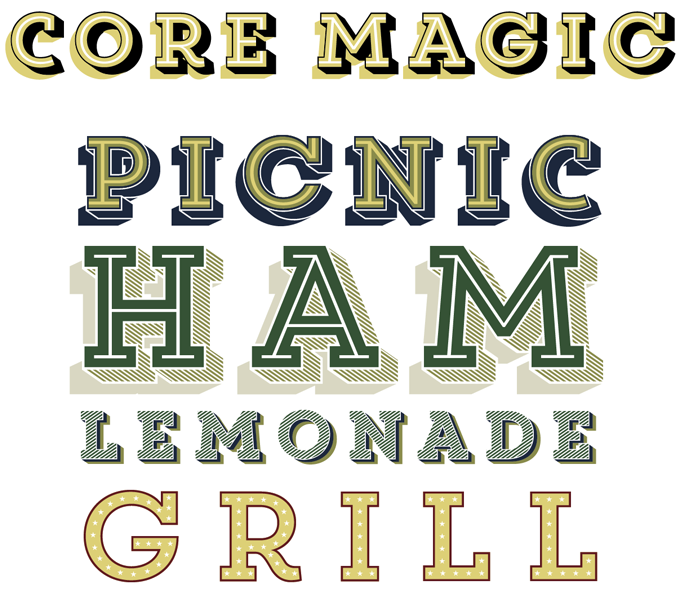
With last year’s successful Core Circus, Korea’s S‑Core found a nice niche to excel in: chromatic fonts, as mentioned in our intro. S‑Core’s are precise and usable. They have now released two more of these families in quick succession — Core Magic and their newest, Core Deco. Core Magic is the most successful so far. It’s a slab-serif version of their Circus font. Like its sibling, it offers eight two-dimensional layers, seven 3D effect layers and one shadow layer. The font is all-caps, so the lowercase positions are used to accommodate stylistic features which are consistent throughout all layers. Combining Core Magic with Core Circus will give you access to almost endless combinations — at least 262,551 different ones! A great family for book and magazine titles, logos, packaging and commercial brochures.
|
|
|
|
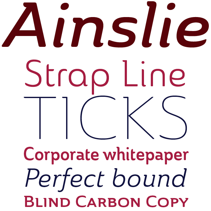
Announced in the Text Fonts section of this newsletter last month, Ainslie by Jeremy Dooley has continued to do very well indeed. Like many of Dooley’s faces, it’s different from the usual. Ainslie belongs to the hybrid category of half-serifs: some letter parts have a serif, some don’t. Also, its atmosphere is different: it is clear and open enough to work well on the text block level but, as the size increases, the font starts swinging and unusual details come to the fore. Originally developed for the Canberra Centenary Typeface Competition, Ainslie incorporates influences from Canberra and surrounding areas, blending the geometric principles of the city’s groundplan with the organic, flowing forms of aboriginal art. The family comes in three widths — Condensed, Normal and Extended — each in seven weights plus italics.
|
|
|
|
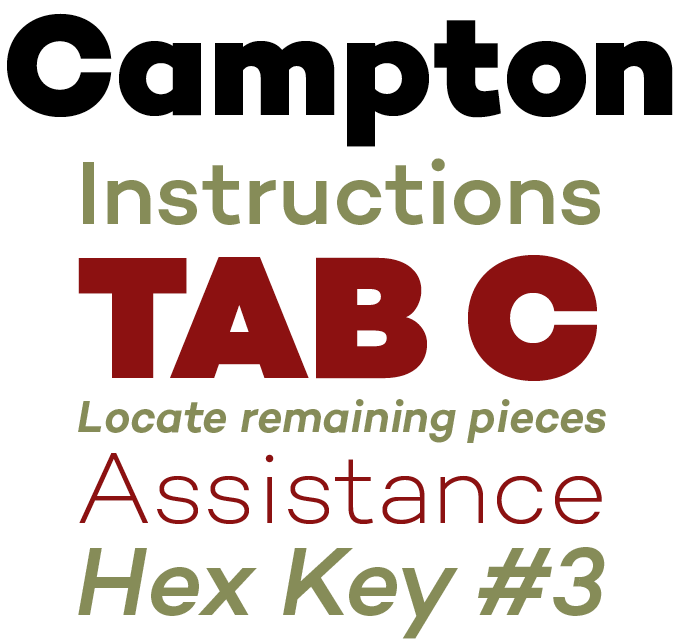
Berlin’s Rene Bieder has not had a single flop since releasing his first type family two years ago. Bieder’s collection has gradually evolved from industrial-looking sans-serifs to a broader palette of styles. Campton has historical overtones: based on early to mid-twentieth century typographic concepts, it aspires to what was once a major obsession to Modernist designers: neutrality. While there are already many faces focusing on similar principles, Campton tries to find its niche by combining simplicity with a subtle friendliness. The resulting family is neutral without being cold or characterless. Campton offers a typographic color that is subtly different from existing font families, for projects ranging from editorial and corporate design via web and interaction design to products.
|
|
|
|
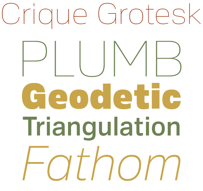
Like Campton (above), Stawix Ruecha’s Crique Grotesk examines the aesthetic of mid-century Modernism. Crique Grotesk’s main sources of inspiration are from a few decades later than Campton’s. There are echoes of Helvetica and Univers, but also some of the shine of Frutiger, and the typeface’s detailing has a contemporary smoothness and elegance all of its own. With eight weights and matching italics, the typeface is well equipped for a variety of tasks; its usability is further enhanced by a Display series, subtly wider to achieve that late 1950s magazine and book cover look.
|
|
|
Text fonts of the month
Typesetting for books, scientific magazines, or annual reports requires fonts with special qualities: excellent readability, a generous range of weights with italics and small caps, multiple figure sets (lining, oldstyle, table) and ample language coverage. In this section of the newsletter you’ll find recent releases that meet these standards.
|
|
|
|
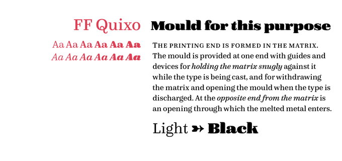
FF Quixo by Frank Grießhammer has been out for several months, but has remained under the radar a bit. Which is a pity, because it’s gorgeous. Fontfont’s promo copy gives us a long (and probably tongue-in-cheek) list of places where Quixo could help out: film, TV, advertising, packaging, editorial, publishing, logo, branding, music, nightlife, software, gaming, sports as well as web and screen design. It’s not too far off the mark, though. With a lively basic design, a generous range of typographic features, superbly readable text weights and two lovely dark weights for display, FF Quixo is much more than a workhorse text face. For one thing, it is a lot more fun.
|
|
|
|
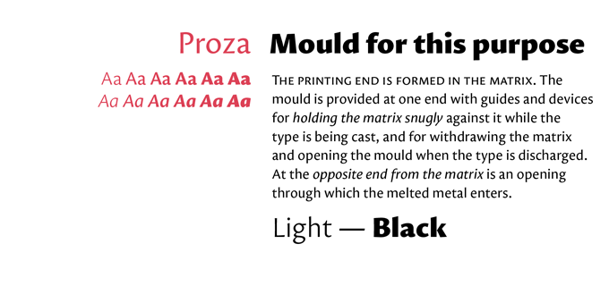
Young Dutch type designer Jasper de Waard has accomplished something rather unique: since his early teens he has posted his fonts-under-construction to international type design forums, seeking guidance and critique. Aged just 18, he recently set up his foundry Bureau Roffa (“Roffa” is slang for Rotterdam, where he lives) and Proza is the first type family under the new label. It’s an ambitious sans serif family with a strong calligraphic contrast. With six weights plus italics, Proza offers all the features needed for demanding editorial design, and with that, an elegant alternative in the humanist sans category.
|
|
|
|
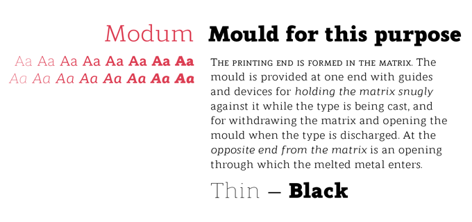
One of the characteristics of The Northern Block is high production: since we interviewed them in February, they’ve produced two more large font families. Modum is the more ambitious of the two. It’s a contemporary text and display family with sturdy serifs, a generous range of weights and open, rather wide italics. Its simplicity and confident proportions give it clarity in text sizes; its distinctive aesthetic makes the weights on both extremes of the spectrum — Thin, Light, Heavy, Black — work well in headlines. With over 800 glyphs per font, alternative a, e, g and y, seven numeral styles, true small caps and OpenType features, Modum is well-equipped indeed.
|
|
|
News Round-Up
In this section we pick out interesting news snippets from MyFonts’ own kitchen and from the greater world of fonts, lettering and typography.
|
|
Installing Fonts from MyFonts on iOS Devices
MyFonts has good news for Apple fanatics. If you love working on your mobile devices equipped with iOS, but hate being limited to the fonts that came with it, help is coming your way. As of now, users can install any font — a new purchase or previously downloaded package — from MyFonts onto your iOS device and use it in apps with a font menu, such as Pages and Keynote.
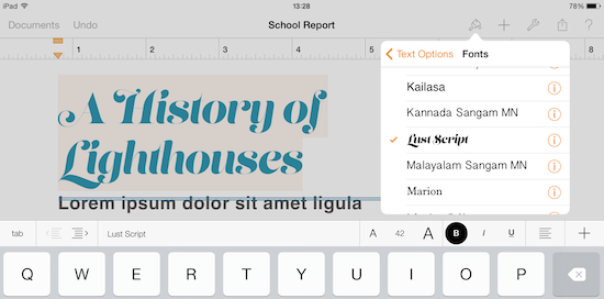
Try it out! Grab your iPad or iPhone and head over to your MyFonts order history and choose from any of your past font purchases. Hit the blue “Install on iPad” or “Install on iPhone” button.
|
|
Kerning, a great little conference
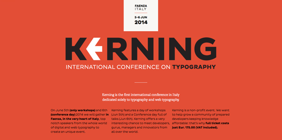
Italy’s Faenza, near Bologna, is not exactly a global center of typography. It’s more famous for its pottery and tiles — called Faience in many languages, after the town’s French name. But a small group of young type and web enthusiasts has now put Faenza on the typographic world map with the Kerning conference, in its second edition this year. The setting is a wonderful Art Deco cinema, sharing a courtyard with a historic letterpress printing shop. This year’s list of speakers is impressive, and includes Jessica Hische, Ellen Lupton, Erik van Blokland, Frank Chimero, Elliot J. Stocks, and MyFonts’ own Jan Middendorp. Star calligrapher Luca Barcellona will be giving a workshop. Kerning 2014 takes place on June 5 (workshops) and June 6 (lectures).
|
| |
|
Contribute to our Pinterest board of chromatic fonts
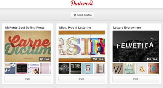
If you’d like to share your multi-chromatic masterpiece, upload your images to Pinterest or Twitter and tag them with #myfontschromatic. We’ll repin our favorites to our “Designed by the MyFonts Community” board.
|
| |
|
MyFonts on Facebook, Tumblr, Twitter
Your opinions matter to us! Join the MyFonts community on Facebook, Tumblr and Twitter — feel free to share your thoughts and read other people’s comments. Plus, get tips, news, interesting links, personal favorites and more from MyFonts’ staff.
|
|
|
|
|
|
|
|
|
MyFonts Inc. 500 Unicorn Park Drive, Woburn, MA 01801, USA
MyFonts and MyFonts.com are registered service marks of MyFonts Inc. Other technologies, font names, and brand names are used for information only and remain trademarks or registered trademarks of their respective companies.
© 2014 MyFonts Inc
|
|
|
|