This month’s selection of successful new fonts is proof that trends in type can be quite persistent. The variegated display suite with a hand-made look? Still going strong. The clean semi-geometric sans-serif? Smoothly yours. Subtly nostalgic, confident brush scripts? The show goes on. And finally: the contemporary oldstyle. You’ll be surprised at how many excellent, original text fonts have landed on our virtual shelves lately. We’ve expanded our Text Font section to include a few more than usual. Enjoy! |
|
|
This Month’s Rising Stars
|
|
|
|
|
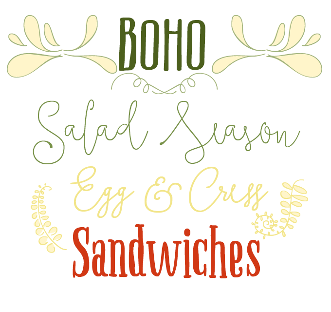
Chilean designer Guisela Mendoza made a splash a few years ago with the playful Ride my Bike, to which she later added a Serif version. Boho is her biggest success since: early this month it was at the top spot of our Hot New Fonts list for several days. According to her foundry Latinotype, Boho is the expression of “a wild and free spirit who knows no bounds.” And boundless it is — its 26 fonts allow for near-endless combinations. The font family walks the well-trodden path of script-and-display suites with a handwritten feel; one thing that makes it special is the Script subfamily, which leaps and swings, and consists of no less than sixteen different styles. It is based on writing with a “cola pen,” a versatile home-made tool that adventurous calligraphy buffs cut from a soda can. Besides the Scripts, Boho consists of three more subfamilies: Line, Sans and Serif, each in two weights with matching italics. Dingbats and ornaments are also included.
For a comparable package, but with a distinctly different look and feel, check out Look from the insigne foundry.
|
|
|
|
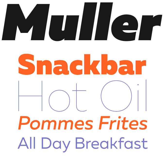
Bulgaria’s Radomir Tinkov has published a handsome collection of clean, contemporary sans-serif faces under his own name. His recent Muller is his first major family for Fontfabric, after having participated in that foundry’s big Nexa Rust project, which made our Fonts of 2014 list. Muller is functional and unadorned, but personality hasn’t been sacrificed. Its letters have agreeably wide silhouettes for better readability in small sizes, and extra attention was given to the detailing for an interesting look in display sizes. The family consists of ten weights plus italics, covering the complete spectrum of weights from the feather-light Hairline to the dark Heavy. Those extreme styles make for striking headlines, while the medium weights also work well for longer text — so Muller is a good choice for advertising and branding, editorial print design as well as web-based projects.
|
|
|
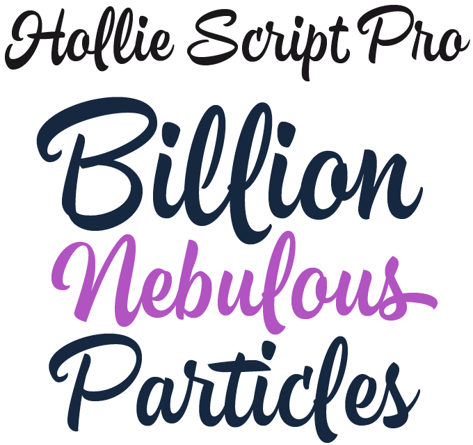
Located in Cali, Columbia, Felipe Calderón is a lettering artist who has a way with a brush. There’s a nice video showing him drawing glyphs, seemingly off-the-cuff, for his recent Hollie Script. The video also reveals some of the historical material this typeface is referencing — the virtuoso hand-lettering that American studios made for ads, brochures and shop windows in the 1940s through the 1960s. Other type designers have taken their cues from the same era — Ale Paul’s Hipster Script Pro is a fine example. But Calderón clearly has a personal approach and his confident take on the genre adds to the packaging designer’s palette. With 2100 glyphs the font offers a huge arsenal of alternates, ligatures and letter groups to create a convincing imitation of hand-made brush lettering. |
|
|
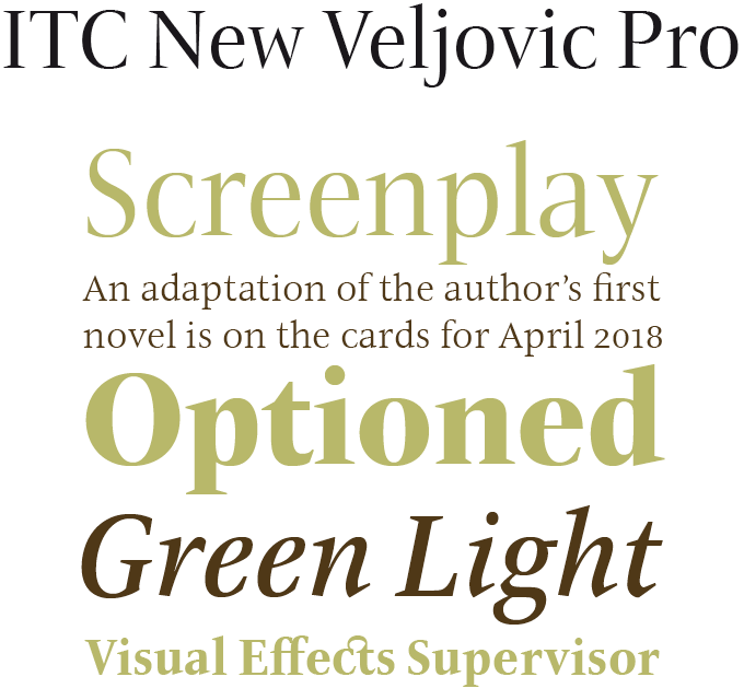
In the Text Font section of last month’s newsletter we presented the ITC New Veljovic™ Pro type family, a revised version of Jovica Veljović’s first typeface. It’s been so successful that we revisit it this month as a bona fide Rising Star. The 1984 original, ITC Veljovic®, was one of the most innovative text and display faces of its time. Thirty years later, Veljović came to believe it was time to completely revise the family. By carefully adjusting the proportions of the characters, he improved the typeface’s presence and usability. The design is as striking as ever, but its appearance is more balanced, increasing its evenness and readability. The expansion has made New Veljovic Pro more versatile than ever before. There’s more on ITC New Veljovic over at the Fonts.com blog. |
|
|
Text Fonts of the month
This is a somewhat special edition of our Text Fonts series. The number of well-made, original text families has been huge this past month, so we’re featuring five of them. All designed for readability and equipped with small caps and multiple figure styles; all supporting a wide range of languages; all discounted for a limit period.
|
|
|
|
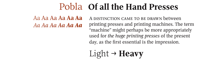
Josep Patau of Tipo Pèpel designed Pobla for optimum readability in small body sizes, resistant to poor printing conditions such as in newsprint. Striking details lend a modern look to a classic skeleton; the italics reference classic cursive calligraphy. With six weights plus italics, small caps and multiple numeral sets for all, Pobla is well-equipped for any editorial design. Special offer until April 20, 2015.
|
|
|
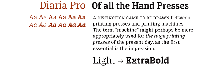
Like Pobla, Diaria Pro by Andriy Konstantynov was designed as a text face for the newspapers. Its low contrast, large x-height and unadorned shapes are optimized for reading in narrow columns. Diaria Pro comes in six weights plus italics, with small caps, six styles of numerals, upper-case punctuation, and other features. It also has an excellent Cyrillic character set. Special offer until April 20, 2015. |
|
|
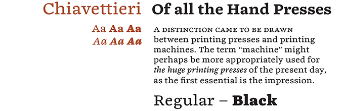
Chiavettieri by Nikola Kostić is a robust text face with a lot of character; it strikes a nice balance between a classic pedigree and contemporary detailing. With three weights plus italics it is a relatively small family. Yet with its distinct italics, small capitals, and multiple figure sets Chiavettieri is well-equipped for editorial print projects as well as for web text. Special offer until May 9, 2015. |
|
|
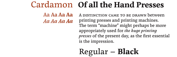
Cardamon is the first published typeface from German designer Brigitte Schuster, who studied on the TypeMedia program at the KABK in The Hague. With Cardamon, Schuster wanted to make “an unobtrusive serif typeface” yet with “a determined and straightforward demeanor.” Cardamon combines superb usability with elegance and personality — and the italic has a dynamism all its own. Special offer until April 20, 2015. |
|
|
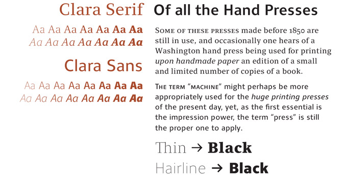
With Clara, the Signature Type Foundry presents a complete suite of sans and serif text fonts. Clara Sans and Clara Serif share many characteristics — a distinct brightness, and very similar underlying structures. Yet designer Rostislav Vaněk has made sure that the two sub-families are distinct enough to complement each other where editorial articulation is needed. With eight weights plus italics, small caps and four styles of numerals, the Clara types are ready for demanding typographic projects. Special offer until April 25, 2015. |
|
|
MyFonts on Facebook, Tumblr, Twitter & Pinterest
Your opinions matter to us! Join the MyFonts community on Facebook, Tumblr, Twitter and Pinterest — feel free to share your thoughts and read other people’s comments. Plus, get tips, news, interesting links, personal favorites and more from MyFonts’ staff.
|
|
|
|
|
|
Subscription info
It is never our intention to send unwanted e-mail.
Want to get future MyFonts newsletters sent to your inbox? Subscribe at:
MyFonts News Mailing List
|
|
|
Comments?
We’d love to hear from you! Please send any questions or comments about this newsletter to [email protected]
|
|
|
|
|
|
MyFonts Inc. 600 Unicorn Park Drive, Woburn, MA 01801, USA
MyFonts and MyFonts.com are registered service marks of MyFonts Inc. ITC Veljovic is a trademark of Monotype ITC Inc. registered in the U.S. Patent and Trademark Office and which may be registered in certain other jurisdictions. ITC New Veljovic is a trademark of Monotype ITC Inc. and may be registered in certain jurisdictions. Other technologies, font names, and brand names are used for information only and remain trademarks or registered trademarks of their respective holders.
© 2015 MyFonts Inc
|
|
|
|