It’s summer in the northern hemisphere — and one of the most intense in living memory. We can only advise you to keep cool and carry on, in spite of the record temperatures. Here at MyFonts, we try to remain focused on the business of type, hoping to give folks around the globe the tools to make hot design more efficiently, with less wasted energy. Take a look at this month’s news section about our new FontScout app. And if you need fresh ideas for a new typographic project, our selection of successful new fonts may be just what you need. |
|
|
This Month’s Rising Stars
|
|
|
|
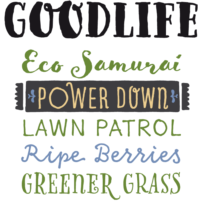
Goodlife, the new display suite from HVD fonts, is very much a child of its time. It is a miscellaneous set consisting of six nonchalant, hand-drawn fonts plus a set of Extras containing catchwords, arrows, ornaments and more. The fonts are very diverse — wide and narrow caps, mixed case, and a pair of whimsical connected scripts — but mix well in multi-font combinations. The suite’s biggest asset is the care with which the OpenType features were programmed. Automatically exchanging alternates, ligatures, end forms, swash letters and more allow attentive users to create witty graphics with a truly hand-made feel. Goodlife is on promotion until July 31st.
|
|
|
|
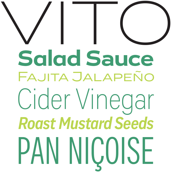
Geometric sans with Art Deco overtones — it’s the typographic style of the moment when it comes to selecting text and display fonts for trendy editorial design and branding. One of the freshest and most versatile contributions to the popular genre is Vito from Vienna’s Typejockeys. In our previous newsletter Vito was a text font of the month — and it has gone on to become the most successful new family of its kind. Designer Thomas Gabriel has invested his sans with subtle references to various periods of modernist typography. Produced in five widths, from Compressed to Wide, Vito is a tremendously flexible family for magazines, packaging or movie titles. On promotion until July 14th, 2015.
|
|
|
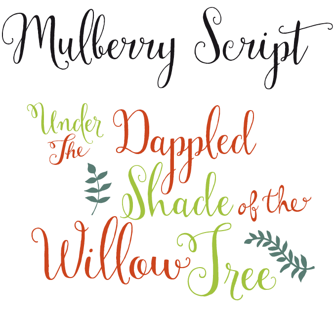
In the three years since she joined MyFonts, Cindy Kinash of Cultivated Mind has produced an impressive range of trend-conscious script and display families. Mulberry Script, her latest, is cheerful, restless, and charming. It is also very affordable, even without a discount. A convincing calligraphic script that dances above and below the baseline, Mulberry is equipped with lovely alternates, ligatures, extras and ornaments. Each of its two weights, Regular and Bold, is available in two variations. The standard Mulberry Script comes with a basic set of alternates; Mulberry Script Pro comes with four sets of alternates including ligatures. |
|
|
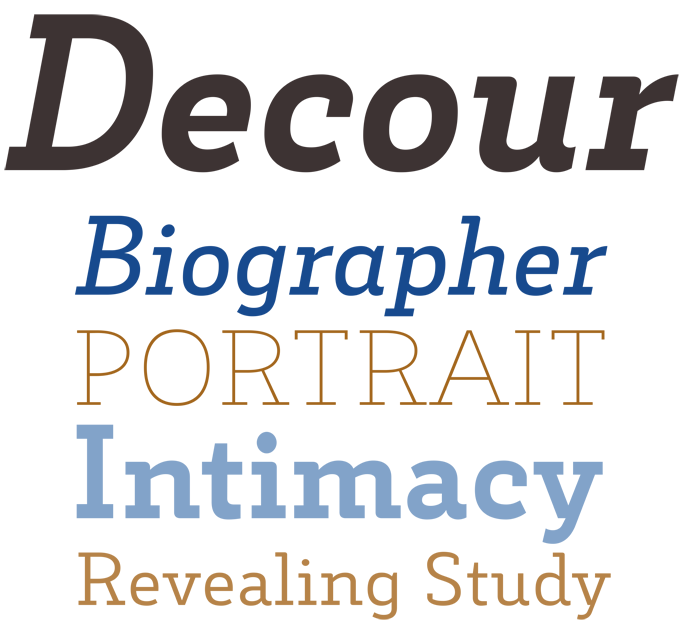
There aren’t many stylistic variations in the slab serif genre. Most fonts in this category of sturdy text faces go for one of two prevailing approaches: they either have an engineered, geometric feel, or they follow the more bookish silhouette of humanist text faces. Decour finds a different kind of balance. Designer Jorge Cisterna has borrowed elements from the humanist model, which he combined with somewhat squarish proportions and some references to Art Deco design. The latter shows through in the long ascenders and high uppercase set — lending Decour eloquence and a lot of vertical breathing space. |
|
|
Text Fonts of the month
Typesetting for books, magazines or annual reports requires font families with special qualities: excellent readability, a generous range of weights with italics and small caps, multiple figure sets (lining, oldstyle, table) and ample language coverage. Here is a selection of recent, high-quality text typefaces.
|
|
|
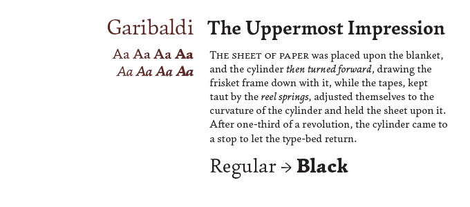
Brazil’s Harbor Type made their first appearance in late 2014 with Graviola, a sans-serif with unique detailing and a strong personality. The same can be said of Garibaldi, their latest offering. Designer Henrique Beier proposes his take on the humanist text face, opting for an approach that is evidently calligraphic; the result, however, is anything but nostalgic. Some of Garibaldi’s spirit echoes expressive Czech type design, from Preissig and Menhart to Veronika Burian’s Maiola. With four weights and matching italics, small caps, and beautifully drawn numerals (including both oldstyle and special small caps figures) Garibaldi is a solid choice for demanding editorial design. Garibaldi has a promotional discount until July 24th. |
|
|
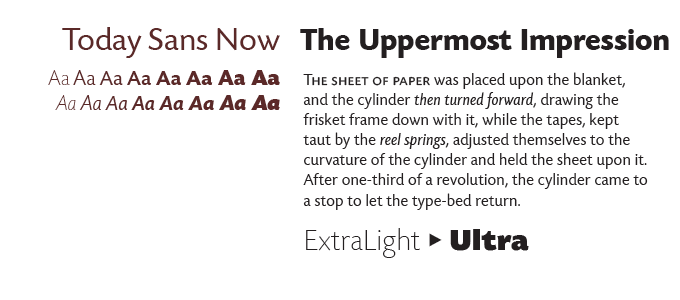
First issued in 1988 by Scangraphic, Volker Küster’s original Today Sans has remained a kind of hidden gem of early digital type design. A sharply cut sans-serif with strong references to traditional book type, Today is both historically rooted and utterly modern. Germany’s Elsner+Flake now presents an impressive update to this contemporary classic. Today Sans Now is a subtle but effective reworking of the original design; it includes small caps for the text weights (from ExtraLight to Medium) and old style figures, as well as a Cyrillic character set. A welcome new version of a distinctive sans-serif with a unique visual rhythm. |
|
|
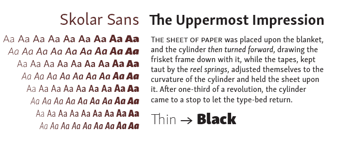
David Březina’s Skolar is one of those contemporary text faces that are a joy to use — expressive in large sizes, modest and practical as a workhorse text face. What it lacked was a sans-serif companion, a versatile partner to complete the editorial designer’s palette. Here it is. Produced in collaboration with Sláva Jevčinová, the Skolar Sans family was designed with responsive web design in mind. Not only does it come in nine weights plus italics, it also offers four subtly graded widths — 72 fonts in all. Very useful for smart web typography, but also a powerful tool for creating compact headlines in printed magazines. Take advantage of the promotional discounts on the Skolar Sans bundles until July 30th. |
|
|
News Round-Up
In this section we pick out interesting news snippets from MyFonts’ own kitchen and from the greater world of fonts, lettering and typography.
|
|
FontScout: A Brand New Way to Discover Fonts
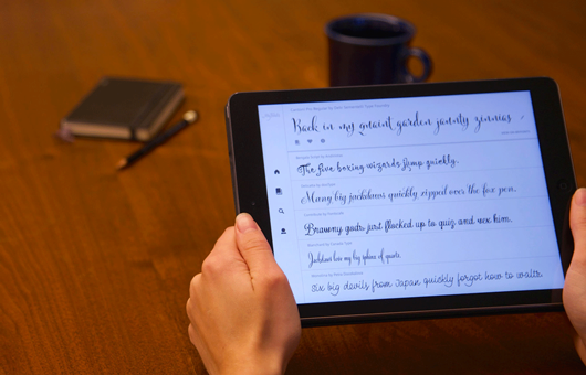
FontScout is the brand new iPad app from MyFonts that gives you a new and different way to explore the world’s largest collection of fonts. Browse the MyFonts collection to narrow down your search to the perfect typeface using our new “More Fonts Like This” technology. Hit the heart button to Fave fonts as you go and add them to albums — everything syncs automatically to your MyFonts account, making it easy to go back to view your top picks later. How much, you ask? It’s free!
|
|
MyFonts on Facebook, Tumblr, Twitter & Pinterest
Your opinions matter to us! Join the MyFonts community on Facebook, Tumblr, Twitter and Pinterest — feel free to share your thoughts and read other people’s comments. Plus, get tips, news, interesting links, personal favorites and more from MyFonts’ staff.
|
|
|
|
|
|
Subscription info
It is never our intention to send unwanted e-mail.
Want to get future MyFonts newsletters sent to your inbox? Subscribe at:
MyFonts News Mailing List
|
|
|
Comments?
We’d love to hear from you! Please send any questions or comments about this newsletter to [email protected]
|
|
|
|
|
|
MyFonts Inc. 600 Unicorn Park Drive, Woburn, MA 01801, USA
MyFonts and MyFonts.com are registered service marks of MyFonts Inc. Other technologies, font names, and brand names are used for information only and remain trademarks or registered trademarks of their respective holders.
© 2015 MyFonts Inc
|
|
|
|