|
This month’s Rising Stars newsletter radiates summer fun. It features a hand-crafted sans serif inspired by its designer’s summer back home in the Pacific Northwest; a typewriter face reminiscent of the typed letters of old you would receive from home while on vacation; an exuberant ’70s style display face with curly swashes that seems to come straight from a California T-shirt; and a slab serif with a special unicase style that mixes uppercase and lowercase forms like a summer cocktail. So put on those flip flops, pull up a beach chair, and put on your sun glasses for this shiny selection of typographic treats.
|
|
|
This Month’s Rising Stars
|
|
|
|
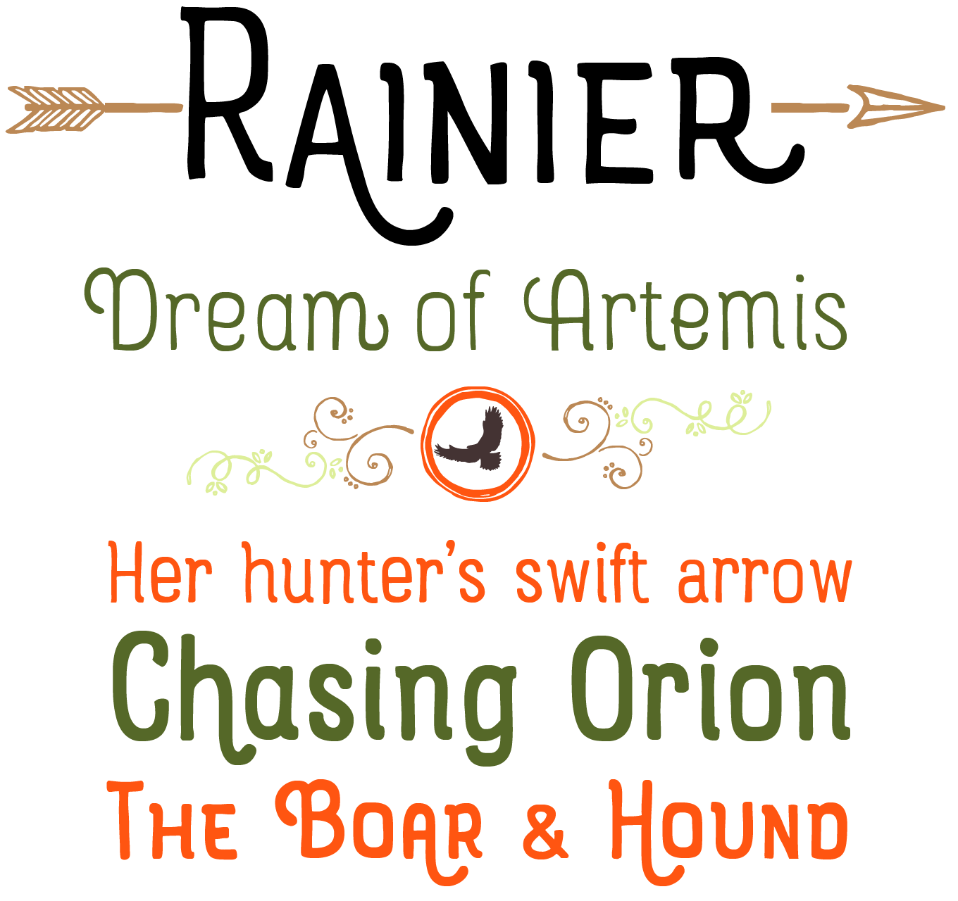
Kimmy Kirkwood has two goals when creating quirky hand-drawn typefaces that offer a wealth of customizable options — she wants the font families to have an intimate, personal feel; and the end product from any designer should look as if it was done by hand. Kimmy drew the inspiration for Rainier from her summer back home in the Pacific Northwest. The narrow handcrafted family comes in two flavors. North has a more traditional sans serif structure, while the rounder West features some script-like forms. Three subtly different versions for each character are alternated automatically for a true hand-lettered look. The family comes with tons of goodies: small caps, stylistic alternates, titling and swash variants, nested capitals, and even supports Greek and Cyrillic. A suite of over 300 rustic ornaments completes the family.
|
|
|
|
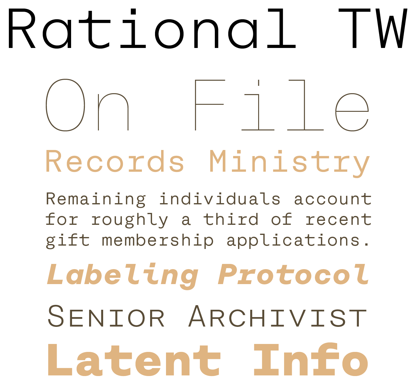
René Bieder’s contemporary neogrotesque Rational was first featured in the Text Fonts section of our April 2016 newsletter, and then graduated to the actual Rising Stars the following month. Now the Berlin-based designer expands the family with the fixed-width variant Rational TW (short for Typewriter). It builds on the same principles as its proportional sibling, combining characteristics from Swiss grotesques and American gothics for a contemporary look, with some altered letter forms to accommodate the monospaced character of the fonts. The family comes in two versions. Rational TW Text features a double-storey ‘a’ and ‘g’ to help differentiate similar letters in small sizes; Rational TW Display is consistently geometric by implementing the single-storey, round forms. Unlike most other monospaced fonts, Rational TW has many OpenType features like small caps, alternate glyphs, case-sensitive shapes, and more.
Rational TW’s introductory discount runs until July 30, 2016.
|
|
|
|
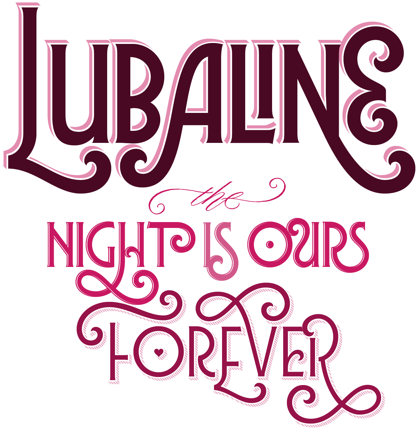
Rejecting the functionalist philosophy of European design in favor of an eclectic and exuberant style, Herb Lubalin broke rules and smashed taboos, proving there’s more to letters than simply being read. Lián Type’s Lubaline is Maximiliano Sproviero’s tribute to the American lettering master. Incorporating influences from Art Deco letter forms in Lubalin’s logos and other lettering creations, like his posters for Beards and The Sound of Music, the Argentinian designer created a family of tall capitals and small caps with tiny serifs in the spirit of ’70s display faces. It comes in many variations, with special effects like highlights, shadow lines and shading. An impressive amount of curly swash variants and a number of judiciously chosen ligatures allow the user to compose extravagant typographic compositions that dazzle and delight. An extra font offers catchwords and ornaments to add the finishing touches.
|
|
|
|
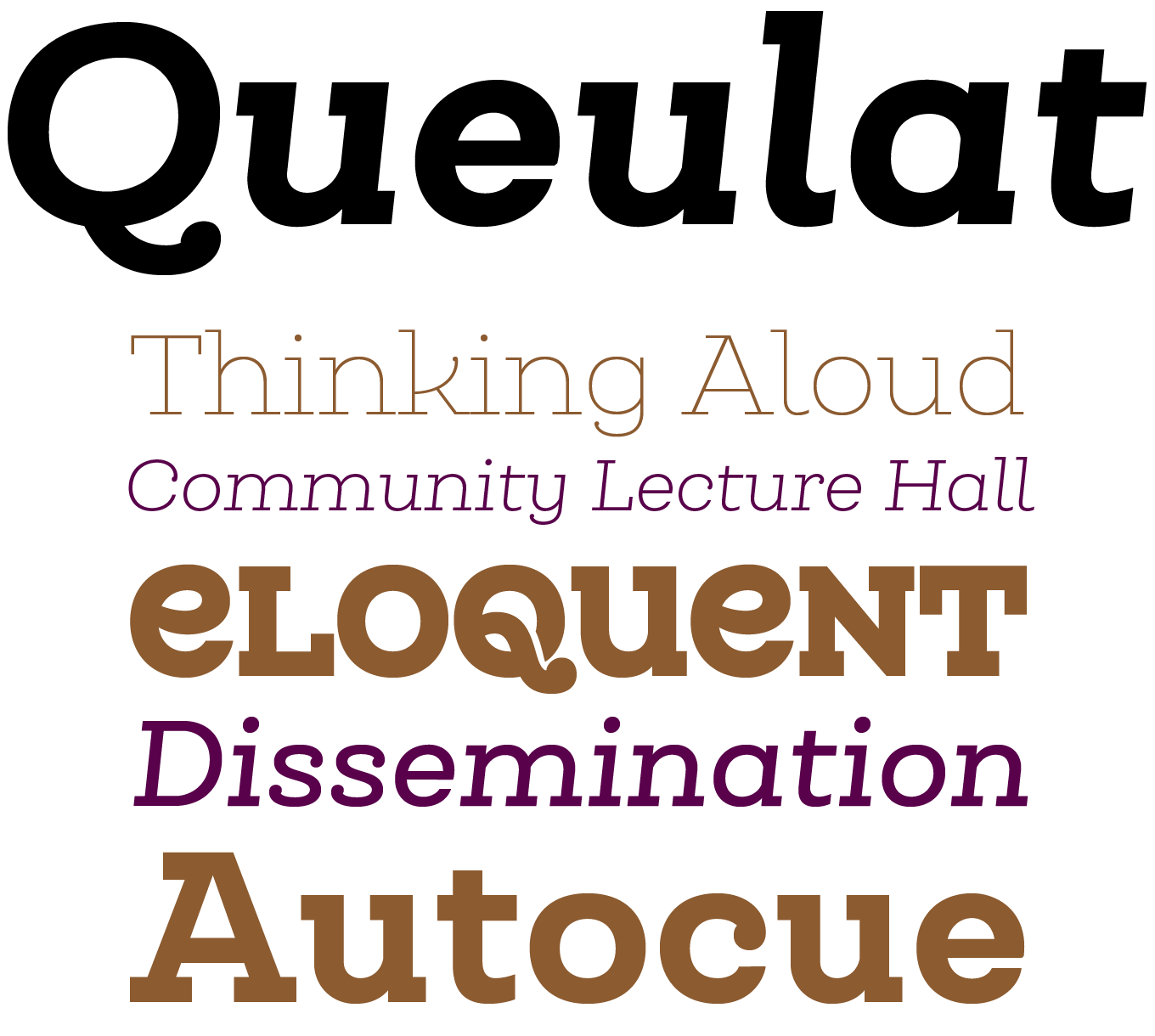
Chilean graphic designer Jorge Cisterna has been contributing type designer for Latinotype, one of the most successful foundries on MyFonts in recent years, since 2008. His latest family is a hybrid typeface that exudes charm, freshness, and — above all — a strong personality. Queulat is a slab serif with two identities. The regular style is rational, with strong slab serifs that give it a straightforward, balanced appearance suitable for headings and short passages of text. The Alt style introduces characteristic teardrop terminals and round forms for key characters, lending the typeface a unique and attractive look, ideal for branding and identity work. The family comes in six weights with matching italics. An additional bold unicase style combines uppercase and lowercase letter forms to create a surprising typographic texture. Try Queulat Regular for free.
|
|
|
Text Fonts of the month
Typesetting for books, magazines or annual reports requires font families with special qualities: excellent readability, a generous range of weights with italics and small caps, multiple figure sets (lining, oldstyle, table) and ample language coverage. Here is a selection of recent, high-quality text typefaces.
|
|
|
|
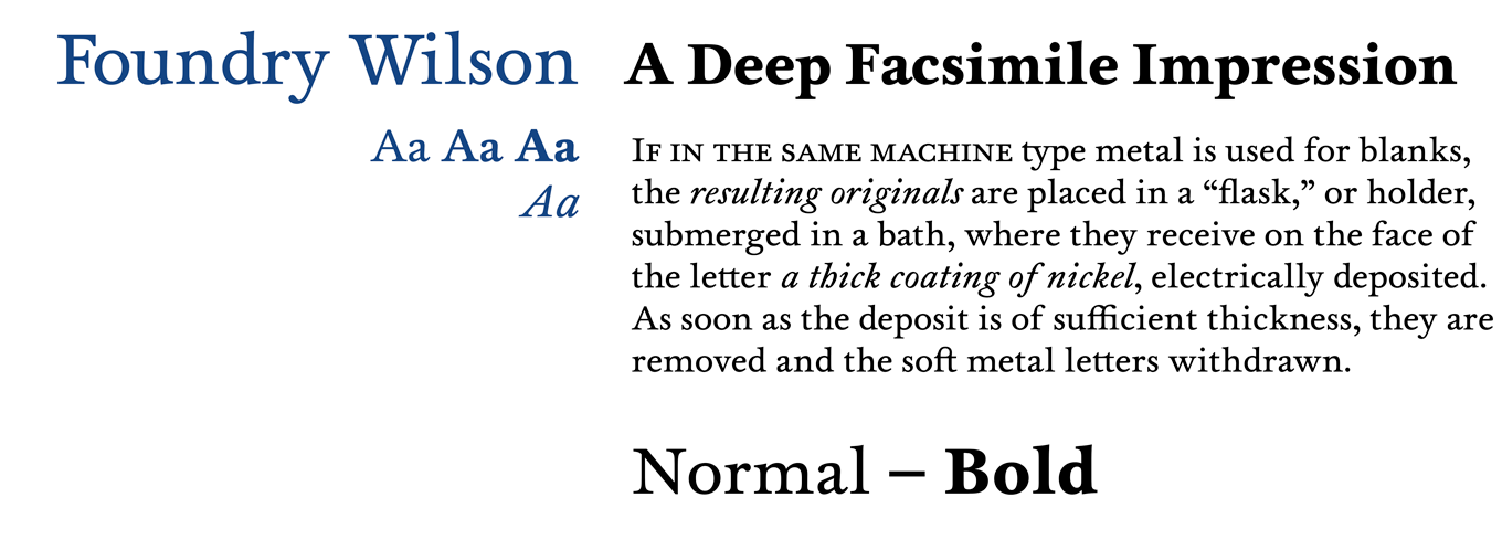
A lovingly drawn revival of a 1760 font from Scottish type founder Alexander Wilson, Foundry Wilson is a fresh alternative to the work of Wilson’s contemporary, John Baskerville. Sharing a taste of the incised letterforms of its time, this transitional serif family from The Foundry is a robust and lively type design that displays a beautiful color and texture on the page. With a generous x-height and confident serifs that anchor the letter forms to the page, the Normal and Italic weights produce a pleasant reading experience. The Medium provides the right amount of emphasis in running text, while the commanding Bold has a well-defined presence, ideal for titles and subheadings. Discover its ornaments and discretionary ligatures for extra sophistication.
Foundry Wilson is on sale until July 18, 2016.
|
|
|
|
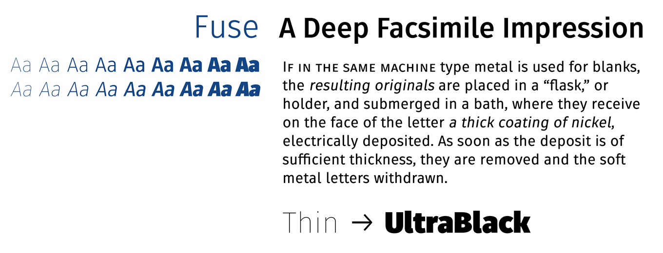
Even though it shares a name with Jon Wozencroft and Neville Brody’s influential publication for experimental type design, Fuse from Without Foundry is a no-nonsense utilitarian text family. The humanist sans designed by Salvador Rodríguez and Diego Aravena Silo combines the parallel rhythm of contemporary classics like Meta and TheSans and some terminal shapes and other design details from DIN with the structure of Frutiger Condensed. The thinnest and boldest weights are well-suited for titling and display, while the middle of the range is very readable in small sizes. All nine weights have a matching italic, and include small caps, several figure styles, extended ligature sets, arrows and numbers in circles. Stylistic sets offer variants for various letters and numbers. The type family is both rational and universal, making it a good choice for a wide range of diverse applications.
|
|
|
|
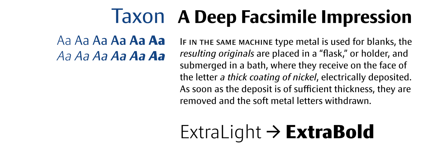
Hoftype’s newest release Taxon is a versatile sans serif family in twelve styles. Taking his cue from classic sans serifs like Optima and Imago, Dieter Hofrichter infused the austere linearity of grotesque faces with the elegance of antique designs. This resulted in a sharp, straight-lined sans serif with an increased contrast between thicks and thins. The family has a contemporary appearance that is both fresh and business-like. OpenType features allow the user to switch between a more conventional style and the popular spurless variant for the ‘b’, ‘g’, and ‘q’. Instead of italics, the six weights come with slanted romans, optically corrected and redrawn for a modern look. The feature-rich OpenType fonts all have small caps, several figure sets, additional ligatures, stylistic alternates, and matching arrows.
|
|
|
News Round-Up
In this section we pick out interesting news snippets from MyFonts’ own kitchen and from the greater world of fonts, lettering and typography.
|
|
New Buying Choices interface
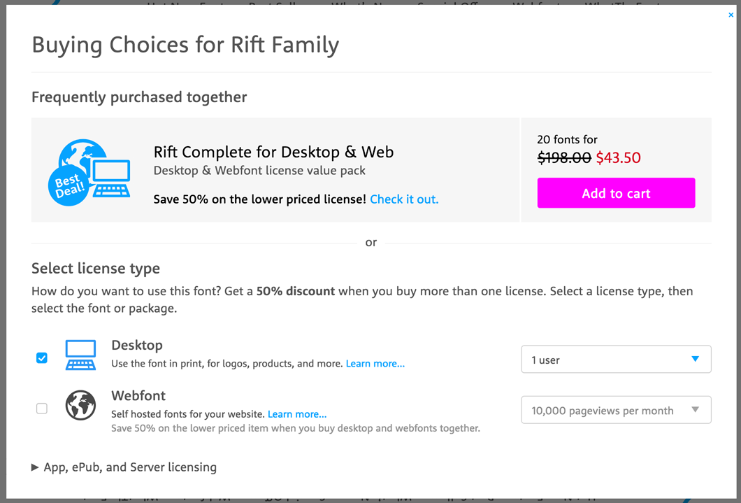
Last month we announced some changes to the MyFonts Cart and Checkout pages that streamline the user experience, making it easier to get in and out and on with your day. Today, we’re excited to let you in on the next step we’re taking towards a fully redesigned MyFonts: a brand new Buying Choices UI.
Detailed user research helped us to make it simpler to buy exactly the right font licenses. Read up on why we made these changes, then head to MyFonts and test it out for yourself. It’s pretty slick!
|
|
MyFonts on Facebook, Tumblr, Twitter & Pinterest
Your opinions matter to us! Join the MyFonts community on Facebook, Tumblr, Twitter and Pinterest — feel free to share your thoughts and read other people’s comments. Plus, get tips, news, interesting links, personal favorites and more from MyFonts’ staff.
|
|
|
|
|
|
|
Comments?
We’d love to hear from you! Please send any questions or comments about this newsletter to [email protected]
|
|
|
|
|
|
MyFonts Inc. 600 Unicorn Park Drive, Woburn, MA 01801, USA
MyFonts and MyFonts.com are registered service marks of MyFonts Inc. Other technologies, font names, and brand names are used for information only and remain trademarks or registered trademarks of their respective holders.
© 2016 MyFonts Inc
|
|
|
|