|
Even though technically the new year begins on January 1st, for most people it actually starts around now, three months earlier in September. People return from their vacation, children go back to school, and business starts picking up again. That is the signal for many people to take a good look at their font library, to identify what is missing or replace the typefaces that have aged poorly. But where do you find nice new fonts? A good place to start your search is our Hot New Fonts list, and every month Rising Stars highlights the most popular ones. So dive in and find the ideal typeface for your next project.
|
|
|
This Month’s Rising Stars
|
|
|
|
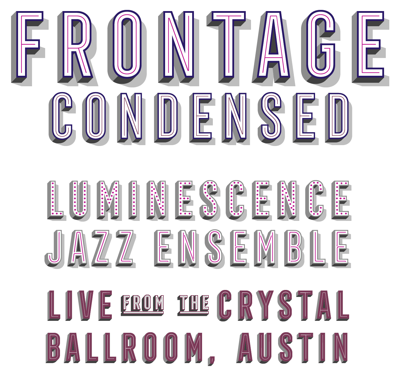
Hipster culture and the popularity of vintage graphics have caused a resurgence of hand-painted lettering on shop signs and bar windows. Juri Zaech beautifully captured the retro charm of classic narrow gothic capitals with a three-dimensional effect in Frontage Condensed. This layered type system allows you to quickly and easily recreate the eye-catching, colorful style of façade signage. Some of the weights can be used out-of-the-box, but the fun really starts when you start layering. Add the Bulb or Neon ornamental layers to suggest theater signs, or enhance the three-dimensional effect by combining the 3D weight with the Bottom and Shadow layers, while the Line layer provides the finishing touch. The Discretionary Ligatures OpenType feature activates 52 catchwords for the ultimate typographic refinement.
Frontage Condensed is on offer through midnight EDT on September 24th, 2016.
|
|
|
|
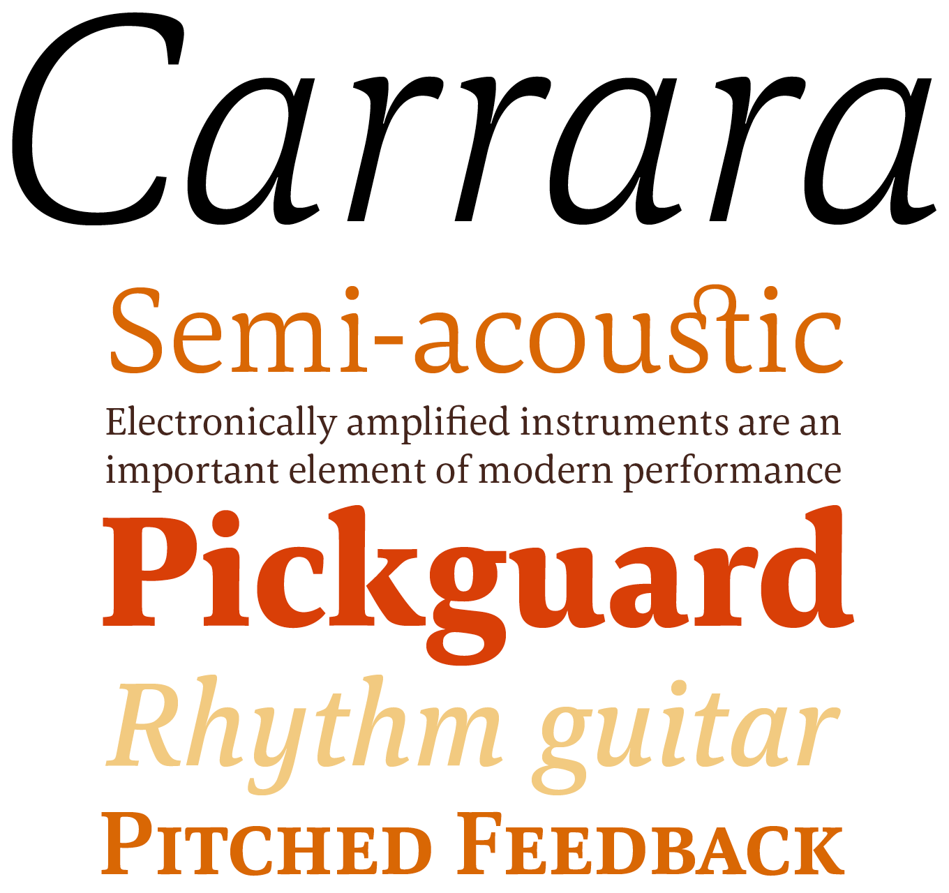
Calligraphic designs hold a special place amongst the serif typefaces. Because their shapes recall the natural gesture of the writing hand, they look friendlier, less mechanical and more personal. Dieter Hofrichter used gentle curves to draw Carrara, making the strokes smoothly transition into the sturdy serifs. This Hoftype release is eminently suited for setting text. Its narrow shapes are economical, allowing for more characters on a line; the rather compact capitals combine well with the generous x-height and the elegant ascenders; and the low contrast creates a pleasant, well-balanced grey value of the text. The family comes in seven weights with matching italics, and offers small caps, all the figure styles, a wealth of ligatures and a set of arrows, and extensive language support.
|
|
|
|
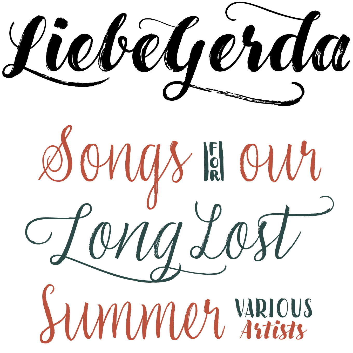
Ulrike Rausch’s latest effort is a brush script of subtle contradictions — it looks effortless but is refined; spontaneous but elegant. Following her successful first brush typeface LiebeDoris and her first connected script LiebeLotte, LiebeGerda is a collection of four co-ordinated fonts that combine the qualities of both genres and takes them to the next level. All the characters of those four styles were drawn individually from scratch, and every detail carefully adjusted by hand. Thanks to OpenType magic, variations of the characters are constantly shuffled to create a believable handwritten effect. The All Caps feature substitutes the swash capitals with plainer versions for improved legibility. Stacked ligatures reinforce the impression that you are looking at a genuine hand-crafted piece of lettering.
|
|
|
|
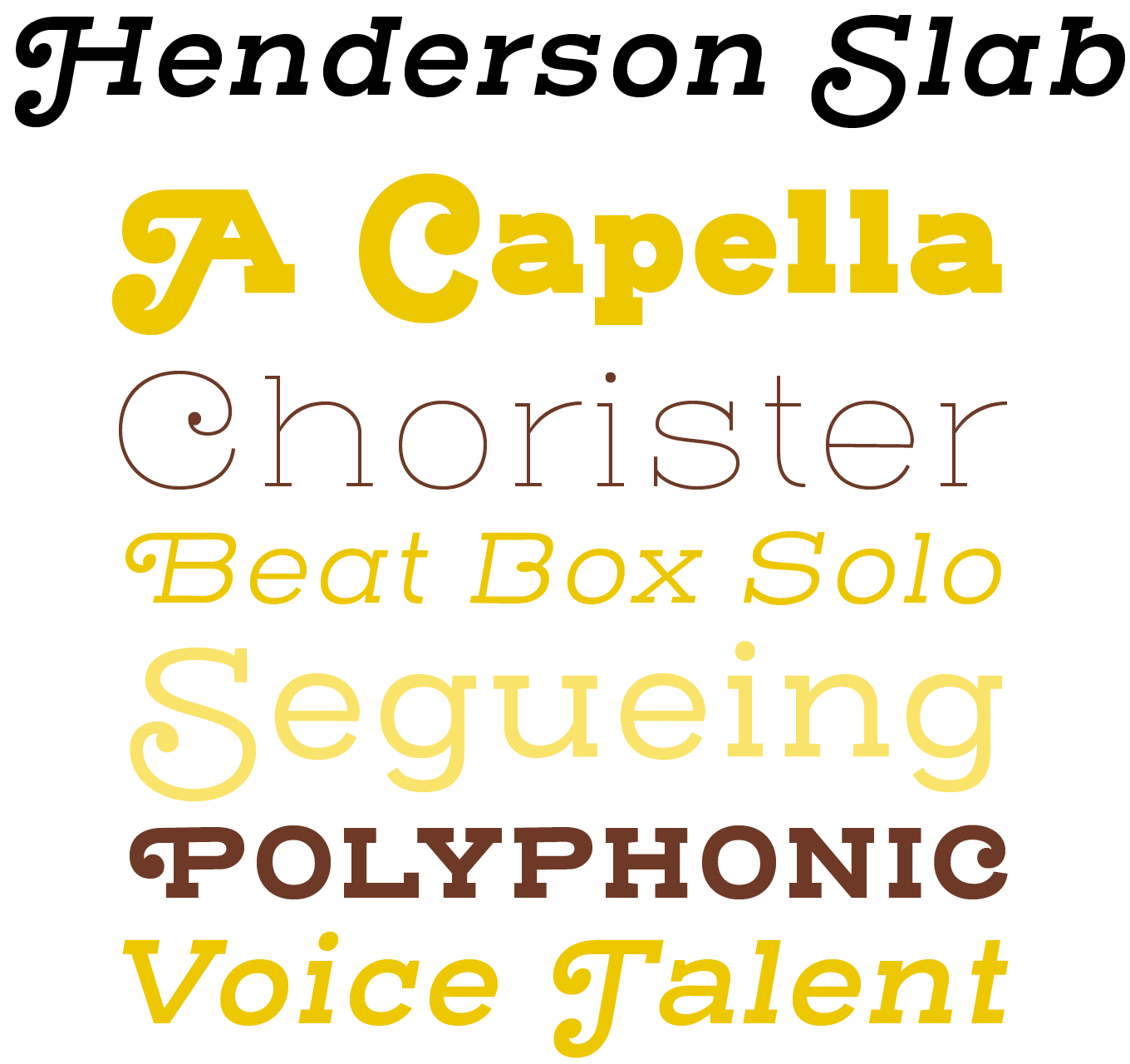
A few bold caps drawn by Albert Du Bois for the 1906 Henderson Sign Painter book set Alejandro Paul off on an investigation of how sign painters approached slab serifs after the industrial revolution. Soon Henderson Slab took on a life of its own — capitals led to a lowercase, one idiosyncratic weight multiplied to become seven, and the upright styles spawned italics. Eventually Henderson became a feature-rich OpenType family that covers nearly the complete history of the slab serif genre in the last century. The basic style refers to its manual, humanist origins; the swash forms sprung out of the photo typesetting era; and the alternates reflect its contemporary side. As usual Ale filled the fonts to the brim with all the typographic goodies one might need.
The introductory discount for Henderson Slab ends at midnight EDT on September 23rd, 2016.
|
|
|
Text Fonts of the month
Typesetting for books, magazines or annual reports requires font families with special qualities: excellent readability, a generous range of weights with italics and small caps, multiple figure sets (lining, oldstyle, table) and ample language coverage. Here is a selection of recent, high-quality text typefaces.
|
|
|
|
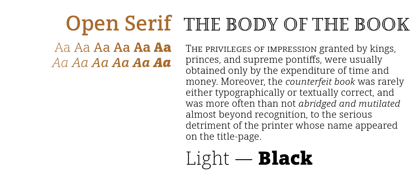
Steve Matteson’s Open Serif is an interesting hybrid, pairing the sturdy shapes and low contrast of a contemporary slab serif with the elegance of the classic Venetian style. This smooth yet energetic companion to the popular Open Sans family has open letter forms and a large x-height, lending it splendid legibility at text sizes and making it comfortable to read in print and on screen. The feature-rich family includes small caps for the Roman styles, swash capitals for the chancery-style italics, and old style figures. Two fonts of decorative capitals round out the collection — the Open and Inline faces are ideal for initial letters, mastheads, titles and decoration. Just like Open Sans, the extensive character set also supports Greek and Cyrillic.
Open Serif’s introductory discount ends at midnight EDT on September 28th, 2016
|
|
|
|
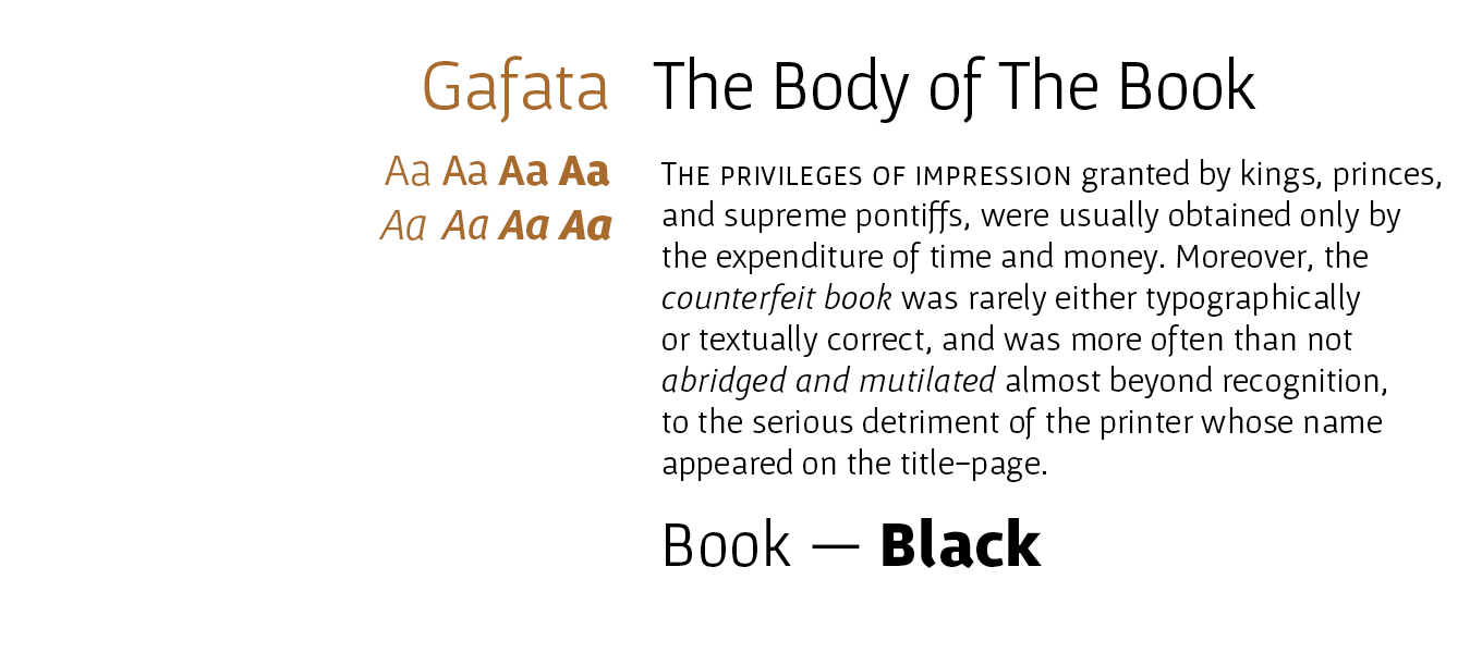
Gafata Pro is the latest release for Uruguaian foundry TipoType. Designed for use in small sizes and medium to long texts, this sans serif family mixes elegance and readability. In his quest to achieve the best possible legibility, Lautaro Hourcade injected the letter forms with whimsical details. In body text they create a lively look, elevating the family from the ordinary while keeping it functional and flexible. This makes the family an excellent candidate for editorial design — in print and on screen — with a casual, fun personality. The family of four text weights with matching italics offers small caps, an extended ligature set, and all the figure styles.
Gafata Pro is on offer through midnight EDT, September 24th, 2016.
|
|
|
|
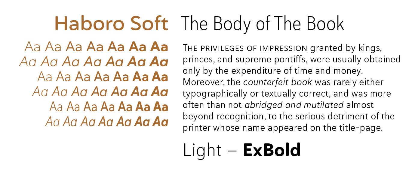
The Insigne type foundry keeps expanding its Haboro super family, and each new member invariably manages to land in our Rising Stars. After exploring the neoclassical genre of the Didones with the original Haboro and creating the sans serif sibling Haboro Sans, Jeremy Dooley offers a friendlier, slightly more casual option with Haboro Soft. It shares its clean, geometric shapes with Haboro Sans, yet the blunted terminals give the letters a more contemporary appearance. Its gentle touch softens the message and adds subtlety to your words. The typeface’s simple, straightforward look lends itself well for packaging, branding, editorial design, web pages, mobile apps, and more. All seven weights plus italics come in regular, condensed, and extended widths.
|
|
|
News Round-Up
In this section we pick out interesting news snippets from MyFonts’ own kitchen and from the greater world of fonts, lettering and typography.
|
|
FontExplorer X 6 Released Today!
Launched today, the latest version of FontExplorer X offers a bunch of new features that make managing even modest fonts collections smoother and less of a hassle. Version 6 helps make creative workflows more efficient by allowing customers to apply more classifications to fonts for better organization and easier searching, while offering the ability to test fonts and edit website text in a web preview mode — making it easier than ever to find the right font for a project.
This awesome tool is an essential component of any type addict’s software set up. Regularly priced at $99, existing users can upgrade for $49. Still not convinced? Try FontExplorer X 6 for 30 days for free!
|
|
Popular Designer of the Month
Each month, we add a new designer to the sidebar of popular designers on our homepage, based on their popularity with customers. This month, our new addition is Ale Paul of Sudtipos.
 For many designers, Ale Paul scarcely needs an introduction. For those who do… well, you’re in for a treat. The Argentinian designer has not only been at the forefront of his own country’s type and lettering design renaissance for a good fifteen years now, but is a leading light of the global independent type design scene and arguably responsible for the surge in interest in sophisticated, smartly programmed calligraphic fonts. He first attained prominence with Affair, an elaborately swashy calligraphic font, and he was a poster-child for OpenType technology back when its potential was still largely untapped.
His foundry Sudtipos — a collective comprising four core members augmented by an extended network of contributing designers — has since gone on to be a powerhouse of Latin-American graphic design and branding, with a retail font library now numbering 180 diverse families, from the typical Sudtipos script fonts Buffet Script and Feel Script to a wide variety of inventive hand drawn styles and contemporary display typefaces such as their latest hits Henderson Sans and Slab — the latter featured in this very newsletter, as many of their others have also been. His latest release is La Taqueria.
|
|
|
MyFonts on Facebook, Tumblr, Twitter & Pinterest
Your opinions matter to us! Join the MyFonts community on Facebook, Tumblr, Twitter and Pinterest — feel free to share your thoughts and read other people’s comments. Plus, get tips, news, interesting links, personal favorites and more from MyFonts’ staff.
|
|
|
|
|
|
|
Comments?
We’d love to hear from you! Please send any questions or comments about this newsletter to [email protected]
|
|
|
|
|
|
MyFonts Inc. 600 Unicorn Park Drive, Woburn, MA 01801, USA
MyFonts and MyFonts.com are registered service marks of MyFonts Inc. FontExplorer is a trademark of Monotype GmbH registered in the U.S. Patent and Trademark Office and may be registered in certain other jurisdictions. Other technologies, font names, and brand names are used for information only and remain trademarks or registered trademarks of their respective holders.
© 2016 MyFonts Inc
|
|
|
|