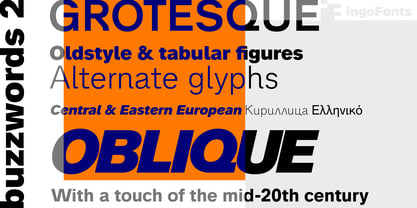
- very traditional forms
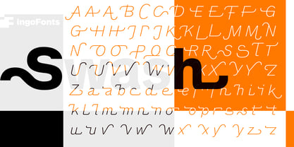
- strongly slanted italic
- consistant proportions
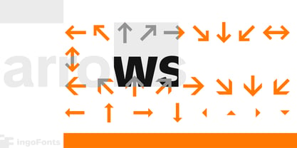
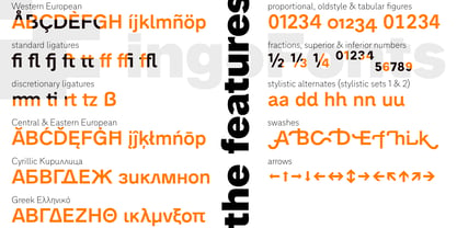
- extraordinary ligatures
- swashes
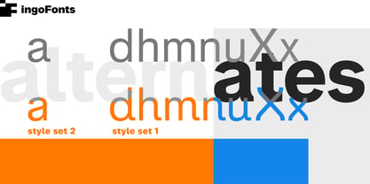
- alternate letters
- alternate figures
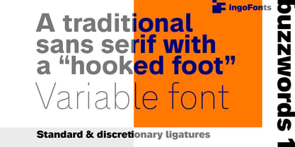
- lower case l with a hooked “foot”
Believe it or not, there are hardly any sans serif fonts in which the lower case letter l also has the hooked form of an l. Instead, we readers have to constantly distinguish whether we are seeing an uppercase I or a lower case l — just take a look at the word “Illinois”...
The ingoFont Analogue was developed for exactly this reason. The intent: To create a pretty much »ordinary«, even classical font with its most striking characteristic being the inclusion of the “crooked l.”
As a model, I used the »mother of all sans serifs«, Akzidenz Grotesk from Berthold, with its beginnings going back to the 19th century.
Analogue is so to say a new interpretation of Akzidenz Grotesk from ingoFonts. All characters — following the model — have been newly designed.
And if you want to emphasize the shape of the hooked foot even more, you can also activate the alternate styles for d, h, m, n (Style Set 1).
Conversely, the alternate a somewhat softens the “hooked” impression (Style Set 2).
The slanted versions — it isn’t truly a real cursive font — are noticeably stronger with 13° than the italics in comparable fonts, and were given a round e with a mind of its own which distinguishes itself considerably compared to the upright characters in the overall appearance of the font.
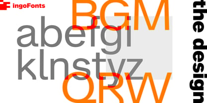
More modern and formal solutions in detail were chosen for some of the characters, for example the M was given lightly slanted sides; the a reflects the curves of the s; the “feet” of a, l and t match; the flared legs of K and R became a “foot”, too. General proportions were carried over almost completely with no changes from Akzidenz Grotesk as well as the slanted trimming on the open forms of a, c, e, s; in comparison, C, G and S were given straight endings.
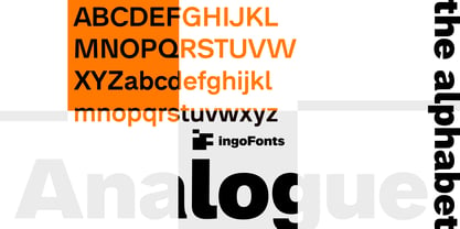
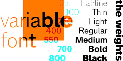
Analogue contains many ligatures, even discretional ligatures, plus proportional, old style as well as tabular figures.
All in all, at first sight Analogue brings back memories of the charm of its well-known predecessor; and yet, many small differences give Analogue an unmistakable certain something...
About Ingo
Founded in 1994, ingoFonts provides the fonts designed and crafted by me, Ingo Zimmermann. I am a type design professional located in Augsburg, Germany, and working in corporate and editorial design. My very first fonts were stencils which I cut out of paperboard and used in graffiti. During my studies I began to publish my fonts under the label ingoFonts, and of all it started with a blackletter: ”Faber Fraktur.“ By now my designs include fonts of all styles, from classical to modern, script fonts, revivals of historic typefaces, Romans, sans serifs, decorative fonts, including fonts like ”Biró Script“, ”Absolut“ or ”Maier's Nr.8“, which seem to be growing quite popular since they've been published.
Read more
Read less

