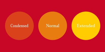
Senlot Serif Norm Thin
Senlot Serif Norm Thin Italic
Senlot Serif Norm Light
Senlot Serif Norm Light Italic
Senlot Serif Norm Book
Senlot Serif Norm Book Italic
Senlot Serif Norm Regular
Senlot Serif Norm Regular Italic
Senlot Serif Norm Medium
Senlot Serif Norm Medium Italic
Senlot Serif Norm Demi
Senlot Serif Norm Demi Italic
Senlot Serif Norm Bold
Senlot Serif Norm Bold Italic
Senlot Serif Norm Ex Bold
Senlot Serif Norm Ex Bold Italic
Senlot Serif Norm Black
Senlot Serif Norm Black Italic
Senlot Serif Condensed Thin
Senlot Serif Condensed Thin Italic
Senlot Serif Condensed Light
Senlot Serif Condensed Light Italic
Senlot Serif Condensed Book
Senlot Serif Condensed Book Italic
Senlot Serif Condensed Regular
Senlot Serif Condensed Regular Italic
Senlot Serif Condensed Medium
Senlot Serif Condensed Medium Italic
Senlot Serif Condensed Demi
Senlot Serif Condensed Demi Italic
Senlot Serif Condensed Bold
Senlot Serif Condensed Bold Italic
Senlot Serif Condensed Ex Bold
Senlot Serif Condensed Ex Bold Italic
Senlot Serif Condensed Black
Senlot Serif Condensed Black Italic
Senlot Serif Extra Thin
Senlot Serif Extra Thin Italic
Senlot Serif Extra Light
Senlot Serif Extra Light Italic
Senlot Serif Extra Book
Senlot Serif Extra Book Italic
Senlot Serif Extra Regular
Senlot Serif Extra Regular Italic
Senlot Serif Extra Medium
Senlot Serif Extra Medium Italic
Senlot Serif Extra Demi
Senlot Serif Extra Demi Italic
Senlot Serif Extra Bold
Senlot Serif Extra Bold Italic
Senlot Serif Extra Ex Bold
Senlot Serif Extra Ex Bold Italic
Senlot Serif Extra Black
Senlot Serif Extra Black Italic









 His label is home to over a hundred font families, many of which have seen great success.