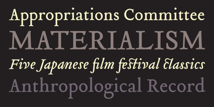
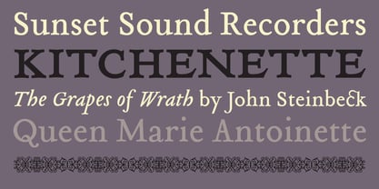
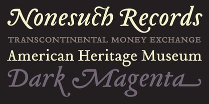
Tribute is a typeface by German type designer Frank Heine. This is Heine’s fourth release with Emigre Fonts.
Remedy, released in 1991, was a major commercial success. Its curlicue, free-style, comic appearance, provided a perfect counter to Emigre’s then primarily modular type designs.
Dalliance, a classic roman and script combo based on handwriting from a photocopy of a 1799 battle map, was released in 2002 and became an instant classic.
With Tribute, Heine followed a path similar to that of Dalliance by using a single printed source (a photo copy of a reprint of a type specimen printed around 1565) as its model. The specimen in question was set in a typeface cut in the 1560’s by the French punchcutter
François Guyot. Not nearly as influential as his elders, such as
Garamond or
Griffo, Guyot’s unusual treatment of certain characters and overall idiosyncratic approach appealed to Heine’s aesthetic sensibilities. Also, to design a font based on a Renaissance Antiqua had been a long held desire for Heine; “I am particularly attracted to its archaic feel, especially with settings in smaller design sizes. It is rougher with less filigree than the types of the following centuries thus exhibiting much cruder craftsmanship of the early printing processes.” By using a third generation copy as a model, which did not reveal much detail, allowed Heine enough room for individual decisions resulting in a decidedly contemporary interpretation while maintaining a link to the past.
The result has been described by a fellow type designer as follows: "It is evident that Frank Heine’s ‘Tribute’ possesses an element of ‘type caricature’ in its drawing, but this fact doesn't relegate it to that one category. Heine has really gone beyond parody, well into an area of personal exploration. He has challenged many traditional assumptions that we ‘connoisseurs’ of hand-cut type have maintained in our attitude toward the historical accuracy sought and loved and expected in ‘revivals.’ The result is a unique combination of caricature, homage, alchemy, and fanciful reinterpretation. Tribute, I think, recalls Guyot’s native French-learned style, primarily as a point of departure for an original - albeit implausible - work of historical fiction, with merits and faults of its own."
About Emigre
Emigre, Inc. is a digital type foundry based in Berkeley, California. Founded in 1984, coinciding with the birth of the Macintosh computer Emigre were among the early adaptors to the new digital technology. From 1984 until 2005 Emigre published the legendary Emigre magazine, a quarterly publication devoted to visual communication. Emigre created some of the very first digital layouts and typeface designs winning them both world-wide acclaim and much criticism. The exposure of these typefaces in Emigre magazine eventually lead to the creation of Emigre Fonts, one of the first independent type foundries utilizing personal computer technology for the design and distribution of fonts. They created the model for hundreds of small foundries who followed in their footsteps.
Read more
Read less
