


Seleccione este tipo de licencia cuando esté desarrollando una aplicación app para iOS, Android o Windows Phone, y vaya a incrustar el archivo en el código de su aplicación móvil. va a incrustar el archivo fuente en el código de su aplicación móvil.
1495 Bastarde Lyon
por GLC
Estilos individuales desde $38.00 USD

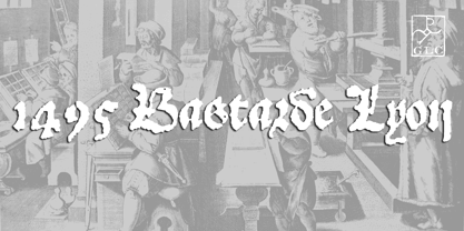
1495 Bastarde Lyon Fuente La familia era
diseñada por
publicado por
GLC. 1495 Bastarde Lyon contiene
1
estilos.
Más información sobre esta familia
Sobre la familia 1495 Bastarde Lyon Fuente
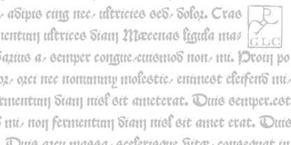
Font designed from this who was used by an unknown printer in Lyon (France) to print the “Conte de Griseldis ” (Griseldis' tale), from Petrarque, inspired by Boccace, in 1495.
The original font has a relatively small number of special characters and ligature, for the time. This font includes “long s”, naturally, as typicaly medieval but numerous letters - as accented ones - were added for this version. A render sheet, enclosed with the file, helps to identify them on keyboard.
It is used variously in web-site titles, posters and fliers design, editing ancient texts or greeting cards as a very decorative and fine font...
This font works at a small size like 9, remaining clear and easy to read on screen, but always better when printed.
1495 Bastarde Lyon

Acerca de GLC
Gilles Le Corre was born in 1950 in Nantes, France. Painter since the end of 70s, he is also an engraver and calligrapher. He has been learning about medieval art and old books for as long as he can remember. More recently he has made the computer a tool for writing like the quill pen and ink. With it, he aims to make it possible to print books that look just like old ones! Beginning in 2007 he has been trying to reproduce, very exactly, a wide range of historic European typefaces, mainly from medieval and early periods of printing - his favorite period - from 1456 with Gutenberg, up to 1913 with a font inspired by a real old typewriter.
Seguir leyendo
Leer menos
- Al seleccionar una opción, se actualiza toda la página.