


Seleccione este tipo de licencia cuando esté desarrollando una aplicación app para iOS, Android o Windows Phone, y vaya a incrustar el archivo en el código de su aplicación móvil. va a incrustar el archivo fuente en el código de su aplicación móvil.
1590 Humane Warszawa
por GLC
Estilos individuales desde $38.00 USD

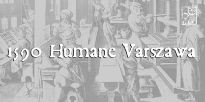
1590 Humane Warszawa Fuente La familia era
diseñada por
publicado por
GLC. 1590 Humane Warszawa contiene
1
estilos.
Más información sobre esta familia
Sobre la familia 1590 Humane Warszawa Fuente
This family was inspired by a font carved circa 1590 for a Polish editor. We don't know who was the punchcutter, nor the printer's name. We have added the special East European diacritics (Czech, Hungarian, Romanian, Croatian, Slovak, Slovenian, Sorbian )as the original font has only the Polish accents.
It is a Garamond type, like our 1592 GLC Garamond or 1589 Humane Bordeaux, rough and a little approximate, but attractive.
We recommend using OTF version with Windows Vista, providing a best compatibility.
1590 Humane Warszawa

Acerca de GLC
Gilles Le Corre was born in 1950 in Nantes, France. Painter since the end of 70s, he is also an engraver and calligrapher. He has been learning about medieval art and old books for as long as he can remember. More recently he has made the computer a tool for writing like the quill pen and ink. With it, he aims to make it possible to print books that look just like old ones! Beginning in 2007 he has been trying to reproduce, very exactly, a wide range of historic European typefaces, mainly from medieval and early periods of printing - his favorite period - from 1456 with Gutenberg, up to 1913 with a font inspired by a real old typewriter.
Seguir leyendo
Leer menos
- Al seleccionar una opción, se actualiza toda la página.