


Seleccione este tipo de licencia cuando esté desarrollando una aplicación app para iOS, Android o Windows Phone, y vaya a incrustar el archivo en el código de su aplicación móvil. va a incrustar el archivo fuente en el código de su aplicación móvil.
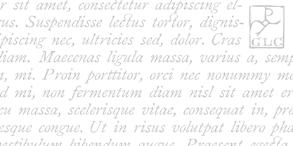
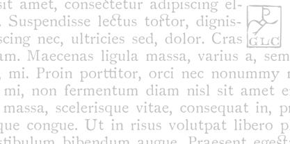
1822 GLC Caslon Pro
por GLC
Estilos individuales desde $42.00 USD
Familia completa de 2 fuentes: $60.00 USD

1822 GLC Caslon Pro Fuente La familia era
diseñada por
publicado por
GLC. 1822 GLC Caslon Pro contiene
2
estilos y opciones de paquetes familiares.
Más información sobre esta familia
- Aa Glifos
-
¡Mejor PrecioPaquetes de familia
- Estilos individuales
- Especificaciones técnicas
- Licencias
Por Estilo:
$30.00 USD
Paquete de 2 estilos:
$60.00 USD
Sobre la familia 1822 GLC Caslon Pro Fuente
This family was inspired by the well-known Caslon typeface created by William Caslon, the English font designer, who was, with John Baskerville, the progenitor of English Transitional typeface classification in the mid-18th century (See also our 1776 Independence).
We were inspired by a Caslon style set used by an unknown Flemish printer from Bruges, in the beginning of 1800s, a little before the revival of Caslon style in the 1840s. Our font covers all Western, Eastern and Central European languages (including Celtic diacritics) and the Turkish alphabet, with a complete small-caps set in each of the two styles. (Please note: The complete character set is available only in TTF and OTF “Pro” version.)
1822 GLC Caslon Pro

Acerca de GLC
Gilles Le Corre was born in 1950 in Nantes, France. Painter since the end of 70s, he is also an engraver and calligrapher. He has been learning about medieval art and old books for as long as he can remember. More recently he has made the computer a tool for writing like the quill pen and ink. With it, he aims to make it possible to print books that look just like old ones! Beginning in 2007 he has been trying to reproduce, very exactly, a wide range of historic European typefaces, mainly from medieval and early periods of printing - his favorite period - from 1456 with Gutenberg, up to 1913 with a font inspired by a real old typewriter.
Seguir leyendo
Leer menos
- Al seleccionar una opción, se actualiza toda la página.