


Seleccione este tipo de licencia cuando esté desarrollando una aplicación app para iOS, Android o Windows Phone, y vaya a incrustar el archivo en el código de su aplicación móvil. va a incrustar el archivo fuente en el código de su aplicación móvil.
Aanaar
por Letterjuice
Estilos individuales desde $66.00 USD
Familia completa de 7 fuentes: $398.00 USD

Aanaar Fuente La familia era
diseñada por
Pilar Cano y
publicado por
Letterjuice. Aanaar contiene
7
estilos y opciones de paquetes familiares.
Más información sobre esta familia
- Aa Glifos
-
¡Mejor PrecioPaquetes de familia
- Estilos individuales
- Especificaciones técnicas
- Licencias
Por Estilo:
$56.85 USD
Paquete de 7 estilos:
$398.00 USD
Aanaar Core Pack
3 fuentesPor Estilo:
$58.66 USD
Paquete de 3 estilos:
$176.00 USD
Aanar Light Bundle
2 fuentesPor Estilo:
$60.00 USD
Paquete de 2 estilos:
$120.00 USD
Aanaar Regular Bundle
2 fuentesPor Estilo:
$60.00 USD
Paquete de 2 estilos:
$120.00 USD
Sobre la familia Aanaar Fuente
This typeface comes from a self initiated project called Sápmi, which aims to contribute to keep a group of minority languages alive through solving issues in the education environment.
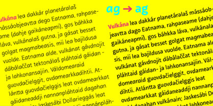
This re-thought edition takes the name of Aanaar and joins our library with a bigger character set and two new weights which complete the typeface providing a big typographic palette as well as adding stylistic two-story a and g for more advanced readers as well as to enable the typeface to be used in other environments.
The typeface was originally designed for children’s text books. Analysing kid’s typeface design, we identified some important problems and solved them within the boundaries we had. The main concern in a typeface which will be used by children is letter recognition, as they have not yet fully develop their reading skills. For example, letters like “a” and “g” share a very similar structure in this particular kind of typefaces, where the only distinctive part is the descender of the “g”. It is known that the lower part of the letter is the less important feature when reading, therefore we decided to make a clear distinction between them by having an “a” with a spur on the top right. This also helped distinguishing “a” and “o”. Children typefaces usually have one story “a”, making “a” usually too close to “o”. Additionally we moved the joint in “a” upwards and narrowed very slightly the “a” to make sure they cannot be mistaken.
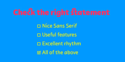
More generally, the x-height is fairly tall and the typeface has a bit of movement which give it a good rhythm helping moving along nicely when reading. Aanaar consists of 5 weights (Light, Regular, Medium, Bold and Black) plus two Italics (Light Italic and Italic).
Diseñadores: Pilar Cano
Editorial: Letterjuice
Fundición: Letterjuice
Propietario del diseño: Letterjuice
MyFonts debut: Jun 20, 2014
Aanaar

Acerca de Letterjuice
We are a small foundry and type design studio based in Barcelona and Buenos Aires run by two designers experienced in many different fields surrounding type design, typography, lettering, visual communication, branding, and teaching.We specialise in letters in a broad sense, from type design to lettering, from Latin to Arabic, passing through other scripts such as Armenian, Georgian, Greek, Cyrillic, Hebrew and Thai. We are surrounded by a network of bright collaborators and consultants in order to ensure the best possible quality. Our work has been recognised internationally in several type competitions such us TDC, ED-Awards, Morisawa, Granshan, Modern Cyrillic and Horouf.Our type library is a manifestation of our personal curiosity and our experimentation ground. We enjoy having room to explore our creativity within the boundaries of functionality, we hope you like what you see!
Seguir leyendo
Leer menos
- Al seleccionar una opción, se actualiza toda la página.