


Seleccione este tipo de licencia cuando esté desarrollando una aplicación app para iOS, Android o Windows Phone, y vaya a incrustar el archivo en el código de su aplicación móvil. va a incrustar el archivo fuente en el código de su aplicación móvil.
Aerle
por Hackberry Font Foundry
Estilos individuales desde $24.95 USD
Familia completa de 5 fuentes: $49.95 USD

Aerle Fuente La familia era
diseñada por
David Bergsland y
publicado por
Hackberry Font Foundry. Aerle contiene
5
estilos y opciones de paquetes familiares.
Más información sobre esta familia
- Aa Glifos
-
¡Mejor PrecioPaquetes de familia
- Estilos individuales
- Especificaciones técnicas
- Licencias
Por Estilo:
$9.99 USD
Paquete de 5 estilos:
$49.95 USD
Sobre la familia Aerle Fuente
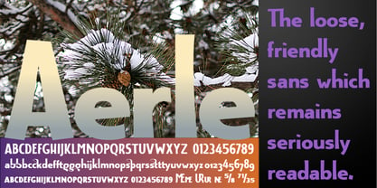
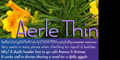
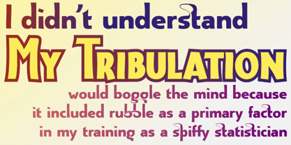
My first font for 2009 was Aerle. It is a new dark sans serif font in my continuing objective of designing book fonts that I can really use. It made a little ripple in the industry, but more than that I found that I loved it with Aramus and Artimas — my latest book font family with the same proportions. In many ways, Aerle is a very different direction for me built on what I have learned on Aramus and other recent developments in my style. The concept came to me while using Bitstream's Mister Earl on a site online—though there is no direct reference. I wanted a more playful heavy sans with a much smaller x-height than I have been using lately, plus taller ascenders. As I was using Aerle, I constantly needed a light and bold version. The new direction I am taking is a result of a decision that my fonts, though I loved the character shapes, produced an even type color that is too dark or a little dense. Aerle was an attempt to get away from that look even though the letterspacing is quite tight. For Aerle Thin I pushed a little further in that direction and increased the letterspacing. The hand-drawn shapes vary a lot, many pushing the boundaries of the normal character. This gives a little looseness and helps the lightness in feel I am looking for. It will be interesting to see where this all goes. Most new type around the world is far too perfect for my taste. While the shapes are exquisite, the feel is not human but digital mechanical. I find myself wanting to draw fonts that feel human — as if a person crafted them. In most ways this is a normal font for me in that it has caps, lowercase, small caps with the appropriate figures for each case. These small caps were very small (x-height as is proper). So Aerle's small caps are a little oversize because they plugged up too bad at x-height size. The bold is halfway between. These size variations seem important and work well in the text. This font has all the OpenType features in the set for 2009. There are several ligatures for your fun and enjoyment: bb gg sh sp st ch ck ff fi fl ffi ffl ffy fj ft tt ty Wh Th and more. Like all of my fonts, there are: caps, lowercase, & small caps; proportional lining figures, proportional oldstyle figures, & small cap figures; plus numerators, denominators, superiors, inferiors, and a complete set of ordinals 1st through infinity. Enjoy!
Diseñadores: David Bergsland
Editorial: Hackberry Font Foundry
Fundición: Hackberry Font Foundry
Propietario del diseño: Hackberry Font Foundry
MyFonts debut: Feb 5, 2009
Aerle

Acerca de Hackberry Font Foundry
- The Hackberry Font Foundry was founded in the 1998 to sell the fonts David Bergsland designed to be used in his digital publishing training books.
- The goal of David’s fonts is to add a hand-drawn edge to them. In this age of increasing technological “slickness” he purposely loosens the structure and adds “air” to the glyphs with breaks.
- All fonts are designed as OpenType Pro fonts with special production features. Almost all of the fonts have oldstyle numbers as well as small cap figures, plus small caps, discretionary ligatures & special dingbats.
- They really shine in book production.
- The production families have contrasting serif and sans serif families both using the same vertical font metrics—for run-in heads and the like.
- At present he mainly writes and designs books.
Seguir leyendo
Leer menos
- Al seleccionar una opción, se actualiza toda la página.