


Seleccione este tipo de licencia cuando esté desarrollando una aplicación app para iOS, Android o Windows Phone, y vaya a incrustar el archivo en el código de su aplicación móvil. va a incrustar el archivo fuente en el código de su aplicación móvil.
Aether Rain™
por Fenotype
Estilos individuales desde $12.00 USD
Familia completa de 7 fuentes: $20.00 USD


Aether Rain Fuente La familia era
diseñada por
Emil Karl Bertell y
publicado por
Fenotype. Aether Rain contiene
7
estilos y opciones de paquetes familiares.
Más información sobre esta familia
- Aa Glifos
-
¡Mejor PrecioPaquetes de familia
- Estilos individuales
- Especificaciones técnicas
- Licencias
Basic typesetting
Letter case
Numerals and scientific typesetting
Typographic variants
Restablecer
Por Estilo:
$2.85 USD
Paquete de 7 estilos:
$20.00 USD
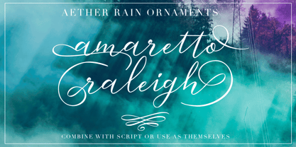
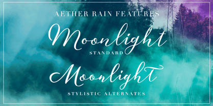
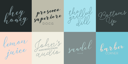
Sobre la familia Aether Rain Fuente
Aether Rain is an elegant modern script family that fits both casual and formal use. Aether Rain includes basic latin alphabets, numerals and punctuation. Aether Rain is equipped with Standard Ligatures that work automatically and it also has Stylistic Alternates (OpenType feature) for each character - and scripts are also PUA encoded so you can access the characters also with Silhouette Studio, Cricut Design Space.
Diseñadores: Emil Karl Bertell
Editorial: Fenotype
Fundición: Fenotype
Propietario del diseño: Fenotype
MyFonts debut: Nov 28, 2017
Aether Rain™
is a trademark of Fenotype Typefaces.
Acerca de Fenotype
Emil Bertell has done it all. Having published his first font files at 16, he was considered to be an international free-font hero while still in his teens. He went on to attend design college, drop out, and become a well-known graphic designer and illustrator. Now one of the most successful type designers from the Nordic countries on MyFonts, the Finland-based designer said in his Creative Characters interview that he’s “had an obsession with visual culture from the beginning.” Before turning his ...
Seguir leyendo