


Seleccione este tipo de licencia cuando esté desarrollando una aplicación app para iOS, Android o Windows Phone, y vaya a incrustar el archivo en el código de su aplicación móvil. va a incrustar el archivo fuente en el código de su aplicación móvil.
Bergsland Round
por Hackberry Font Foundry
Estilos individuales desde $24.95 USD
Familia completa de 4 fuentes: $77.95 USD

Bergsland Round Fuente La familia era
diseñada por
David Bergsland y
publicado por
Hackberry Font Foundry. Bergsland Round contiene
4
estilos y opciones de paquetes familiares.
Más información sobre esta familia
- Aa Glifos
-
¡Mejor PrecioPaquetes de familia
- Estilos individuales
- Especificaciones técnicas
- Licencias
Por Estilo:
$19.48 USD
Paquete de 4 estilos:
$77.95 USD
Sobre la familia Bergsland Round Fuente
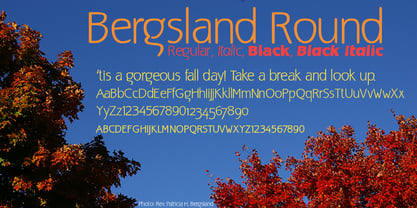
This is a version of the Bergsland Fashion stylized sans serif font family that is very high-waisted and sleek with rounded terminals called Bergsland Round. Round is my favorite out of the group as it is looser and friendlier. This four-font set has a Regular and a Black plus the italics. The stroke is only slightly modulated. The letterforms are higher, with a more open aperture, and sprinkled with breaks to add light and sparkle. This an attempt at a readable sans serif for text. It has many OpenType features and 465 characters per font: Caps, lower case, small caps, old style figures, numerators, denominators, accents characters and so on.
Diseñadores: David Bergsland
Editorial: Hackberry Font Foundry
Fundición: Hackberry Font Foundry
Propietario del diseño: Hackberry Font Foundry
MyFonts debut: Oct 17, 2005
Bergsland Round

Acerca de Hackberry Font Foundry
- The Hackberry Font Foundry was founded in the 1998 to sell the fonts David Bergsland designed to be used in his digital publishing training books.
- The goal of David’s fonts is to add a hand-drawn edge to them. In this age of increasing technological “slickness” he purposely loosens the structure and adds “air” to the glyphs with breaks.
- All fonts are designed as OpenType Pro fonts with special production features. Almost all of the fonts have oldstyle numbers as well as small cap figures, plus small caps, discretionary ligatures & special dingbats.
- They really shine in book production.
- The production families have contrasting serif and sans serif families both using the same vertical font metrics—for run-in heads and the like.
- At present he mainly writes and designs books.
Seguir leyendo
Leer menos
- Al seleccionar una opción, se actualiza toda la página.