


Seleccione este tipo de licencia cuando esté desarrollando una aplicación app para iOS, Android o Windows Phone, y vaya a incrustar el archivo en el código de su aplicación móvil. va a incrustar el archivo fuente en el código de su aplicación móvil.
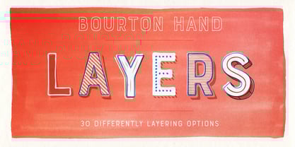
Bourton Hand
por Kimmy Design
Estilos individuales desde $5.00 USD
Familia completa de 35 fuentes: $99.00 USD


Bourton Hand Fuente La familia era
diseñada por
Kimmy Kirkwood y
publicado por
Kimmy Design. Bourton Hand contiene
34
estilos y opciones de paquetes familiares.
Más información sobre esta familia
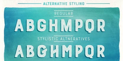
- Aa Glifos
-
¡Mejor PrecioPaquetes de familia
- Estilos individuales
- Especificaciones técnicas
- Licencias
Bourton Hand Basic Pack
28 fuentesPor Estilo:
$2.67 USD
Paquete de 28 estilos:
$75.00 USD
Sobre la familia Bourton Hand Fuente
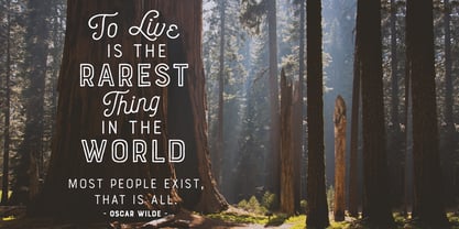
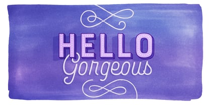
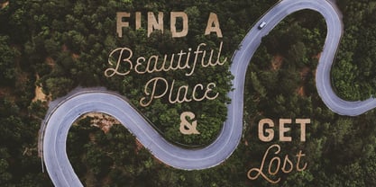
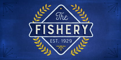
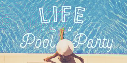
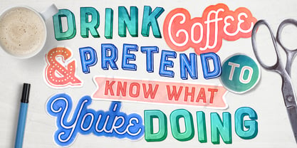
Bourton Hand is a new typeface by Kimmy Design. It’s the hand drawn version of Bourton and a sans-serif cousin to Burford. In addition to a new look, it boasts more layering options, stylistic alternatives, graphic extras and even comes with its own script font!
Okay...so here’s everything you get with Bourton Hand:
• 6 Base Layer Fonts (Base, Inline, Marquee, Stripes A, Stripes B, Stripes C, Sketch A, Sketch B)
• 6 Top Layer Fonts (Base Drop, Dots, Line Light/Medium/Bold, Outline Light/Medium/Bold)
• 6 Extrude Fonts (Extrude, Outline, Shadow, Extrude Outline)
• 5 Drop Shadow Fonts + 5 solo styles (Drop Shadow, Drop Extrude, Drop Line, Drop Stripes A, Drop Stripes B)
• 2 Line Fonts for secondary text (Line Medium, Line Bold)
• Bourton Hand Script Light
• Bourton Hand Script Bold
• Bourton Hand Extras - Ornaments, banners, frames, borders, flags and line break
• Bourton Hand Extras - Flourishes
Happy Creating!
Diseñadores: Kimmy Kirkwood
Editorial: Kimmy Design
Fundición: Kimmy Design
Propietario del diseño: Kimmy Design
MyFonts debut: May 23, 2017
Bourton Hand
Acerca de Kimmy Design
“Kimmy Design is based out of Santa Monica, CA, but it’s as mobile as I am,” Kimmy Kirkwood says. “I love finding new inspiration and I work from Seattle, Palm Springs, Santa Monica, or wherever the next adventure takes me!” Kimmy founded her company in 2010; the same year that she graduated from college. Her first typeface, Madeleine, which is based on a logotype that she had created for a hotel in Positano, Italy, was actually a part of one of her final collegiate projects. She used it as an opportunity to teach herself about the intricacies of type design and develop the programming skills needed to create a true working font. Since then, her most successful designs have included Lunchbox and Lunchbox Slab: quirky hand-drawn typefaces that give an incredible array of customizable options and an authentically hand-crafted look. “My goal with these,” she says, “was to make them unique enough that the end product from any designer would look as if it was all made by hand.” “I love organic typefaces. Creating something that looks naturally handcrafted and letting the customers make it their own. In every hand drawn family I make I include multiple weights, styles and variations.” Kimmy uses contextual alternates in her typefaces and typically creates 3-5 variations of each letter, giving her fonts a truly hand-lettered feel. “I also usually include stylistic alternatives, which range from creating simple variations on specific letters to a unique style alternative for every character. Small Caps are a great way to give more options to designers while keeping the width and size of the font consistent. All of my font families are multilingual, and many include full Cyrillic and Greek alphabets. Whenever possible, I always include some sort of swash - either in fancy capitals, at the beginning and end of characters, or stylistic swashes.” All of these customizable options give the young designer’s families an intimate, personal feel. “Two different people could use my font and create something totally unique from one another. That’s what makes them so fun to use!”
Seguir leyendo
Leer menos
- Al seleccionar una opción, se actualiza toda la página.